


 文章介绍了SwiftUI的基础知识,包括如何通过Xcode创建项目,理解初始代码,使用ZStack布局以及优化重复代码。进一步展示了如何创建可翻转的CardView,并实现动态增减显示内容的功能,最后提到了一些常见的UI控件及其用法。
刚刚接触到swift ui看了斯坦福老爷爷的课,想要写一下今天的一些收获
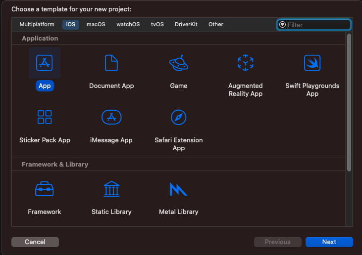
首先需要下载Xcode,创建第一个项目
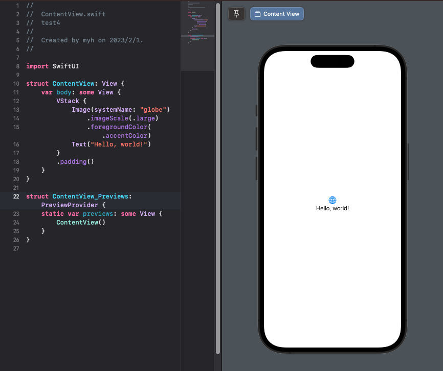
下面这串代码是系统自动给你生存的初始代码,它的意思就是生成了一个图标和一句“Hello world”,Text后边的内容你可以自己修改成任何你喜欢的一句话
struct ContentView: View {
    var body: some View {
        VStack {
            Image(systemName: "globe")
                .imageScale(.large)
                .foregroundColor(.accentColor)
            Text("Hello, world!")
        }
        .padding()
    }
}
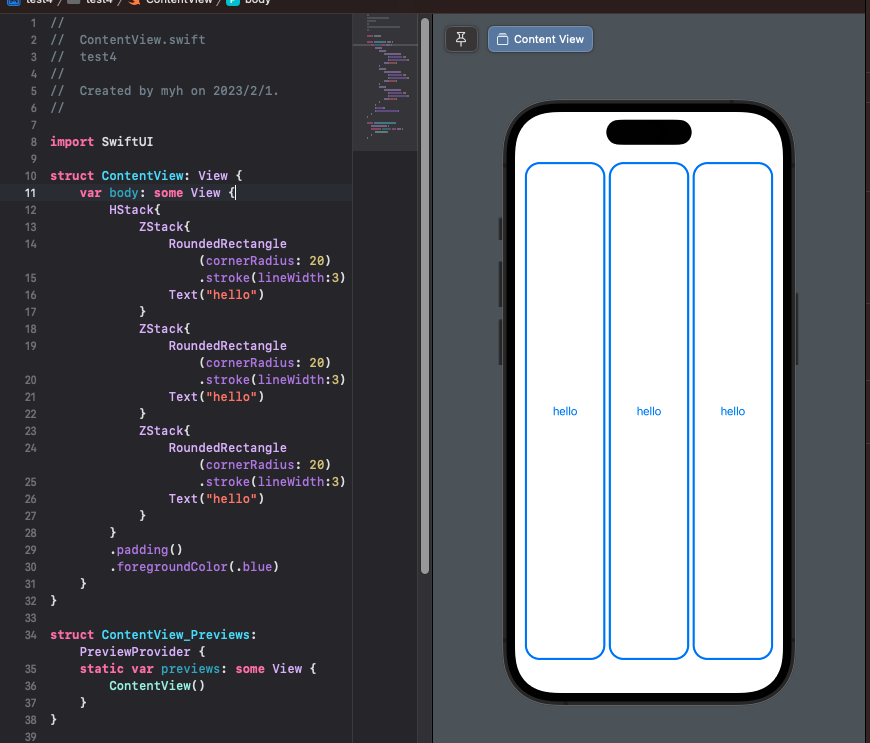
接下来我们可以使用ZStack使几条语句沿垂直于屏幕的方向排列
struct ContentView: View {
    var body: some View {
        HStack{
            ZStack{
                RoundedRectangle(cornerRadius: 20)//设置一个矩形
                    .stroke(lineWidth:3)
                Text("hello")//文本为“hello”
            }
            ZStack{
                RoundedRectangle(cornerRadius: 20)
                    .stroke(lineWidth:3)
                Text("hello")
            }
            ZStack{
                RoundedRectangle(cornerRadius: 20)
                    .stroke(lineWidth:3)
                Text("hello")
            }
        }
        .padding()//填充此视图
        .foregroundColor(.blue)//矩形边框的颜色为蓝色
    }
}
很明显代码中有很多重复的地方,我们可以使它变得简洁一些,就是将相同的部分存为一个结构体
import SwiftUI

struct ContentView: View {
    var body: some View {
        HStack{
        CardView()
        CardView()
        CardView()

        }
        .padding()
        .foregroundColor(.blue)
    }
}
struct CardView : View{
    var body:some View{
        ZStack{
            RoundedRectangle(cornerRadius:20)
                .stroke(lineWidth:3)
            Text("hello")
        }
    }
}
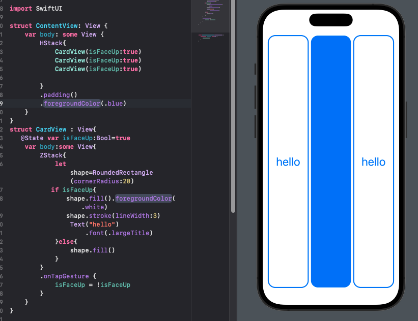
接下来我们希望这些矩形更像卡牌一些,并且具有反转功能,应当注意的是
import SwiftUI

struct ContentView: View {
    var body: some View {
        HStack{
            CardView(isFaceUp:true)
            CardView(isFaceUp:true)
            CardView(isFaceUp:true)

        }
        .padding()
        .foregroundColor(.blue)
    }
}
struct CardView : View{
   @State var isFaceUp:Bool=true//使用 @State 进行页面私有属性设置,驱动 View 的动态显示
    var body:some View{
        ZStack{
            let shape=RoundedRectangle(cornerRadius:20)
           if isFaceUp{//为真则展示该页面
               shape.fill().foregroundColor(.white)
               shape.stroke(lineWidth:3)
                Text("hello")
                    .font(.largeTitle)
            }else{
                shape.fill()
            }
        }
        .onTapGesture {//点击跳转手势
            isFaceUp = !isFaceUp//通过改变其bool值来改变正反面
        }
    }
}
“hello”这个字符串我们可以改变它,也可以用一些符号来代替,或者用数组来存储,但是当需要实现一些增加或者删减的时候我们就不得不使用数组和循环来控制展示出来的页面数量,需要注意的是当增减的数量超过范围的时候会预览失败,因此我们应该增加一些限制
import SwiftUI
struct ContentView:View{
    var emojis=["✈️","🚄","🐶","🐒","🐎","🐑","🐲","🐮","🍺","🐯"]
    @State var emojiCount=4
    var body :some View{

        VStack{
            LazyVGrid(columns: [GridItem(),GridItem()]){
          //  HStack{
                ForEach(emojis[0..<emojiCount],id:\.self){
                    emoji in
                    CardView(content:emoji)
                }
            }
        .foregroundColor(.blue)
            Spacer()
            HStack{
                remove
                Spacer()
                add
            }
            .font(.largeTitle)
            .padding(.horizontal)
        }
        .padding(.horizontal)
     //   .foregroundColor(.black)
    }
    var remove:some View{
        Button(action:{
            if emojiCount>1{
                emojiCount-=1
            }
        },label:{
            Image(systemName: "minus.circle")
        })
    }
    var add :some View{
        Button(action:{
            if emojiCount<emojis.count{
                emojiCount+=1
            }
        },label:{
            Image(systemName: "plus.circle")
        })
    }

    struct CardView:View{
        var content:String
        @State var isFaceUp:Bool=true

        var body:some View{
            ZStack{
                let shape=RoundedRectangle(cornerRadius:20)
                if isFaceUp{
                    /*  RoundedRectangle(cornerRadius:20)
                     .fill()
                     .foregroundColor(.white)
                     RoundedRectangle(cornerRadius:20)
                     .stroke(lineWidth:3)*/
                    shape.fill().foregroundColor(.white)
                    shape.stroke(lineWidth:3)
                    Text(content).font(.largeTitle)

                }
                else{
                    // RoundedRectangle(cornerRadius:20)
                    shape.fill()
                }
            }
            .onTapGesture{
                isFaceUp = !isFaceUp
            }
        }
    }
    struct ContentView_Previews: PreviewProvider {
        static var previews: some View {
            ContentView()
        }
    }
}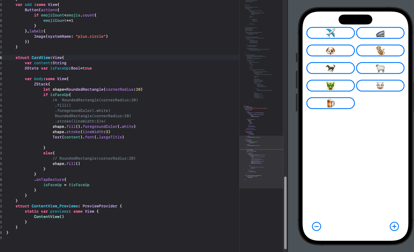
现在我们就可以实现反转以及增加和减少的功能,下面还有一些积累的UI控件的知识点
Text("Text ")文本
tracking(10) //字间距
blur(1)  //模糊效果
background(Color.black) //背景设置如颜色图片
font(.system(size: 20)) //字体大小
foregroundColor(.white) //字体颜色
lineSpacing(20) //行间距
kerning(10)//字间距
bold() //加粗
italic() //斜体
Spacer()//填充空间
VStack//使 View 纵向排列
HStack//使View 水平排列
ZStack//使view垂直于屏幕方向排列
List//列表如
List(0 ..< 10) { _ in
    Text("hello")
}
List {
    ForEach(0 ..< 5) { _ in
        Text("666")
    }
}
Button//设置按钮
Button(action:{
                emojiCount-=1
        },label:{
            Image(systemName: "minus.circle")
        })
Divider//分割线


 扫一扫
扫一扫


 1650
1650

 被折叠的 条评论
为什么被折叠?
被折叠的 条评论
为什么被折叠?
 到【灌水乐园】发言


