


 本文探讨了交互式图形在数据可视化中的应用,包括串联图、过滤滑块、更换坐标轴等技术,以及交互算符如何提升分析效率。
交互式图形(Interactive Graphics)
在可视化时,可交互的图比静态(static)的图更方便分析。了解不同的交互方式可以帮助我们理解交互的分析,了解可视化软件的局限以及改进。【很好玩】
串联图(Linked plots)
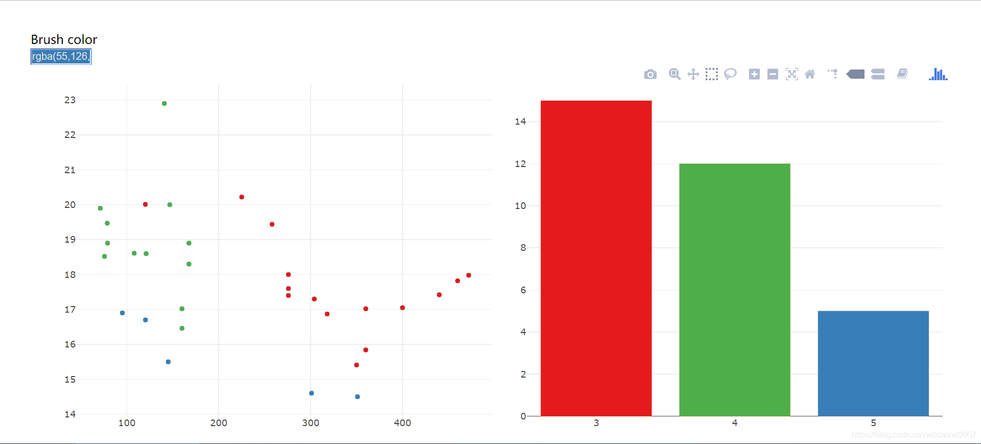
散点图-柱状图(scatter-bar)
以数据mtcars为例,用crosstalk串联一个散点图(data=mtcars,x=disp,y=qsec)与一个柱状图(x=gear)
library(plotly)
library(crosstalk)
library(tidyr)

data <- mtcars
d <- SharedData$new(data)

scatter <- plot_ly(d, x = ~disp, y = ~qsec) %>%
  add_markers()

bar <-plot_ly(d, x=~as.factor(gear)) %>%
  add_histogram() %>%
  layout(barmode="overlay")

subplot(scatter, bar)%>%
  highlight(on="plotly_select", dynamic=T, persistent = T, opacityDim = I(1))%>%hide_legend()
左上角选择不同颜色后,可以在柱状图中给不同不同的柱上色,对应的散点图也会变色
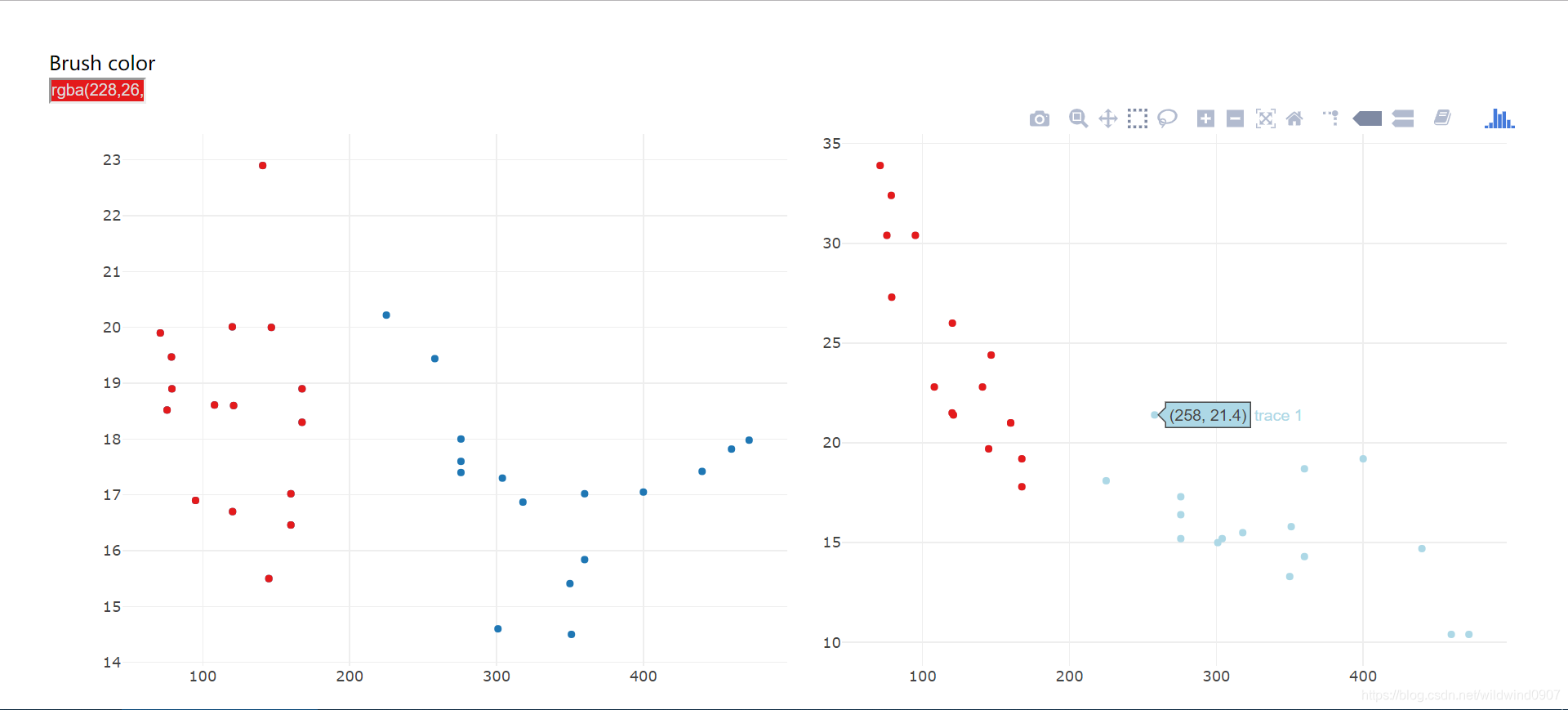
散点图-散点图(scatter-scatter)
scatter2 <- plot_ly(d, x = ~disp, y = ~mpg)%>%
  add_markers(color = I("lightblue"))
subplot(scatter, scatter2)%>%
  highlight(on="plotly_select", dynamic=T, persistent = T, opacityDim = I(1))%>%hide_legend()
通过框出不同的点来交互
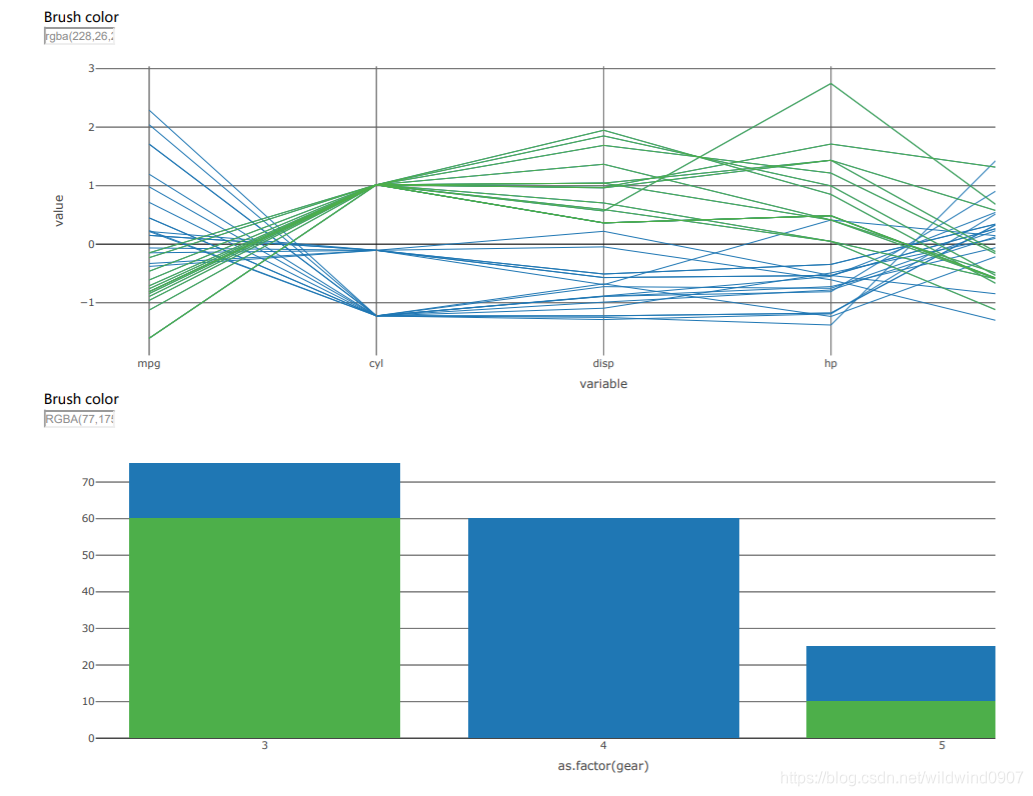
平行坐标图-柱状图(parallel coordinates-bar)
借助htmltools来串联一个平行坐标图和一个柱状图
library(GGally)
p<-ggparcoord(data, columns = 1:5)
d0<-plotly_data(ggplotly(p))%>%group_by(.ID)
d1<-SharedData$new(d0, ~.ID)

p1 <- plot_ly(d1, x=~variable, y=~value)%>%
  add_lines(line=list(width=0.3))%>%
  add_markers(marker=list(size=0.3),
              text=~.ID, hoverinfo="text")

p2 <- plot_ly(d1, x=~as.factor(gear) )%>%add_histogram()%>%layout(barmode="overlay")

ps<-htmltools::tagList(p1%>%
                        highlight(on="plotly_select", dynamic=T, persistent = T, opacityDim = I(1))%>%
                        hide_legend(),
                      p2%>%
                        highlight(on="plotly_select", dynamic=T, persistent = T, opacityDim = I(1))%>%
                        hide_legend())
htmltools::browsable(ps)
可以在平行坐标图中某单列的滑动,选择观察量,在柱状图中也会跟着变化
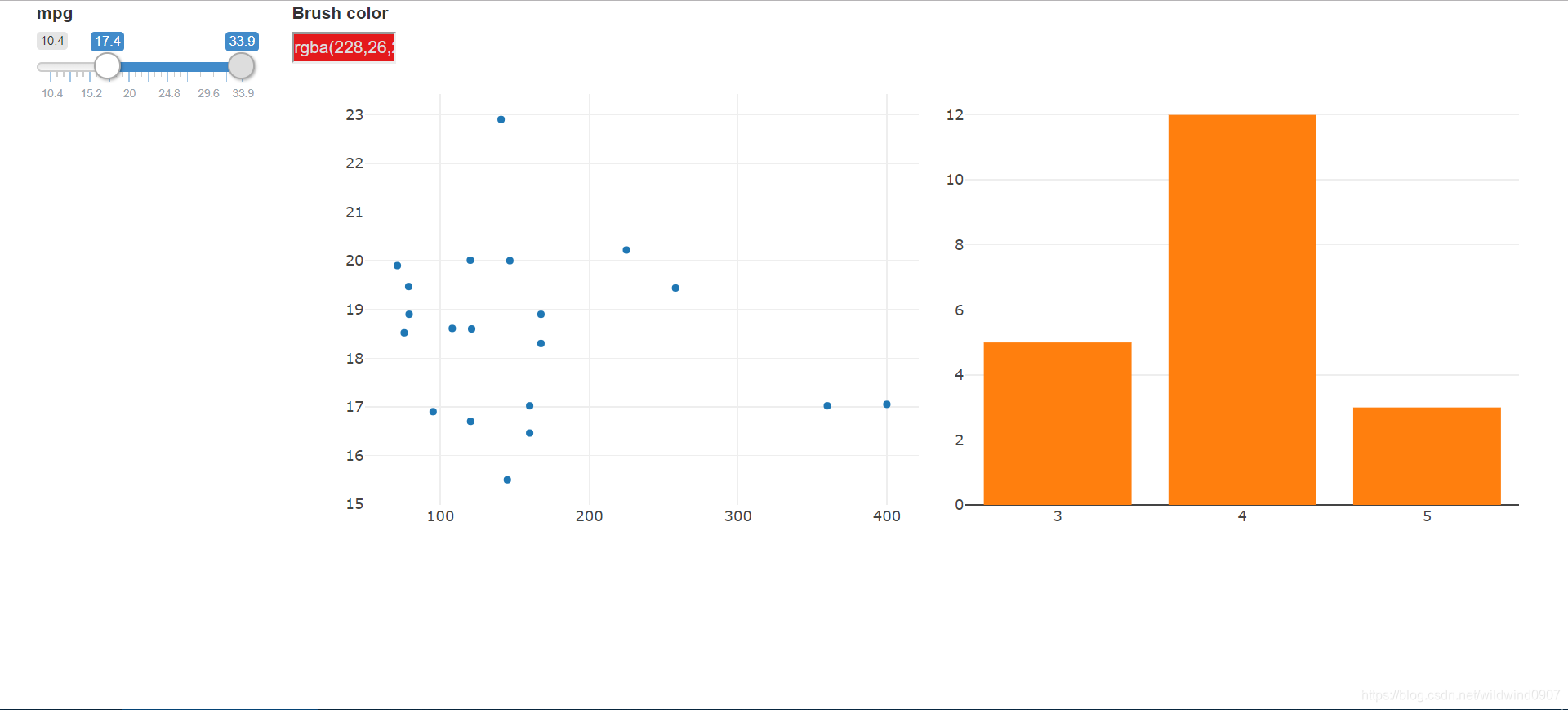
过滤滑块(filter)
借助crosstalk::bscols中的filter_slider,在前图中加入一个对应其他特征的过滤滑块(column=mpg)
bscols(widths=c(2, NA),filter_slider("R", "mpg", d, column=~mpg),
       subplot(scatter, bar)%>%
         highlight(on="plotly_select", dynamic=T,
                   persistent = T, opacityDim = I(1))%>%hide_legend())
滑动左边的滑块后,右边两图会实时变换
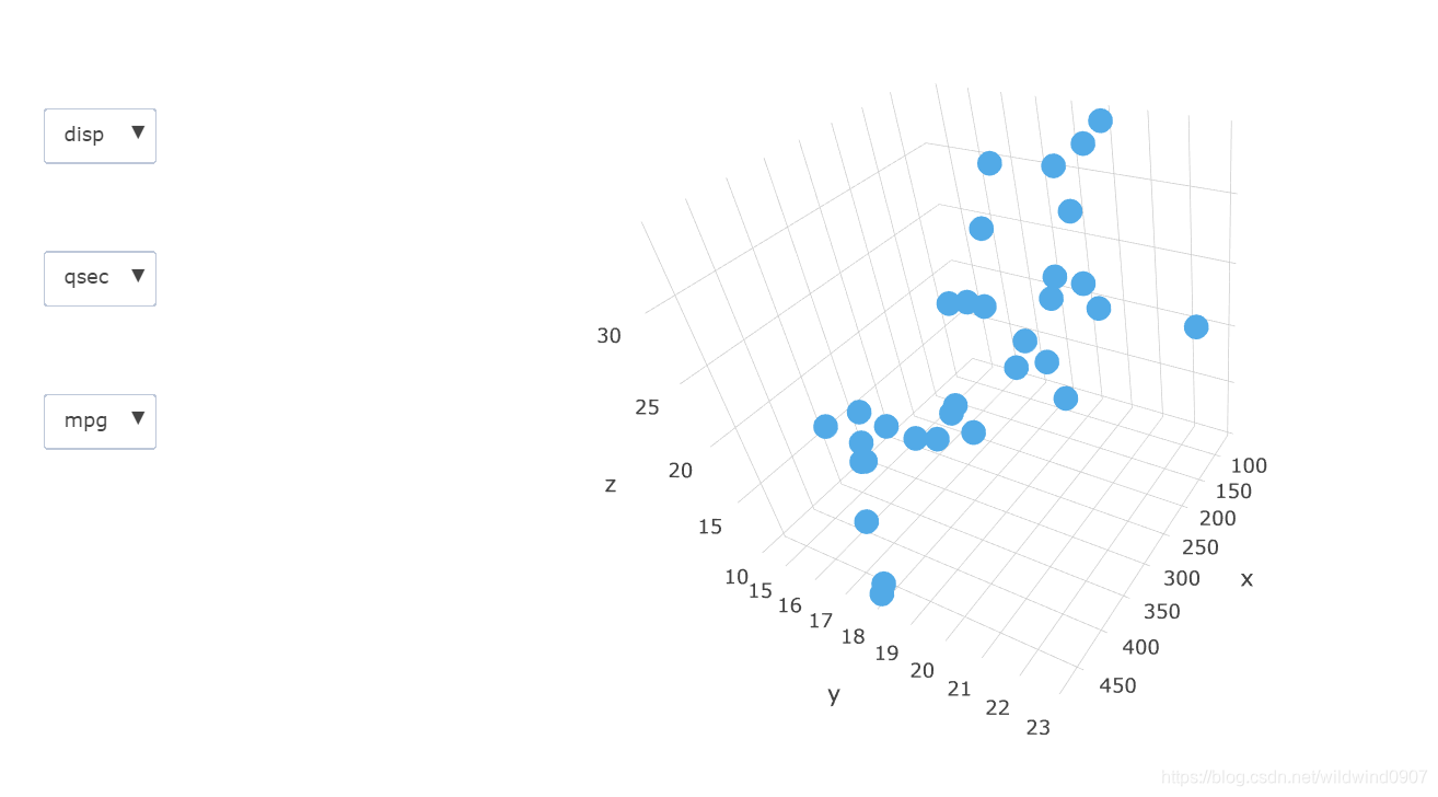
更换坐标轴(buttons)
ButtonsX=list()
for (i in 1:11){
  ButtonsX[[i]]= list(method = "restyle",
                        args = list( "x", list(data[[i]])),
                        label = colnames(data)[i])}
ButtonsY=list()
for (i in 1:11){
  ButtonsY[[i]]= list(method = "restyle",
                        args = list( "y", list(data[[i]])),
                        label = colnames(data)[i])}
ButtonsZ=list()
for (i in 1:11){
  ButtonsZ[[i]]= list(method = "restyle",
                        args = list( "z", list(data[[i]])),
                        label = colnames(data)[i])}

plot_ly(d, x = ~mpg, y = ~mpg, z= ~mpg, alpha = 0.8) %>%
  add_markers() %>%
  layout(scene = list(
    xaxis=list(title="x"),
    yaxis=list(title="y"),
    zaxis=list(title="z")
  ),
  updatemenus = list(
    list(y=0.9, buttons = ButtonsX),
    list(y=0.7, buttons = ButtonsY),
    list(y=0.5, buttons = ButtonsZ)
  )
  )
可以在左边的三个选择框中选择需要的XYZ坐标。在观察右三维图时,可调整摄像头位置,翻转或者缩放图像【去掉Z坐标就是平面图了】
交互算符(Interactive operator)
在可视化的交互中有很多种的交互算符(Interactive operator,不知道正式的译名是什么-.-)归纳了交互的不同方式。以下时一些主要的交互算符以及他们的使用方式
- 导览(Navigation):相机位置,观察方向,分级显示细节
- 选择(Selection):高亮,掩盖
- 连接(Connection)
- 过滤(Filtering):减少数据
- 重置(Reconfiguring):更改特征
- 编码(Encoding):更换图的类型【直译应该是在代码上做修改】
- 提取(Abstraction):鱼眼
另外还有一些结合两种算符的,如
- “选择”+“连接”:刷(parallel-bar),框(scatter+bar)
其他
联动图可以方便使用者观察数据间的关系。注意只有plotly可以直接使用crosstalk::SharedData生成的变量。在处理平行坐标图中,先用GGally绘图,再用plotly::plotly_data得到新的SharedData是一个很取巧的方法。
就笔者个人感觉,实际应用中的交互算符其实很多都是复合的,且难以区分(例如:调整摄像头角度与缩放也可以算减少数据)。所以它的实际意义还是在于让使用者知道交互图可能的使用方式。


 518
518

 被折叠的 条评论
为什么被折叠?
被折叠的 条评论
为什么被折叠?
 到【灌水乐园】发言


