


 本文探讨了五种不同的网页布局技巧,包括BFC、Flex布局、Table布局、Float结合Margin及Calc计算宽度,适用于不同场景,提供了丰富的代码示例。
在地铁上无聊看到一个面试帖子,“俩个div并排,左边div固定宽度,右边宽度自适应”,至少列出4种。
嗡,写了这么多年代码,竟然只能列出2种。回来还是写几个例子验证下。
方式一:BFC(块级格式化上下文)
思路:左边定宽,右边采用 overflow: hidden; /* 触发bfc */
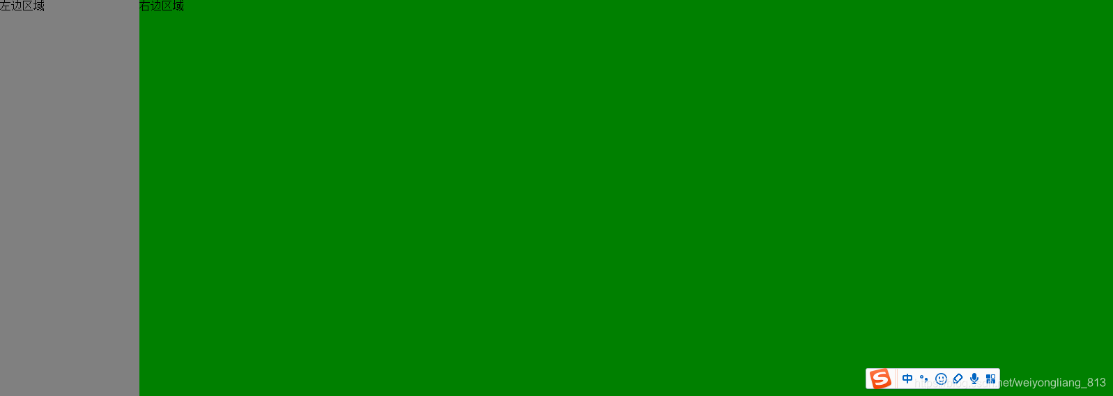
代码:
<!DOCTYPE html>
<html lang="en">
<head class="h100b">
  <meta charset="UTF-8">
  <title>Title</title>
  <style type="text/css">
    html,body{
      padding: 0;
      margin: 0;
      height: 100%;
    }
    div{
      padding: 0;
      margin: 0;
    }
    .h100b {
      width: 100%;
      height: 100%;
    }

    /*方法一: BFC(块级格式化上下文)*/
    .container {
      width: 100%;
      height: 100%;
    }

    .left {
      width: 200px;
      height: 100%;
      background: gray;
      float: left;
    }

    .right {
      height: 100%;
      overflow: hidden; /* 触发bfc */
      background: green;
    }

  </style>
</head>
<body class="h100b">

<div class="container">
  <div class="left">左边区域</div>
  <div class="right">右边区域</div>
</div>

</body>
</html>
兼容ie8+,其他浏览器都是ok的
方式二:采用flex布局
这种应该是最简单的方式,但flex兼容性不行,ie11都不支持
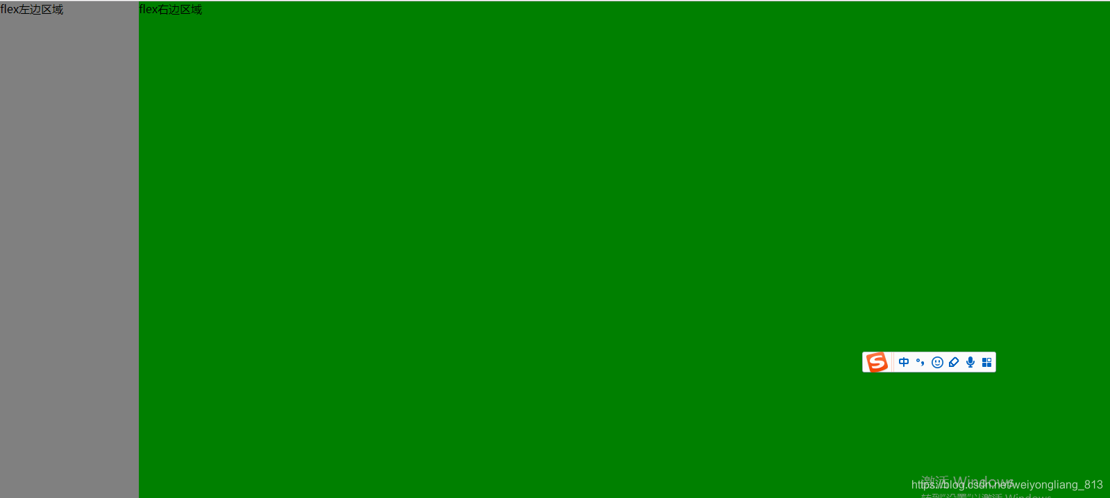
代码如下:
<!DOCTYPE html>
<html lang="en">
<head class="h100b">
  <meta charset="UTF-8">
  <title>Title</title>
  <style type="text/css">
    html,body{
      padding: 0;
      margin: 0;
      height: 100%;
    }
    div{
      padding: 0;
      margin: 0;
    }
    .h100b {
      width: 100%;
      height: 100%;
    }

    .container {
      width: 100%;
      height: 100%;
      display: -webkit-box; /* 老版本语法: Safari, iOS, Android browser, older WebKit browsers. */
      display: -moz-box; /* 老版本语法: Firefox (buggy) */
      display: -ms-flexbox; /* 混合版本语法: IE 10 */
      display: -webkit-flex; /* 新版本语法: Chrome 21+ */
      display: flex; /* 新版本语法: Opera 12.1, Firefox 22+ */
    }

    .left {
      width: 200px;
      height: 100%;
      background: gray;
    }

    .right {
      height: 100%;
      background: green;
      -webkit-flex: 1; /* Chrome */
      -ms-flex: 1; /* IE 10 */
      flex: 1; /* NEW, Spec - Opera 12.1, Firefox 20+ */
      -webkit-box-flex: 1; /* OLD - iOS 6-, Safari 3.1-6 */
      -moz-box-flex: 1; /* OLD - Firefox 19- */
    }

  </style>
</head>
<body class="h100b">

<div class="container">
  <div class="left">flex左边区域</div>
  <div class="right">flex右边区域</div>
</div>

</body>
</html>
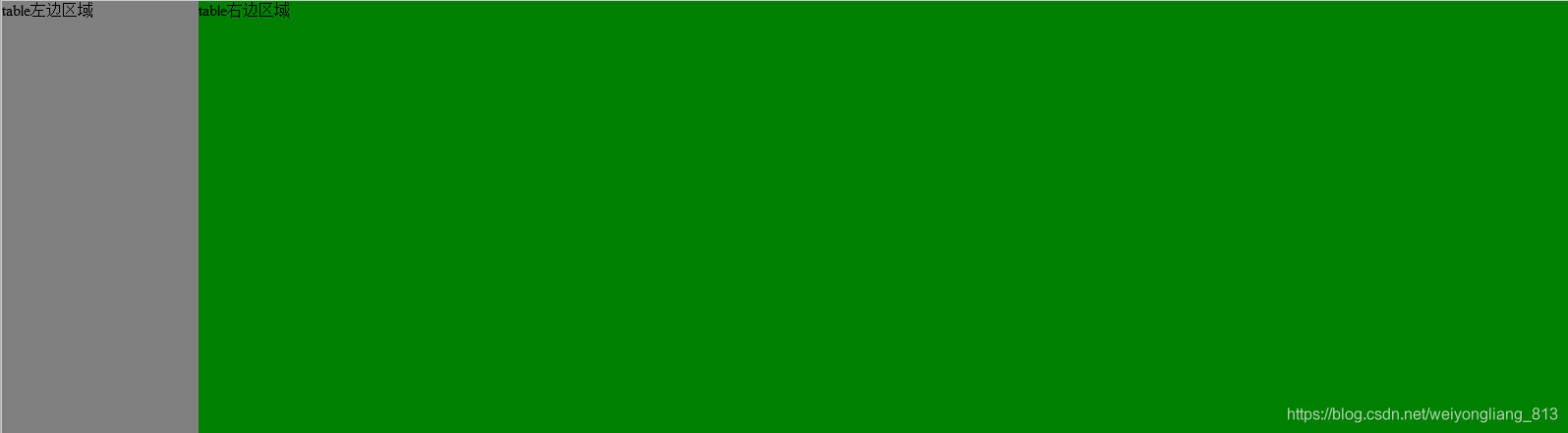
方式三:采用display:table的方式来实现布局
日常开发中说实话用display:table相对比较少,用 table布局倒是不少,但现在慢慢开始抛弃table来实现布局。
代码如下:
<!DOCTYPE html>
<html lang="en">
<head class="h100b">
  <meta charset="UTF-8">
  <title>Title</title>
  <style type="text/css">
    html,body{
      padding: 0;
      margin: 0;
      height: 100%;
    }
    div{
      padding: 0;
      margin: 0;
    }
    .h100b {
      width: 100%;
      height: 100%;
    }

    .container{
      width: 100%;
      height: 100%;
      display:table;         /*table布局*/
    }
    .left{
      width:200px; height:100%;background:gray;
      display:table-cell;
    }
    .right{
      height:100%;background:green;
      display: table-cell;
    }


  </style>
</head>
<body class="h100b">

<div class="container">
  <div class="left">table左边区域</div>
  <div class="right">table右边区域</div>
</div>

</body>
</html>
测试了兼容性相对不错,ie8 都兼容,果断决定,今后得多用这东西了,比第一种方式采用overflow:hidden触发 BFC要好理解多了
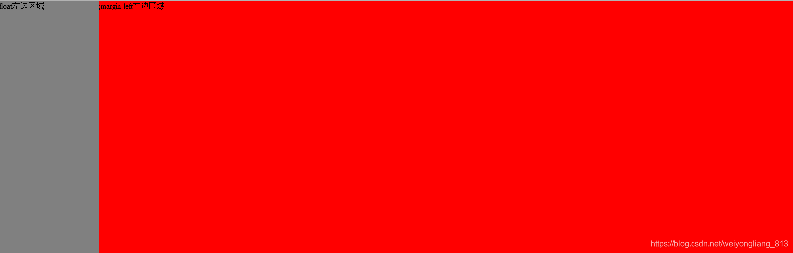
方式四:采用float+margin-left的方式,来实现。这种方式不建议使用,因为这种方式,右边的div高度计算会不一样,高度不是由子元素撑开的,而是默认100%的高度。兼容ie8、IE8+
代码如下:
<!DOCTYPE html>
<html lang="en">
<head class="h100b">
  <meta charset="UTF-8">
  <title>Title</title>
  <style type="text/css">
    html,body{
      padding: 0;
      margin: 0;
      height: 100%;
    }
    div{
      padding: 0;
      margin: 0;
    }
    .h100b {
      width: 100%;
      height: 100%;
    }

    .container{
      width: 100%;
      height: 100%;
    }
    .left{
      float:left;
      width:200px; height:100%;background:gray;
    }
    .right{
      height:100%;width:auto;margin-left:200px;background:#f00;
    }


  </style>
</head>
<body class="h100b">

<div class="container">
  <div class="left">float左边区域</div>
  <div class="right">;margin-left右边区域</div>
</div>

</body>
</html>
方式5:采用calc计算宽度的方式来实现
其实calc兼容性还行,ie9兼容,今后项目里面可以多用用了
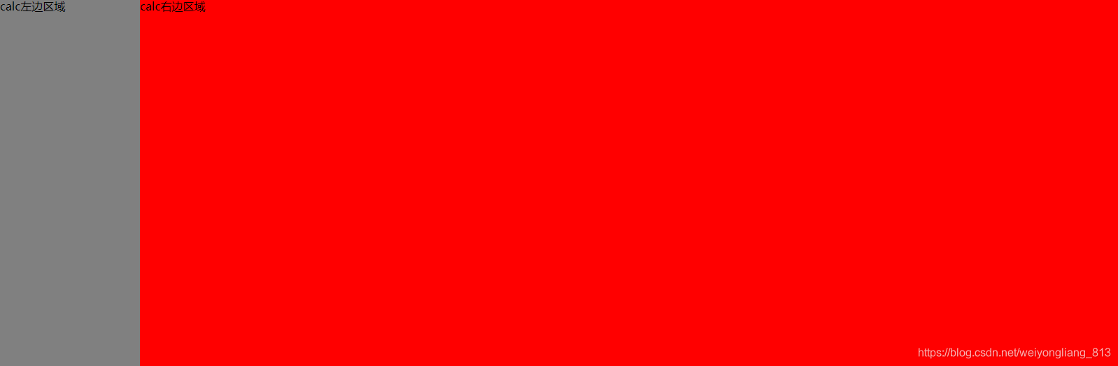
代码:
<!DOCTYPE html>
<html lang="en">
<head class="h100b">
  <meta charset="UTF-8">
  <title>Title</title>
  <style type="text/css">
    html,body{
      padding: 0;
      margin: 0;
      height: 100%;
    }
    div{
      padding: 0;
      margin: 0;
    }
    .h100b {
      width: 100%;
      height: 100%;
    }

    .container{
      width: 100%;
      height: 100%;
    }
    .left{
      float:left;
      width:200px; height:100%;background:gray;
    }
    .right{
      height:100%;
      float:right;
      background:#f00;
      width:calc(100% - 200px);
    }


  </style>
</head>
<body class="h100b">

<div class="container">
  <div class="left">calc左边区域</div>
  <div class="right">calc右边区域</div>
</div>

</body>
</html>
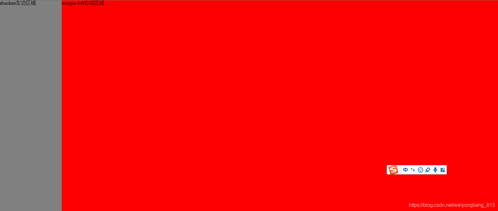
方式5:采用absolute+margin-left来实现,其实这个跟float:left+margin-left的方式类似。
兼容IE8+
代码如下:
<!DOCTYPE html>
<html lang="en">
<head class="h100b">
  <meta charset="UTF-8">
  <title>Title</title>
  <style type="text/css">
    html,body{
      padding: 0;
      margin: 0;
      height: 100%;
    }
    div{
      padding: 0;
      margin: 0;
    }
    .h100b {
      width: 100%;
      height: 100%;
    }

    .container{
      width: 100%;
      height: 100%;
    }
    .left{
     position: absolute;
      width:200px; height:100%;background:gray;
    }
    .right{
      height:100%;
      background:#f00;
      margin-left: 200px;
      width: auto;
    }


  </style>
</head>
<body class="h100b">

<div class="container">
  <div class="left">absolute左边区域</div>
  <div class="right">margin-left右边区域</div>
</div>

</body>
</html>


 扫一扫
扫一扫


 1569
1569

 被折叠的 条评论
为什么被折叠?
被折叠的 条评论
为什么被折叠?
 到【灌水乐园】发言


