


 这篇博客介绍了CSS中如何实现元素的圆角效果,包括不同类型的圆角和椭圆。接着讲解了如何设置元素的阴影效果,包括内阴影和外阴影。此外,还详细探讨了边界图片的使用,如设置边框背景图片路径、切片、宽度等。最后,讨论了背景图的使用,包括如何添加背景图片、背景图像的位置区域以及背景裁剪属性。
CSS 圆角
通过 CSS border-radius 属性,可以实现任何元素的“圆角”样式。
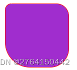
1.border-radius;四个值的时候
.div-1{
            width: 100px;
            height: 100px;
            border: 1px solid red;
            background-color: rgb(160, 45, 206);
            /* 四个值:左上  右上  右下  坐下 */
            border-radius: 10px 20px 30px 40px;
       }
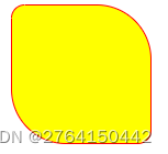
2.border-radius;三个值的时候
.div-2{
            width: 100px;
            height: 100px;
            border: 1px solid red;
            background-color: rgb(255, 255, 0);
            /* 三个值:左上  右上和左下  右下 */
            border-radius: 10px 50px 30px ;
        }
3.border-radius;两个值的时候
.div-2{
            width: 100px;
            height: 100px;
            border: 1px solid red;
            background-color: rgb(255, 255, 0);
            /* 两个值:左上右下   右上右下 */
            border-radius: 10px 40px;
        }
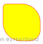
4.圆弧形
 .div-4{
            width: 100px;
            height: 100px;
            border: 1px solid red;
            background-color: rgb(0, 204, 255);
            border-radius: 60px/30px;   /* x轴60px/y轴30px */
        }
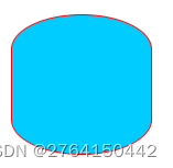
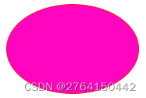
5.椭圆( border-radius:超过50%就是椭圆)
.div-5{
            width: 150px;
            height: 100px;
            border: 1px solid red;
            background-color: rgb(255, 5, 192);
            border-radius: 70%;
        }
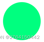
6.圆( border-radius: 50%;)
 .div-3{
            width: 100px;
            height: 100px;
            background-color: springgreen;
            border-radius: 50%;
        }
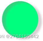
A.阴影
.div-3{
            width: 100px;
            height: 100px;
            background-color: springgreen;
            border-radius: 50%;
            /* box-shadow:水平位置  垂直位置    模糊距离    阴影尺寸(阴影大小)  阴影颜色内/外阴影 */
            box-shadow: 10px 5px 5px #947d7d5b inset,10px 5px 5px #947d7d5b;
        }
设置了内阴影和外阴影,中间用逗号隔开
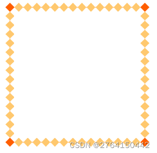
边界图片
border-image-source:边框背景图片路径
border-image-slice:图片边框向内偏移(切片)
border-image-width:图片边框的宽度
border-image-outset:边框图像区域超出边框的量
border-image-repeat:图片边框是否应该平铺(repeat)/铺满(round)/拉伸(stretch)(针对切片图像)
原始图片:

1.round平铺
.div-6{
            width: 200px;
            height: 200px;
            /* 给元素设置透明色的边框
            transprent:透明 */
            border: 15px solid transparent;
            /* 设置边框图片 round平铺*/
            border-image: url(img/border.png) 27 27 round;
        }
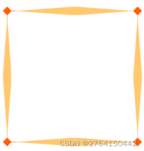
2.repeat铺满
.div-7{
            width: 200px;
            height: 200px;
            /* 给元素设置透明色的边框
            transprent:透明 */
            border: 15px solid transparent;
            /* 设置边框图片 repeat铺满*/
            border-image: url(img/border.png) 27 27 repeat;
        }
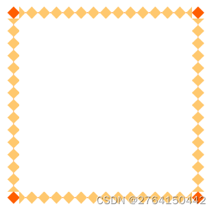
注意:仔细对比两张图不一样的!!!
3.stretch拉伸
.div-8{
            width: 200px;
            height: 200px;
            /* 给元素设置透明色的边框
            transprent:透明 */
            border: 15px solid transparent;
            /* 设置边框图片 stretch拉伸*/
            border-image: url(img/border.png) 27 27 stretch;
        }
背景图
CSS3 中可以通过background-image属性添加背景图片。
不同的背景图像和图像用逗号隔开,所有的图片中显示在最顶端的为第一张。
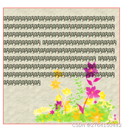
1.一般背景图(想试试注释起来的就自己粘贴试试吧)
.div-9{
            width: 300px;
            height: 300px;
            border: 1px solid red;
            background: url(img/flower_small.gif) no-repeat right bottom,url(img/flower.gif) no-repeat  right bottom,url(img/paper.gif);
            /* background-size: contain; 按比例平铺缩放不会超出*/
            /* background-size: cover; 按比例平铺缩放,撑满盒子,多出的会隐藏起来*/
        }
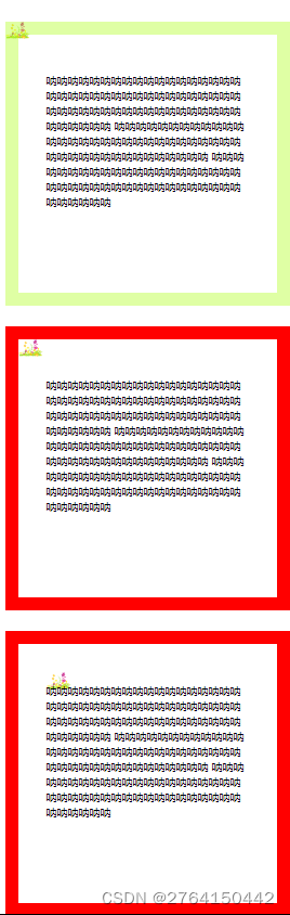
2.background-origin属性指定了背景图像的位置区域。
background-origin属性指定了背景图像的位置区域。
content-box、padding-box和border-box区域内可以放置背景图像。
1. content-box: 背景图片的摆放以 border 区域为参考
2. padding-box:背景图片的摆放以 padding 区域为参考
3. border-box: 背景图片的摆放以 content 区域为参考
        .div-10{
            padding: 40px;
            width: 300px;
            height: 300px;
            border: 20px solid rgba(166, 255, 0, 0.356);
            background: url(img/flower_small.gif) no-repeat;
            background-origin: border-box;
        }
        .div-11{
            padding: 40px;
            width: 300px;
            height: 300px;
            border: 20px solid red;
            background: url(img/flower_small.gif) no-repeat;
            background-origin: padding-box;
        }
        .div-12{
            padding: 40px;
            width: 300px;
            height: 300px;
            border: 20px solid red;
            background: url(img/flower_small.gif) no-repeat;
            background-origin: content-box;
        }
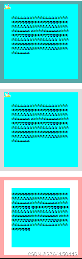
3.background-clip: ; 背景裁剪属性是从指定位置开始绘制的(看背景色)
1. border-box:背景被裁剪到边框盒。
2. padding-box:背景被裁剪到内边距框。
3. content-box:背景被裁剪到内容框。
.div-13{
            padding: 40px;
            width: 300px;
            height: 300px;
            border: 20px solid rgba(255, 0, 0, 0.342);
            background: url(img/flower_small.gif) no-repeat;
            background-color: aqua;
            background-clip: border-box;
        }
        .div-14{
            padding: 40px;
            width: 300px;
            height: 300px;
            border: 20px solid rgba(153, 153, 153, 0.342);
            background: url(img/flower_small.gif) no-repeat;
            background-color: aqua;
            background-clip: padding-box;
        }
        .div-15{
            padding: 40px;
            width: 300px;
            height: 300px;
            border: 20px solid rgba(255, 0, 0, 0.342);
            background: url(img/flower_small.gif) no-repeat;
            background-color: aqua;
            background-clip: content-box;
        }


 扫一扫
扫一扫


 788
788

 被折叠的 条评论
为什么被折叠?
被折叠的 条评论
为什么被折叠?
 到【灌水乐园】发言


