


结构伪类
作用:根据元素在HTML中的结构关系查找元素(根据
html结构选择标签)好处:选择方便,省去了很多类名
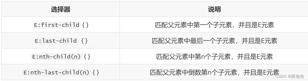
通过代码带你感受一下什么是结构伪类
<!DOCTYPE html>
<html lang="en">
<head>
<meta charset="UTF-8">
<meta http-equiv="X-UA-Compatible" content="IE=edge">
<meta name="viewport" content="width=device-width, initial-scale=1.0">
<title>Document</title>
<style>
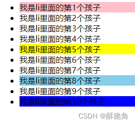
/* 选择li里面的第一个孩子 */
ul li:first-child {
background-color: pink;
}
/* 选择li里面的最后一个孩子 */
ul li:last-child {
background-color: blue;
}
/* 选择li里面的某个孩子 如果写(5) 就是选择第5个孩子 */
ul li:nth-child(5) {
background-color: yellow;
}
/*选择倒数第几个孩子 */
ul li:nth-last-child(3) {
background-color: skyblue;
}
</style>
</head>
<body>
<ul>
<!-- <div>私生子</div> -->
<li>我是li里面的第1个孩子</li>
<li>我是li里面的第2个孩子</li>
<li>我是li里面的第3个孩子</li>
<li>我是li里面的第4个孩子</li>
<li>我是li里面的第5个孩子</li>
<li>我是li里面的第6个孩子</li>
<li>我是li里面的第7个孩子</li>
<li>我是li里面的第8个孩子</li>
<li>我是li里面的第9个孩子</li>
<li>我是li里面的第10个孩子</li>
</ul>
</body>
</html>运行结果
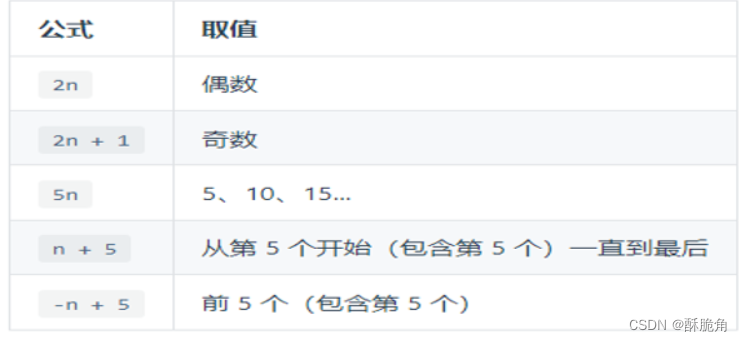
E:nth-child(n)
注意事项:
E:nth-child(n) 只能写n 不能写其他字母.写n表示选中所有孩子
E:nth-child(n) 不能完全取代 E:first-child E:last-child
n的注意点:
1、n为:0、1、2、3、4 ......
2、关键字:even(偶数)odd(奇数)
3、通过n可以组成常见公式
代码演示
<!DOCTYPE html>
<html lang="en">
<head>
<meta charset="UTF-8">
<meta http-equiv="X-UA-Compatible" content="IE=edge">
<meta name="viewport" content="width=device-width, initial-scale=1.0">
<title>Document</title>
<style>
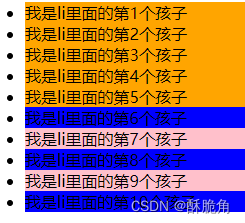
/* 如果直接写n 表示选中所有的孩子 */
/* E:nth-child(n) 只能写n 不能写其他字母*/
/* n为 0 1 2 ..... */
/* .box li:nth-child(n) {
background-color: pink;
} */
/* n可以直接写 数字 表示选择第几个孩子 */
/* .box li:nth-child(6) {
background-color: blue;
} */
/* n为关键字 even(偶数 ) odd(奇数)*/
.box li:nth-child(even) {
background-color: blue;
}
.box li:nth-child(odd) {
background-color: pink;
}
/* 2n 表示选中偶数 */
.box li:nth-child(2n) {
/* background-color: pink; */
}
/* 2n+1 表示选中奇数数 */
.box li:nth-child(2n+1) {
/* background-color: blue; */
}
/* 3n 表示3的倍数 */
.box li:nth-child(3n) {
/* background-color: orange; */
}
/* n+5 表示从第5个开始 一直到最后 包含第5个*/
.box li:nth-child(n+5) {
/* background-color: orange; */
}
/* -n+5 选中前5个 包含第5个 */
.box li:nth-child(-n+5) {
background-color: orange;
}
</style>
</head>
<body>
<ul class="box">
<li>我是li里面的第1个孩子</li>
<li>我是li里面的第2个孩子</li>
<li>我是li里面的第3个孩子</li>
<li>我是li里面的第4个孩子</li>
<li>我是li里面的第5个孩子</li>
<li>我是li里面的第6个孩子</li>
<li>我是li里面的第7个孩子</li>
<li>我是li里面的第8个孩子</li>
<li>我是li里面的第9个孩子</li>
<li>我是li里面的第10个孩子</li>
</ul>
</body>
</html>运行结果
伪元素
伪元素就是由css模拟出来的盒子
::before 在父元素内容的最前面添加一个元素
::after 在父元素内容的最后面添加一个元素
注意事项
伪元素必须要指定 content属性
伪元素插入的元素属于行内元素 设置宽高无效
伪元素的权重和标签一致 000
css2伪元素是单冒号
C333伪元素是双冒号
就是伪了区分伪类和伪元素,但是单冒号仍然有效的.
代码演示
<!DOCTYPE html>
<html lang="en">
<head>
<meta charset="UTF-8">
<meta http-equiv="X-UA-Compatible" content="IE=edge">
<meta name="viewport" content="width=device-width, initial-scale=1.0">
<title>伪元素</title>
<!-- 伪元素就是由css模拟出来的创建的标签或者盒子-->
<style>
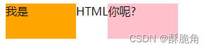
/* ::before 在父元素内容的最前面添加一个元素 */
.box::before {
display: inline-block;
width: 100px;
height: 50px;
background-color: orange;
content: '我是';
}
/* ::after 在父元素内容的最后面添加一个元素 */
.box::after {
content: '你呢?';
display: inline-block;
width: 100px;
height: 50px;
background-color: pink;
}
/*
注意事项
伪元素必须要指定 content属性
伪元素插入的元素属于行内元素 设置宽高无效
伪元素的权重和标签一致 0001
*/
</style>
</head>
<body>
<div class="box">HTML</div>
</body>
</html>运行结果
垂直对齐方式
场景:解决行内/行内块元素垂直对齐问题
vertical-align属性只对行内或行内块元素有效.
/* 默认值 基线对齐 */
vertical-align: baseline;
/* 底部对齐 */
vertical-align: bottom;
/*中线对齐 */
vertical-align: middle;
/* 顶部对齐 */
vertical-align: top;
光标类型
场景:设置鼠标光标在元素上显示的样式
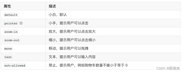
通过代码更直观的感受光标类型 :
<!DOCTYPE html>
<html lang="en">

<head>
    <meta charset="UTF-8">
    <meta http-equiv="X-UA-Compatible" content="IE=edge">
    <meta name="viewport" content="width=device-width, initial-scale=1.0">
    <title>Document</title>
    <style>
        ul li:nth-child(1) {
            cursor: default;
        }

        ul li:nth-child(2) {
            cursor: pointer;
        }

        ul li:nth-child(3) {
            cursor: zoom-in;
        }

        ul li:nth-child(4) {
            cursor: zoom-out;
        }

        ul li:nth-child(5) {
            cursor: move;
        }

        ul li:nth-child(6) {
            cursor: text;
        }

        ul li:nth-child(7) {
            cursor: not-allowed;
        }
    </style>
</head>

<body>
    <ul>
        <li>鼠标形状默认值 箭头</li>
        <li>鼠标形状 小手</li>
        <li>鼠标形状 放大 后期搭配js一起使用</li>
        <li>鼠标形状 缩小 后期搭配js一起使用</li>
        <li>鼠标形状 移动</li>
        <li>鼠标形状 文本</li>
        <li>鼠标形状 禁止</li>
    </ul>
</body>

</html>
这个代码的运行结果要亲身体验才能体会到
边框圆角
border-radius:数值(百分比)
<!DOCTYPE html>
<html lang="en">

<head>
    <meta charset="UTF-8">
    <meta http-equiv="X-UA-Compatible" content="IE=edge">
    <meta name="viewport" content="width=device-width, initial-scale=1.0">
    <title>Document</title>
    <style>
        .box {
            width: 300px;
            height: 300px;
            background-color: pink;
            margin: 50px auto;
            /*  */
            /* border-radius: 10px; */
            /* 从左上角开始赋值 如果没有赋值看对角 */
            border-radius: 10px 40px;
            border-radius: 10px 40px 60px;
            /* 左上角 右上角  右下角  左下角  顺时针 */
            border-radius: 10px 40px 60px 90px;
            border-radius: 0 50%;
        }
    </style>
</head>

<body>
    <div class="box"></div>
</body>

</html>
运行结果

overflow溢出部分显示效果
场景:控制内容溢出部分的显示效果,如:显示、隐藏、滚动条等等
<!DOCTYPE html>
<html lang="en">

<head>
    <meta charset="UTF-8">
    <meta http-equiv="X-UA-Compatible" content="IE=edge">
    <meta name="viewport" content="width=device-width, initial-scale=1.0">
    <title>Document</title>
    <style>
        .box {
            /* 溢出部分显示效果 */
            /* 默认值 溢出部分可见 */
            overflow: visible;
            /* 溢出部分隐藏 */
            overflow: hidden;
            /* 无论是否溢出都显示滚动条 */
            overflow: scroll;
            /* 根据是否溢出,自动显示滚动条 */
            overflow: auto;
            width: 300px;
            height: 300px;
            background-color: pink;
        }
    </style>
</head>

<body>
    <div class="box">
        你好你好 你好你好 你好你好 你好你好 你好你好 你好你好 你好你好 你好你好 你好你好 你好你好 你好你好 你好你好 你好你好 你好你好 你好你好 你好你好 你好你好 你好你好 你好你好 你好你好 你好你好 你好你好 你好你好 你好你好 你好你好 你好你好 你好你好 你好你好 你好你好 你好你好 你好你好 你好你好 你好你好 你好你好 你好你好 你好你好 你好你好 你好你好 你好你好 你好你好 你好你好 你好你好 你好你好 你好你好 你好你好 你好你好 你好你好 你好你好 你好你好 你好你好 你好你好 你好你好 你好你好 你好你好 你好你好 你好你好 你好你好 你好你好 你好你好 你好你好 你好你好 你好你好 你好你好 你好你好 你好你好 你好你好 你好你好 你好你好 你好你好 你好你好 你好你好 你好你好 你好你好 你好你好 你好你好 你好你好 你好你好 你好你好 你好你好 你好你好 你好你好 你好你好 你好你好 你好你好 你好你好 你好你好 你好你好 你好你好 你好你好 你好你好 你好你好 你好你好 你好你好 你好你好 你好你好 你好你好 你好你好 你好你好 你好你好 你好你好 你好你好 你好你好 你好你好 你好你好 你好你好 你好你好 你好你好 你好你好 你好你好 你好你好
    </div>
</body>
运行结果
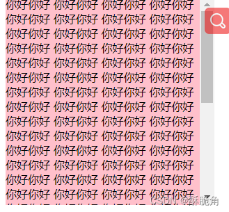
(定位的盒子慎用 overflow: hidden;)
文字溢出显示
<!DOCTYPE html>
<html lang="en">

<head>
    <meta charset="UTF-8">
    <meta http-equiv="X-UA-Compatible" content="IE=edge">
    <meta name="viewport" content="width=device-width, initial-scale=1.0">
    <title>Document</title>
    <style>
        .box {
            width: 160px;
            height: 20px;
            font-size: 16px;
            background-color: pink;
            /* 如果文字显示不开 自动换行 */
            /* white-space: normal; */
            /* 1 让换行的文字强制在一行显示 */
            white-space: nowrap;
            /* 2 溢出的部分隐藏 */
            overflow: hidden;
            /* 3 文字溢出显示用省略号 */
            text-overflow: ellipsis;

        }

        .box1 {
            /* 多行文本溢出显示省略号 */
            overflow: hidden;
            text-overflow: ellipsis;
            display: -webkit-box;
            -webkit-line-clamp: 3;
            -webkit-box-orient: vertical;
            width: 170px;
            height: 66px;
            background-color: red;
        }

        /*
        多行文本溢出必须有固定的高度
        有兼容性问题,ie浏览器不支持
        实际开发建议后端程序员来完成多行文字溢出功能.
        */
    </style>
</head>

<body>
    <div class="box">升降桌的体验天花板?9am智能升降桌Robin体验</div>
    <hr>
    <div class="box1">EOPN品牌 羽绒服男女装大鹅狼毛领2021冬季新款户外工装情侣派克服厚重4.5斤外套 石墨灰 M</div>
</body>

</html>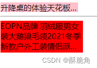
元素本身隐藏
/* 隐藏元素本身 占位置 / visibility: hidden;
/ 隐藏元素本身 不占位置*/ display: none;
<!DOCTYPE html>
<html lang="en">

<head>
    <meta charset="UTF-8">
    <meta http-equiv="X-UA-Compatible" content="IE=edge">
    <meta name="viewport" content="width=device-width, initial-scale=1.0">
    <title>Document</title>
    <style>
        div {
            width: 200px;
            height: 200px;
        }

        .box1 {
            /* 隐藏元素本身 占位置 */
            /* visibility: hidden; */
            /* 隐藏元素本身 不占位置*/
            display: none;
            background-color: red;
        }

        .box2 {
            background-color: purple;
        }

        .father {
            width: 500px;
            height: 500px;
            background-color: pink;
        }

        /* 1 让son盒子隐藏 */
        .son {
            display: none;
            width: 100px;
            height: 100px;
            background-color: blue;
        }

        /* 2 鼠标经过father盒子后让son显示出来 */
        .father:hover .son {
            display: block;
        }
    </style>
</head>

<body>
    <div class="box1">乔治</div>
    <div class="box2">小猪佩奇</div>
    <hr>
    <div class="father">
        <div class="son"></div>
    </div>
</body>

</html>
(自己运行体验一下)
元素整体透明度
opacity:属性;
属性值:0~1之间的数字
1:表示完全不透明
0:表示完全透明
opacity会让元素整体透明,包括里面的内容,如:文字、子元素等……
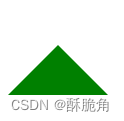
css画三角形
步骤:
1、设置一个盒子
2、设置四周不同颜色的边框
3、将盒子宽高设置为0,仅保存边框
4、得到四个三角形,选择其中一个自己所需的,其他三角形(边框)设置颜色为透
<!DOCTYPE html>
<html lang="en">

<head>
    <meta charset="UTF-8">
    <meta http-equiv="X-UA-Compatible" content="IE=edge">
    <meta name="viewport" content="width=device-width, initial-scale=1.0">
    <title>Document</title>
    <style>
        .box {
            width: 0;
            height: 0;
            border-top: 50px solid transparent;
            border-bottom: 50px solid green;
            border-left: 50px solid transparent;
            border-right: 50px solid transparent;
        }
    </style>
</head>

<body>
    <div class="box"></div>
</body>

</html>
运行结果
链接伪类选择器
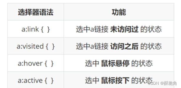
代码演示
<!DOCTYPE html>
<html lang="en">

<head>
    <meta charset="UTF-8">
    <meta http-equiv="X-UA-Compatible" content="IE=edge">
    <meta name="viewport" content="width=device-width, initial-scale=1.0">
    <title>Document</title>
    <style>
        a {
            text-decoration: none;
        }

        /* 1 未访问过的状态 */
        a:link {
            color: red;
        }

        /* 2 访问之后的状态 */
        /* 0001+0010 =0011 */
        a:visited {
            color: blue;
        }

        /* 3 鼠标悬停时候的状态 */
        a:hover {
            color: green;
        }

        /* 4 鼠标按下未弹起时的状态 */
        a:active {
            color: orange;
        }

        /* 伪类选择器权重是10 */
        /* 如果要实现以上4种伪类选择器生效 必须遵循 LVHA的写法 */
    </style>
</head>

<body>
    <a href="#">百度一下</a>
</body>

</html>
(也是要自己运行体验一下的)


 扫一扫
扫一扫


 被折叠的 条评论
为什么被折叠?
被折叠的 条评论
为什么被折叠?
 到【灌水乐园】发言


