


CSS3 动画相关属性实例大全(六)(outline 、outline-color 、outline-offset、outline-width、padding、padding-bottom、padding-left 、padding-right 、padding-top、perspective属性)
本文目录:
一、outline 属性(设置outline元素周围的轮廓)
二、outline-color 属性(设置元素周围的轮廓颜色)
三、outline-offset属性(设置在 border 边缘外的偏移)
六、padding-bottom属性(设置元素的内边距中下方的高度)
七、padding-left 属性(元素在内边距区域中左边的宽度)
八、padding-right 属性(元素在内边距区域中右边的宽度)
九、padding-top属性(元素在内边距区域中上方的宽度)
十、perspective属性(指定了观察者与 z=0 平面的距离)
一、outline 属性(设置outline元素周围的轮廓)
设置outline元素周围的轮廓
outline是绘制于元素周围的一条线,位于边框边缘的外围,可起到突出元素的作用。
outline简写属性在一个声明中设置所有的轮廓属性。
可以设置的属性分别是:outline-color, outline-style, outline-width
| 参阅:outline-width 中可能的值。 | |
| outline-color | 规定边框的颜色。 |
| outline-style | 规定边框的样式。 |
| inherit | 规定应该从父元素继承 outline 属性的设置。 |
    <style>
        #animation60 {
            width: 150px;
            height: 150px;
            outline: 1px solid black;
            background-color: #c1ffc1;
            color: black;
            text-align: center;
            -webkit-animation: animation60a 1s infinite;
            animation: animation60a 1s infinite;
        }

        @-webkit-keyframes animation60a {
            50% { outline: 15px dashed lightblue;  } }

        @keyframes animation60a {
            50% { outline: 15px dashed lightblue; } }
    </style>
<div id="animation60">逆境清醒</div>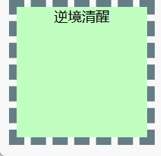
改变 outline 属性:
从 outline: 1px solid black;到 outline: 15px dashed lightblue;
二、outline-color 属性(设置元素周围的轮廓颜色)
    <style>
        #animation61 {
            width: 150px;
            height: 150px;
            outline: 15px dashed black;
            background-color: #c1ffc1;
            color: black;
            text-align: center;
            -webkit-animation: animation61a 1s infinite;
            animation: animation61a 1s infinite;
        }

        @-webkit-keyframes animation61a {
            50% { outline: 15px dashed lightblue;  }  }

        @keyframes animation61a {
            50% { outline: 15px dashed lightblue; } }
    </style>
<div id="animation61">逆境清醒</div>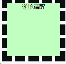
改变 outline-color 属性:从 black 到 lightblue
三、outline-offset属性(设置在 border 边缘外的偏移)
outline-offset属性设置轮廓框架在 border 边缘外的偏移
Outlines在两个方面不同于边框:
- Outlines 不占用空间
- Outlines 可能非矩形
    <style>
        #animation62 {
            width: 100px;
            height: 100px;
            margin: auto;
            border: 1px solid black;
            outline: red solid 5px;
            background-color: #c1ffc1;
            color: black;
            text-align: center;
            -webkit-animation: animation62a 1s infinite;
            animation: animation62a 1s infinite;
        }

        @-webkit-keyframes animation62a {
            50% {outline-offset: 30px;}}

        @keyframes animation62a {
            50% {outline-offset: 30px;}}
    </style>
<div id="animation62">逆境清醒</div>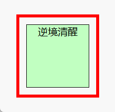
改变 outline-offset 属性:从 0 到 100px
四、outline-width属性(指定轮廓的宽度)
outline-width指定轮廓的宽度。
outline是围绕元素。它是围绕元素的边距。但是,它是来自不同的边框属性。
outline不是元素尺寸的一部分,因此元素的宽度和高度属性不包含轮廓的宽度。
| thin | 规定细轮廓。 |
| medium | 默认。规定中等的轮廓。 |
| thick | 规定粗的轮廓。 |
| length | 允许您规定轮廓粗细的值。 |
| inherit | 规定应该从父元素继承轮廓宽度的设置。 |
    <style>
        #animation63 {
            width: 100px;
            height: 100px;
            margin: auto;
            border: 1px solid black;
            outline: #808080 solid 5px;
            background-color: lightblue;
            color: black;
            text-align: center;
            margin: auto 50%;
            -webkit-animation: animation63a 1s infinite;
            animation: animation63a 1s infinite;
        }

        @-webkit-keyframes animation63a {
            50% {outline-width: 30px; }}

        @keyframes animation63a {
            50% {outline-width: 30px;}}
    </style>
<div id="animation63">逆境清醒</div>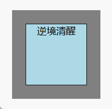
改变 outline-width 属性:从 5px 到 30px
五、padding属性(设置元素的内容和边框之间的区域)
内边距(padding)是指一个元素的内容和边框之间的区域。
和外边距(margin)不同,
内边距(padding)是不允许有负值的。
内边距(padding)可以用四个值声明一个元素的四个方向的内边距(paddings)
padding:1px 2px 3px 4px;
上边距是 1px
右边距是 2px
下边距是 3px
左边距是 4px
padding:10px 50px 60px;
上边距是 10px
右边距和左边距是 50px
下边距是 60px
padding:10px 50px;
上边距和下边距是 10px
右边距和左边距是 50px
padding:10px;
所有四个边距都是 10px
    <style>
        #animation64 {
            width: 100px;
            height: 150px;
            margin: auto;
            border: 1px solid black;
            background-color: lightblue;
            color: black;
            text-align: center;
            margin: auto 50%;
            -webkit-animation: animation64a 1s infinite;
            animation: animation64a 1s infinite;
        }
        @-webkit-keyframes animation64a {
            50% {padding: 30px;}}
        @keyframes animation64a {
            50% {padding: 30px; }}
    </style>
<div id="animation64">逆境清醒2023年春节祝福第二弹——逆境清醒送你一只守护兔,让它温暖每一个你</div>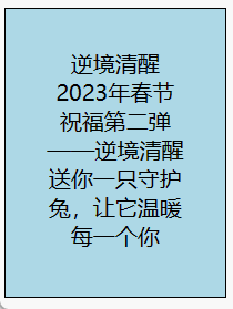
改变 padding 属性:从 0 到 30px
六、padding-bottom属性(设置元素的内边距中下方的高度)
padding-bottom 是指一个元素在内边距区域(padding area)中下方的高度。
    <style>
        #animation66 {
            width: 160px;
            height: 90px;
            margin: auto;
            border: 1px solid black;
            background-color: lightblue;
            color: black;
            text-align: center;
            padding: 10px;
            margin: auto 50%;
            -webkit-animation: animation66a 1s infinite;
            animation: animation66a 1s infinite;
        }

        @-webkit-keyframes animation66a {
            50% { padding-bottom: 60px; } }

        @keyframes animation66a {
            50% { padding-bottom: 60px; } }
    </style>
<div id="animation66">逆境清醒2023年春节祝福第二弹——逆境清醒送你一只守护兔,让它温暖每一个你</div>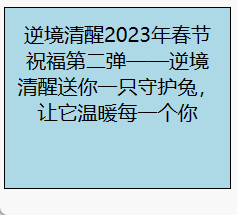
改变 padding-bottom 属性:从 0 到 100px
七、padding-left 属性(元素在内边距区域中左边的宽度)
padding-left 是指一个元素在内边距区域(padding area)中左边的宽度
    <style>
        #animation67 {
            width: 100px;
            height: 200px;
            margin: auto;
            border: 1px solid black;
            background-color: lightblue;
            color: black;
            text-align: center;
            padding: 10px;
            margin: auto 50%;
            -webkit-animation: animation67a 1s infinite;
            animation: animation67a 1s infinite;
        }

        @-webkit-keyframes animation67a {
            50% { padding-left: 50px;  } }

        @keyframes animation67a {
            50% { padding-left: 50px;  } }
    </style>
<div id="animation66">逆境清醒2023年春节祝福第二弹——逆境清醒送你一只守护兔,让它温暖每一个你</div>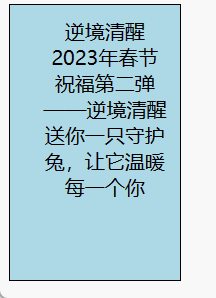
改变 padding-left 属性:到 50px
八、padding-right 属性(元素在内边距区域中右边的宽度)
padding-right 是指一个元素在内边距区域(padding area)中右边的宽度
    <style>
        #animation68 {
            width: 100px;
            height: 200px;
            margin: auto;
            border: 1px solid black;
            background-color: lightblue;
            color: black;
            text-align: center;
            padding: 10px;
            margin: auto 50%;
            -webkit-animation: animation68a 1s infinite;
            animation: animation68a 1s infinite;
        }

        @-webkit-keyframes animation68a {
            50% { padding-right: 50px; } }

        @keyframes animation68a {
            50% { padding-right: 50px;  }  }
    </style>
<div id="animation67">逆境清醒2023年春节祝福第二弹——逆境清醒送你一只守护兔,让它温暖每一个你</div>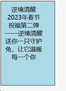
改变 padding-right 属性:到 50px
九、padding-top属性(元素在内边距区域中上方的宽度)
padding-top属性 是指一个元素在内边距区域(padding area)中上方的宽度
    <style>
        #animation69 {
            width: 160px;
            height: 90px;
            margin: auto;
            border: 1px solid black;
            background-color: lightblue;
            color: black;
            text-align: center;
            padding: 10px;
            margin: auto 50%;
            -webkit-animation: animation69a 1s infinite;
            animation: animation69a 1s infinite;
        }

        @-webkit-keyframes animation69a {
            50% { padding-top: 60px; } }

        @keyframes animation69a {
            50% { padding-top: 60px; }  }
    </style>
<div id="animation68">逆境清醒2023年春节祝福第二弹——逆境清醒送你一只守护兔,让它温暖每一个你</div> 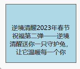
改变 padding-top 属性:到 60px
十、perspective属性(指定了观察者与 z=0 平面的距离)
CSS 属性 perspective 指定了观察者与 z=0 平面的距离,使具有三维位置变换的元素产生透视效果。z>0 的三维元素比正常大,而 z<0 时则比正常小,大小程度由该属性的值决定。
三维元素在观察者后面的部分不会绘制出来,即 z 轴坐标值大于 perspective 属性值的部分。
默认情况下,消失点位于元素的中心,但是可以通过设置 perspective-origin 属性来改变其位置。
当该属性值不为 0 和 none 时,会创建新的 层叠上下文。
在这种情况下,容器内元素的层叠关系像是使用了 position: fixed 一样。
标准语法:perspective = none | <length [0,∞]>
none 没有应用 perspective 样式时的默认值。
<length> <length> 指定观察者距离 z=0 平面的距离,为元素及其内容应用透视变换。
当值为 0 或负值时,无透视变换。
    <style>

        .pers500 { perspective: 500px;  }

         .container {
            width: 200px;
            height: 200px;
            margin: 75px 0 0 75px;
            border: none;
        }

        .cube {
            width: 100%;
            height: 100%;
            backface-visibility: visible;
            perspective-origin: 150% 150%;
            transform-style: preserve-3d;
        }

        .face {
            display: block;
            position: absolute;
            width: 100px;
            height: 100px;
            border: none;
            line-height: 100px;
            font-family: sans-serif;
            font-size: 60px;
            color: white;
            text-align: center;
        }

         .front {
            background: rgb(0, 0, 0, 0.20);
            transform: translateZ(50px);
        }

        .back {
            background: rgba(0, 255, 0, 1);
            color: black;
            transform: rotateY(180deg) translateZ(50px);
        }

        .right {
            background: rgba(196, 0, 0, 0.8);
            transform: rotateY(90deg) translateZ(50px);
        }

        .left {
            background: rgba(0, 0, 196, 0.8);
            transform: rotateY(-90deg) translateZ(50px);
        }

        .top {
            background: rgba(196, 196, 0, 0.8);
            transform: rotateX(90deg) translateZ(50px);
        }

        .bottom {
            background: rgba(196, 0, 196, 0.8);
            transform: rotateX(-90deg) translateZ(50px);
        }

        th, p, td {
            background-color: #EEEEEE;
            padding: 10px;
            font-family: sans-serif;
            text-align: left;
        }
    </style>
<div class="container">
<div class="cube pers500">
<div class="face front">1</div>
<div class="face back">2</div>
<div class="face right">3</div>
<div class="face left">4</div>
<div class="face top">5</div>
<div class="face bottom">6</div>
</div>
</div>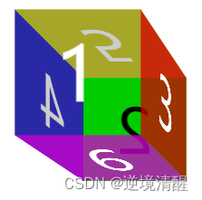
perspective 指定了观察者与 z=0 平面的距离,使具有三维位置变换的元素产生透视效果。
z>0 的三维元素比正常大,
而 z<0 时则比正常小,
大小程度由该属性的值决定。
CSS3 动画相关属性实例大全系列目录:
- 1、CSS3 动画相关属性实例大全(一)(@keyframes ,background属性,border 属性)
- 2、CSS3 动画相关属性实例大全(二)(bottom 、box-shadow、clip、color 、column-count、column-gap、column-rule、column-rule-color、column-rule-width、column-width 属性)
- 3、CSS3 动画相关属性实例大全(三)(columns、filter、flex、flex-basis 、flex-grow、flex-shrink属性)
- 4、CSS3 动画相关属性实例大全(四)(font、height、left、letter-spacing、line-height 属性)
- 5、CSS3 动画相关属性实例大全(五)(margin 、max-height、max-width、min-height、min-width、opacity 、order 属性)
- 6、CSS3 动画相关属性实例大全(六)(outline 、outline-color 、outline-offset、outline-width、padding、padding-bottom、padding-left 、padding-right 、padding-top、perspective属性)
- 7、
推荐阅读:CSS @规则(At-rules)详解系列索引目录
|
|
|
|
| 给照片换底色(python+opencv) | 猫十二分类 | 基于大模型的虚拟数字人__虚拟主播实例 |
|
|
|
|
| 计算机视觉__基本图像操作(显示、读取、保存) | 直方图(颜色直方图、灰度直方图) | 直方图均衡化(调节图像亮度、对比度) |
|
|
|
|


逆境清醒
|
| ||
|
| ||
| Three.js实例详解___旋转的精灵女孩(附完整代码和资源)(一) | ||
|
|
|
|
| 立体多层玫瑰绘图源码__玫瑰花python 绘图源码集锦 | ||
|
|
|
|
| 用代码写出浪漫__合集(python、matplotlib、Matlab、java绘制爱心、玫瑰花、前端特效玫瑰、爱心) | python爱心源代码集锦(18款) | |
|
|
|
|
|
|
| |
| 用代码过中秋,python海龟月饼你要不要尝一口? | ||
|
|
|
|
| 草莓熊python turtle绘图(风车版)附源代码 | ||
|
|
| |
| 皮卡丘python turtle海龟绘图(电力球版)附源代码 | ||


|
|
|
|
| 2024年6月多家权威机构____编程语言排行榜__薪酬状况 | ||
|
|
|
|
| 【优快云云IDE】个人使用体验和建议(含超详细操作教程)(python、webGL方向) | ||


|
|
|
|


 扫一扫
扫一扫


 被折叠的 条评论
为什么被折叠?
被折叠的 条评论
为什么被折叠?
 到【灌水乐园】发言


