


-
5.使用弹窗
1.概述
弹窗一般指打开应用时自动弹出或者用户行为操作时弹出的UI界面,用于短时间内展示用户需关注的信息或待处理的操作。
弹窗的种类
根据用户交互操作场景,弹窗可分为模态弹窗和非模态弹窗两种类型,其区别在于用户是否必须对其做出响应。
- 模态弹窗: 为强交互形式,会中断用户当前的操作流程,要求用户必须做出响应才能继续其他操作,通常用于需要向用户传达重要信息的场景。
- 非模态弹窗: 为弱交互形式,不会影响用户当前操作行为,用户可以不对其进行回应,通常都有时间限制,出现一段时间后会自动消失。一般用于告诉用户信息内容外还需要用户进行功能操作的场景。
说明
当前模态弹窗通过设置指定属性变成非模态,例如AlertDialog,可以设置isModal为false变成非模态,其他弹窗详见API说明。
2.模态转场
1.基本用法
半模态顾名思义,就是半屏的模态效果(如上图)
| 名称 | 参数 | 参数描述 |
| bindSheet | isShow: boolean, | 给组件绑定半模态页面,点击后显示模态页面。 |
@Entry
  @Component
  struct SheetTransitionExample1 {
    // 1. 定义控制变量
    @State isShow: boolean = false

    // 2.自定义内容
    @Builder
    myBuilder() {
       // 结构略
    }

    build() {
      Column() {
        Button(`显示半模态`)
          //  3.绑定半模态框
          .bindSheet(this.isShow, this.myBuilder())
          .onClick(() => {
            // 4.控制显示
            this.isShow = true
          })
      }
    }
  }
实现双向数据绑定
该代码有个小问题,如果通过那个关闭按钮来关闭模态会出现无法开启的情况
说明
在非双向绑定情况下,以拖拽方式关闭半模态页面不会改变isShow参数的值。
为了使isShow参数值与半模态界面的状态同步,建议使用$$双向绑定isShow参数。
@Entry
@Component
struct Index {
  // 2. 准备bindSheet的两个参数
  @State isShow:boolean = false
  @Builder sheetBuilder(){
    Column(){
      Text('半模态提示框内容')
        .fontSize(50)
    }
  }
  build() {
    Column() {
        /*
         * 半模态提示框:
         * .bindSheet()
         * */

      Button('点我弹出')
        // 1. 在按钮上注册bindSheet实现半模态提示框
        // $$this.isShow 表示将this.isShow这个状态变量与bindSheet内部的动作进行双向绑定
        // 双向: 数据发生改变 -> 驱动页面更新 +  当页面发生改变 -> 驱动数据跟着改变  双向
        .bindSheet($$this.isShow,this.sheetBuilder())
        .onClick(()=>{
          // 3. 点击按钮的时候打开半模态
          this.isShow = true
        })
    }
    .height('100%')
    .width('100%')
    .backgroundColor(Color.Pink)

  }
}
2. 可选属性
通过第三个可选参数SheetOptions,可以对半模态的内容进行调整
其中常用属性如下
| 名称 | 类型 | 必填 | 描述 |
| height | | Length | 否 | 半模态高度,默认是LARGE。 说明: 底部弹窗竖屏时,当设置detents时,该属性设置无效。 |
| dragBar | boolean | 否 | 是否显示控制条,默认显示。 说明: 半模态面板的dentents属性设置多个不同高度并且设置生效时,默认显示控制条。否则不显示控制条。 |
| showClose | boolean | Resource | 否 | 是否显示关闭图标,默认显示。 |
| detents | [(SheetSize | Length), ( SheetSize | Length)?, (SheetSize | Length)?] | 否 | 半模态页面的切换高度档位。 说明: 底部弹窗竖屏生效,元组中第一个高度为初始高度。 |
| 。。。。剩余属性参考文档 | |||
3.示例
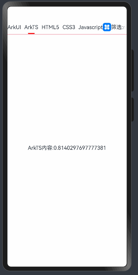
import { iType } from './data/DataSource'
@Entry
@Component
struct test_demo {
  // 1. 状态变量
  @State typeList: iType[] = [
    { id: 1, name: 'ArkUI' },
    { id: 2, name: 'ArkTS' },
    { id: 3, name: 'HTML5' },
    { id: 4, name: 'CSS3' },
    { id: 5, name: 'Javascript' },
    { id: 6, name: 'TypeScript' }
  ]
  @State Items:string[] =[
    'ArkUI',
    'ArkTS',
    'HTML5',
    'CSS3',
    '这是一条测试的长数据1111111111',
    'Javascript',
    'TypeScript',
    'Vue',
    'React',
    'Angular',
  ]
  @State currIdx:number = 0
  @State isShow:boolean = false
  //2.抽离模块
  @Builder Item(item:iType,idx:number){
    TabContent(){
      Text(item.name+'内容:'+Math.random())
    }.tabBar(this.TabsView(item,idx))

  }
  @Builder TabsView(item:iType,idx:number){
    Column({space:8}){
      Text(item.name)
      Row()
        .height(3)
        .width(20)
        .backgroundColor(Color.Red)
        .borderRadius(3)
        .opacity(this.currIdx==idx?1:0)
    }.margin({right:10}).padding({right:this.typeList.length-1 === idx ? 70:0})

  }

  @Builder mySheet(){
    Column(){
      Row(){
        Text('重置')
        Text('筛选题目')
        Text('完成').fontColor('rgba(243, 209, 143, 1.00)').onClick(() => {
          this.isShow = false
        }) // 设置 rgba 颜色
      }.margin({top:20,bottom:20}).width('100%').justifyContent(FlexAlign.SpaceAround)
      Text('选择阶段').width('100%').fontWeight(700).padding({left:10})
      Flex({wrap:FlexWrap.Wrap}){
        ForEach(this.Items,(item:string)=>{
          Text(item).padding(5).backgroundColor('#fff').margin(5)
        })
      }
    }
  }

  //构建代码
  build() {
    Column(){
      Tabs(){
        ForEach(this.typeList,(item:iType,idx:number)=>{
          this.Item(item,idx)
        })
      }.barMode(BarMode.Scrollable)
      .animationDuration(1000)
      .onTabBarClick((index:number)=>{
        this.currIdx = index
        console.log('123',index)
      })
      Blank().height(2).backgroundColor(Color.Pink).margin({ top: '-186%'})
      Row(){
        Image($r('app.media.startIcon')).width(25)
        Text('筛选')
      }.position({x:'80%',y:'10'}).backgroundColor(Color.White)
      .bindSheet($$this.isShow,this.mySheet(),{
        height:'400',//模态框高度
        dragBar:true,//是否显示拖动条
        detents:[200,400,600],//拖动条高度
        showClose:false,//是否显示关闭按钮
      })
      .onClick(()=>{
        this.isShow = !this.isShow
      })
    }
  }
}
3.正在加载中的动画图标
   Row(){
        LoadingProgress()
          .height(50)
          .color(Color.Red)
      }.width('100%').justifyContent(FlexAlign.Center)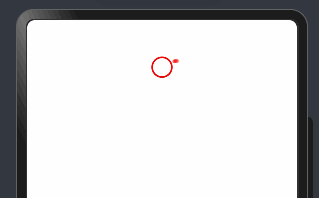
4.promptAction(弹窗)
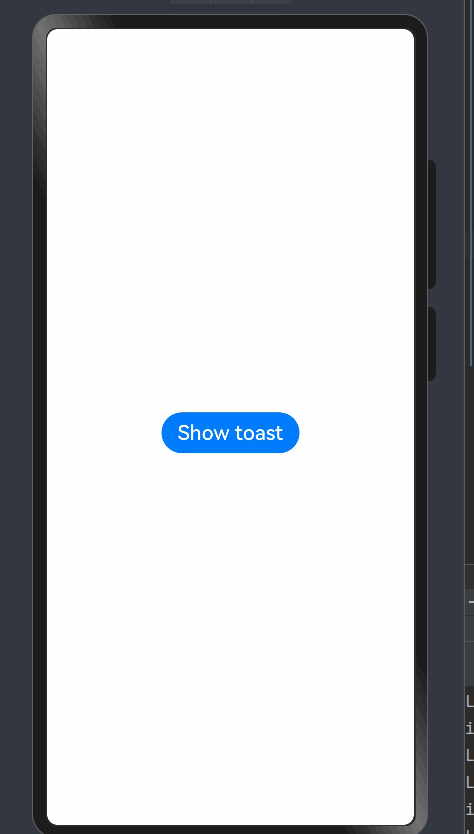
1.promptAction.showToast
创建并显示文本提示框。
import { promptAction } from '@kit.ArkUI'
import { BusinessError } from '@kit.BasicServicesKit';

@Entry
@Component
struct toastExample {
  build() {
    Column() {
      Button('Show toast').fontSize(20)
        .onClick(() => {
          try {
            promptAction.showToast({
              message: 'Hello World',
              duration: 1000,
              alignment:Alignment.Top,
              offset:{dx:0,dy:100}
            });
          } catch (error) {
            let message = (error as BusinessError).message
            let code = (error as BusinessError).code
            console.error(`showToast args error code is ${code}, message is ${message}`);
          };
        })
    }.height('100%').width('100%').justifyContent(FlexAlign.Center)
  }
}
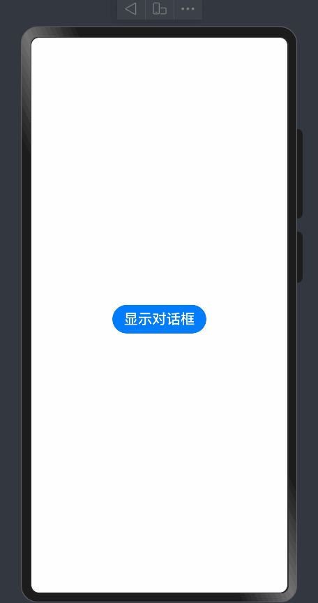
2.promptAction.showDialog
创建并显示对话框,对话框响应结果异步返回。
import { promptAction } from '@kit.ArkUI'
import { BusinessError } from '@kit.BasicServicesKit';

@Entry
@Component
struct toastExample {
  build() {
    Column() {
      Button('显示对话框').fontSize(20)
        .onClick(() => {
          promptAction.showDialog({
            title: '确定删除吗',
            message: 'Message Info',
            //当弹窗的showInSubWindow属性为true时,弹窗可显示在窗口外。
            showInSubWindow: true,
            buttons: [
              {
                text: '确定',
                color: '#000000'
              },
              {
                text: '取消',
                color: '#000000'
              }
            ],
          })
            .then(data => {
              if(data.index === 0){
                AlertDialog.show({ message:'点击的是确定' + data.index})
              }else{
                AlertDialog.show({ message:'点击的是取消' + data.index})
              }
            })

        })
    }.height('100%').width('100%').justifyContent(FlexAlign.Center)
  }
}
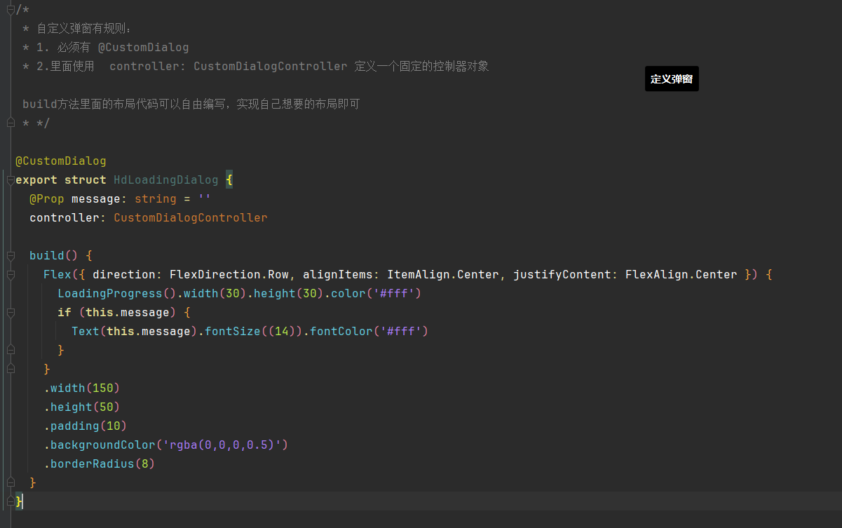
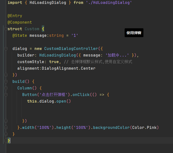
5. 自定义弹窗 (CustomDialog)
定义弹窗 (CustomDialog)是什么?
CustomDialog是自定义弹窗,可用于广告、中奖、警告、软件更新等与用户交互响应操作。开发者可以通过CustomDialogController类显示自定义弹窗。


 扫一扫
扫一扫


 748
748

 被折叠的 条评论
为什么被折叠?
被折叠的 条评论
为什么被折叠?
 到【灌水乐园】发言


