


1.使用文本
文本显示 (Text/Span)-使用文本-UI开发 (ArkTS声明式开发范式)-ArkUI(方舟UI框架)-应用框架 - 华为HarmonyOS开发者 (huawei.com)
1.文本显示(Text/Span)
a.常见属性
| 属性 | 描述 |
| fontSize | 字体大小 |
| fontColor | 字体颜色 |
| fontStyle | 字体样式 |
| fontWeight | 字体粗细 |
| lineHeight | 文本行高 |
| decoration | 文本修饰线及颜色 |
| textAlign | 水平方向Text对齐方式 |
| align | 垂直方向对齐方式 |
| textIndent | 文本首行缩进 |
b.通过textCase设置文字一直保持大写或者小写状态。
解释

Text() {
  Span('I am Upper-span').fontSize(12)
    .textCase(TextCase.UpperCase)
}
.borderWidth(1)
.padding(10)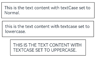
c.通过copyOption属性设置文本是否可复制粘贴。
Text("这是一段可复制文本")
  .fontSize(30)
  .copyOption(CopyOptions.InApp)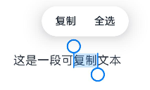
d.添加子组件
创建Span。
Span组件需要写到Text组件内,单独写Span组件不会显示信息,Text与Span同时配置文本内容时,Span内容覆盖Text内容。
Text('我是Text') {
  Span('我是Span')
}
.padding(10)
.borderWidth(1)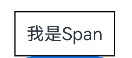
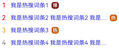
e.场景示例
// 试一试吧
@Entry
@Component
struct TextExample {
  build() {
    Column() {
      Row() {
        Text("1").fontSize(14).fontColor(Color.Red).margin({ left: 10, right: 10 })
        Text("我是热搜词条1")
          .fontSize(12)
          .fontColor(Color.Blue)
          .maxLines(1)
          .textOverflow({ overflow: TextOverflow.Ellipsis })
          .fontWeight(300)
        Text("爆")
          .margin({ left: 6 })
          .textAlign(TextAlign.Center)
          .fontSize(10)
          .fontColor(Color.White)
          .fontWeight(600)
          .backgroundColor(0x770100)
          .borderRadius(5)
          .width(15)
          .height(14)
      }.width('100%').margin(5)

      Row() {
        Text("2").fontSize(14).fontColor(Color.Red).margin({ left: 10, right: 10 })
        Text("我是热搜词条2 我是热搜词条2 我是热搜词条2 我是热搜词条2 我是热搜词条2")
          .fontSize(12)
          .fontColor(Color.Blue)
          .fontWeight(300)
          .constraintSize({ maxWidth: 200 })
          .maxLines(1)
          .textOverflow({ overflow: TextOverflow.Ellipsis })
        Text("热")
          .margin({ left: 6 })
          .textAlign(TextAlign.Center)
          .fontSize(10)
          .fontColor(Color.White)
          .fontWeight(600)
          .backgroundColor(0xCC5500)
          .borderRadius(5)
          .width(15)
          .height(14)
      }.width('100%').margin(5)

      Row() {
        Text("3").fontSize(14).fontColor(Color.Orange).margin({ left: 10, right: 10 })
        Text("我是热搜词条3")
          .fontSize(12)
          .fontColor(Color.Blue)
          .fontWeight(300)
          .maxLines(1)
          .constraintSize({ maxWidth: 200 })
          .textOverflow({ overflow: TextOverflow.Ellipsis })
        Text("热")
          .margin({ left: 6 })
          .textAlign(TextAlign.Center)
          .fontSize(10)
          .fontColor(Color.White)
          .fontWeight(600)
          .backgroundColor(0xCC5500)
          .borderRadius(5)
          .width(15)
          .height(14)
      }.width('100%').margin(5)

      Row() {
        Text("4").fontSize(14).fontColor(Color.Grey).margin({ left: 10, right: 10 })
        Text("我是热搜词条4 我是热搜词条4 我是热搜词条4 我是热搜词条4 我是热搜词条4")
          .fontSize(12)
          .fontColor(Color.Blue)
          .fontWeight(300)
          .constraintSize({ maxWidth: 200 })
          .maxLines(1)
          .textOverflow({ overflow: TextOverflow.Ellipsis })
      }.width('100%').margin(5)
    }.width('100%')
  }
}
2.文本输入 (TextInput/TextArea)
1.概述
TextInput、TextArea是输入框组件,通常用于响应用户的输入操作,比如评论区的输入、聊天框的输入、表格的输入等,也可以结合其它组件构建功能页面,例如登录注册页面。具体用法请参考TextInput、TextArea。
TextInput常用参数
| 参数名 | 类型 | 是否必填 | 说明 |
| placeholder | 否 | 设置无输入时的提示文本。 | |
| text | 否 | 设置输入框当前的文本内容。从API version 10开始,该参数支持$$ 双向绑定变量。 |
常用属性
| 名称 | 参数类型 | 描述 |
| type | InputType | 设置输入框类型。默认值:InputType.Normal |
| showUnderline | boolean | 设置是否开启下划线。下划线默认颜色为'#33182431',默认粗细为1px,文本框尺寸48vp(下划线只支持InputType.Normal类型)。默认值:false |
| passwordIcon | PasswordIcon | onIconSrc:输入状态时图标offIconSrc:隐藏状态时图标 |
| placeholderColor | 设置placeholder文本颜色。默认值跟随主题。 |
TextArea常用参数
| 参数名 | 类型 | 是否必填 | 说明 |
| placeholder | 否 | 设置无输入时的提示文本。 | |
| text | 否 | 设置输入框当前的文本内容。从API version 10开始,该参数支持$$ 双向绑定变量。 |
常用属性
| 名称 | 参数类型 | 描述 |
| type | InputType | 设置输入框类型。默认值:InputType.Normal |
| placeholderColor | 设置placeholder文本颜色。默认值跟随主题。 | |
| showCounter | value: boolean, options11+?: InputCounterOptions | 参数value为true时,才能设置options,文本框开启计数下标功能,需要配合maxlength(设置最大字符限制)一起使用。 |
| maxLength | number | 设置文本的最大输入字符数。 默认不设置最大输入字符数限制。 到达文本最大字符限制,将无法继续输入字符,同时边框变为红色。 |
| .... |
2.创建输入框
TextInput为单行输入框、TextArea为多行输入框。通过以下接口来创建。
TextInput(value?:{placeholder?: ResourceStr, text?: ResourceStr, controller?: TextInputController})

TextArea(value?:{placeholder?: ResourceStr, text?: ResourceStr, controller?: TextAreaController})
单行输入框/多行输入框
TextInput()
TextArea()
//多行输入框文字超出一行时会自动折行。
TextArea({text:"我是TextArea我是TextArea我是TextArea我是TextArea"}).width(300)


3.设置输入框类型
TextInput有9种可选类型,分别为Normal基本输入模式、Password密码输入模式、Email邮箱地址输入模式、Number纯数字输入模式、PhoneNumber电话号码输入模式、USER_NAME用户名输入模式、NEW_PASSWORD新密码输入模式、NUMBER_PASSWORD纯数字密码输入模式、NUMBER_DECIMAL带小数点的数字输入模式。通过type属性进行设置:
密码输入模式
TextInput()
  .type(InputType.Password)
4.自定义样式
设置无输入时的提示文本。
设置输入框当前的文本内容。
添加backgroundColor改变输入框的背景颜色。
更丰富的样式可以结合通用属性实现。
TextInput({placeholder:'我是提示文本'})

TextInput({placeholder:'我是提示文本',text:'我是当前文本内容'})

TextInput({placeholder:'我是提示文本',text:'我是当前文本内容'})
  .backgroundColor(Color.Pink)


5.添加事件
文本框主要用于获取用户输入的信息,把信息处理成数据进行上传,绑定onChange事件可以获取输入框内改变的内容。用户也可以使用通用事件来进行相应的交互操作。
TextInput()
.onChange((value: string) => {
console.info(value);
})
.onFocus(() => {
console.info('获取焦点');
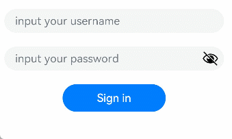
})6.示例
@Entry
@Component
struct TextInputSample {
  build() {
    Column() {
      TextInput({ placeholder: 'input your username' }).margin({ top: 20 })
        .onSubmit((EnterKeyType)=>{
          console.info(EnterKeyType+'输入法回车键的类型值')
        })
      TextInput({ placeholder: 'input your password' }).type(InputType.Password).margin({ top: 20 })
        .onSubmit((EnterKeyType)=>{
          console.info(EnterKeyType+'输入法回车键的类型值')
        })
      Button('Sign in').width(150).margin({ top: 20 })
    }.padding(20)
  }
}
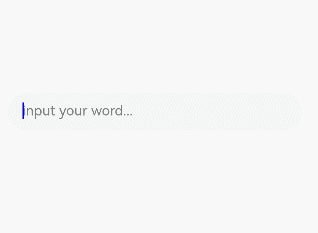
7.$$语法:内置组件双向同步(Vue里面的v-model双向数据绑定)
$$运算符为系统内置组件提供TS变量的引用,使得TS变量和系统内置组件的内部状态保持同步。
内部状态具体指什么取决于组件。例如,TextInput组件的text参数。
// xxx.ets
@Entry
@Component
struct TextInputExample {
  @State text: string = ''
  controller: TextInputController = new TextInputController()

  build() {
    Column({ space: 20 }) {
      Text(this.text)
      TextInput({ text: $$this.text, placeholder: 'input your word...', controller: this.controller })
        .placeholderColor(Color.Grey)
        .placeholderFont({ size: 14, weight: 400 })
        .caretColor(Color.Blue)
        .width(300)
    }.width('100%').height('100%').justifyContent(FlexAlign.Center)
  }
}
3.富文本组件RichText
富文本是什么?
被html标签包裹住的文本,叫做富文本,例如<h1>hello</h1> 、<p>hello</p>
RichText是什么?
RichText组件适用于加载与显示一段HTML字符串(富文本)
基本语法
// 问题:这种写法会让文字显示非常小,看不清楚
RichText(`<h1>这是一个富文本</h1>`)

//解决:可以使用一段html结构+div 设置字体大小来解决
  RichText(`
            <html>
            <body>
              <div style="font-size:45px"><h1>这是一个富文本</h1></div>
            <body>
            </html>
            `)
适用场景:RichText组件适用于加载显示一段HTML字符串(富文本),如果还需要有交互建议使用Web组件
性能问题:RichText组件比较消耗内存资源,在List组件中循环重复使用RichText时,会出现卡顿、滑动响应慢等现象,这时建议使用RichEditor组件
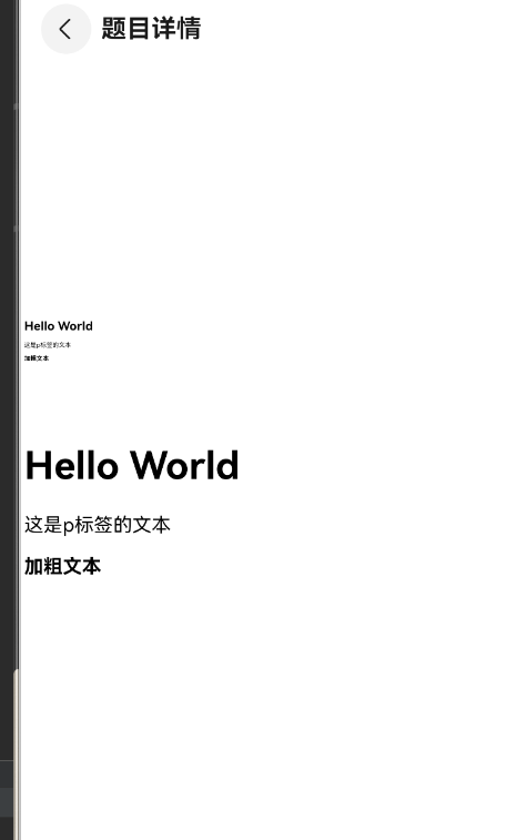
@Entry
@Component
struct QuestionDetailPage {
  @State message: string = '<h1>Hello World</h1><p>这是p标签的文本</p><strong>加粗文本</strong>';
  // 获取AppStraoage中的数据
  @StorageProp("topHeight") topHeight: number = 0

  build() {
    Navigation() {
      Row() {
        Column() {
          // 兼容问题:RichText在显示一个富文本的时候,文字会特别的小
          RichText(this.message).height(100)

          //  兼容性处理:使用一段html结构+给div设置font-size来做兼容处理
          //   其中50px按照同学们具体的开发要求来进行合理设置即可
          RichText(`
                  <html>
                  <body>
                    <div style="font-size:50px"> ${this.message}</div>
                  </body>
                  </html>
    `).height(200)

        }
        .width('100%')
      }
      .height('100%')
    }
    .padding({ top: this.topHeight + 10 })
    .titleMode(NavigationTitleMode.Mini)
    .title('题目详情')
  }
}
2.使用图片(Image)
1.概述
开发者经常需要在应用中显示一些图片,例如:按钮中的icon、网络图片、本地图片等。在应用中显示图片需要使用Image组件实现,Image支持多种图片格式,包括png、jpg、bmp、svg、gif和heif,具体用法请参考Image组件。
2.加载图片
Image(src: PixelMap | ResourceStr | DrawableDescriptor)a.本地资源
创建文件夹,将本地图片放入ets文件夹下的任意位置。
Image组件引入本地图片路径,即可显示图片(根目录为ets文件夹)
Image('images/view.jpg')
.width(200)
b.网络资源
引入网络图片需申请权限ohos.permission.INTERNET,具体申请方式请参考声明权限。此时,Image组件的src参数为网络图片的链接。
当前Image组件仅支持加载简单网络图片。
Image组件首次加载网络图片时,需要请求网络资源,非首次加载时,默认从缓存中直接读取图片,更多图片缓存设置请参考setImageCacheCount、setImageRawDataCacheSize、setImageFileCacheSize。但是,这三个图片缓存接口并不灵活,且后续不继续演进,对于复杂情况,更推荐使用ImageKnife。
Image('https://www.example.com/example.JPG') // 实际使用时请替换为真实地址c.Resource资源
使用资源格式可以跨包/跨模块引入图片,resources文件夹下的图片都可以通过$r资源接口读 取到并转换到Resource格式。
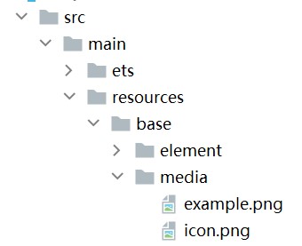
//调用方式
Image($r('app.media.icon'))
还可以将图片放在rawfile文件夹下。
Image($rawfile('example1.png'))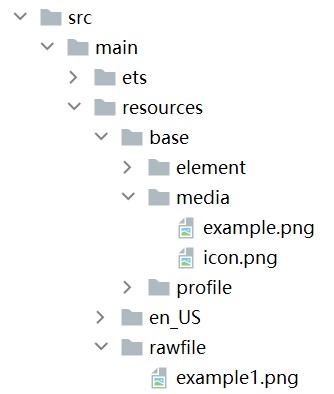
3.显示矢量图
Image组件可显示矢量图(svg格式的图片),支持的svg标签为:svg、rect、circle、ellipse、path、line、polyline、polygon和animate。
svg格式的图片可以使用fillColor属性改变图片的绘制颜色。
Image($r('app.media.cloud'))
  .width(50)
  .fillColor(Color.Blue)
图3 原始图片

图4 设置绘制颜色后的svg图片

4.组件属性
| 属性 | 描述 |
| width | 宽度(通用属性) |
| height | 高度(通用属性) |
| aspectRatio | 宽高比(通用属性) |
| alt | 加载时显示的占位图,支持本地图片(png、jpg、bmp、svg和gif类型),不支持网络图片。 |
| objectFit | 设置图片的填充效果。默认值:ImageFit.Cover |
属性:objectFit
参数类型:枚举 ImageFit
- Contain:图片宽或高缩放到与组件尺寸相同则停止缩放,可能导致组件有空白(等比缩放)
- Cover:默认效果,图片缩放到完全覆盖组件范围,可能导致图片显示不完整(等比缩放)
- Fill:图片缩放至充满组件(不等比缩放)
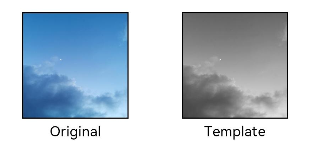
设置图片渲染模式
通过renderMode属性设置图片的渲染模式为原色或黑白。
@Entry
@Component
struct MyComponent {
  build() {
    Column({ space: 10 }) {
      Row({ space: 50 }) {
        Image($r('app.media.example'))
          // 设置图片的渲染模式为原色
          .renderMode(ImageRenderMode.Original)
          .width(100)
          .height(100)
          .border({ width: 1 })
            // overlay是通用属性,用于在组件上显示说明文字
          .overlay('Original', { align: Alignment.Bottom, offset: { x: 0, y: 20 } })
        Image($r('app.media.example'))
          // 设置图片的渲染模式为黑白
          .renderMode(ImageRenderMode.Template)
          .width(100)
          .height(100)
          .border({ width: 1 })
          //设置浮层
          .overlay('Template', { align: Alignment.Bottom, offset: { x: 0, y: 20 } })
      }
    }.height(150).width('100%').padding({ top: 20,right: 10 })
  }
}
-----------(第二次)今天更新结束觉得写的不错就点点关注吧❤--------------------
3.按钮(Button)
1.创建按钮
Button通过调用接口来创建,接口调用有以下两种形式:
1.创建不包含子组件的按钮。
其中,label用来设置按钮文字,type用于设置Button类型,stateEffect属性设置Button是否开启点击效果。
Button('Ok', { type: ButtonType.Normal, stateEffect: true })
  .borderRadius(8)
  .backgroundColor(0x317aff)
  .width(90)
  .height(40)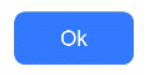
2.创建包含子组件的按钮
只支持包含一个子组件,子组件可以是基础组件或者容器组件。
解释

Button({ type: ButtonType.Normal, stateEffect: true }) {
  Row() {
    Image($r('app.media.loading')).width(20).height(40).margin({ left: 12 })
    Text('loading').fontSize(12).fontColor(0xffffff).margin({ left: 5, right: 12 })
  }.alignItems(VerticalAlign.Center)
}.borderRadius(8).backgroundColor(0x317aff).width(90).height(40)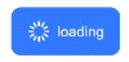
2.设置按钮类型
Button有三种可选类型,分别为胶囊类型(Capsule)、圆形按钮(Circle)和普通按钮(Normal),通过type进行设置。
- 胶囊按钮(默认类型)
此类型按钮的圆角自动设置为高度的一半,不支持通过borderRadius属性重新设置圆角。
Button('Disable', { type: ButtonType.Capsule, stateEffect: false })
  .backgroundColor(0x317aff)
  .width(90)
  .height(40)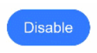
圆形按钮(Circle)
此类型按钮为圆形,不支持通过borderRadius属性重新设置圆角。
Button('Circle', { type: ButtonType.Circle, stateEffect: false })
  .backgroundColor(0x317aff)
  .width(90)
  .height(90)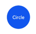
普通按钮(Normal)
此类型的按钮默认圆角为0,支持通过borderRadius属性重新设置圆角。
Button('Ok', { type: ButtonType.Normal, stateEffect: true })
  .borderRadius(8)
  .backgroundColor(0x317aff)
  .width(90)
  .height(40)
3.自定义样式
设置文本样式。
通过添加文本样式设置按钮文本的展示样式。
Button('font style', { type: ButtonType.Normal })
  .fontSize(20)
  .fontColor(Color.Pink)
  .fontWeight(800)
创建功能型按钮。
为删除操作创建一个按钮。
let MarLeft: Record<string, number> = { 'left': 20 }
Button({ type: ButtonType.Circle, stateEffect: true }) {
  Image($r('app.media.ic_public_delete_filled')).width(30).height(30)
}.width(55).height(55).margin(MarLeft).backgroundColor(0xF55A42)
4.单选框(Radio)
Radio是单选框组件,通常用于提供相应的用户交互选择项,同一组的Radio中只有一个可以被选中。具体用法请参考Radio。
1.创建单选框
value是单选框的名称,group是单选框的所属群组名称。checked属性可以设置单选框的状态,状态分别为false和true,设置为true时表示单选框被选中。
Radio支持设置选中状态和非选中状态的样式,不支持自定义形状。
Radio({ value: 'Radio1', group: 'radioGroup' })
  .checked(false)
Radio({ value: 'Radio2', group: 'radioGroup' })
  .checked(true)
2.添加事件
除支持通用事件外,Radio还用于选中后触发某些操作,可以绑定onChange事件来响应选中操作后的自定义行为。
Radio({ value: 'Radio1', group: 'radioGroup' })
    .onChange((isChecked: boolean) => {
      if(isChecked) {
        //需要执行的操作
      }
    })
  Radio({ value: 'Radio2', group: 'radioGroup' })
    .onChange((isChecked: boolean) => {
      if(isChecked) {
        //需要执行的操作
      }
    })


 扫一扫
扫一扫


 1846
1846

 被折叠的 条评论
为什么被折叠?
被折叠的 条评论
为什么被折叠?
 到【灌水乐园】发言


