


在Windows Presentation Foundation (WPF) 中,样式(Style)和模板(Template)是创建丰富且可重用的UI元素的强大工具。样式允许你定义一组属性设置,这些设置可以应用于一个或多个控件,而模板则允许你自定义控件的呈现方式。
<Window.Resources>
    <Style TargetType="Button" x:Key="BTS1">
        <Setter Property="Width" Value="100"/>
        <Setter Property="Height" Value="30"/>
        <Setter Property="Background" Value="Yellow"/>
        <Setter Property="Foreground" Value="Blue"/>
    </Style>

    <Style x:Key="BtnInfoStyle" TargetType="Button">
        <Setter Property="Width" Value="70"/>
        <Setter Property="Height" Value="25"/>
        <Setter Property="Foreground" Value="White"/>
        <Setter Property="BorderThickness" Value="0"/>
        <Setter Property="Background" Value="#43a9c7"/>
        <Setter Property="Template">
            <Setter.Value>
                <ControlTemplate TargetType="Button">
                    <Border x:Name="border" Background="{TemplateBinding Background}" BorderBrush="{TemplateBinding BorderBrush}" BorderThickness="{TemplateBinding BorderThickness}" SnapsToDevicePixels="True">
                        <TextBlock Text="{TemplateBinding Content}" Foreground="{TemplateBinding Foreground}" VerticalAlignment="Center" HorizontalAlignment="Center"/>
                    </Border>
                    <ControlTemplate.Triggers>
                        <Trigger Property="IsMouseOver" Value="True">
                            <Setter TargetName="border" Property="Background" Value="#2f96b4"/>
                        </Trigger>
                        <Trigger Property="IsPressed" Value="True">
                            <Setter TargetName="border" Property="Background" Value="green"/>
                        </Trigger>
                    </ControlTemplate.Triggers>
                </ControlTemplate>
            </Setter.Value>
        </Setter>
    </Style>


</Window.Resources>
<Grid>
<StackPanel>
<Button Content="bt1" Style="{StaticResource BTS1}"/>
<Button Content="bt2" Style="{StaticResource BTS1}" Background="Purple"/>
<Button Content="bt4" Style="{StaticResource BtnInfoStyle}"/>
<!--<Button FontFamily="" Content="" />-->
</StackPanel>
</Grid>文字图标按钮
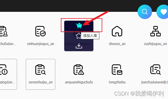
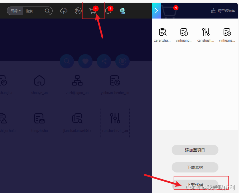
1.寻找图标文字 阿里图标网站
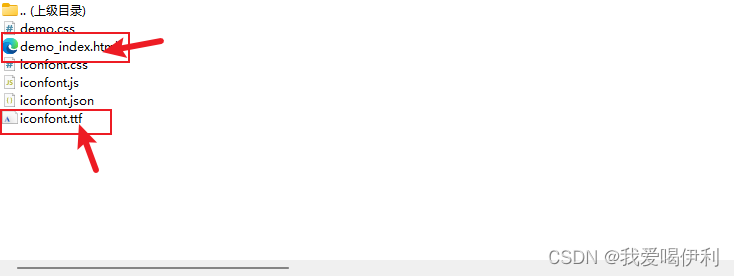
2.选择需要的图标下载

<Button Width="80" Height="80" Background="Green">
<TextBlock FontFamily="/Font/#iconfont" Text="" FontSize="40" Width="40" Height="40" HorizontalAlignment="Center" VerticalAlignment="Center" Foreground="White"/>
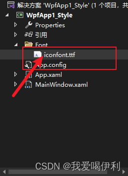
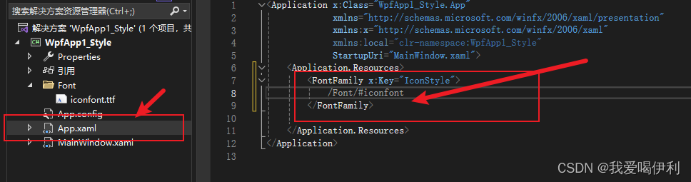
</Button>设置全局图标库


 扫一扫
扫一扫


 3万+
3万+

 被折叠的 条评论
为什么被折叠?
被折叠的 条评论
为什么被折叠?
 到【灌水乐园】发言


