


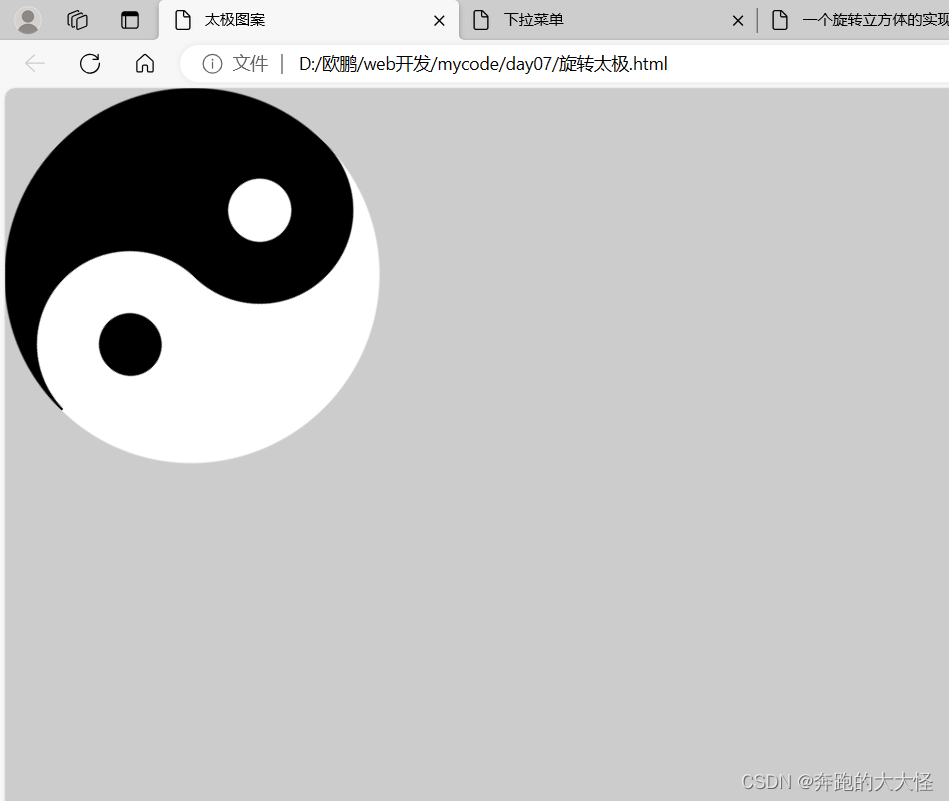
1、旋转太极
<!DOCTYPE html>
<html>
	<head>
		<meta charset="UTF-8">
		<title>太极图案</title>
        <link rel="stylesheet" href="./css/taiji.css">
	</head>
	<body>
		<div class="taiji">

		</div>
	</body>
</html>
			* {
			    margin: 0;
			    padding: 0;
			    background: #ccc;
			}

			.taiji {
			    width: 0;
			    height: 300px;
			    border-left: 150px solid #000000;
			    border-right: 150px solid #FFFFFF;
			    border-radius: 50%;
			    animation: myRotate 2s linear infinite;
			}

			@keyframes myRotate {
			    from {
			        transform: rotate(0deg);
			    }

			    to {
			        transform: rotate(360deg);
			    }
			}

			.taiji::before {
			    display: block;
			    content: "";
			    background: white;
			    height: 50px;
			    width: 50px;
			    border-radius: 50%;
			    border: 50px solid #000000;
			    margin-left: -72px;
			}

			.taiji::after {
			    display: block;
			    content: "";
			    background: black;
			    height: 50px;
			    width: 50px;
			    border-radius: 50%;
			    border: 50px solid white;
			    margin-left: -72px;
			}
运行结果:
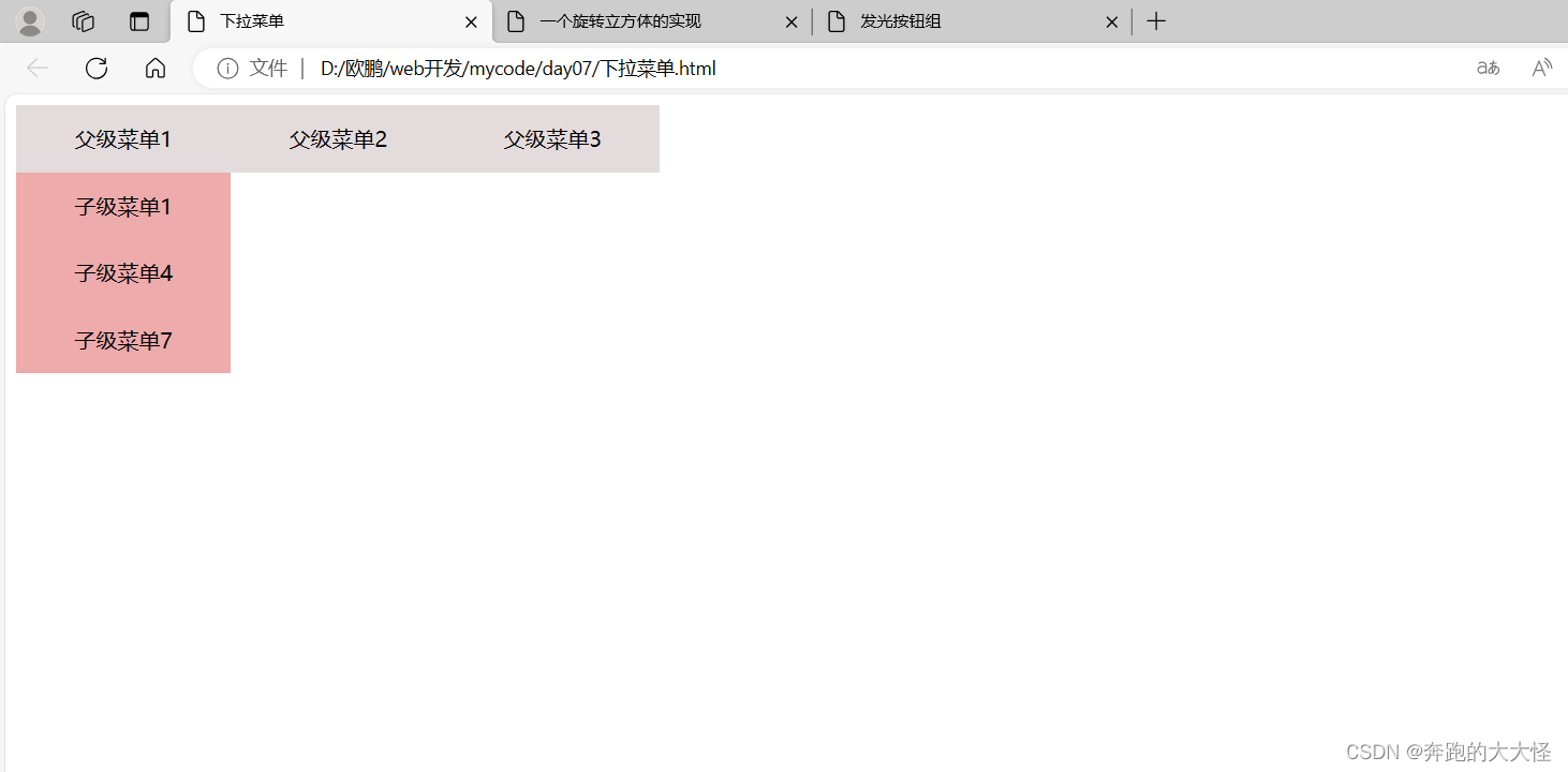
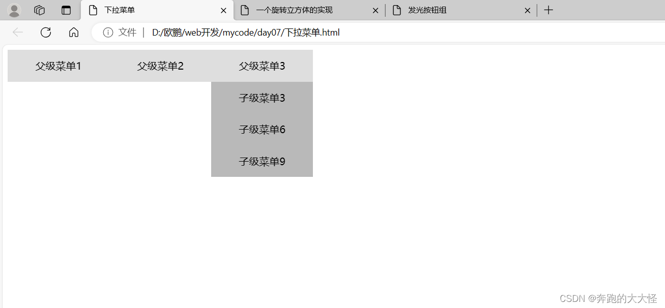
2、下拉菜单
<!DOCTYPE html>
<html lang="en">

<head>
    <meta charset="UTF-8">
    <meta name="viewport" content="width=device-width, initial-scale=1.0">
    <title>下拉菜单</title>
    <link rel="stylesheet" href="./css/check.css">
</head>

<body>
    <div class="tol">
        <div class="box1">父级菜单1 <div class="box4">子级菜单1</div> <div class="box4">子级菜单4</div> <div class="box4">子级菜单7</div></div>
        <div class="box2">父级菜单2 <div class="box5">子级菜单2</div> <div class="box5">子级菜单5</div> <div class="box5">子级菜单8</div></div>
        <div class="box3">父级菜单3 <div class="box6">子级菜单3</div> <div class="box6">子级菜单6</div> <div class="box6">子级菜单9</div></div>


    </div>

</body>

</html>
.tol{
    width: 480px;
}

.box1{
    float: left;
    width: 160px;
    height: 50px;
    text-align: center;
    line-height: 50px;
    background: #e4dcdc;
    margin: 0px;
}
.box2{
    float: left;
    width: 160px;
    height: 50px;
    text-align: center;
    line-height: 50px;
    background: #e4dcdc;
    margin: 0px;
}
.box3{
    float: left;
    width: 160px;
    height: 50px;
    text-align: center;
    line-height: 50px;
    background: #e4dcdc;
    margin: 0px;
}

.box4{
    float: left;
    width: 160px;
    height: 50px;
    text-align: center;
    line-height: 50px;
    background: #edabab;
    margin: 0px;
    display: none;
}
.box5{
    float: left;
    width: 160px;
    height: 50px;
    text-align: center;
    line-height: 50px;
    background: #edabab;
    margin: 0px;
    display: none;
}
.box6{
    float: left;
    width: 160px;
    height: 50px;
    text-align: center;
    line-height: 50px;
    background: #edabab;
    margin: 0px;
    display: none;
}

.box1:hover .box4{
        display: block;
}
.box2:hover .box5{
        display: block;
}
.box3:hover .box6{
        display: block;
}
/* html {
	filter: grayscale(1);
} */
运行结果:
3、页面灰度化
html {
	filter: grayscale(1);
}
运行结果:
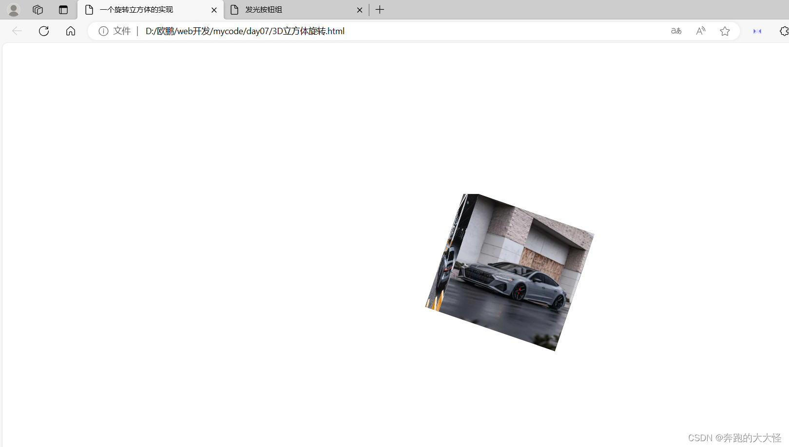
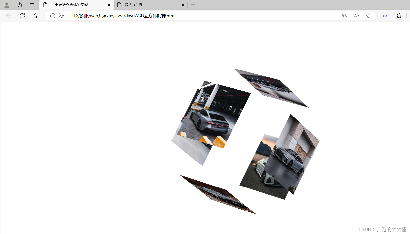
4、3D立方体旋转
<!DOCTYPE html>
<html lang="en">
<head>
	<meta charset="UTF-8">
	<title>一个旋转立方体的实现</title>
	<link rel="stylesheet" href="./css/3D.css">
</head>
<body>
	<div class="container">
		<img src="img/mv1.png" alt="">
		<img src="img/mv2.png" alt="">
		<img src="img/mv3.png" alt="">
		<img src="img/mv4.png" alt="">
		<img src="img/mv6.png" alt="">
		<img src="img/mv5.png" alt="">
	</div>
</body>
</html>
body {
    /* 3d视距,如果没有,无法透视出3D效果 */
    perspective: 5000px;
}

.container {
    width: 200px;
    height: 200px;
    margin: 300px auto;
    /*border: 1px solid red;*/
    position: relative;
    /* 以3D显示效果 */
    transform-style: preserve-3d;
    /* 开始执行动画 */
    animation: myRotate 5s infinite linear;
}

/* 动画效果 */
@keyframes myRotate {
    from {
        transform: rotateX(0deg) rotateY(0deg) rotateZ(0deg);
    }

    to {
        transform: rotateX(360deg) rotateY(360deg) rotateZ(360deg);
    }
}

.container>img {
    width: 200px;
    height: 200px;
    position: absolute;
}

.container:hover>img:first-child {
    transform: translateZ(-300px);
}

.container:hover>img:last-child {
    transform: translateZ(100px);
}

.container:hover img:nth-child(2) {
    transform: rotateY(-90deg) translateZ(100px);
}

.container:hover img:nth-child(3) {
    transform: rotateX(90deg) translateZ(100px);
}

.container:hover img:nth-child(4) {
    transform: rotateY(90deg) translateZ(100px);
}

.container:hover img:nth-child(5) {
    bottom: -200px;
    transform-origin: top;
    transform: rotateX(-90deg) translateZ(100px);
}

.container>img:first-child {
    /*底部的一张图片*/
    /* 需要缩进200px,作为底部 */
    transform: translateZ(-200px);
}

.container>img:last-child {
    /* 顶部的一张图片 */
    display: block;
}

.container>img:nth-child(2) {
    /* 左侧 */
    left: -200px;
    transform-origin: right;
    transform: rotateY(-90deg);
}

.container>img:nth-child(3) {
    /* 上侧 */
    top: -200px;
    transform-origin: bottom;
    transform: rotateX(90deg);

}

.container>img:nth-child(4) {
    /* 右侧 */
    right: -200px;
    transform-origin: left;
    transform: rotateY(90deg);
}

.container>img:nth-child(5) {
    /* 下侧 */
    bottom: -200px;
    transform-origin: top;
    transform: rotateX(-90deg);
}
运行结果:
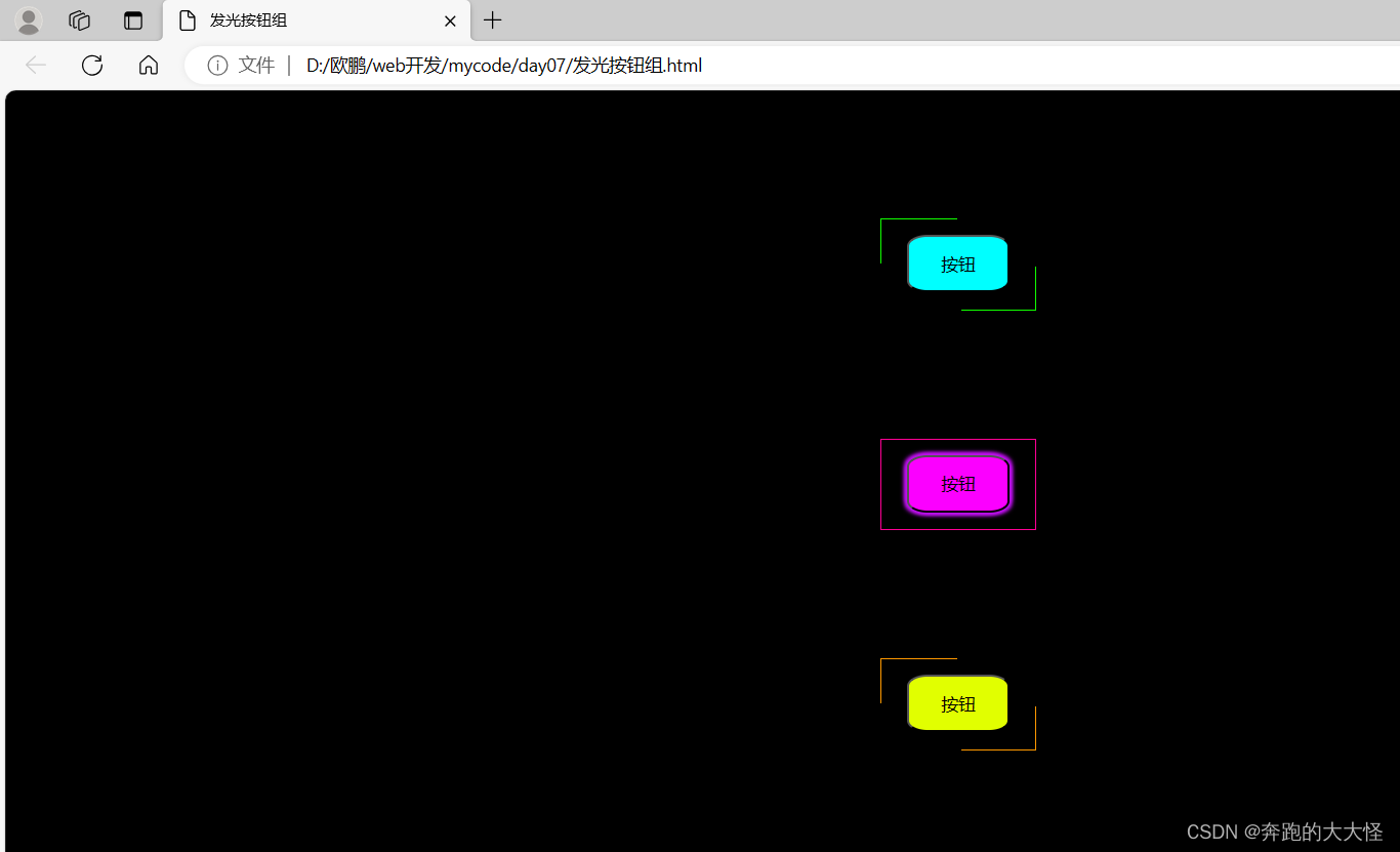
5、发光按钮组
<!DOCTYPE html>
<html lang="en">
<head>
    <meta charset="UTF-8">
    <meta name="viewport" content="width=device-width, initial-scale=1.0">
    <title>发光按钮组</title>
    <link rel="stylesheet" href="./css/button.css">
</head>
<body>
    <div class="box1">
        <div class="box2"></div>
        <div class="box3"></div>
        <button class="box4">按钮</button>
    </div>

    <div class="box5">
        <div class="box6"></div>
        <div class="box7"></div>
        <button class="box8">按钮</button>
    </div>

    <div class="box9">
        <div class="box10"></div>
        <div class="box11"></div>
        <button class="box12">按钮</button>
    </div>

</body>
</html>
body{
    background-color: black;
}
.box1{
    width: 120px;
    height: 70px;
    margin: auto;
    margin-top: 100px;
    border: 1px solid rgb(17, 255, 0);
    position: relative;
}
.box2{
    width: 60px;
    height: 35px;
    border-top: 4px solid black;
    border-right: 4px solid black;
    position: absolute;
    margin-left: 59px;
    margin-top: -2px;
}
.box3{
    width: 60px;
    height: 35px;
    border-left: 4px solid black;
    border-bottom: 4px solid black;
    position: absolute;
    margin-top: 34px;
    margin-left: -2px;
}
.box4{
    width: 80px;
    height: 45px;
    background-color: aqua;
    border-radius: 20%;
    position: absolute;
    margin-top: 12px;
    margin-left: 20px;

}
.box1:hover .box4{
    box-shadow: 2px 2px 3px rgb(15, 241, 203),
                -2px 2px 3px rgb(15, 241, 203),
                2px -2px 3px rgb(15, 241, 203),
                -2px -2px 3px rgb(15, 241, 203);
}
.box1:hover .box2{
    display: none;
}
.box1:hover .box3{
    display: none;
}


.box5{
    width: 120px;
    height: 70px;
    margin: auto;
    margin-top: 100px;
    border: 1px solid rgb(255, 0, 149);
    position: relative;
}
.box6{
    width: 60px;
    height: 35px;
    border-top: 4px solid black;
    border-right: 4px solid black;
    position: absolute;
    margin-left: 59px;
    margin-top: -2px;
}
.box7{
    width: 60px;
    height: 35px;
    border-left: 4px solid black;
    border-bottom: 4px solid black;
    position: absolute;
    margin-top: 34px;
    margin-left: -2px;
}
.box8{
    width: 80px;
    height: 45px;
    background-color: rgb(251, 0, 255);
    border-radius: 20%;
    position: absolute;
    margin-top: 12px;
    margin-left: 20px;

}
.box5:hover .box8{
    box-shadow: 2px 2px 3px rgb(192, 15, 241),
                -2px 2px 3px rgb(192, 15, 241),
                2px -2px 3px rgb(192, 15, 241),
                -2px -2px 3px rgb(192, 15, 241);
}
.box5:hover .box6{
    display: none;
}
.box5:hover .box7{
    display: none;
}


.box9{
    width: 120px;
    height: 70px;
    margin: auto;
    margin-top: 100px;
    border: 1px solid rgb(255, 153, 0);
    position: relative;
}
.box10{
    width: 60px;
    height: 35px;
    border-top: 4px solid black;
    border-right: 4px solid black;
    position: absolute;
    margin-left: 59px;
    margin-top: -2px;
}
.box11{
    width: 60px;
    height: 35px;
    border-left: 4px solid black;
    border-bottom: 4px solid black;
    position: absolute;
    margin-top: 34px;
    margin-left: -2px;
}
.box12{
    width: 80px;
    height: 45px;
    background-color: rgb(225, 255, 0);
    border-radius: 20%;
    position: absolute;
    margin-top: 12px;
    margin-left: 20px;

}
.box9:hover .box12{
    box-shadow: 2px 2px 3px rgb(241, 71, 15),
                -2px 2px 3px rgb(241, 71, 15),
                2px -2px 3px rgb(241, 71, 15),
                -2px -2px 3px rgb(241, 71, 15);
}
.box9:hover .box10{
    display: none;
}
.box9:hover .box11{
    display: none;
}
运行结果:


 扫一扫
扫一扫


 663
663

 被折叠的 条评论
为什么被折叠?
被折叠的 条评论
为什么被折叠?
 到【灌水乐园】发言


