


🔥 本文由 程序喵正在路上 原创,优快云首发!
💖 系列专栏:Flutter学习
🌠 首发时间:2024年5月26日
🦋 欢迎关注🖱点赞👍收藏🌟留言🐾
目录
有状态组件StatefulWidget
在 Flutter 中自定义组件其实就是一个类,这个类需要继承 StatelessWidget / StatefulWidget。
StatelessWidget是无状态组件,状态不可变的 widgetStatefulWidget是有状态组件,持有的状态可能在 widget 生命周期改变- 通俗的讲:如果我们想改变页面中的数据的话,这个时候就需要用到
StatefulWidget
实现计数器功能
import 'package:flutter/material.dart';
void main() {
runApp(const MyApp());
}
class MyApp extends StatelessWidget {
const MyApp({super.key});
Widget build(BuildContext context) {
return MaterialApp(
title: 'Flutter Demo',
theme: ThemeData(
primarySwatch: Colors.blue,
),
home: const HomePage(),
);
}
}
class HomePage extends StatefulWidget {
const HomePage({super.key});
State<HomePage> createState() => _HomePageState();
}
class _HomePageState extends State<HomePage> {
int _numCount = 0; //计数
Widget build(BuildContext context) {
return Scaffold(
appBar: AppBar(
title: const Text("flutter App"),
),
body: Center(
child: Column(
mainAxisAlignment: MainAxisAlignment.center,
children: [
Text(
"$_numCount",
style: Theme.of(context).textTheme.headlineMedium,
),
const SizedBox(height: 60),
ElevatedButton(
onPressed: () {
setState(() {
_numCount++;
});
},
child: const Text("增加"))
],
),
),
//Scaffold组件中自带的浮动按钮
floatingActionButton: FloatingActionButton(
onPressed: () {
setState(() {
_numCount++;
});
},
child: const Icon(Icons.add),
),
);
}
}
在使用 StatefulWidget 后,建议我们代码的框架写成上面这样,将 Scaffold 组件写到自定义组件中,这样我们可以使用其在有状态组件中的一些属性

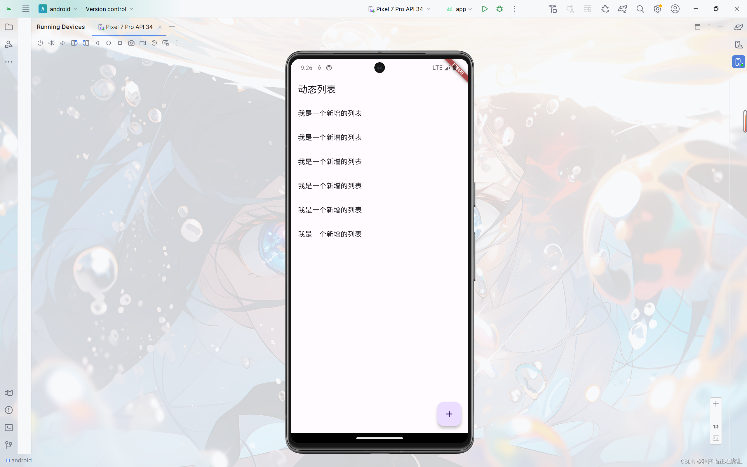
实现动态列表
需求:实现通过点击按钮就能添加列表项的效果
class _HomePageState extends State<HomePage> {
final List<String> _list = []; //final修饰的列表可以增加元素
Widget build(BuildContext context) {
return Scaffold(
appBar: AppBar(
title: const Text("动态列表"),
),
floatingActionButton: FloatingActionButton(
onPressed: () {
setState(() {
_list.add("我是一个新增的列表");
});
},
child: const Icon(Icons.add),
),
body: ListView(
children: _list.map((e) {
return ListTile(
title: Text(e),
);
}).toList(),
),
);
}
}
Scaffold属性:BottomNavigationBar
组件介绍
BottomNavigationBar 是底部导航条,可以让我们定义底部 Tab 切换,bottomNavigationBar 是 Scaffold 组件的参数。
BottomNavigationBar 常见的属性
| 属性名 | 说明 |
|---|---|
| items | List 底部导航条按钮集合 |
| iconSize | icon |
| currentIndex | 默认选中第几个 |
| onTap | 选中变化回调函数 |
| fixedColor | 选中的颜色 |
| type | 底部超过4个菜单必须配置这个属性:ButtomNavigationBarType.fixed、ButtomNavigationBarType.shifting |
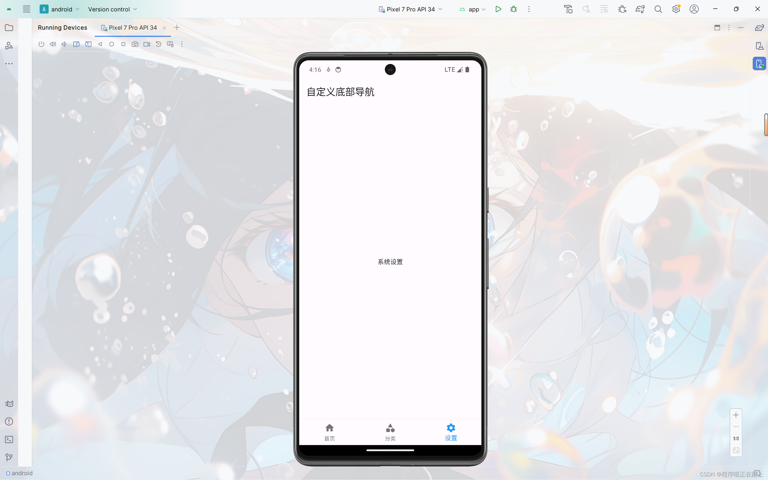
自定义底部导航
实现如下效果:

class _HomePageState extends State<HomePage> {
Widget build(BuildContext context) {
return Scaffold(
appBar: AppBar(
title: const Text("自定义底部导航"),
),
body: const Center(child: Text("我是一个文本")),
bottomNavigationBar: BottomNavigationBar(
items: const [
BottomNavigationBarItem(icon: Icon(Icons.home), label: "首页"),
BottomNavigationBarItem(icon: Icon(Icons.category), label: "分类"),
BottomNavigationBarItem(icon: Icon(Icons.settings), label: "设置"),
],
),
);
}
}
底部菜单选中
前面自定义的底部导航还没有完整实现,一般要求我们点击哪个菜单,哪个菜单就会显示选中的效果,下面我们来实现这个效果

class _HomePageState extends State<HomePage> {
int _currentIndex = 0; //当前选中索引
Widget build(BuildContext context) {
return Scaffold(
appBar: AppBar(
title: const Text("自定义底部导航"),
),
body: const Center(child: Text("我是一个文本")),
bottomNavigationBar: BottomNavigationBar(
currentIndex: _currentIndex,
fixedColor: Colors.blue,
onTap: (value) {
setState(() {
_currentIndex = value;
});
},
items: const [
BottomNavigationBarItem(icon: Icon(Icons.home), label: "首页"),
BottomNavigationBarItem(icon: Icon(Icons.category), label: "分类"),
BottomNavigationBarItem(icon: Icon(Icons.settings), label: "设置"),
],
),
);
}
}
自定义底部导航实现页面切换
为了让代码条理更加清晰,我们将每个页面分文件写。
在 lib 目录下新建目录 pages,在 pages 下新建文件 tabs.dart 和文件夹 tabs,在 tabs 下新建 3 个页面对应的文件:
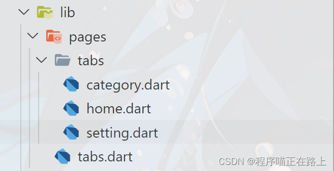
home.dart
import 'package:flutter/material.dart';
class HomePage extends StatefulWidget {
const HomePage({super.key});
State<HomePage> createState() => _HomePageState();
}
class _HomePageState extends State<HomePage> {
Widget build(BuildContext context) {
return const Center(
child: Text("首页"),
);
}
}
category.dart
import 'package:flutter/material.dart';
class CategoryPage extends StatefulWidget {
const CategoryPage({super.key});
State<CategoryPage> createState() => _CategoryPageState();
}
class _CategoryPageState extends State<CategoryPage> {
Widget build(BuildContext context) {
return const Center(
child: Text("分类"),
);
}
}
setting.dart
import 'package:flutter/material.dart';
class SettingPage extends StatefulWidget {
const SettingPage({super.key});
State<SettingPage> createState() => _SettingPageState();
}
class _SettingPageState extends State<SettingPage> {
Widget build(BuildContext context) {
return const Center(
child: Text("系统设置"),
);
}
}
tabs.dart:前面页面切换的代码
import 'package:flutter/material.dart';
import './tabs/home.dart';
import './tabs/category.dart';
import './tabs/setting.dart';
class Tabs extends StatefulWidget {
const Tabs({super.key});
State<Tabs> createState() => _TabsState();
}
class _TabsState extends State<Tabs> {
int _currentIndex = 0; //当前选中索引
final List<Widget> _pages = const [
HomePage(),
CategoryPage(),
SettingPage(),
];
Widget build(BuildContext context) {
return Scaffold(
appBar: AppBar(
title: const Text("自定义底部导航"),
),
body: _pages[_currentIndex], //自动切换页面
bottomNavigationBar: BottomNavigationBar(
currentIndex: _currentIndex,
fixedColor: Colors.blue,
onTap: (value) {
setState(() {
_currentIndex = value;
});
},
items: const [
BottomNavigationBarItem(icon: Icon(Icons.home), label: "首页"),
BottomNavigationBarItem(icon: Icon(Icons.category), label: "分类"),
BottomNavigationBarItem(icon: Icon(Icons.settings), label: "设置"),
],
),
);
}
}
main.dart
import 'package:flutter/material.dart';
import 'pages/tabs.dart';
void main() {
runApp(const MyApp());
}
class MyApp extends StatelessWidget {
const MyApp({super.key});
Widget build(BuildContext context) {
return MaterialApp(
title: 'Flutter Demo',
theme: ThemeData(
primarySwatch: Colors.blue,
),
debugShowCheckedModeBanner: false,
home: const Tabs(),
);
}
}
Scaffold属性:FloatingActionButton
FloatingActionButton详解
FloatingActionButton 简称 FAB ,可以实现浮动按钮,也可以实现类似闲鱼app的底部凸起导航
| 属性名称 | 属性值 |
|---|---|
| child | 子视图,一般为 Icon,不推荐使用文字 |
| tooltip | FAB被长按时显示,也是无障碍功能 |
| backgroundColor | 背景颜色 |
| elevation | 未点击时的阴影 |
| highlightElevation | 点击时阴影值,默认12 |
| onPressed | 点击事件回调 |
| shape | 可以定义FAB的形状等 |
| mini | 是否为 mini 类型,默认为 false |
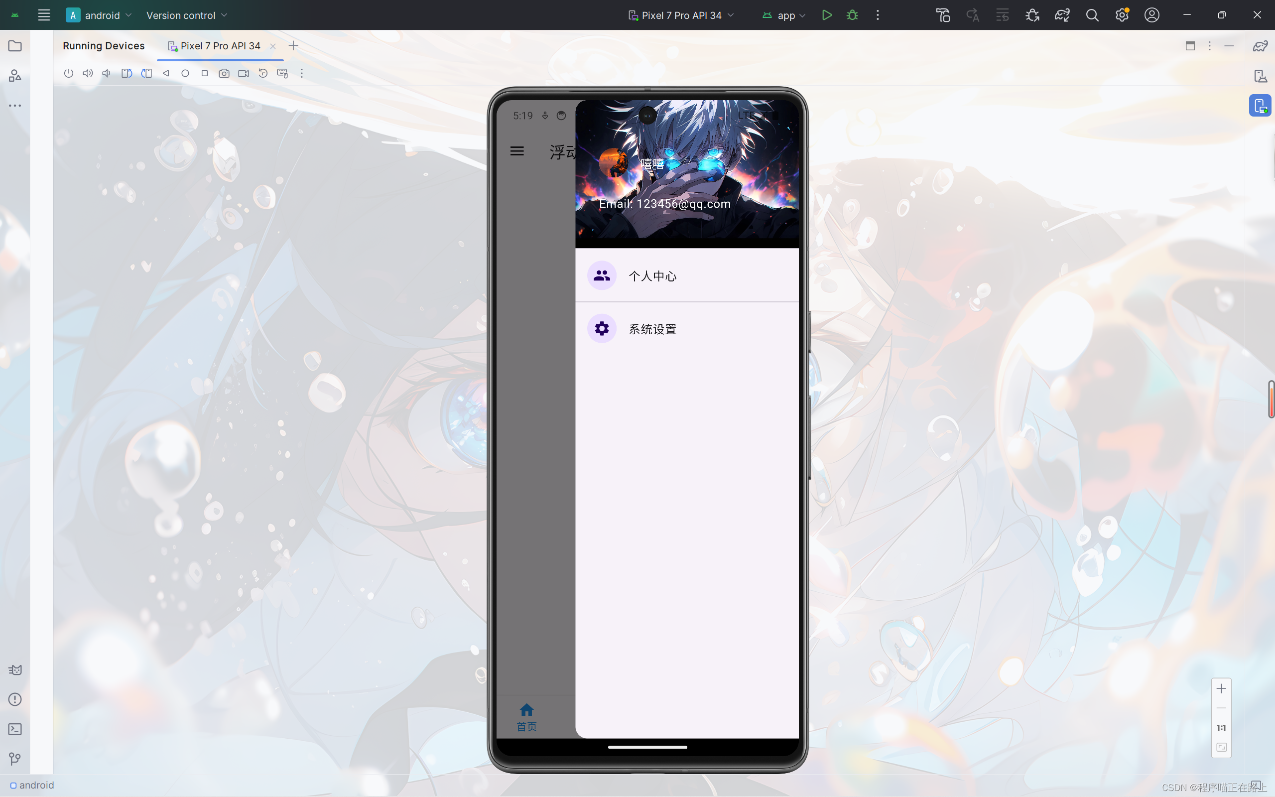
实现类似闲鱼App底部导航凸起按钮
我们在前面自定义底部导航的代码稍加修改,再添加一个浮动按钮即可实现类似闲鱼底部导航效果:
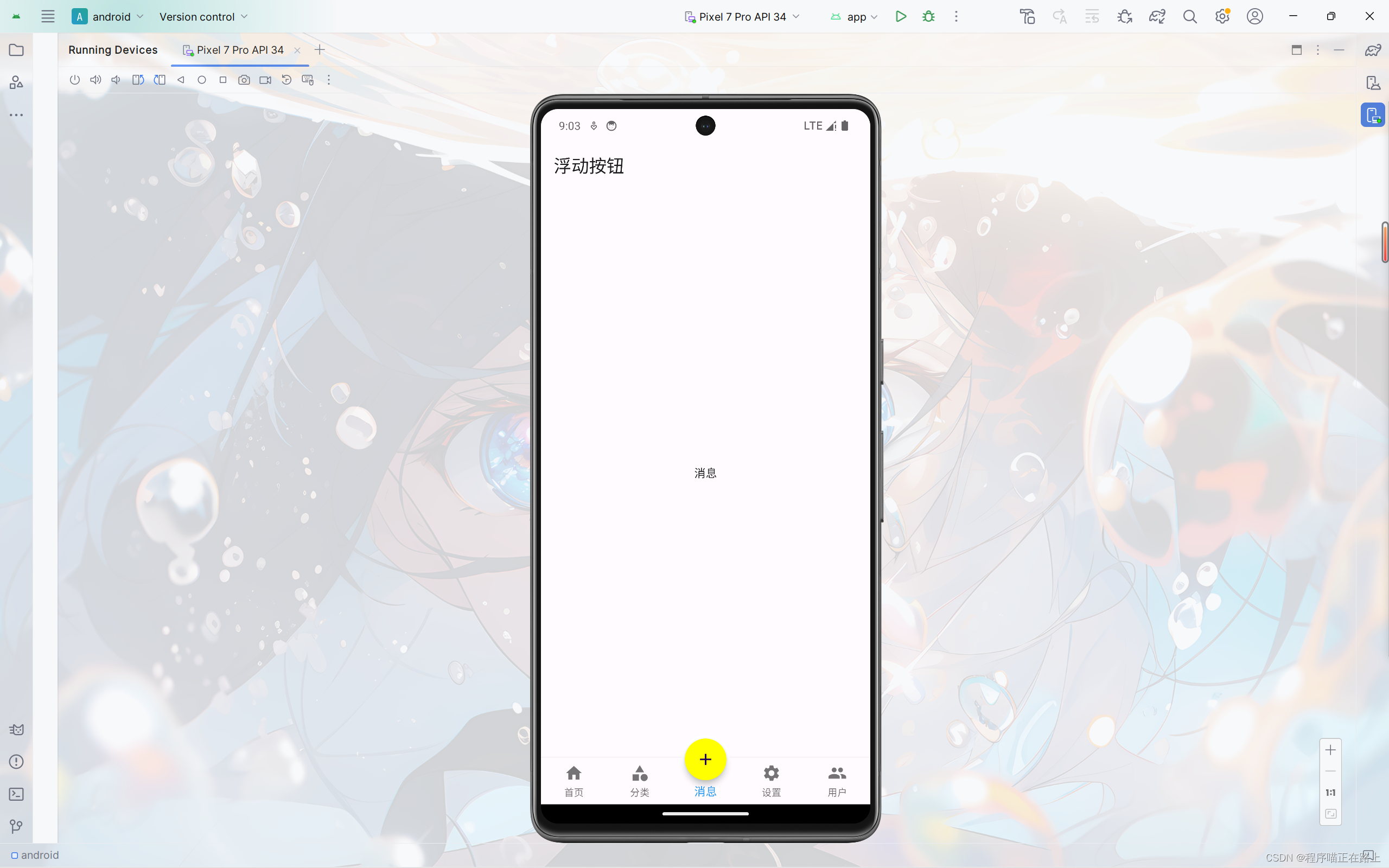
这里给出 tabs.dart 的代码,其中 message.dart 和 user.dart 两个页面内容和其他页面类似
import 'package:flutter/material.dart';
import './tabs/home.dart';
import './tabs/category.dart';
import './tabs/setting.dart';
import './tabs/message.dart';
import './tabs/user.dart';
class Tabs extends StatefulWidget {
const Tabs({super.key});
State<Tabs> createState() => _TabsState();
}
class _TabsState extends State<Tabs> {
int _currentIndex = 0; //当前选中索引
final List<Widget> _pages = const [
HomePage(),
CategoryPage(),
MessagePage(),
SettingPage(),
UserPage(),
];
Widget build(BuildContext context) {
return Scaffold(
appBar: AppBar(
title: const Text("浮动按钮"),
),
body: _pages[_currentIndex], //自动切换页面
bottomNavigationBar: BottomNavigationBar(
type: BottomNavigationBarType.fixed,
currentIndex: _currentIndex,
fixedColor: Colors.blue,
onTap: (value) {
setState(() {
_currentIndex = value;
});
},
items: const [
BottomNavigationBarItem(icon: Icon(Icons.home), label: "首页"),
BottomNavigationBarItem(icon: Icon(Icons.category), label: "分类"),
BottomNavigationBarItem(icon: Icon(Icons.message), label: "消息"),
BottomNavigationBarItem(icon: Icon(Icons.settings), label: "设置"),
BottomNavigationBarItem(icon: Icon(Icons.people), label: "用户")
],
),
floatingActionButton: Container(
height: 60,
width: 60,
padding: const EdgeInsets.all(4),
margin: const EdgeInsets.only(top: 4),
decoration: BoxDecoration(
color: Colors.white, borderRadius: BorderRadius.circular(30)),
child: FloatingActionButton(
shape: const CircleBorder(),
backgroundColor:
_currentIndex == 2 ? Colors.yellowAccent : Colors.blueAccent,
onPressed: () {
setState(() {
_currentIndex = 2;
});
},
child: const Icon(Icons.add),
),
),
floatingActionButtonLocation:
FloatingActionButtonLocation.centerDocked, //浮动按钮位置
);
}
}
Scaffold属性:抽屉菜单Drawer
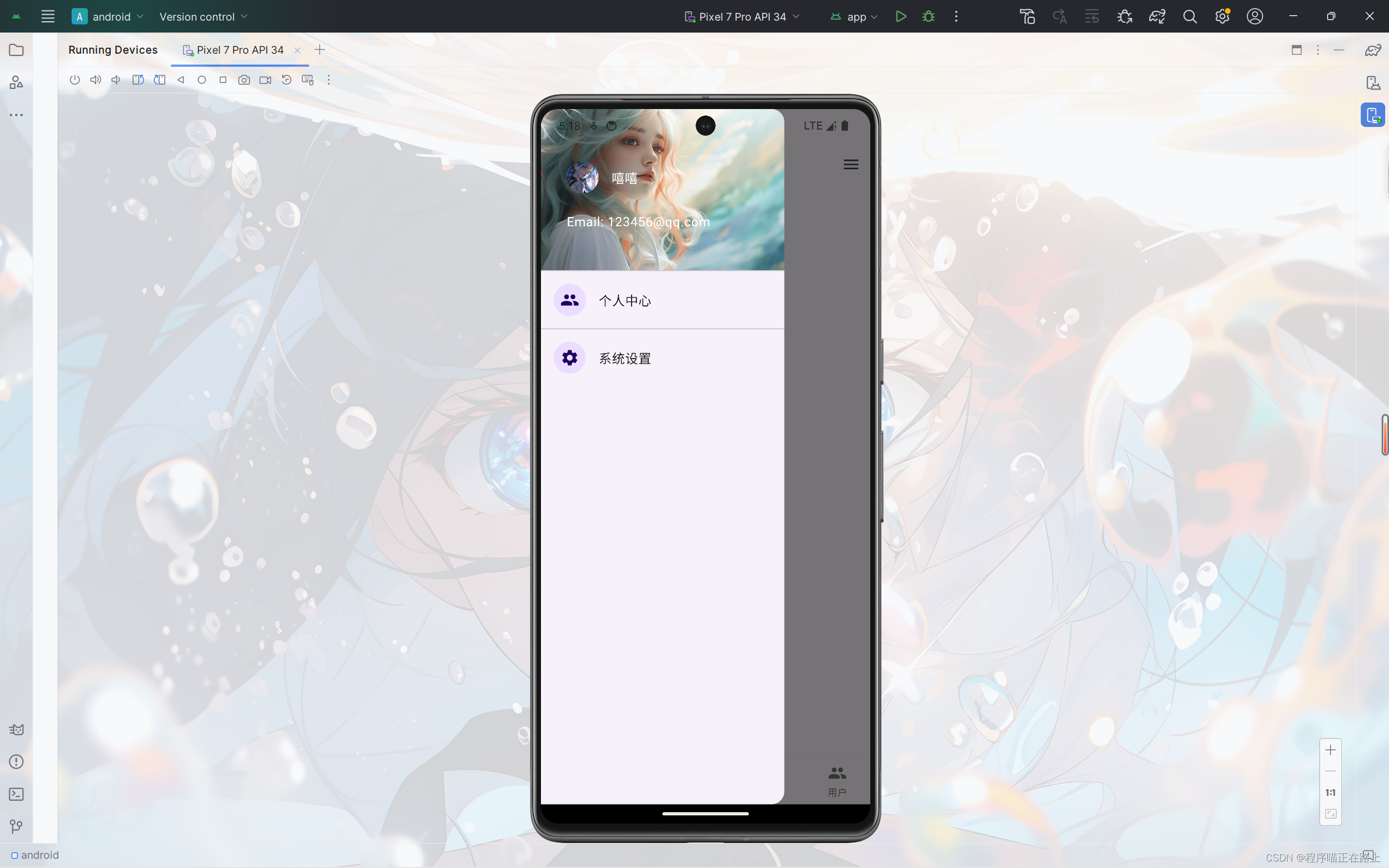
在 Scaffold 组件里面传入 drawer 参数可以定义左侧边栏,传入 endDrawer 可以定义右侧边栏。侧边栏默认是隐藏的,我们可以通过手指滑动显示侧边栏,也可以通过点击按钮显示侧边栏。
DrawerHeader
DrawerHeader 是侧边栏的头部,常见属性如下:
| 属性 | 描述 |
|---|---|
| decoration | 设置顶部背景颜色 |
| child | 配置子元素 |
| padding | 内边距 |
| margin | 外边距 |
在上一节代码 tabs.dart 的基础上,我们来给页面添加侧边栏
class _TabsState extends State<Tabs> {
int _currentIndex = 0; //当前选中索引
final List<Widget> _pages = const [
HomePage(),
CategoryPage(),
MessagePage(),
SettingPage(),
UserPage(),
];
Widget build(BuildContext context) {
return Scaffold(
appBar: AppBar(
title: const Text("浮动按钮"),
),
//左侧边栏
drawer: Drawer(
child: Column(
children: [
DrawerHeader(
decoration: const BoxDecoration(
color: Colors.blueAccent,
image: DecorationImage(
image: NetworkImage(
"https://xixi-web-tlias.oss-cn-guangzhou.aliyuncs.com/1.jpg"),
fit: BoxFit.cover)),
child: ListView(
children: const [
ListTile(
leading: CircleAvatar(
backgroundImage: NetworkImage(
"https://xixi-web-tlias.oss-cn-guangzhou.aliyuncs.com/2.jpg"),
),
title: Text(
"嘻嘻",
style: TextStyle(
color: Colors.white,
),
),
),
ListTile(
title: Text(
"Email: 123456@qq.com",
style: TextStyle(
color: Colors.white,
),
),
),
],
),
),
const ListTile(
leading: CircleAvatar(child: Icon(Icons.people)),
title: Text("个人中心"),
),
const Divider(),
const ListTile(
leading: CircleAvatar(child: Icon(Icons.settings)),
title: Text("系统设置"),
)
],
),
),
//右侧侧边栏
endDrawer: Drawer(
child: Column(
children: [
DrawerHeader(
decoration: const BoxDecoration(
color: Colors.blueAccent,
image: DecorationImage(
image: NetworkImage(
"https://xixi-web-tlias.oss-cn-guangzhou.aliyuncs.com/3.jpg"),
fit: BoxFit.cover)),
child: ListView(
children: const [
ListTile(
leading: CircleAvatar(
backgroundImage: NetworkImage(
"https://xixi-web-tlias.oss-cn-guangzhou.aliyuncs.com/4.jpg"),
),
title: Text(
"嘻嘻",
style: TextStyle(
color: Colors.white,
),
),
),
ListTile(
title: Text(
"Email: 123456@qq.com",
style: TextStyle(
color: Colors.white,
),
),
),
],
),
),
const ListTile(
leading: CircleAvatar(child: Icon(Icons.people)),
title: Text("个人中心"),
),
const Divider(),
const ListTile(
leading: CircleAvatar(child: Icon(Icons.settings)),
title: Text("系统设置"),
)
],
),
),
body: _pages[_currentIndex], //自动切换页面
bottomNavigationBar: BottomNavigationBar(
type: BottomNavigationBarType.fixed,
currentIndex: _currentIndex,
fixedColor: Colors.blue,
onTap: (value) {
setState(() {
_currentIndex = value;
});
},
items: const [
BottomNavigationBarItem(icon: Icon(Icons.home), label: "首页"),
BottomNavigationBarItem(icon: Icon(Icons.category), label: "分类"),
BottomNavigationBarItem(icon: Icon(Icons.message), label: "消息"),
BottomNavigationBarItem(icon: Icon(Icons.settings), label: "设置"),
BottomNavigationBarItem(icon: Icon(Icons.people), label: "用户")
],
),
floatingActionButton: Container(
height: 60,
width: 60,
padding: const EdgeInsets.all(4),
margin: const EdgeInsets.only(top: 4),
decoration: BoxDecoration(
color: Colors.white, borderRadius: BorderRadius.circular(30)),
child: FloatingActionButton(
shape: const CircleBorder(),
backgroundColor:
_currentIndex == 2 ? Colors.yellowAccent : Colors.blueAccent,
onPressed: () {
setState(() {
_currentIndex = 2;
});
},
child: const Icon(Icons.add),
),
),
floatingActionButtonLocation:
FloatingActionButtonLocation.centerDocked, //浮动按钮位置
);
}
}
左右侧边栏只是名称不同,其他组件的使用都是一致的
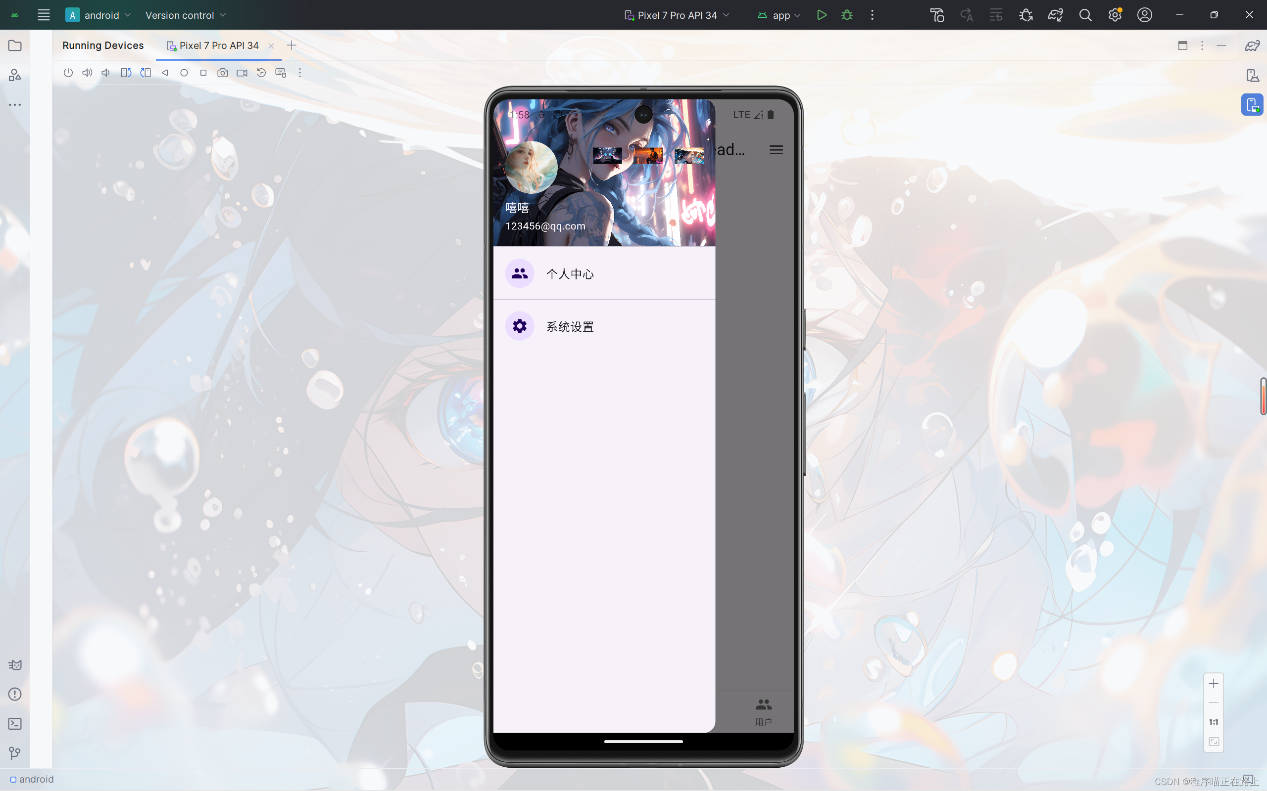
UserAccountsDrawerHeader
像前面这样我们自己写侧边栏的头部内容,还是比较麻烦的,而且样式也不好调整,为此 flutter 给我们提供了 UserAccountsDrawerHeader 组件,其常用属性如下:
| 属性 | 描述 |
|---|---|
| decoration | 设置顶部背景颜色 |
| accountName | 账户名称 |
| accountEmail | 账户邮箱 |
| currentAccountPicture | 用户头像 |
| otherAccountsPictures | 用来设置当前账户其他账户头像 |
| margin | 外边距 |
接下来,我们用 来写一个侧边栏
//左侧边栏
drawer: Drawer(
  child: Column(
    children: [
      UserAccountsDrawerHeader(
        accountName: const Text("嘻嘻"),
        accountEmail: const Text("123456@qq.com"),
        currentAccountPicture: const CircleAvatar(
          backgroundImage: NetworkImage(
              "https://xixi-web-tlias.oss-cn-guangzhou.aliyuncs.com/1.jpg"),
        ),
        decoration: const BoxDecoration(
          color: Colors.blue,
          image: DecorationImage(
              image: NetworkImage(
                  "https://xixi-web-tlias.oss-cn-guangzhou.aliyuncs.com/2.jpg"),
              fit: BoxFit.cover),
        ),
        otherAccountsPictures: [
          Image.network(
              "https://xixi-web-tlias.oss-cn-guangzhou.aliyuncs.com/3.jpg"),
          Image.network(
              "https://xixi-web-tlias.oss-cn-guangzhou.aliyuncs.com/4.jpg"),
          Image.network(
              "https://xixi-web-tlias.oss-cn-guangzhou.aliyuncs.com/5.jpg"),
        ],
      ),
      const ListTile(
        leading: CircleAvatar(child: Icon(Icons.people)),
        title: Text("个人中心"),
      ),
      const Divider(),
      const ListTile(
        leading: CircleAvatar(child: Icon(Icons.settings)),
        title: Text("系统设置"),
      )
    ],
  ),
),


 扫一扫
扫一扫


 540
540

 被折叠的 条评论
为什么被折叠?
被折叠的 条评论
为什么被折叠?
 到【灌水乐园】发言


