


<!DOCTYPE html>
<html lang="en">
<head>
    <meta charset="UTF-8">
    <meta http-equiv="X-UA-Compatible" content="IE=edge">
    <meta name="viewport" content="width=device-width, initial-scale=1.0">
    <title>Document</title>
    <link rel="stylesheet" href="../bootstrap-3.4.1-dist/css/bootstrap.min.css">
    <script src="../js/jquery.js"></script>
    <script src="../bootstrap-3.4.1-dist/js/bootstrap.min.js"></script>
</head>
<style>
    .row{
        width: 100%;
    }
    .row::after{    /*清除浮动*/
        clear: left;
        content: "";
        display: table;/*该元素会作为块级表格来显示(类似于<table>)*/
    }
    [class^="col"]{    /*class属性是以col开头的元素*/
        float: left;
        background-color: #e0e0e0;
    }
    .col1{
        width: 25%;
    }
    .col2{
        width: 50%;
    }

    /*媒体查询:查询浏览器窗口的大小,根据浏览器窗口的大小来设置页面的显示结构*/
    @media(max-width:768px){
        .row{
            width: 100%;
        }
        [class^="col"]{
            float: none;
            width: 100%;
        }
    }
</style>
<body>
    <div class="row"><header>头部</header></div>
    <div class="row">
        <nav class="col1">导航</nav>
        <div class="col2">主要内容</div>
        <aside class="col1">侧边栏</aside>
    </div>
    <div class="row"><footer>页尾</footer></div>
</body>
</html>
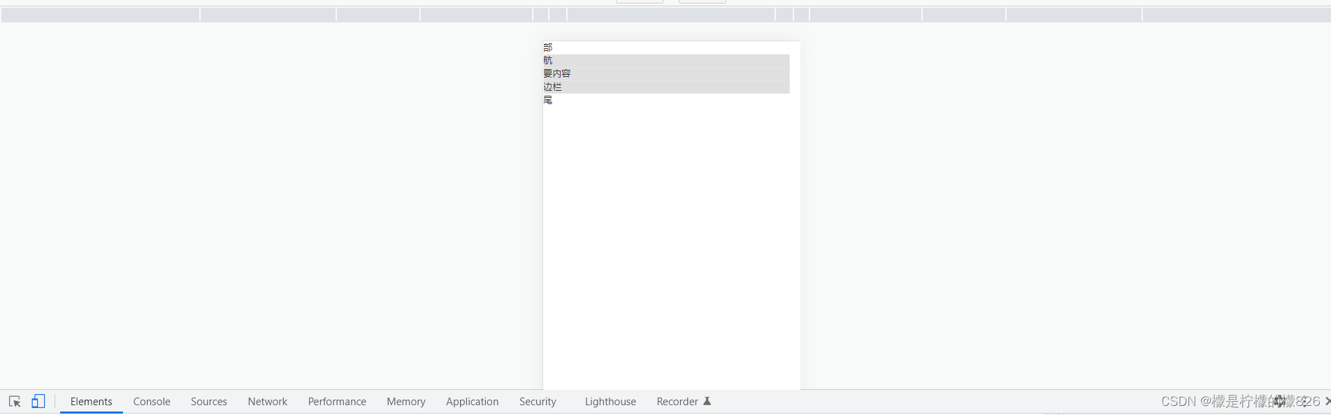
移动端显示如下:
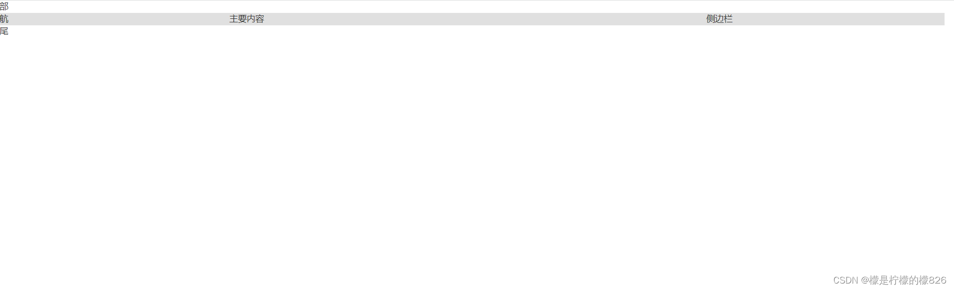
PC端显示如下:


 扫一扫
扫一扫


 被折叠的 条评论
为什么被折叠?
被折叠的 条评论
为什么被折叠?
 到【灌水乐园】发言


