


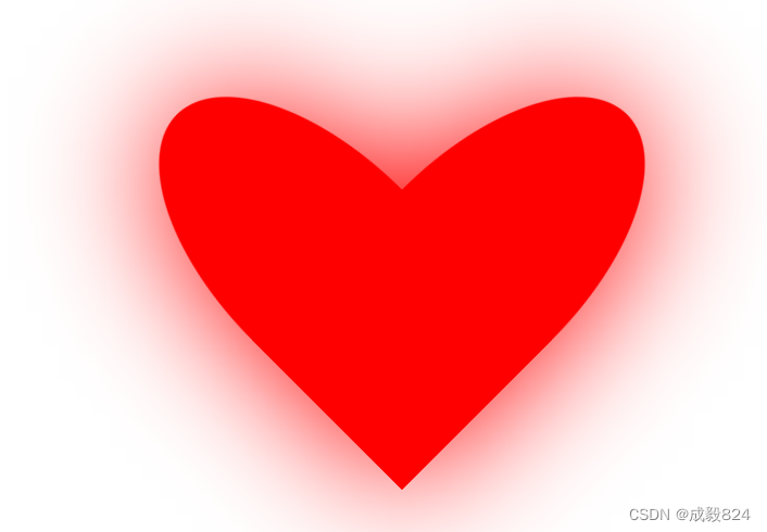
 该文章展示了一段CSS代码,用于创建一个由两个旋转的正方形部分组成的动态心形图案。通过边角圆角化、颜色设定、旋转角度以及关键帧动画,实现了从无到有逐渐显现的心形效果,并且这个动画会无限循环播放。
首先 定义一个盒子 形状为正方形 并将该盒子分为左右相等两份
使用#love div:nth-child(1) 分别设计两个样式 边角圆角化 颜色设置为红色 并将该元素顺时针旋转45 以右下角为起点 另一个逆时针旋转45 以左下角为起点
设置动画 关键帧 规模从0到1
调用关键帧:
@keyframes animation{
0% / from{
}
100% / to{
}
}
0%或者from是动画的开始
to或者100%是动画的结束
animation: move 1s ease infinite ;
animation-name:关键的名字
animation-duration:制作动画需要完成的时间
animation-time-function:规定动画的速度曲线
animation-delay:规定动画何时开始
animation-iteration-count:规定动画播放次数 infinite 无限循环/ 数字比如1,2 等
animation-fill-mode:规定动画结束的状态 保持动画后的状态:forward 回到最初的状态:drawback
<!DOCTYPE html>
<html>
	<head>
		<meta charset="utf-8">
		<title>love</title>
		<style>
			html,body{
				display: flex;
				justify-content: center;
				align-items:center;
				height: 100%;
			}
			#love{
				display: flex;
				width: 400px;
				height: 400px;
				/* border: 1px solid blue; */
  //加滤镜 让图片外围视觉上有发散的感觉
				filter: drop-shadow(0 0 50px red) ;
			}
//将盒子分为左右两个
			#love div{
			  width: 50%;
			   height: 100%;
              animation: move 1s ease infinite ;

			}

			#love div:nth-child(1){
				background-color: red;
				width: 50%;
				transform: rotate(45deg);
				transform-origin: right bottom;
				border-radius: 50% 50% 0 0;

			}
			#love div:nth-child(2){
				background-color: red;
				width: 50%;
				transform: rotate(-45deg);
					transform-origin: left bottom;
					border-radius: 50% 50% 0 0;

			}
			@keyframes move {
				from{
					scale: 0;
				}
				to{
					scale: 1;
				}
			}
			@keyframes run {
				from{

					margin-top: 0;
				}
				to{
					margin-top: 100%;
				}
			}
		</style>
	</head>
	<body>
		<div id="love">

			<div></div>
			<div></div>
		</div>


	</body>
</html>
http://127.0.0.1:8848/%E8%AF%95%E9%AA%8C2/love.html


 扫一扫
扫一扫


 1563
1563

 被折叠的 条评论
为什么被折叠?
被折叠的 条评论
为什么被折叠?
 到【灌水乐园】发言


