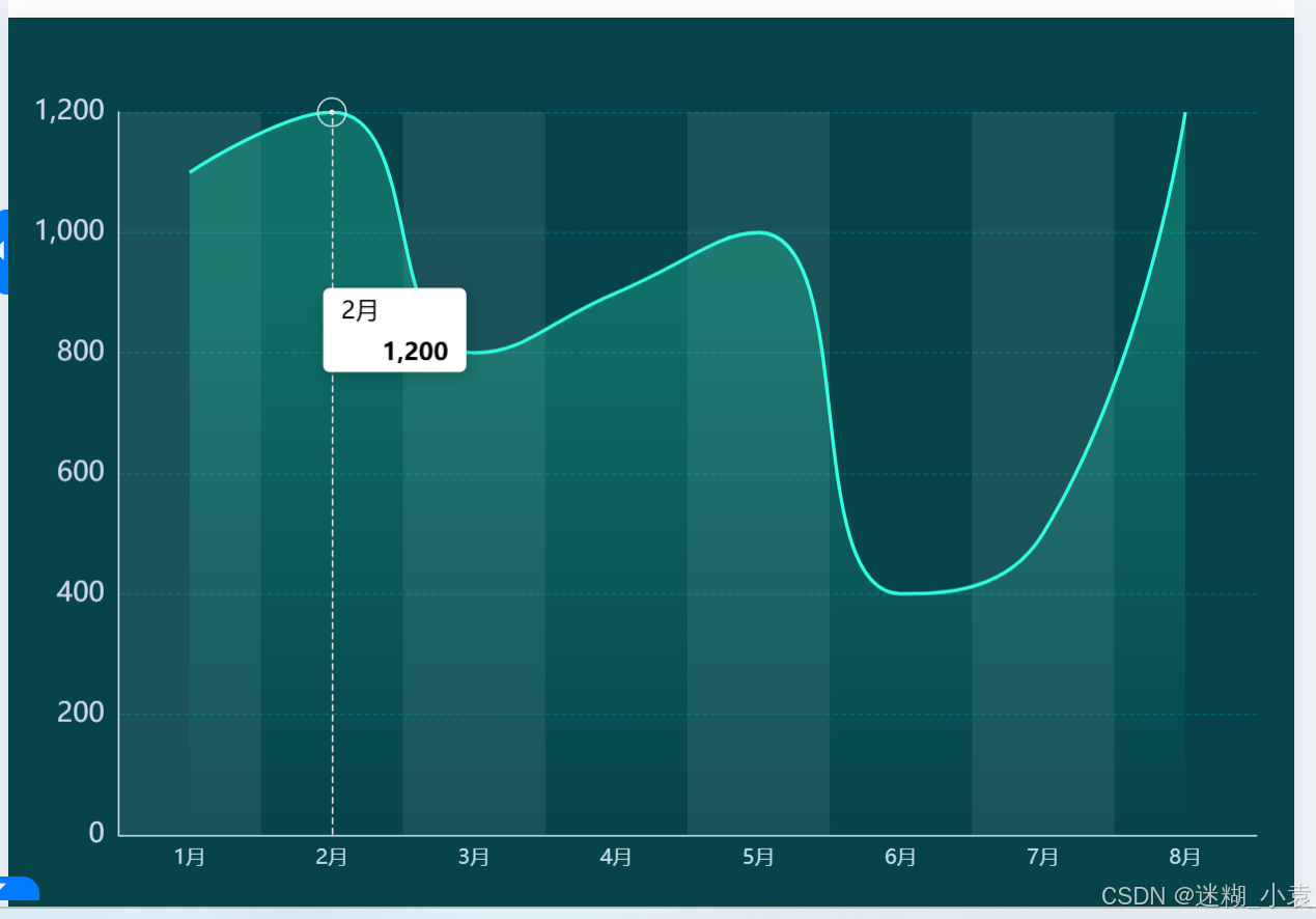
1、实现效果
2、配置代码
option = {
    backgroundColor: '#06444a', // 背景颜色
    tooltip: {
        trigger: 'axis',
        axisPointer: {
            type: 'line', // 指示线类型
            lineStyle: {
                color: '#ddd' // 指示线颜色
            }
        },
        backgroundColor: 'rgba(255,255,255,1)', // 提示框背景颜色
        padding: [5, 10], // 提示框内边距
        textStyle: {
            color: '#000', // 提示文本颜色
        }
    },
    grid: {
        top: '10%',
        left: '2%',
        right: '3%',
        bottom: '10%',
        containLabel: true // 包含标签
    },
    xAxis: {
        type: 'category',
        data: ['1月', '2月', '3月', '4月', '5月', '6月', '7月', '8月'],
        axisLabel: {
            color: '#bbdce0', // 标签颜色
            interval: 0,
            fontSize: 12 // 字体大小
        },
        axisTick: {
            show: false // 不显示刻度
        },
        axisLine: {
            lineStyle: {
                color: '#bbdce0' // X轴线颜色
            }
        },
        splitArea: {
            show: true, // 显示分割区域
            areaStyle: {
                color: ["rgba(250,250,250,0.08)", "rgba(250,250,250,0)"] // 分割区域颜色
            }
        }
    },
    yAxis: {
        type: 'value',
        axisLabel: {
            show: true,
            color: '#CFD7EB',
            fontSize: 16
        },
        splitLine: {
            show: true,
            lineStyle: {
                width: 0.8,
                color: '#036373',
                type: 'dashed' // 虚线样式
            }
        },
        axisLine: {
            show: true,
            lineStyle: {
                color: '#bbdce0' // Y轴线颜色
            }
        },
        max: 1200 // 根据数据设置最大值
    },
    series: [
        {
            type: 'line',
            showSymbol: false,
            smooth: true,
            symbolSize: 15,
            lineStyle: {
                color: '#2CFFCE' // 线条颜色
            },
            symbol: 'circle', // 设置为圆点空心圆
            itemStyle: {
                color: {
                    type: 'radial',
                    x: 0.5,//x 和 y 的值为 0.5,表示渐变的中心点在数据点的中心位置。
                    y: 0.5,
                    r: 0.2,// 的值为 0.5,表示渐变的半径。
                    /*
                    *colorStops 数组定义了渐变的颜色和位置:
                    *offset 表示颜色在渐变中的位置,范围从 0(中心)到 1(边缘)。
                    *color 根据 val.isOff 的值决定使用的颜色。
                    *如果 isOff 为 1,则使用红色(rgb(191, 53, 44)),
                    *否则使用 temp0(温度状态对应的颜色)。
                    */
                    colorStops: [{
                        offset: 0,
                        color: `#fff` // 中间圆心颜色
                    },
                    {
                        offset: 0.4,
                        color: '#fff' // 边框颜色
                    },
                    {
                        offset: 0.5,
                        color: 'rgba(240, 128, 19,0)',
                    },
                    {
                        offset: 1,
                        color: 'rgba(240, 128, 19,0)',
                    },
                    ],
                },
                borderColor: `#bbdce0`, // 边框颜色
                borderWidth: 1, // 边框宽度
            },
            areaStyle: {
                color: {
                    type: 'linear',
                    x: 0,
                    y: 0,
                    x2: 0,
                    y2: 1,
                    colorStops: [
                        {
                            offset: 0.25,
                            color: 'rgba(44, 255, 185, 0.32)' // 渐变颜色
                        },
                        {
                            offset: 1,
                            color: 'rgba(44, 255, 185, 0.00)' // 渐变透明
                        }
                    ]
                }
            },
            data: [1100, 1200, 800, 900, 1000, 400, 500, 1200] // 数据
        }
    ]
}


 扫一扫
扫一扫


 5075
5075

 被折叠的 条评论
为什么被折叠?
被折叠的 条评论
为什么被折叠?
 到【灌水乐园】发言


