


 本文展示了一个经过改进的个人电商项目,包括开始页面、VR观景、文创购买页面的源码。作者使用了新的布局和动画效果,提升了用户体验。项目托管在GitHub上,邀请读者查看并提供反馈。
目录 :
------------------------------------------------------------------------------
🎊🎊叨叨一下:
唔,这个本来是之前做的一个电商的项目,咱当时还没有学很多东西,就是粗略的做了一下,最近呢,咱改了一些样式以及增加了一些功能,就想着给大家康康,变好看了不少!✨
🍉🍉🍉这是之前写的文章,
当时一下就冲上热榜了(bushi
话不多说,上项目!!
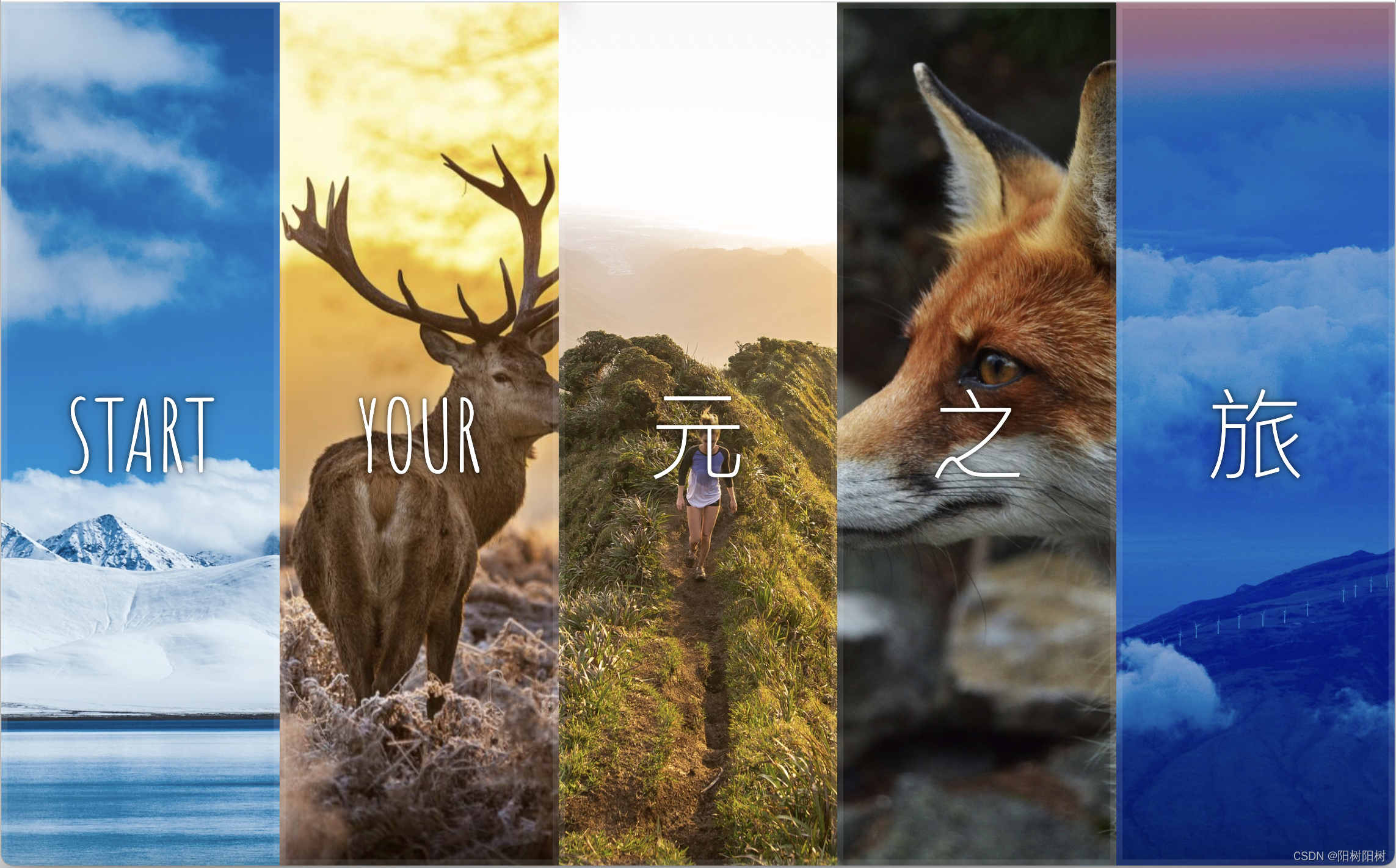
大家先来康康效果图吧:
最近新学的布局,点击就可以进入首页了呀!🍓🍓🍓
✨✨这里还有一个小惊喜哦,点击哪张图片哪张图片就会撑开让你看到全貌,有很不错的动画效果哦~
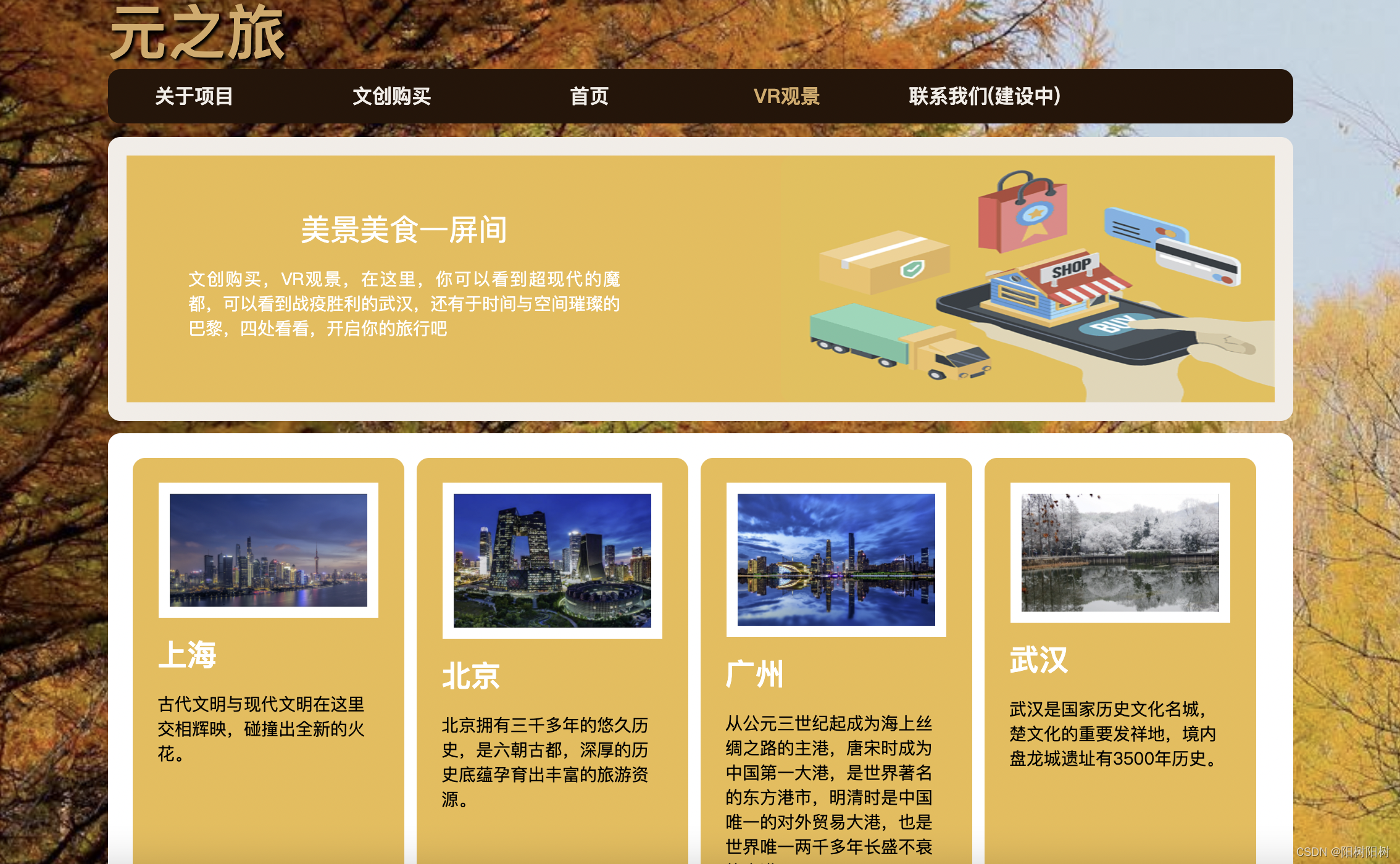
进入首页后就可以看到我们的VR观景部分啦,每个图片都是一个B站的视频链接,但是由于水平有限做不成VR的效果,有无大佬可以指点指点,
求求了💦💦💦⛄⛄
(虽然这方面技术不行,但视频都是精心挑选的)
主页看完了,再来看看文创购买界面吧!
这个界面布局大体沿用VR观景页面,不过有小细节哦!
鼠标悬停在商品上面可以看到图片正在缓缓的放大,是动画效果哦~
🐠🐠🐠
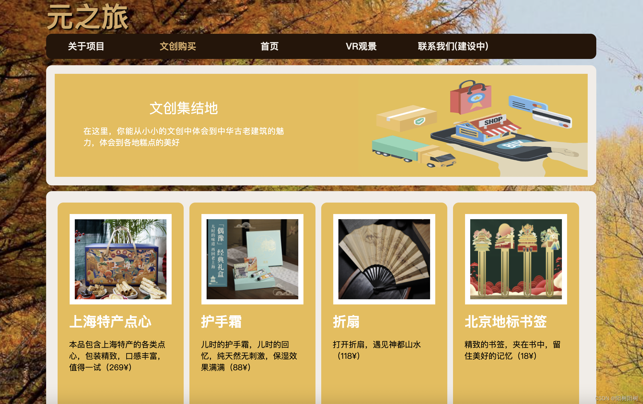
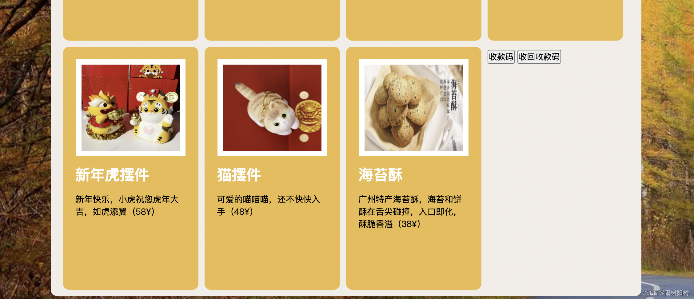
是不是还不错?
后面还有一个“关于项目”页面,大体上差不多,这里就不展示了嗷。
大家想要去看一下我的这个项目哦,网页放在这里啦:元之旅
碎碎念:这个项目是搭建在GitHub上面的,安全性倒是很可靠,就是不太便于访问,近期打算再用其他的框架做一个个人博客(虽然我已经有一个前端知识库惹),去分享一些个人的经历与成长!
接下来我要放源码啦!
码字不易,能给个赞然后收藏一下嘛✨
------------------------------------------------------------------------------
分割线~
开始页面源码:🐯
<!DOCTYPE html>
<html lang="en">
<head>
  <meta charset="UTF-8">
  <title>元之旅</title>
  <link href='https://fonts.googleapis.com/css?family=Amatic+SC' rel='stylesheet' type='text/css'>
</head>
<body>
  <style>
      html {
          box-sizing: border-box;
          background: #ffc600;
          font-family:'helvetica neue';
          font-size: 20px;
          font-weight: 200;
      }
      body {
          margin: 0;
      }
      *,*:before,*:after {
          box-sizing: inherit;
      }

      .panels {
        min-height: 100vh;
        overflow: hidden;
        display: flex;
      }

      .panel {
          background: #6B0F9C;
          box-shadow: inset 0 0 0 5px rgba(255, 255, 255, 0.1);
          color: white;
          text-align: center;
          align-items: center;
          transition:
            font-size 0.7s cubic-bezier(0.61,-0.19, 0.7,-0.11),
            /* flex的变化用0.7s的渐变动画,渐变动画的时间函数是贝塞尔曲线,具体参数就和他写的似的 */
            flex 0.7s cubic-bezier(0.61,-0.19, 0.7,-0.11),
            /* 就是对于background的变化 采用0.2s的渐变动画 */
            background 0.2s;
          font-size: 20px;
          background-size: cover;
          background-position: center;
          flex: 1;
          justify-content: center;
          align-items: center;
          display: flex;
          /* 属性指定了内部元素是如何在 flex 容器中布局的,定义了主轴的方向(正方向或反方向)。 */
          flex-direction: column;
      }
      .panel1 { background-image:url(https://source.unsplash.com/gYl-UtwNg_I/1500x1500); }
      .panel2 { background-image:url(第二张.jpg); }
      .panel3 { background-image:url(https://images.unsplash.com/photo-1465188162913-8fb5709d6d57?ixlib=rb-0.3.5&q=80&fm=jpg&crop=faces&cs=tinysrgb&w=1500&h=1500&fit=crop&s=967e8a713a4e395260793fc8c802901d); }
      .panel4 { background-image:url(https://source.unsplash.com/ITjiVXcwVng/1500x1500); }
      .panel5 { background-image:url(https://source.unsplash.com/3MNzGlQM7qs/1500x1500); }

      .panel > * {
          margin: 0;
          width: 100%;
          transition:transform 0.5s;
          flex:1 0 auto;
          display: flex;
          justify-content: center;
          align-items: center;
      }

      .panel > *:first-child {transform: translateY(-100%)}
      .panel.open-active > * :first-child {transform:translateY(0)}
      .panel > *:last-child {transform: translateY(100%)}
      .panel.open-active > * :last-child {transform:translateY(0)}

      .panel a{
          text-transform: uppercase;
          font-family: 'Amatic SC',cursive;
          text-shadow: 0 0 4px rgba(0, 0, 0, 0.72), 0 0 14px rgba(0, 0, 0, 0.45);
          font-size: 2em;
      }
      .panel a:nth-child(2){
          font-size: 4em;
      }

      .panel.open {
          flex: 5;
          font-size: 40px;
      }

      a {
        text-decoration: none;
        /* font-size: 2em; */
        color: white;

      }
  </style>


  <div class="panels">
    <div class="panel panel1">
      <a href="index1.html">Hey</a>
      <a href="index1.html">start</a>
      <a href="index1.html">Dance</a>
      <!-- <a href=""></a> -->
    </div>
    <div class="panel panel2">
      <a href="index1.html">Give</a>
      <a href="index1.html">your</a>
      <a href="index1.html">Receive</a>
    </div>
    <div class="panel panel3">
      <a href="index1.html">Experience</a>
      <a href="index1.html">元</a>
      <a href="index1.html">Today</a>
    </div>
    <div class="panel panel4">
      <a href="index1.html">Give</a>
      <a href="index1.html">之</a>
      <a href="index1.html">You can</a>
    </div>
    <div class="panel panel5">
      <a href="index1.html">Life</a>
      <a href="index1.html">旅</a>
      <a href="index1.html">Motion</a>
    </div>
  </div>

  <script>
  const panels =document.querySelectorAll('.panel');

    function toggleOpen() {
        this.classList.toggle('open');
    }

    function toggleActive(e) {
        if(e.propertyName.includes('flex')){
            this.classList.toggle('open-active');
        }
    }

    panels.forEach(panel => panel.addEventListener('click',toggleOpen));
    panels.forEach(panel => panel.addEventListener('transitionend', toggleActive));

  </script>


</body>
</html>
VR观景源码:⚡
<!doctype html>
<html lang="en">
<head>
	<meta charset="utf-8"/>
	<title>元之旅</title>
	<link rel="stylesheet" href="styles.css" type="text/css" media="screen" />
	<link rel="stylesheet" type="text/css" href="print.css" media="print" />
<script type="text/javascript" src="http://code.jquery.com/jquery-latest.js"></script>
<script type="text/javascript">
function smartColumns() { //Create a function that calculates the smart columns

//Reset column size to a 100% once view port has been adjusted
$("ul.column").css({ 'width' : "100%"});

var colWrap = $("ul.column").width(); //Get the width of row
var colNum = Math.floor(colWrap / 200); //Find how many columns of 200px can fit per row / then round it down to a whole number
var colFixed = Math.floor(colWrap / colNum); //Get the width of the row and divide it by the number of columns it can fit / then round it down to a whole number. This value will be the exact width of the re-adjusted column

$("ul.column").css({ 'width' : colWrap}); //Set exact width of row in pixels instead of using % - Prevents cross-browser bugs that appear in certain view port resolutions.
$("ul.column li").css({ 'width' : colFixed}); //Set exact width of the re-adjusted column

}

smartColumns();//Execute the function when page loads

$(window).resize(function () { //Each time the viewport is adjusted/resized, execute the function
smartColumn
最低0.47元/天 解锁文章


 扫一扫
扫一扫


 1065
1065

 被折叠的 条评论
为什么被折叠?
被折叠的 条评论
为什么被折叠?
 到【灌水乐园】发言


