


扯皮
首先,关于“能用CSS就不考虑JS”这个系列,一开始是我自己在学习过程中发现的,发现CSS很神奇,好多效果是可以代替JS完成的,之后就想做一个相关系列。
之后在寻找可能的案例过程中,偶然刷到一个大佬有做这个系列,而且该笔者认为用CSS代替JS是有很大优势在的,并且我也在他那里学会了很多有意思的案例。
于是,我决定将我学到的案例以更加通俗易懂的讲解,介绍给大家,希望大家会有新的发现,学到新的东西。
选中效果引入
关于我口中的选中效果,我就拿大家最熟悉的“导航栏”来引入。
前端中,“导航栏”是页面布局中很重要的一部分,你或许遇到过这样的设计——点击选中后高亮,如下所示:

那么,上述示例效果若用JS代码实现,步骤如下:
- 写一个
active类备用,可实现导航高亮的CSS代码 - 给所有导航项(
a标签包裹)绑定点击事件,你可以用事件委托实现 - 获取添加
active类的a标签 - 判断是否获取到已添加该类的
a标签,若成功获取到,继而移除该类 - 移除已有类后,给点击到的导航项添加该类
具体代码:
HTML:
<nav>
        <ul>
            <li><a href="#">首页</a></li>
            <li><a href="#">体育</a></li>
            <li><a href="#">搞笑</a></li>
            <li><a href="#">动画</a></li>
            <li><a href="#">腾讯</a></li>
        </ul>
</nav>
CSS:
        html,
        body {
            height: 100%;
            margin: 0;
            padding: 0;
        }

        nav {
            height: 100%;
            position: relative;
            background-color: #000000;
        }

        ul {
            position: absolute;
            left: 50%;
            top: 50%;
            transform: translate(-50%, -50%);
            list-style: none;
            width: 440px;
            height: 64px;
            border: #505050 solid 2px;
            border-radius: 64px;
            display: flex;
            justify-content: space-around;
            align-items: center;
            padding: 25px;
        }

        ul li {
            margin: 10px;
        }

        a {
            text-decoration: none;
            color: #ffffff;
            font-weight: 600;
            font-size: 1.3em;
            transition: 0.3s;
        }

        input {
            display: none;
        }

        a.active {
            color: #f60707;
        }
JS:
        const ul = document.querySelector('ul')
        ul.addEventListener('click', e => {
            if (e.target.tagName === 'A') {
                const old = document.querySelector('a.active')
                if (old) old.classList.remove('active')
                e.target.classList.add('active')
            }
        })
CSS相关知识
在上一小节,我们引入“导航高亮”基本案例,并用JS实现了基本的效果,其中,有许多需要我们注意的小坑,比如要先删除类再添加类。
那在本小节,我们将大概的复习一下相关的CSS知识点。其中包括,<input>标签、<label>标签和:checked伪类选择器等。
input
<input>的工作方式相当程度上取决于type属性的值,如果未指定此属性,则采用的默认类型为text,即文本框。
而我们要用到的type类型只有radio(单选按钮)和checkbox(复选框):
radio
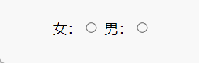
单选按钮,配合<input>标签的name属性,允许在多个拥有相同name值的选项中选中其中一个。
 <!-- 性别选择 -->
   女:<input type="radio" name="gender">
   男:<input type="radio" name="gender">
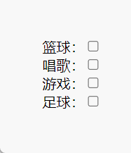
checkbox
复选框,可将其值设为选中或未选中。
<!-- 爱好选择 -->
篮球:<input type="checkbox"><br>
唱歌:<input type="checkbox"><br>
游戏:<input type="checkbox"><br>
足球:<input type="checkbox"><br>
label
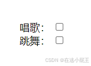
<label>元素(标签)表示用户界面中某个元素的说明。
<label for="sing">唱歌:</label>
<input type="checkbox" id="sing"><br>
<label for="dance">跳舞:</label>
<input type="checkbox" id="dance">
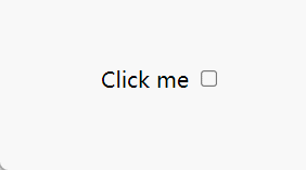
同样的标签说明,用<label>包裹和<input>相关联主要有这些优点:
<label>标签文本不仅与其相应的文本输入元素在视觉上相关联,程序中也是如此。这意味着,当用户聚焦到这个表单输入元素时,屏幕阅读器可以读出标签,让使用辅助技术的用户更容易理解应输入什么数据- 你可以点击关联的
<label>标签来聚焦或者激活这个输入元素,就像直接点击输入元素一样。这扩大了元素的可点击区域,让包括使用触屏设备在内的用户更容易激活这个元素
将一个<label>和一个<input>匹配在一起,你需要给<input>一个id属性。而<label>需要一个for属性,其值和<input>的 id一样。这样你就可以点击关联的<label>标签来聚焦或者激活这个输入元素。
<label for="click">Click me</label>
<input type="checkbox" id="click">
实战案例
上一小节,我们复习了要用到的CSS知识,那么相同的效果用JS是如何实现的呢?我们将在本小节讲清楚!
其实,相同效果的实现主要是通过控<input>标签是否被选中来间接的控制具体的可视的选项。我们先来实现“导航高亮”案例。
导航高亮
HTML:
    <nav>
        <div class="nav">
            <input type="radio" name="teb" id="home">
            <label for="home" class="home"><a href="#">首页</a></label>
            <input type="radio" name="teb" id="soprts">
            <label for="soprts" class="soprts"><a href="#">体育</a></label>
            <input type="radio" name="teb" id="funny">
            <label for="funny" class="funny"><a href="#">搞笑</a></label>
            <input type="radio" name="teb" id="cartoon">
            <label for="cartoon" class="cartoon"><a href="#">动画</a></label>
            <input type="radio" name="teb" id="Tencent">
            <label for="Tencent" class="Tencent"><a href="#">腾讯</a></label>
        </div>
    </nav>
CSS:
        html,
        body {
            height: 100%;
            margin: 0;
            padding: 0;
        }
        nav {
            height: 100%;
            position: relative;
            background-color: #000000;
        }
        .nav {
            position: absolute;
            left: 50%;
            top: 50%;
            transform: translate(-50%, -50%);
        }
        a {
            text-decoration: none;
            pointer-events: none;
            color: #ffffff;
            font-weight: 600;
            font-size: 1.3em;
            transition: 0.3s;
        }
        input {
            display: none;
        }
        /* 核心代码 */
        input:checked+label a {
            color: #f60707;
        }
        /* 导航边框 */
        .nav {
            width: 440px;
            height: 64px;
            border: #505050 solid 2px;
            border-radius: 64px;
            display: flex;
            justify-content: space-around;
            align-items: center;
            padding: 25px;
        }
代码分析
在上边的代码中我们利用<input type="radio">可以被用户点击的特性,然后再将<lable>元素与其绑定并放置在其后边。这样不仅可以通过点击<label>来选中<input>,还能使用相邻兄弟选择器通过<input>来选中<label>。 此时作为工具人的<input>元素就能从页面中隐藏了,我们只需要通过点击可操作性更强的<label>元素来控制它自身的样式即可。
<input>标签的type属性选择radio单选按钮类型,实现有且仅有一个导航项被选中高亮- 导航项
a标签被<label>标签包裹,扩大点击范围,实现点击文字即可控制<input>选中情况 - 隐藏
<input>标签,只显示需要被控制的选项,即<label>标签 input配合:checked伪类选择器,匹配任意被选中的单选按钮- 符号“+”是紧邻兄弟选择器,匹配某个元素后面紧挨的兄弟元素,示例中每个
<label>紧邻相关联的<input>
切换选项卡
HTML:
   <div class="tab">
        <!-- 第一个设checked默认被选中 -->
        <input checked type="radio" id="one" name="tab">
        <label for="one">选项1</label>
        <input type="radio" id="two" name="tab">
        <label for="two">选项2</label>
        <input type="radio" id="three" name="tab">
        <label for="three">选项3</label>
        <input type="radio" id="four" name="tab">
        <label for="four">选项4</label>
    </div>
CSS:
        html,
        body {
            height: 100%;
        }
        .tab {
            background-color: #000;
            height: 100%;
            display: flex;
            justify-content: center;
            align-items: center;
        }
         /* 选项卡样式 */
        label {
            box-sizing: border-box;
            width: 60px;
            height: 120px;
            padding: 0 5px;
            font-size: 18px;
            border-radius: 10px;
            background-color: #ccc;
            margin: 5px;
            line-height: 120px;
            text-align: center;
            color: #fff;
            font-weight: 400;
            cursor: pointer;
            transition: .3s;
        }
        input {
            display: none;
        }
         /* 核心代码 */
        input:checked+label {
            width: 120px;
            background-color: #99e6ff;
            color: #000;
        }
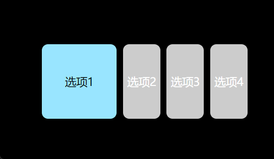
代码分析
本案例的基本思路和上个案例是一样的,这里就不再过多赘述。唯一不同点是,我们所看到的关于这个选项卡的样式,是通过直接为<label>标签设计样式得来的。
是的,我们的<label>标签在结构上没有特别的样式考虑,是简单的行内元素,可以直接为其应用设计想要的样式,这是很方便很实用的。
任意选中取消选项卡
HTML:
   <div class="box">
        <div class="checkBox">
            <input type="checkbox" id="one">
            <label for="one">1</label>
            <input type="checkbox" id="two">
            <label for="two">2</label>
            <input type="checkbox" id="three">
            <label for="three">3</label>
            <input type="checkbox" id="four">
            <label for="four">4</label>
            <input type="checkbox" id="five">
            <label for="five">5</label>
        </div>
        <div class="reset">
            <i>reset</i>
        </div>
    </div>
CSS:
        html,
        body {
            height: 100%;
            display: flex;
            justify-content: center;
            align-items: center;
        }
        /* 选项卡样式*/
        label {
            display: inline-block;
            width: 100px;
            height: 100px;
            background-color: gray;
            margin: 5px;
            line-height: 100px;
            text-align: center;
            color: rgb(249, 249, 249);
            font-size: 20px;
            font-weight: 400;
            cursor: pointer;
        }
        input {
            display: none;
        }
        /* 核心代码*/
        input:checked+label {
            background-color: pink;
            color: #000000;
        }
        .reset {
            text-align: center;
            margin-top: 10px;
        }
        .reset i {
            font-style: normal;
            width: 50px;
            height: 50px;
            box-sizing: border-box;
            padding: 5px;
            border-radius: 7px;
            background-color: #000000;
            color: aliceblue;
            cursor: pointer;
        }
JS:
        const reset = document.querySelector('.reset i')
        const inputs = document.querySelectorAll('input')
        reset.addEventListener('click', () => {
            inputs.forEach(item => {
                //点击reset全部input取消选中,恢复未选中状态
                item.checked = false
            })
        })
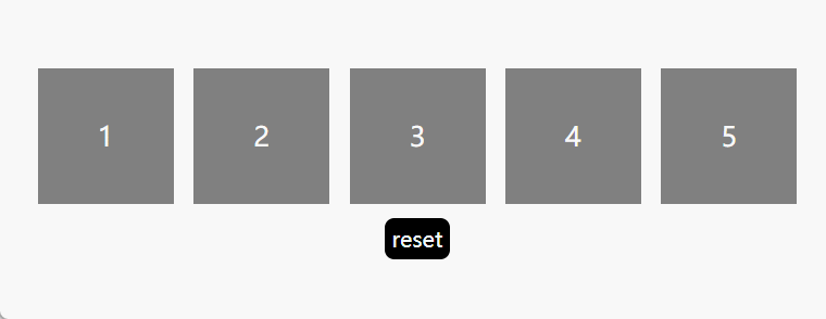
代码分析
和上面两个案例不同的是,这个是利用<input type="checkbox">复选框的可选中可取消的特性来实现的,其它代码思路一致。
总结
通过以上分析可知,实现思路是非常单一的,但使用这种技巧能实现的效果能远超你的想象。希望大家通过对以上内容的学习,可以实现在实战中将其灵活灵现,不拘泥于简单的模型意识,而是做到融会贯通,做到真正的学以致用。
未完待续…


 扫一扫
扫一扫


 6493
6493

 被折叠的 条评论
为什么被折叠?
被折叠的 条评论
为什么被折叠?
 到【灌水乐园】发言


