


CSS3作用
美化网页。字体,颜色,边距,宽度,高度,背景,网页定位,网页浮动,部分动画特效…
CSS3语法
1.在HTML文件里面直接写出css代码(内部样式表)
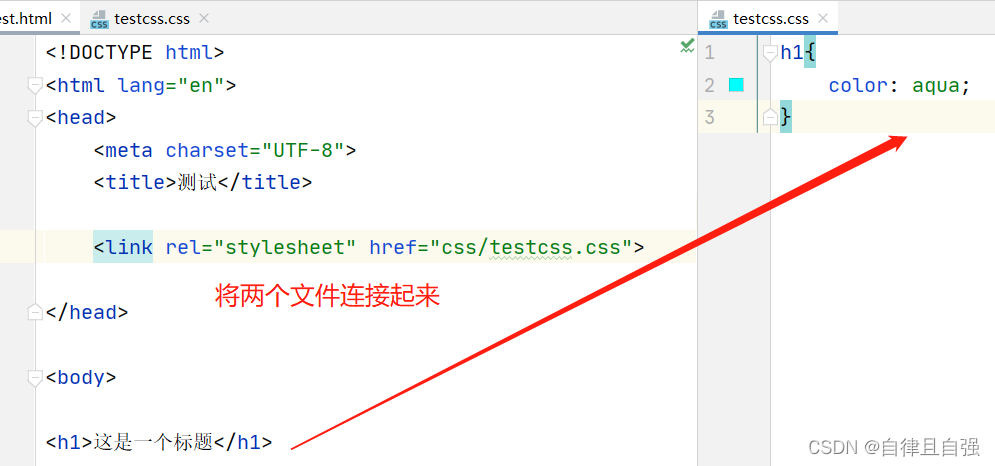
<head>
    <meta charset="UTF-8">
    <title>测试</title>

    <style>
        h1{
            color: aqua;
        }
    </style>

</head>
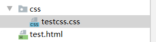
2.新建一个css文件(推荐)(外部样式表)
- 结构(内容)和表现(美化)分离
- css文件可以多次复用
- 利用SEO,容易被搜索引擎收录
3.行内样式
(不推荐)
<h1 style="color: #2c4557">这是一个标题</h1>
三种语法优先级:就近原则。 谁离标签近就表现谁的。
选择器
1.三种基本选择器(重点)
1.1 标签选择器:对HTML里面所有的标签都有效(没有另外两种选择器),不能复用,不够灵活,不推荐。
1.2 类选择器:不同的标签都可以复用同一个class
语法是 .class的名称{…}
  <style>
        .test{
            color: #1f389c;
        }
    </style>
    ...
    <h1 class="test" >这是一个标题</h1>
1.3 id选择器:全局只能用一次
语法:#id的名称{…}
	<style>
        #bianqian{
            color: #1f389c;
        }
    </style>
    ...
	<h1 id="bianqian">这是一个标题</h1>
优先级:id选择器 > 类选择器 > 标签选择器
ps:写代码可以从浏览器里面调试(源代码)成想要的效果在把代码复制下来。
2.层次选择器
2.1后代选择器:在某个元素的后面,不管多少层都能被选择。(空格)
2.2 子选择器(>)
2.3 相邻兄弟选择器(+)向下选择
2.4 通用选择器(~)
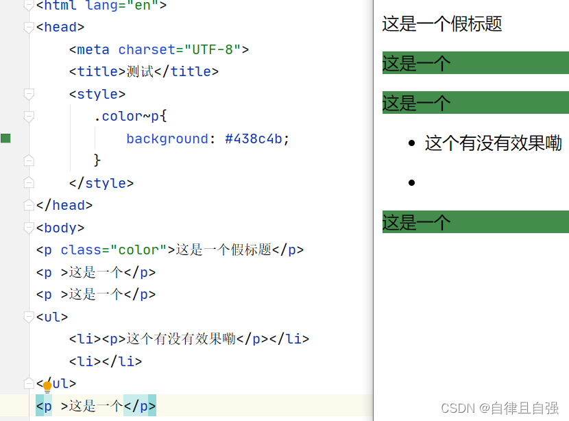
优点:使用一个类选择器或id选择器就可以使一块区域的标签同时被选择。
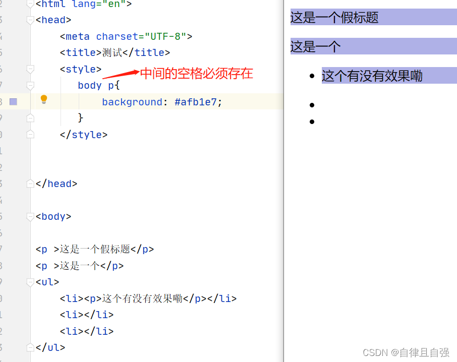
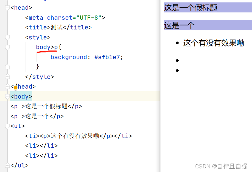
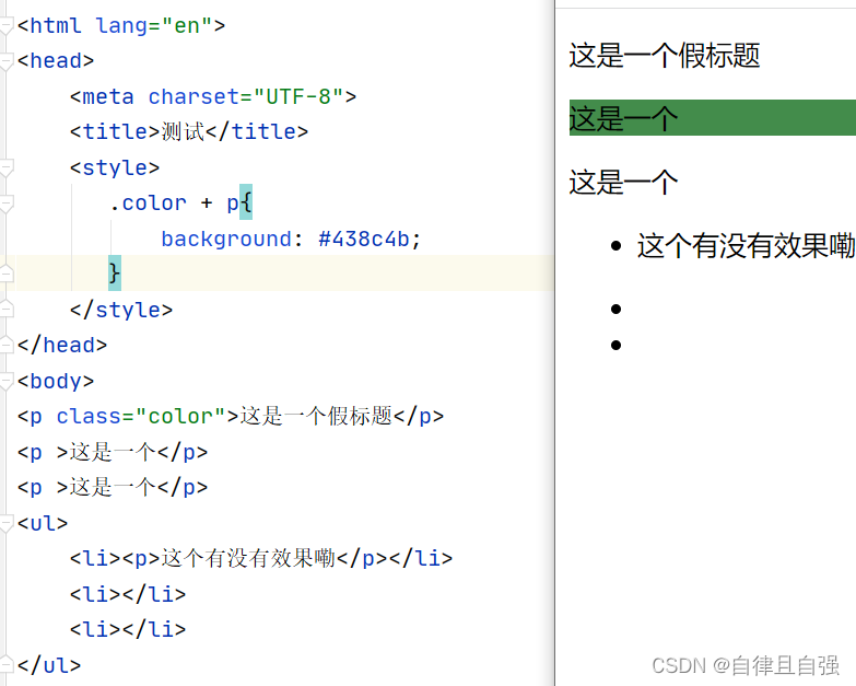
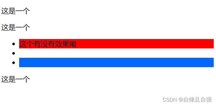
3.伪类选择器
	 <style>
        ul li:first-child{
            background-color: red;
        }
        ul li:last-child{
            background-color: #0066FF;
        }
        <!--识别伪类选择器看有没有冒号-->

    </style>
	<ul>
	    <li>这个有没有效果嘞</li>
	    <li></li>
	    <li></li>
	</ul>
4.属性选择器
将类和id选择器结合起来
	<style>
       a[href^=http]{
           background-color: #0066FF;
       }
        a[href$=jpg]{
            background-color: #F8981D;
       }
        a[class*=mark]{
            text-decoration: none;
        }
    </style>
	<a href="https://www.bilibili.com" class="link mark" id="test">1</a>
	<a href="image/123.png" class=" mark" id="test"  >2</a>
	<a href="image/23.jpg" id="test" >3</a>
运行结果:

语法:标签[属性名=属性值(可以是正则值)]{…}
正则表达式:
^=xx 开头为xx的值
$=xx 结尾为xx的值
*=xx 包含xx的值
=xx 绝对等于xx的值
美化网页元素(排版)
1.字体样式:font(具体:font-)
2.文本样式: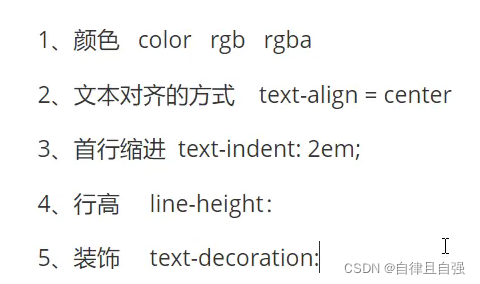
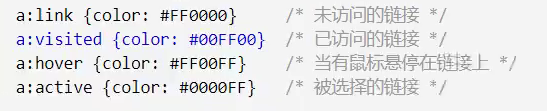
3.a标签伪类(hover为主)
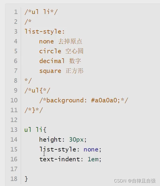
4.列表
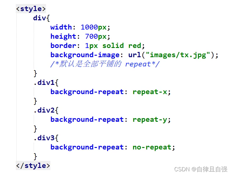
5.背景图片

渐变图片:
background-color: #8EC5FC;
background-image: linear-gradient(62deg, #8EC5FC 0%, #E0C3FC 100%);
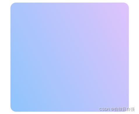
渐变图片资源:https://www.grabient.com/
6.获取边距可以在网页源码调出想要的效果再把数据复制下来
7.boder-radius圆角边框
浮动
1.display属性(行内元素)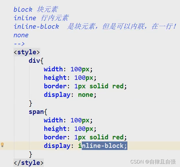 每个网站都有导航栏,使用ul li,使他们成一行的方法:display:inline-block

2.float属性
可以使许多块元素变成一行,将块元素与底层分开,使其往指定方向移动。
3. 清除左右浮动(行)但是保留浮动起来的效果:块元素+浮动元素
	float:left ;
    clear: both;
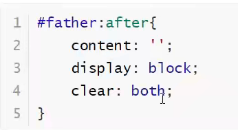
4.父级边框塌陷问题解决方案:
①浮动元素后面增加空div加clear:both(简单,但是代码中尽量不用空div)
②设置父级元素的高度(简单,元素有了父级高度就会被限制)
③父级元素增加 overflow:auto
④父类后添加一个伪类(原理和①差不多)
6.对比
display:让元素排在一列,没有方向
float:让元素排在一列,有方向,但需要解决父级边框塌陷问题
定位
1.相对定位 position:relative
相对于原先位置进行对应的偏移,偏移后仍然在标准文档流,保留原先位置。
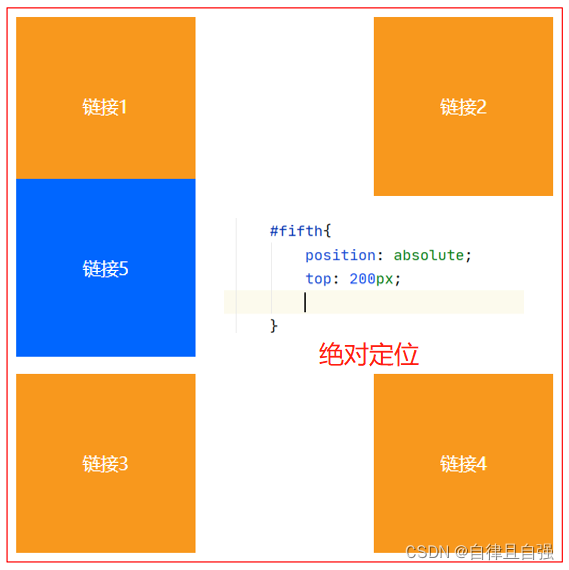
2.绝对定位 position:absolute
没有父级元素定位的前提下,相对于浏览器定位,若父级元素存在定位(如position:relative)则相对于父级元素定位,偏移后不保留原先位置。
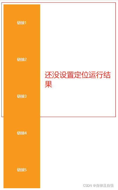
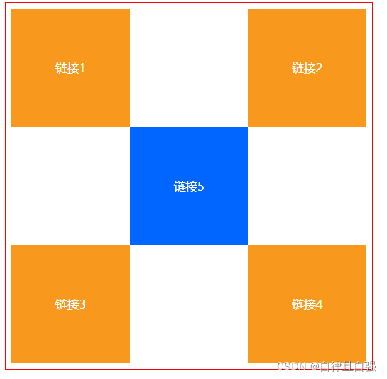
方块练习:
<!DOCTYPE html>
<html lang="en">
<head>
    <meta charset="UTF-8">
    <title>方块练习</title>
    <style>
        #father{
            height: 600px;
            width: 600px;
            border: 1px solid red;
            padding: 10px;
        }

        a:hover{
            background-color: #0066FF;
        }
        a{
            height: 200px;
            width: 200px;
            display: block;
            text-align: center;
            line-height: 200px;
            font-size: 20px;
            color: white;
            text-decoration: none;
            background-color: #F8981D;
        }
        /*把a标签转化为块元素*/
        #second,#forth{
            position: relative;
            top: -200px;
            left: 400px;
        }
        #fifth{
            position: relative;
            top: -600px;
            left: 200px;
        }
    </style>
</head>
<body>
<div id="father">
    <a href="#" id="firth" >链接1</a>
    <a href="#" id="second" >链接2</a>
    <a href="#" id="third">链接3</a>
    <a href="#" id="forth">链接4</a>
    <a href="#" id="fifth" >链接5</a>

</div>
<!--id选择器命名不能重复-->

</body>
</html>
运行结果:
3.固定定位 position:fixed
无论网页怎么变它都固定在对应的位置。
4.z-index定位
可以设置浮动起来的图层在上还是在下
z-index:0~999 表示从最下面的图层到最顶端的图层。
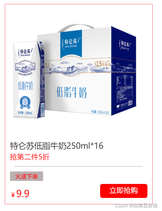
综合练习:(做一个商品链接)
    <!DOCTYPE html>
    <html lang="en">
    <head>
        <meta charset="UTF-8">
        <title>商品链接</title>
        <style>
            body,ul,li{
                padding: 0;
                margin: 0;
            }
            img{
                width: 270px;
                height: 270px;
            }
            #content{
                margin: 10px;
                padding: 10px;
                width: 290px;
                height: 400px;
                border: 1px solid #f34252;
                overflow: hidden;
            }
            ul li{
                list-style: none;
            }
            ul{
                position: relative;
            }
            .first2 a{
                text-decoration: none;
                color: #393636;
                font-size: 17px;
                line-height: 25px;
            }
            .first3 a{
                text-decoration: none;
                color: red;
                font-size: 15px;
                line-height: 10px;
            }
            .first{
                border: none;
                height: 1px;
                background-color: #aaa2a2;
                opacity: 0.5;
                margin: 10px;
            }
            .first4,.first5{
                height: 20px;
                width:70px;
                position: absolute;
            }
            .first4{
                z-index: 0;
                background-color: #bab0b0;

            }
            .first5 {
                font-weight: bold;
                color: #e33d3d;
                font-size: 12px;
                line-height: 20px;
                text-align: center;
            }
            .first6 span{
                color: red;
                font-size: 13px;
            }

            .first6{
                color: red;
                font-size: 20px;
                bottom: -33px;
                position: relative;
            }
            .first7{
                display: block;
                width: 100px;
                height: 30px;
                color: white;
                font-size: 15px;
                line-height: 25px;
                text-align: center;
                text-decoration: none;
                border-radius: 5px;
                background-color: red;
                float: right;
            }

        </style>
    </head>
    <body>
    <div id="content">
        <ul>
            <li class="first1"><a href="https://www.jd.com" target="_blank"><img src="../img/特仑苏商品图.jpg" alt=""></a></li>
            <li class="first2"><a href="https://www.jd.com" target="_blank">特仑苏低脂牛奶250ml*16</a></li>
            <li class="first3"><a href="https://www.jd.com" target="_blank">抢第二件5折</a></li>
            <li class="first"><hr></li>
            <li class="first4"></li>
            <li class="first5">火速下单</li>
            <li class="first6"><span>¥</span>9.9</li>
            <li ><a href="https://www.jd.com"  class="first7" target="_blank">立即抢购</a></li>
        </ul>
    </div>

    </body>
    </html>
运行结果:
拓展:
1.< canvas> 元素可被用来通过 JavaScript(Canvas API 或 WebGL API)绘制图形及图形动画。是 HTML5 新增的元素,只是一个画布,本身并不具有绘图的能力,绘图必须使用JavaScript等脚本语言。
2.卡巴斯基监控网站,可以查看全球网络威胁。页面很炫酷,可以欣赏一下。
3.前端有很多东西都是可以直接从模板网站里面找源码的,加上自己的idea加以修改就可以很块做出一个页面。
学习视频网址:https://www.bilibili.com/video/BV1YJ411a7dy?p=24&share_source=copy_web


 扫一扫
扫一扫


 被折叠的 条评论
为什么被折叠?
被折叠的 条评论
为什么被折叠?
 到【灌水乐园】发言


