


css
1.css是什么
2.CSS怎么用(快速入门)
3.CSS选择器(重点 + 难点)
4.美化页面(文字、阴影、超链接、列表、渐变…)
5.盒子模型
6.浮动
7.定位
8.网页动画(特效)
写好的框架
layui
飞冰
快速入门
建议使用这种规范
h1{
    color: pink;
}
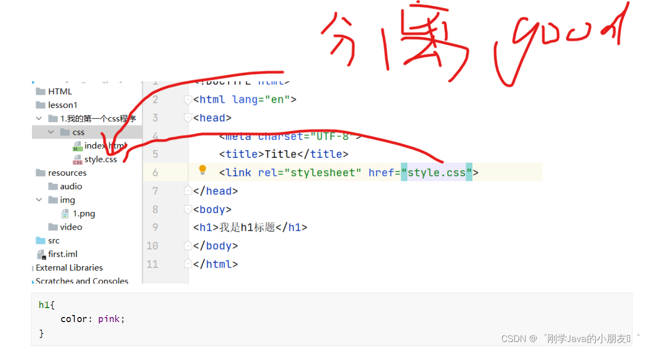
css的四种导入方式
- 行内样式:即在html中写
- 内部样式:在html的style标签里面写
- 外部样式:另外建一个style.css在html外面写
行内样式优先级》内部样式》外部样式(即就近远则)
外部样式的两种方式:
连接式:
<link rel="stylesheet" href="style.css">
导入式:
<style>
@import url(css/style.css);
</style>
选择器
三中基本选择器(重点)
-
标签选择器:
h1{ color:red; } -
类选择器
.class的名字{ color:red; } -
id选择器
#id的名称{
   color:red;
}
不遵循就近选择,是固定的优先级
id>class>h1(标签选择器)
层次选择器
后代选择器:后代选择器:在某个元素的后面
/*    后代选择器*/
    body p{
        background: greenyellow;
    }
子选择器
body>p{
    background: aqua;
}
相邻选择器:相邻的兄弟选择器 同辈、只有一个,相邻(向下)
/*    相邻选择器*/
    .active+p{
        background: blanchedalmond ;
    }
通用兄弟选择器:当前选中元素的向下的所有兄弟元素
.a~li{
    background: chocolate;
}
结构伪类选择器
<!DOCTYPE html>
<html lang="en">
<head>
    <meta charset="UTF-8">
    <title>结构伪类选择器</title>

    <style >
        /*ul的第一个子元素*/
        ul li:first-child{
            background: chocolate;
        }
        /*ul的最后一个子元素*/
        ul li:last-child{
            background: pink;
        }
        /*选中p1:定位到父元素,选择当前的第一个元素
          选择当前p元素 的父级元素,选中父级元素的第一个,并且是当前元素才生效!
      */
        p:nth-child(1){
            background: blueviolet;
        }
        /*选中父元素下的,第1个p元素*/
        p:nth-of-type(1){
            background: blanchedalmond;
        }

        /*鼠标放上去会变颜色*/
        a:hover{
            background: beige;
        }
    </style>
</head>
<body>
      <a href="">123</a>
       <h1>2</h1>
       <p>1</p>
       <p>2</p>
       <p>3</p>
       <ul>
           <li >1</li>
           <li>2</li>
           <li>3 </li>
       </ul>
</body>
</html>
属性选择器(重要)
<!DOCTYPE html>
<html lang="en">
<head>
    <meta charset="UTF-8">
    <title>属性选择器</title>
    <style>
        .demo a{
            display: block;/*成为“块级”元素(*/
            height: 50px;
            width: 50px;
            float:left;/*配置对象靠左(浮动靠左)排版*/
            border-radius: 20px;/*添加圆角边框*/
            background: blue;
            text-align: center;/*文字居中*/
            color: beige;/*文字颜色*/
            text-decoration: none;/*属性规定添加到文本的修饰。这里是无文本装饰,即取消a标签的i的下划线*/
            margin-right: 5px;/*设置 元素的右外边距*/
            font: bold 30px/50px Arial;/*bold 加粗    30px/50px:字体在块中的大小(行高)   Arial表示字体  */
        }
        /*属性名,属性名=属性值(正则)
        =表示绝对等于
        *=表示包含
        ^=表示以...开头
        $=表示以...结尾
        存在id属性的元素  a[]{}
        */
        /* a[id]{
             background: red;
         }*/

        /*id=first的元素*/
        /* a[id=first]{*/
        /*     background: aqua;*/
        /* }*/


        /*class中有links元素*/
        /* a[class = "links item2 first2"]{*/
        /*     background: orange;*/
        /* }*/

        /*a[class*="links"]{*/
        /*    background: black ;*/
        /*}*/
        /*选中href中以http开头的元素*/
        /*a[href^="http"]{*/
        /*    background: orange;*/
        /*}*/

    </style>

</head>
<body>
<p class="demo">
    <a href="http://www.baidu.com" class="links item first" id="first">1</a>
    <a href="/adad/faf" class="links item2 first2" >2</a>
    <a href="qwe123" class="links item3 first3" >3</a>
    <a href="eweqe" class="links item4 first4" >4</a>
    <a href="rrrrr" class="links item5 first5" >5</a>
    <a href="ttt" class="links item6 first6" >6</a>
    <a href="yyy" class="links item7 first7" >7</a>
</p>
</body>
</html>
字体样式
span标签:重点要突出的字,使用span标签套起来
font-family:字体
font-size:字体大小
font-weight:字体粗细
<style>
    body{
        font-family:楷体;
        color:red; 	}
    h1{
        font-size: 50px; }
    .p1{
         font-weight:blod;
    }
</style>
italic 是使用文字的斜体,oblique 是让没有斜体属性的文字倾斜
font-weight:bolder;/*也可以填px,但不能超过900,相当于bloder*/
/*常用写法:*/
font:oblique bloder 12px "楷体"
文本样式
- 颜色 –> color, rgb(255,255,255),rgba( 透明度)
- 文本对齐方式 –> text-align:center
- 首行缩进 –> text-indent:2em
- 行高 –> line-height:300px;height = 300px 行高和块高引用,即单行文字上下居中!
- 下划线 –> text-decoration
- 文本图片水平对齐:vertical-align: middle;
text-decoration:underline/*下划线*/
text-decoration:line-through/*中划线*/
text-decoration:overline/*上划线*/
text-decoration:none/*超链接去下划线*/
图片、文字水平对齐
img,span{vetical-align:middle}/*垂直对齐 middle中间*/
文本阴影
 /* text-shadow: 阴影颜色,水平偏移,垂直偏移,阴影半径*/
        #price{
            text-shadow: #008800 20px -10px 2px;
        }
超链接伪类
/* 鼠标移动到链接上,鼠标悬浮的状态*/
a:hover {color: #FF00FF}
/* 选定的链接,鼠标按住未释放的状态*/
a:active {color: #0000FF}
列表ul li
ul li{
    line-height: 30px;
    /*去掉列表前面的小圆圈*/
    list-style: none;
    margin-right: 20px;
    /*首航缩进*/
    text-indent:1em;

}
背景图像
可以插入背景图
opacity: 0.5;/*背景透明度*/
background: red url("../images/c.jpg") 270px 10px no-repeat;
/*270px 10px 表示插入图片的位置*/
background-image:url("");/*默认是全部平铺的*/
background-repeat:repeat-x/*水平平铺*/
background-repeat:repeat-y/*垂直平铺*/
background-repeat:no-repeat/*不平铺*/
渐变
渐变网页:Grabient
渐变网页:https://www.grablent.com
<!--径向渐变,圆形-->
    <style>
        body{
            background-color: #FFFFFF;
            background-image: linear-gradient(66deg, #FFFFFF 0%, #6284FF 50%, #FF0000 100%);
        }
    </style>
盒子模型
- margin:外边距
- padding:内边距
- border:边框
border:粗细 样式 颜色
样式:
| 值 | 描述 |
|---|---|
| none | 无边框 |
| hidden | 隐藏边框,与 “none” 类似 |
| dotted | 定义点状虚线边框 |
| dashed | 定义虚线边框 |
| solid | 定义实线边框 |
| double | 定义双实线边框,双实线边框的宽度等于 border-width 的值 |
| groove | 定义 3D 凹槽边框,其效果取决于 border-color 的值 |
| ridge | 定义 3D 垄状边框,其效果取决于 border-color 的值 |
| inset | 定义 3D 嵌入边框,其效果取决于 border-color 的值 |
| outset | 定义 3D 突出边框,其效果取决于 border-color 的值 |
| inherit | 从父元素继承边框样式 |
盒子计算尺寸:boder+margin+padding+内容元素
盒子大小:box-sixe
圆角边框
div{
            width: 100px;
            height: 50px;
            border: 10px solid pink;
            border-radius: 100px 100px 0 0;/* 设置矩形的边框*/
        }
盒子阴影
div{
    width: 100px;
    height: 50px;
    border: 10px solid pink;
    box-shadow: 30px 30px 20px pink ;/* 设置矩形的阴影*/
}
浮动
块级元素:独占一行 h1~h6 、p、div、 列表…
行内元素:不独占一行 span、a、img、strong
注: 行内元素可以包含在块级元素中,反之则不可以。
display(重要)
- block:块元素
- inline:行内元素
- inline-block:是块元素,但是可以内联,在一行
- none:消失
这也是一种实现行内元素排列的方式,但是我们很多情况用float
<!--block 块元素
        inline 行内元素
        inline-block 是块元素,但是可以内联 ,在一行
    -->
    <style>
        div{
            width: 100px;
            height: 100px;
            border: 1px solid red;
            display: inline-block;
        }
        span{
            width: 100px;
            height: 100px;
            border: 1px solid red;
            display: inline-block;
        }
    </style>
float
left/right左右浮动
float: left;/*向左浮动*/
clear: both;/*清除浮动,这样就不会一个接着一个,可以换行浮动了,每一个都在*/
display与float对比
- **display:**方向不可以控制
- **float:**浮动起来的话会脱离标准文档流,所以要解决父级边框塌陷的问题。
overflow
父级边框塌陷问题
clear:
right:右侧不允许有浮动元素
left:左侧不允许有浮动元素
both:两侧不允许有浮动元素
none:
解决塌陷问题方案
方案一:增加父级元素的高度;
#father{
    border: 1px #000 solid;
    height: 800px;
}
方案二:增加一个空的div标签,清除浮动
<!DOCTYPE html>
<html lang="en">
<head>
    <meta charset="UTF-8">
    <title>Title</title>
    <style>-----------------------------------------------------------
	.clear{
		clear:both;
		margin:0;
		padding:0;
      }
</style>---------------------------------------------------
</head>
<body>
<div id="father">
    <div class="layer01"><img src="images/1.png" alt=""></div>
    <div class="layer02"><img src="images/2.png" alt=""></div>
    <div class="layer03"><img src="images/3.png" alt=""></div>
    <div class="layer04">
        浮动的盒子可以向左浮动,也可以向右浮动,知道它的外边缘碰到包含或另一个浮动盒子为止
    </div>
    <div class="clear"></div>《《《《《《《《《《《--------------------------------
</div>
</body>
</html>
方案三:在父级元素中增加一个overflow:hidden
overflow:hidden/*隐藏*/
overflow:scoll/*滚动*/
方案四:父类添加一个伪类:after(市面上最认可的方案)
#father:after{
	content:'';
	display:block;
	clear:both;
}
<!DOCTYPE html>
<html lang="en">
<head>
    <meta charset="UTF-8">
    <title>Title</title>
    <style>
    	div{
            margin: 10px;
            padding: 5px;
        }
        #father{
            border: 1px #000 solid;
        }
        #father:after{
            content: '';
            display: block;
            clear: both;
        }
        .layer01{
            border: 1px #F00 dashed;
            display: inline-block;
            float: left;/*向左浮动*/
        }
        .layer02{
            border: 1px #00F dashed;
            display: inline-block;
            float: left;
        }
        .layer03{
            border: 1px #060 dashed;
            display: inline-block;
            float: right;
        }
        /*
        clear:right;右侧不允许有浮动元素
        clear:left; 左侧不允许有浮动元素
        clear:both; 两侧不允许有浮动元素
        clear:none;
         */
        .layer04{
            border: 1px #666 dashed;
            font-size: 12px;
            line-height: 23px;
            display: inline-block;
            float: right;
        }
    </style>
</head>
<body>
<div id="father">
    <div class="layer01"><img src="../lesson06/images/1.png" alt=""></div>
    <div class="layer02"><img src="images/2.png" alt=""></div>
    <div class="layer03"><img src="images/3.png" alt=""></div>
    <div class="layer04">
        浮动的盒子可以向左浮动,也可以向右浮动,知道它的外边缘碰到包含或另一个浮动盒子为止
    </div>
    <div class="clear"></div>
</div>
</body>
</html>
定位
相对定位
相对定位:positon:relstive;
相对于原来的位置,进行指定的偏移,相对定位的话,它仍然在标准文档流中,原来的位置会被保留
position: relative;/*相对定位 上下左右*/
top: -20px;/*向上偏移20px*/
left: 20px;/*向右偏移20*/
绝对定位
定位:基于xxx定位,上下左右~
1、没有父级元素定位的前提下,相对于浏览器定位
2、假设父级元素存在定位( position: relative;),我们通常会相对于父级元素进行偏移
3、在父级元素范围内移动,不会超出父类的范围
总结:相对一父级或浏览器的位置,进行指定的偏移,绝对定位的话,它不在标准文档流中,原来的位置不会被保留
<!DOCTYPE html>
<html lang="en">
<head>
    <meta charset="UTF-8">
    <title>Title</title>
    <style>
        div{
            margin: 10px;
            padding: 5px;
            font-size: 12px;
            line-height: 25px;
        }

        #father{
            border: 1px solid #666;
            padding: 0;
            position: relative;/*父级元素存在定位*/
        }
        #first{
            background-color: #a13d30;
            border: 1px dashed #b27530;

        }
        #second{
            background-color: green;
            border: 1px dashed #0ece4f;
            position: absolute;
            right:30px;
            top:30px;  /不会超出父级元素的范围哦*/
        }
        #third{
            background-color: red;
            border: 1px dashed #ff1b87;
        }
    </style>
</head>
<body>
<div id = "father">
    <div id="first">第一个盒子</div>
    <div id="second">第二个盒子</div>
    <div id="third">第三个盒子</div>
</div>
</body>
</html>
固定定位-fixed
无论怎么走,都在那个位置
position: fixed;/* 固定定位*/
<!DOCTYPE html>
<html lang="en">
<head>
    <meta charset="UTF-8">
    <title>Title</title>
    <style>
        body{
            height: 1000px;
        }
         div:nth-of-type(1){/*绝对定位:没有相对的父级元素,所以相对于浏览器*/
             width: 100px;
             height: 100px;
             background:red;
             position: absolute;
             right: 0;
             bottom: 0;
         }
        div:nth-of-type(2){
            width: 50px;
            height: 50px;
            background: yellow;
            position: fixed;/* 固定定位*/
            right: 0;
            bottom: 0;
        }
    </style>
</head>
<body>

<div>div1</div>
<div>div2</div>

</body>
</html>
z-index
有层级概念

z-index 属性设置元素的堆叠顺序。拥有更高堆叠顺序的元素总是会处于堆叠顺序较低的元素的前面。
**注释:**元素可拥有负的 z-index 属性值。
**注释:**Z-index 仅能在定位元素上奏效(例如 position:absolute;)!
动画
的父级元素,所以相对于浏览器*/
width: 100px;
height: 100px;
background:red;
position: absolute;
right: 0;
bottom: 0;
}
div:nth-of-type(2){
width: 50px;
height: 50px;
background: yellow;
position: fixed;/* 固定定位*/
right: 0;
bottom: 0;
}
z-index
有层级概念
z-index 属性设置元素的堆叠顺序。拥有更高堆叠顺序的元素总是会处于堆叠顺序较低的元素的前面。
**注释:**元素可拥有负的 z-index 属性值。
**注释:**Z-index 仅能在定位元素上奏效(例如 position:absolute;)!


 扫一扫
扫一扫


 被折叠的 条评论
为什么被折叠?
被折叠的 条评论
为什么被折叠?
 到【灌水乐园】发言


