


从零开始将 Element Plus 集成到 Vue 3 项目的完整指南,包含最佳实践和常见配置:
1. 创建 Vue 3 项目(使用 Vite)
npm create vite@latest my-element-project -- --template vue-ts
cd my-element-project
npm install
2. 安装 Element Plus
npm install element-plus @element-plus/icons-vue3. 基础配置(推荐按需导入)
安装自动导入工具
npm install -D unplugin-vue-components unplugin-auto-import配置 vite.config.ts
import { defineConfig } from 'vite'
import vue from '@vitejs/plugin-vue'
import AutoImport from 'unplugin-auto-import/vite'
import Components from 'unplugin-vue-components/vite'
import { ElementPlusResolver } from 'unplugin-vue-components/resolvers'

export default defineConfig({
  plugins: [
    vue(),
    AutoImport({
      resolvers: [ElementPlusResolver()],
    }),
    Components({
      resolvers: [ElementPlusResolver()],
    }),
  ],
})
4. 引入样式文件
在 main.ts 中添加:
import 'element-plus/dist/index.css'
import * as ElementPlusIconsVue from '@element-plus/icons-vue'

const app = createApp(App)

// 注册图标
for (const [key, component] of Object.entries(ElementPlusIconsVue)) {
  app.component(key, component)
}

app.mount('#app')
5. 创建 TypeScript 声明文件(可选)
// src/element-plus.d.ts
import type {
  ElMessageBoxOptions, ElNotificationOptions
} from 'element-plus'

declare module 'element-plus' {
  export interface ElMessageBoxShortcutMethod {
    (options: ElMessageBoxOptions): Promise<void>
    (message: string, title?: string, options?: ElMessageBoxOptions): Promise<void>
  }
}

export { }
6. 基础使用🌰
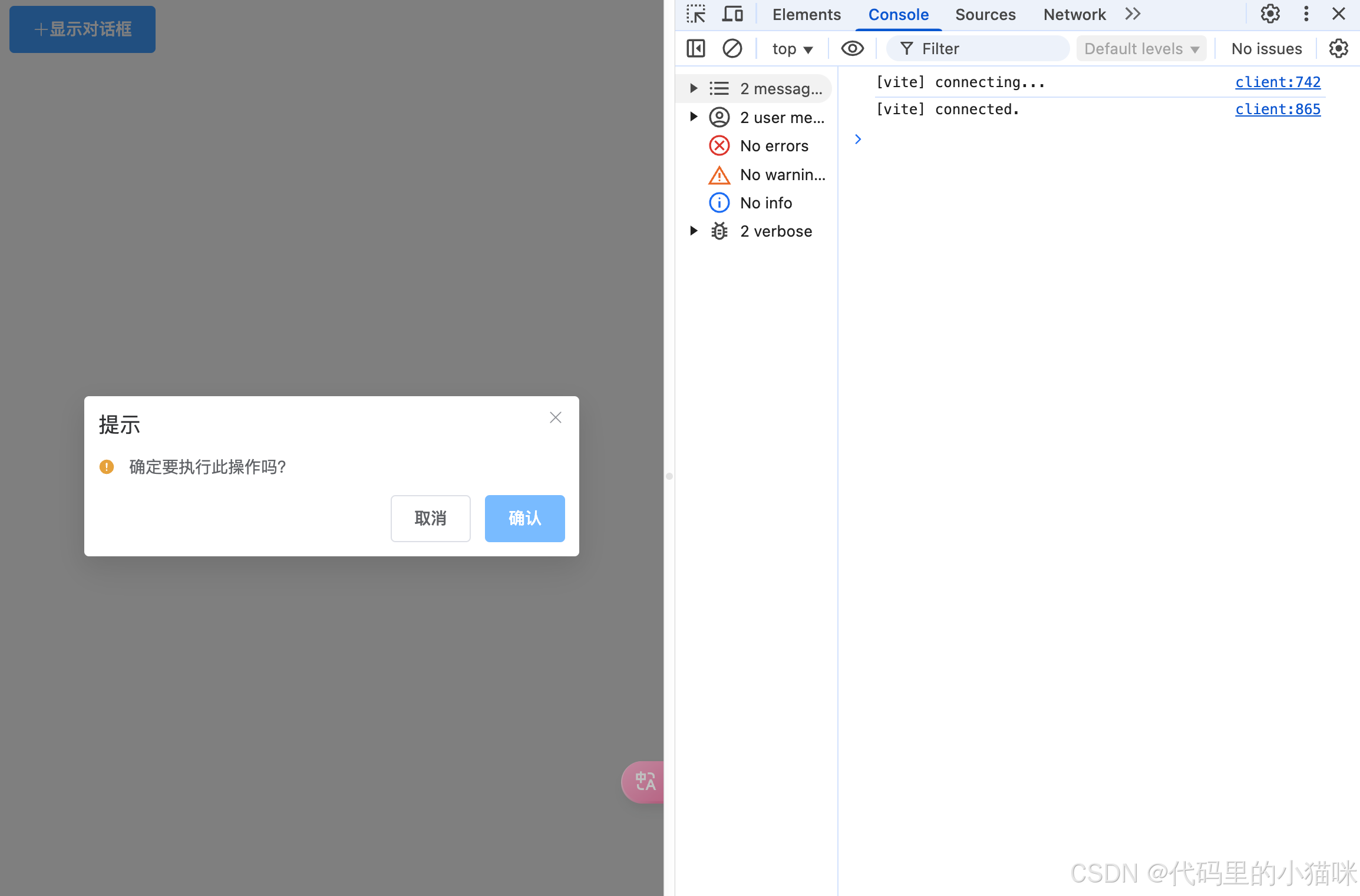
组件模版:
<template>
  <ElButton type="primary" @click="showMessage">
    <ElIcon><Plus /></ElIcon>
    显示对话框
  </ElButton>
</template>

<script setup lang="ts">
import { ElMessageBox, ElIcon, ElButton } from 'element-plus';
import { Plus } from '@element-plus/icons-vue';

const showMessage = () => {
  ElMessageBox.confirm('确定要执行此操作吗?', '提示', {
    confirmButtonText: '确认',
    cancelButtonText: '取消',
    type: 'warning',
  })
    .then(() => {
      ElMessage.success('操作成功!');
    })
    .catch(() => {
      ElMessage.info('已取消操作');
    });
};
</script>
7. 高级配置
全局配置(尺寸/国际化)
// main.ts
import { createApp } from 'vue'
import ElementPlus from 'element-plus'
import zhCn from 'element-plus/dist/locale/zh-cn.mjs'

const app = createApp(App)

app.use(ElementPlus, {
  // 全局组件尺寸
  size: 'large',
  // 国际化配置
  locale: zhCn,
})
自定义主题
1、创建 src/styles/element-variables.scss
@forward "element-plus/theme-chalk/src/common/var.scss" with (
  $colors: (
    "primary": (
      "base": #1890ff,
    ),
  ),
  $border-radius: (
    "base": 4px,
  )
);
2、修改 vite.config.ts
export default defineConfig({
  css: {
    preprocessorOptions: {
      scss: {
        additionalData: `@use "@/styles/element-variables.scss" as *;`,
      },
    },
  }
})
8. 最佳实践建议
- 按需加载:始终使用自动导入方案,减少打包体积
- 图标管理:仅导入实际使用的图标
- 主题定制:通过 SCSS 变量覆盖实现样式定制
- 组件封装:对常用组件(如 Message)进行二次封装
- 类型安全:为复杂交互添加 TypeScript 类型声明
通过以上步骤,已成功在项目中集成 Element Plus,并配置了现代化的开发环境。
额外补充一点(彩蛋🥚):
9. 通用组件二次封装
封装业务组件和通用组件存在明显差异。业务组件通常仅使用一次,而通用组件的要求较高,不仅要保证功能完备,还需做到调用简单,避免复杂的使用方式。
举个 🌰
传统使用 Element Plus 的 Dialog 组件如下:
<template>
  <ElButton plain @click="dialogVisible = true">点击打开Dialog</ElButton>

  <ElDialog v-model="dialogVisible" title="Tips" width="500" :before-close="handleClose">
    <span>This is a message</span>
    <template #footer>
      <div class="dialog-footer">
        <ElButton @click="dialogVisible = false">Cancel</ElButton>
        <ElButton type="primary" @click="dialogVisible = false"> Confirm </ElButton>
      </div>
    </template>
  </ElDialog>
</template>

<script lang="ts" setup>
import { ref } from 'vue';
import { ElMessageBox, ElButton, ElDialog } from 'element-plus';

const dialogVisible = ref(false);

const handleClose = (done: () => void) => {
  ElMessageBox.confirm('Are you sure to close this dialog?')
    .then(() => {
      done();
    })
    .catch(() => {
      // catch error
    });
};
</script>
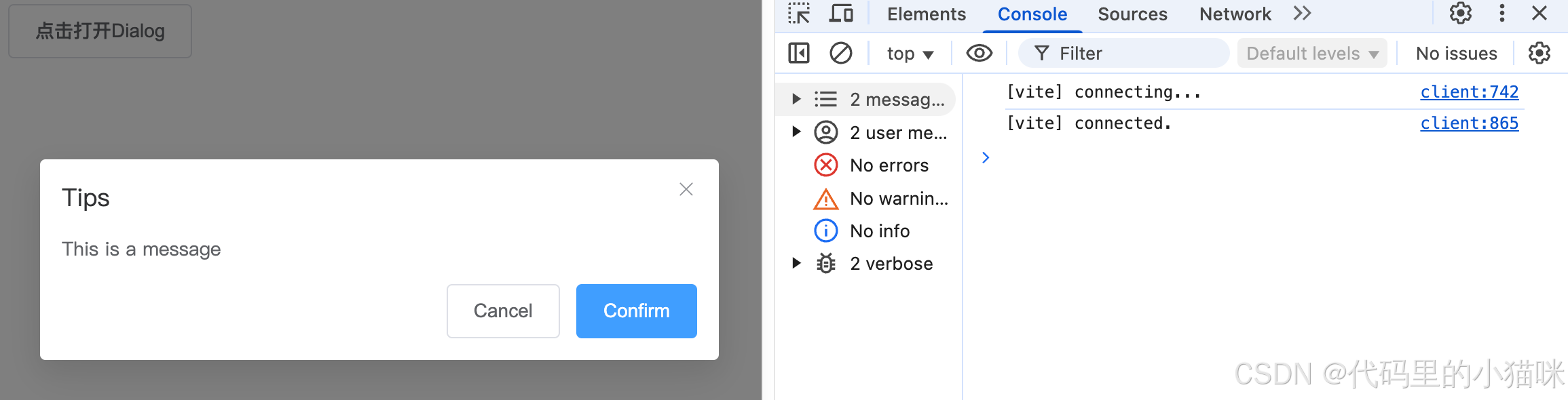
而当前使用方式不够便捷,比如设置 dialogVisible 手动控制展示和隐藏,以及用 ElMessageBox.confirm 进行提示等操作较为繁琐,每次调用都需要书写一遍。期望能有一个方法,只需传入提示文本即可直接调用。
封装后的 showDialog 方法如下:支持链式调用和灵活扩展。
// utils/dialog.ts
import { h, render, type Component, type VNode } from 'vue'
import { ElDialog, ElButton } from 'element-plus'

type DialogConfig = {
  title?: string
  width?: number | string
  confirmText?: string
  showCancel?: boolean
  beforeClose?: () => Promise<boolean>
}

export function showDialog(
  content: string | Component | VNode,
  config: DialogConfig = {}
): Promise<boolean> {
  return new Promise((resolve) => {
    // 创建容器
    const container = document.createElement('div')

    // 关闭处理
    const close = (result: boolean) => {
      render(null, container)
      container.remove()
      resolve(result)
    }

    // 创建对话框组件
    const dialog = h(ElDialog, {
      title: config.title || '提示',
      modelValue: true,
      width: config.width || '500px',
      'onUpdate:modelValue': (val: boolean) => val || close(false),
      beforeClose: async (done: () => void) => {
        if (config.beforeClose) {
          const allowClose = await config.beforeClose()
          allowClose ? done() : null
        } else {
          done()
        }
      }
    }, {
      default: () => typeof content === 'string' ? h('span', content) : content,
      footer: () => h('div', { class: 'dialog-footer' }, [
        config.showCancel && h(ElButton, {
          onClick: () => close(false)
        }, () => '取消'),
        h(ElButton, {
          type: 'primary',
          onClick: () => close(true)
        }, () => config.confirmText || '确认')
      ])
    })

    // 渲染到DOM
    render(dialog, container)
    document.body.appendChild(container)
  })
}
扩展配置项说明:
| 参数 | 类型 | 默认值 | 说明 |
|---|---|---|---|
| title | string | ‘提示’ | 对话框标题 |
| width | string | number | ‘500px’ | 对话框宽度 |
| confirmText | string | ‘确认’ | 确认按钮文字 |
| showCancel | boolean | false | 是否显示取消按钮 |
| beforeClose | () => Promise<boolean> | - | 关闭前的二次确认逻辑 |
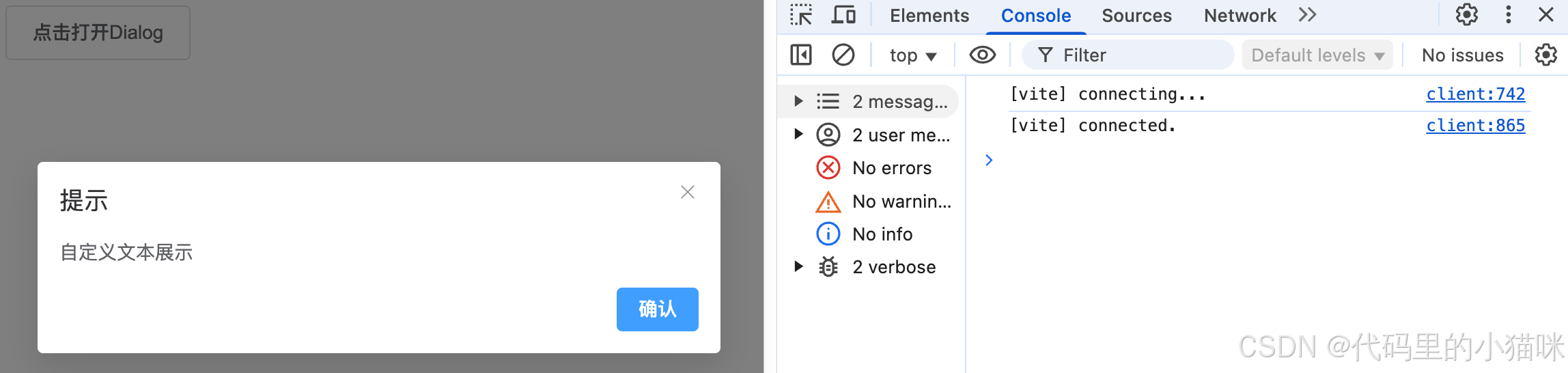
基本使用:显示简单文本
<template>
  <ElButton plain @click="handleClick">点击打开Dialog</ElButton>
</template>

<script lang="ts" setup>
import { showDialog } from '../utils/dialog';

const handleClick = () => {
  // 显示简单文本
  showDialog('自定义文本展示').then((confirmed) => {
    console.log('用户点击:', confirmed ? '确认' : '取消');
  });
};
</script>
带自定义配置
<template>
  <ElButton plain @click="handleClick">点击打开Dialog</ElButton>
</template>

<script lang="ts" setup>
import { h } from 'vue';
import { ElMessageBox } from 'element-plus';
import { showDialog } from '../utils/dialog';

const handleClick = () => {
  // 显示复杂内容
  showDialog(h('div', [h('p', '当前操作将不可恢复'), h('p', { style: 'color: red' }, '请谨慎操作!')]), {
    title: '危险操作',
    width: 600,
    confirmText: '强制删除',
    showCancel: true,
    beforeClose: async () => {
      try {
        await ElMessageBox.confirm('确认关闭?');
        return true;
      } catch {
        return false;
      }
    },
  });
};
</script>
展示为:
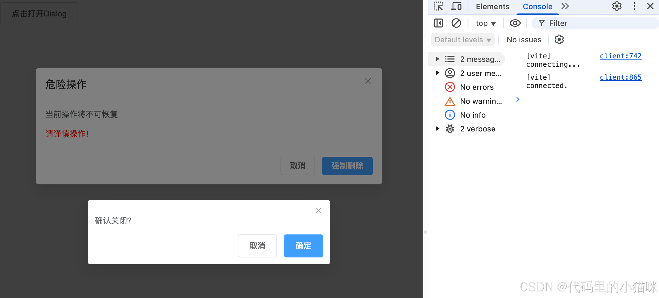
由此可见,方法使用极其简单,扩展性极强(推荐)
核心优势
- 极简调用:showDialog('内容') 即可触发弹窗
- 灵活内容:支持传入字符串、VNode 或 Vue 组件
- 链式操作:通过 Promise 处理用户操作结果
- 内存安全:自动处理组件卸载和 DOM 清理


 扫一扫
扫一扫


 7万+
7万+

 被折叠的 条评论
为什么被折叠?
被折叠的 条评论
为什么被折叠?
 到【灌水乐园】发言


