


 本文介绍了四种让盒子在页面中水平垂直居中的方法:1) 使用margin:auto;2) 利用定位(子绝父相);3) 应用flex布局;4) 通过计算外边距实现。详细解析了每种方法的实现原理和代码示例。
【盒子水平垂直居中的三种(四种)方式】
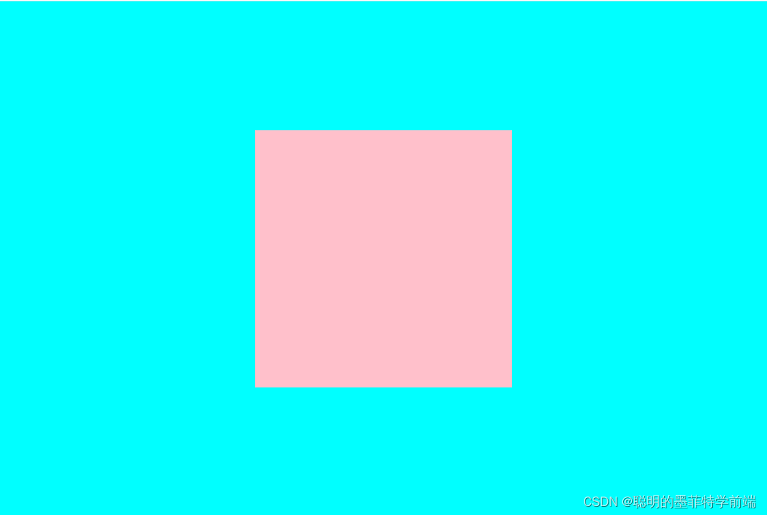
效果
方法一:利用margin:auto
margin: auto;和 margin-top: ;搭配使用
<style>
        * {
            padding: 0;
            margin: 0;
        }
        .parent {
            position: fixed;
            width: 900px;
            height: 600px;
            background-color: aqua;
        }
        .children {
            margin: auto;
            margin-top: 150px;
            width: 300px;
            height: 300px;
            background-color: pink;
        }
    </style>
</head>
<body>
    <div class="parent">
        <div class="children">

        </div>
    </div>
</body>
方法一:利用定位(子绝父相)
父盒子使用相对定位,子盒子使用绝对定位,利用top:50% left:50% 让子盒子相距父盒子上边界,左边界宽高的50% 利用 margin-top margin-left返回子盒子自身宽高的50%
<style>
        * {
            padding: 0;
            margin: 0;
        }
        .parent {
            position: relative;
            width: 900px;
            height: 600px;
            background-color: aqua;
        }
        .children {
            position: absolute;
            top: 50%;
            /* 相当于父盒子高度的50% */
            left: 50%;
            /*相对于父盒子宽度的50%*/
            margin-top: -150px;
            /*向上走回自身高度的一半*/
            margin-left: -150px;
            /*向左走回自身宽度的一半*/
            width: 300px;
            height: 300px;
            background-color: pink;
        }
    </style>
</head>
<body>
    <div class="parent">
        <div class="children">

        </div>
    </div>
</body>
方法三:利用flex布局
<style>
      * {
        padding: 0;
        margin: 0;
      }
      .parent {
        display: flex;
        /* x轴居中 */
        justify-content: center;
        /* y轴居中 */
        align-items: center;
        width: 900px;
        height: 600px;
        background-color: aqua;
      }
      .children {
        width: 300px;
        height: 300px;
        background-color: pink;
      }
    </style>
  </head>
  <body>
    <div class="parent">
      <div class="children"></div>
    </div>
  </body>
方法四:利用计算外边距(和margin:auto相似)
<style>
      * {
        padding: 0;
        margin: 0;
      }
      .parent {
        position: fixed;
        width: 900px;
        height: 600px;
        background-color: aqua;
      }
      .children {
        /* 距离上侧150px */
        margin-top: 150px;
        /* 距离左侧300px */
        margin-left: 300px;
        width: 300px;
        height: 300px;
        background-color: pink;
      }
    </style>
  </head>
  <body>
    <div class="parent">
      <div class="children"></div>
    </div>
  </body>


 扫一扫
扫一扫


 1912
1912

 被折叠的 条评论
为什么被折叠?
被折叠的 条评论
为什么被折叠?
 到【灌水乐园】发言


