 PCA算法:数据降维的实用方法


目录
- PCA 算法- Principal Component Analysis
- 數據降維算法 Data Reduction Algorithm—PCA
- Machine Learning in PCA — sklearn
PCA 算法- Principal Component Analysis
content: MachineLearning, data analyst
數據降維算法 Data Reduction Algorithm—PCA
-
Why reduce dimensionality?
- be less complex
- require less disk space
- require less computation time
- have lower chance of model overfitting 拟合过度
降維最簡單的方法是只選擇從更大的數據集中感覺重要的特征或列
→ 最難的是決定選擇哪些特征
- A linear dimension-reduction technique 線性降維技術
- It is a mathematical decomposition method that transforms variables (or features) of a large dataset (i.e., multivariate data) into a smaller one that still contains most of the information in the large dataset.
- Trade-off between accuracy and simplicity.
- Transformed datasets are easier to explore and visualise and make analysing data much easier and faster for machine learning algorithms
“feature extraction” technique: The first principal component holds the most variance in the data.
Each principal component represents a percentage of total variation captured from the data每个主成分代表了从数据中捕捉到的总变化的百分比
A technique which is used to emphasise variation(強調變異) and reveal strong patterns in a dataset. It is often used to make data easy to explore and visualise.
considered as a compression method.视为一种压缩方法
Each feature could be considered as a different dimension
PCA allows us to summarise and to visualise the information in a dataset containing individuals/observations/samples described by multiple correlated quantitative variables. PCA 使我们能够对包含由多个相关定量变量描述的个体/观察结果/样本的数据集中的信息进行总结和可视化。
是最常用的降維方法
通過PCA降維,可以使用較少的數據維度保留住較多的原始數據特征
PCA通過投影,將高維數據映射到低維空間
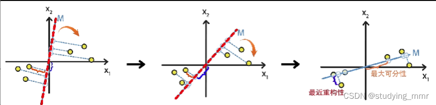
為了達到降維目的,PCA可以基於兩種思路進行優化:
目標函數都是相同的
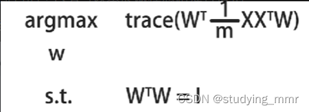
最大可分性
樣本投影到低維的超平面後能夠盡量的分開
最近重構性
樣本到所投影的低維超平面的距離,要盡可能的小
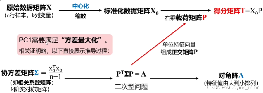
數學原理
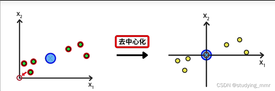
先找到樣本的中心位置 將樣本中心位置移動到圓原點 所有點的相對位置不變
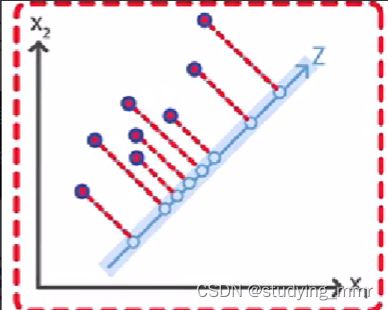
樣本到直線的距離小 → 最近重構性
投影點到原點的距離大 → 最大可分性
單獨看一個樣本
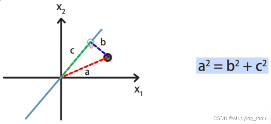
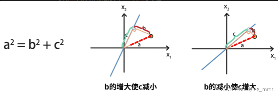
樣本到直線的距離不隨直線變化 也就是 a 2 a^2 a2不變
投影點到原點的距離最大 → 新維度下樣本的方差最大
為了使另一個維度表示出更多信息,PC1和PC2需要完全獨立
通過優先選擇方差最大的成分來實現這個目標
離群點的篩除要謹慎
Advantage
- Feature 太多的時候,可以防止overfit,方便可視化
- Feature之間相關的時候,可以去掉correlated data
什麼時候用: 特征本身過多的時候需要降維
特征之間相關性很高的時候
Disadvantage
- feature本身:會丟失一部分信息
- feature之間沒有關聯
什麼時候不用: 需要識別全部的variables的時候
要變量之間保持相互獨立的時候,並且可以解釋
操作過程
特征值(特征根)
每個成分都有一個特征根:他可以理解為該主成分攜帶了多少自變量的信息。
某一特征值/所有特征值的和 = 該特征向量的方差貢獻率(方差比例)
表示了主成分的重要性程度
值越大 越重要
提取主成分: 相關係數 or 協方差舉證
sklearn中默認是協方差矩陣,建議先標準化
注意自變量的量綱不一樣的情況下協方差矩陣和相關係數矩陣會有不同結果, 一般情況下是相同結果的。
主成分回歸 機器學習不會用到的
操作順序
-
“decorrelation” “去相關”
- Rotates data samples to be aligned with axes 旋轉數據樣本以與軸對齊
- Shifts data sample so they have mean 0
- No information is loss
Resulting PCA features are not linearly correlated 所得PCA特征不是線性相關的(”decorrelation”)
- 減少維度
Machine Learning in PCA — sklearn
sklearn.decomposition.PCA(n_components=None, copy=True, whiten=False, svd_solver='auto') 根據協方差矩陣提取主成分
#Default:
from sklearn.decomposition import PCA
PCA(n_components=None, *, copy=True, whiten=False, svd_solver='auto', tol=0.0, iterated_power='auto', n_oversamples=10, power_iteration_normalizer='auto', random_state=None)
https://scikit-learn.org/stable/modules/generated/sklearn.decomposition.PCA.html
parameter
-
n_components:int, float, None or str
沒有設定就是保留所有的主成分
n_components=2 代表返回前2个主成分
n_components=0.98,指返回满足主成分方差累计贡献率达到98%的主成分 返回達到這個結果需要的主成分
n_components=None,返回所有主成分
n_components=‘mle’,将自动选取主成分个数n,使得满足所要求的方差百分比
-
copy : bool类型, False/True
是否将原数据复制。降维,数据会变动。
copy=True时,直接 fit_transform(X),就能够显示出降维后的数据。
copy=False时,需要 fit(X).transform(X) ,才能够显示出降维后的数据。
-
whiten:bool类型,False/True
白化。白化是一种重要的预处理过程,其目的就是降低输入数据的冗余性,使得经过白化处理的输入数据具有如下性质:
(i)特征之间相关性较低
(ii)所有特征具有相同的方差。
PCA中的白化指的是要不要将PCA之后的数据标准化。
-
svd_solver:str类型,str {‘auto’, ‘full’, ‘arpack’, ‘randomized’}
奇异值分解 SVD 的方法。
默认auto,‘randomized’:适用于数据量大,数据维度多同时主成分数目比例又较低的 PCA 降维。
Attributes
-
components_:返回主成分系数矩阵 ndarray of shape (n_components, n_features)
representing the directions of maximum variance in the data 代表数据中方差最大的方向
-
explained_variance_:降维后的各主成分的方差值
The amount of variance explained by each of the selected components.
-
explained_variance_ratio_:降维后的各主成分的方差值占总方差值的比例。(主成分方差贡献率)
Percentage of variance explained by each of the selected components.每個成分所解釋的方差百分比
[Standardization標準化]
详细内容在另一篇标准化下
標準化數據
from sklearn.preprocessing import StandardScaler
scaler = StandardScaler()
df_std = pd.DataFrame(scaler.fit_transform(df), columns=df.columns)
添加一個參考點: 點云中心
- 矢量指向這個最強模式的方向
- 添加垂直與第一個向量的第二個向量來解釋該數據集中的其餘方差
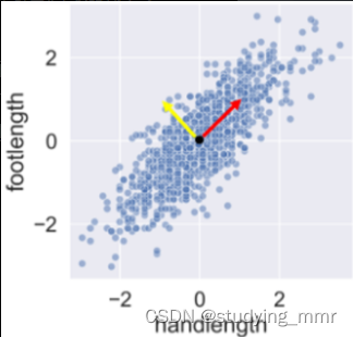
該數據集中的每個點都可以通過將這兩個垂直向量相乘然後相加來描述
→ 基本上已經創建了一個與數據差異一致的新的參考系統
每個點在這個新參考坐標系中的坐標稱為主成分
在執行操作之前,使用StandardScaler()縮放值
from sklearn.preprocessing import StandardScaler
scaler = StandardScaler()
std_df = scaler.fit_transform(df)
然後創建PCA實例並應用
from sklearn.decomposition import PCA

pca = PCA()
print(pca.fit_transform(std_df))
用處理後的數據繪製點雲不再顯示任何相關性,因此不再有重複信息
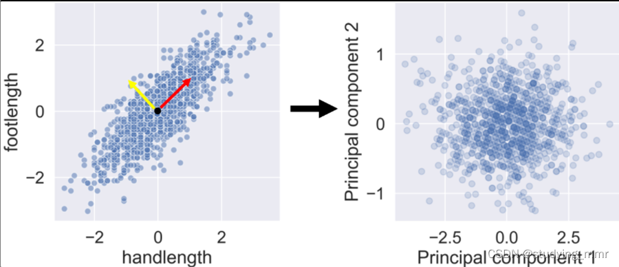
如果不想失去任何信息,還必須添加第三個主成分
explain the variance ratio attributes
將算法擬合到數據後得出每個主成分的比率 得到屬性
from sklearn.decomposition import PCA

pca = PCA()

pca.fit(std_df)

print(pca.explained_variance_ratio_)
print(pca.explained_variance_ratio_.cumsum())#通過這個可以計算選多少個主成分足夠
當處理具有大量相關性的數據集時,解釋方差通常集中在前幾個分量中,剩下的組件解釋的差異很小,可以將他們丟棄 → 決定犧牲多少解釋方差
components attributes
告訴我們每個分量的向量在多大程度上受特征影響,具有多大正面或負面影響的特征 然後使用組件為該組件添加含義
print(pca.components_)
plot -
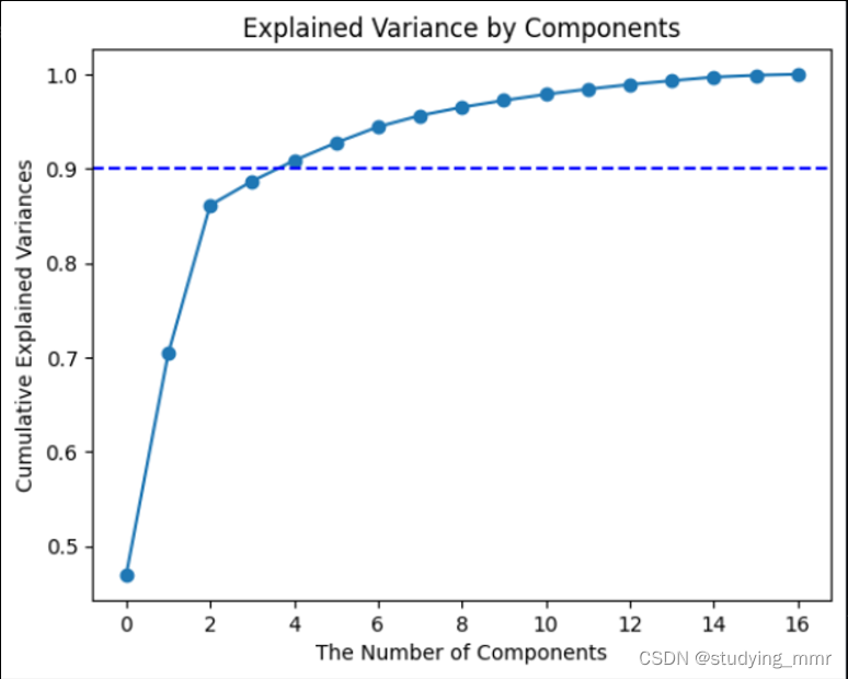
Explained Variance by Components
import matplotlib.pyplot as plt
plt.plot(pca.explained_variance_ratio_.cumsum(), marker='o', linestyle='-')#plot variance_sum follow the principal
plt.axhline(y=1, color='b', linestyle='--') # plot a line when y=1 cause this is when principal include 100% data
plt.title('Explained Variance by Components')
plt.xlabel("The Number of Components")
plt.ylabel("Cumulative Explained Variances" )
plt.show()
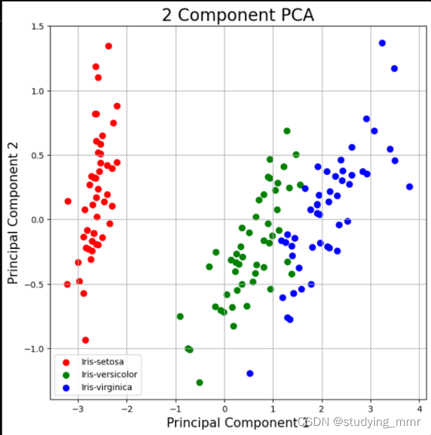
2D
import matplotlib.pyplot as plt
fig = plt.figure(figsize = (8,8)) #size of the plot
ax = fig.add_subplot(1,1,1) #Add an Axes to the current figure or retrieve an existing Axes.
ax.set_xlabel('Principal Component 1', fontsize = 15)
ax.set_ylabel('Principal Component 2', fontsize = 15)
ax.set_title('2 Component PCA', fontsize=20)
targets = ['Iris-setosa', 'Iris-versicolor', 'Iris-virginica']
colors = ['r', 'g', 'b']
for target, color in zip(targets,colors):
    indicesToKeep = finalDF['target'] == target
    ax.scatter(finalDF.loc[indicesToKeep, 'pc1']
               , finalDF.loc[indicesToKeep, 'pc2']
               , c = color
               , s = 50)
ax.legend(targets) # 根據我們的目標把下面的東西分類
ax.grid()
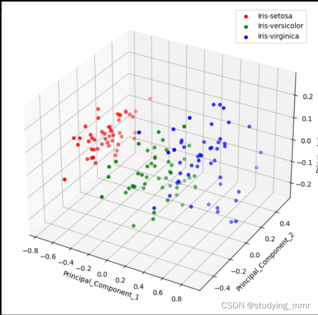
3D
from mpl_toolkits.mplot3d import Axes3D
import seaborn as sns
colors = {'Iris-setosa': 'red', 'Iris-versicolor': 'green', 'Iris-virginica': 'blue'}
#鸢尾花集合的数据作为示例
fig = plt.figure(figsize=(10, 8))
ax = fig.add_subplot(111, projection='3d')

for label, color in colors.items():
    class_finalDf_New = finalDF[finalDF['target'] == label]
    ax.scatter(
        class_finalDf_New['PC1'],
        class_finalDf_New['PC2'],
        class_finalDf_New['PC3'],
        c=color,
        label=label
    )

# Set labels for the axes
ax.set_xlabel('Principal_Component_1')
ax.set_ylabel('Principal_Component_2')
ax.set_zlabel('Principal_Component_3')

# Add a legend
ax.legend()

# Show the plot
plt.show()
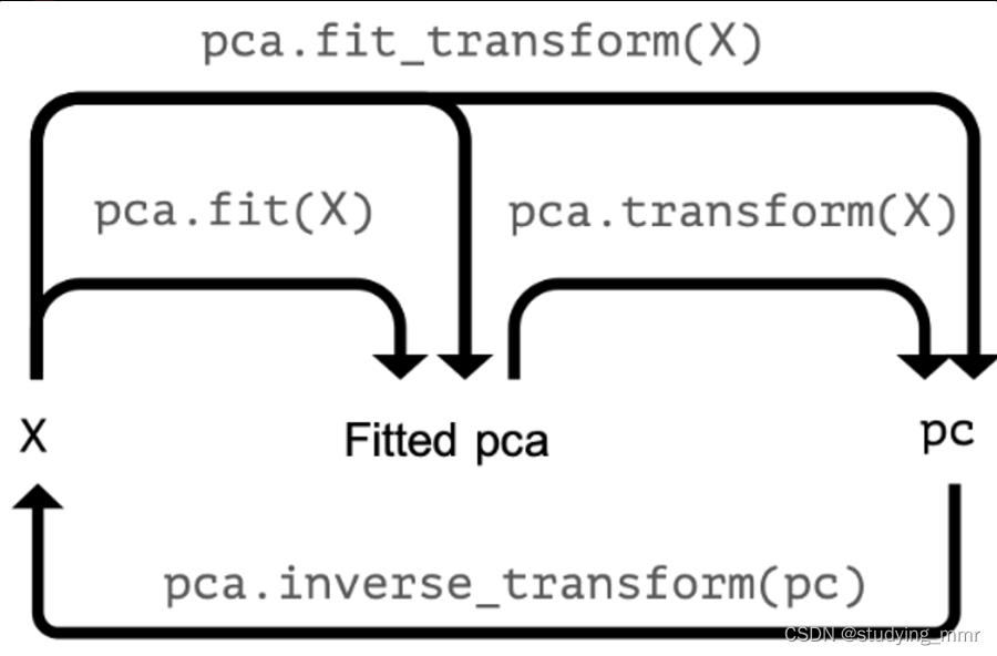
PCA in pipeline
from sklearn.preprocessing import StandardScaler
from sklearn.decomposition import PCA
from sklearn.pipeline import Pipeline

pipe = Pipeline([
				('scaler',StandardScaler()),
				('reducer', PCA()))])
pc = pipe.fit_transform(df)
print(pc[:,:2])
print(df.categories.head())
checking the effect of categorical features
df_categories['PC 1"] = pc[:,0]
df_categories['PC 2"] = pc[:,1]
sns.scatterplot(data=df_categories,
								x='PC 1', y='PC 2',
								hue='Height_class',alpha=0.4)
每個category都要畫一次圖
pipe = Pipeline([
				('scaler',StandardScaler()),
				('reducer', PCA(n_components=3)),
				('classifier',RandomForestClassifier()))])
print(pipe['reducer'])
pipe.fit(X_train, y_train)
pipe['reducer'].explained_variance_ratio_
pipe['reducer'].explained_variance_ratio_sum()
#check in test
print(pipe.score(X_test,y_test))
告訴PCA想要的最小方差的比例
→ 保留並讓算法決定實現該目標所需的PC數量 傳遞0-1之間的數字
pipe = Pipeline([
				('scaler',StandardScaler()),
				('reducer', PCA(n_components=0.9))])
#0.9意思是確保足夠的組件來解釋90%的方差
pipe.fit(df)
print(len(pipe['reducer'].components_))
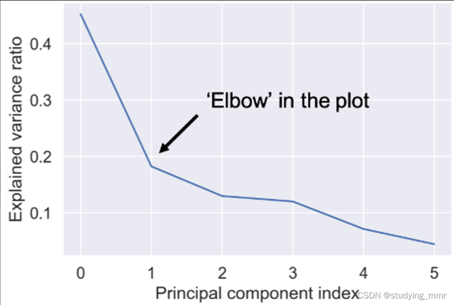
optimal number of components
pipe.fit(df)
var = pipe['reducer'].explained_variance_ratio_

plt.plot(var)

plt.xlabel('Principal component index')
plt.ylabel('Explained variance ratio')
plt.show()
plt.plot(pca.explained_variance_ratio_.cumsum(),marker='o', linestyle='-')
plt.axhline(y=0.9, color='b', linestyle='--')
plt.title('Explained Variance by Components')
plt.xlabel("The Number of Components")
plt.ylabel("Cumulative Explained Variances" )
plt.show()
PCA Image manipulation 圖像操作
print(X_test.shape)
print(X_train.shape)
pipe = Pipeline([
				('scaler',StandardScaler()),
				('reducer', PCA(n_components=290))])
pipe.fit(X_train)
#用這個擬合模型來轉換看不見的測試
pc = pipe.fit_transform(X_test)
print(pc.shape)
#perform the inverse transform operation to rebuild pixels from principal components執行逆變換操作以從主成分重建像素
X_rebuilt = pipe.inverse_transform(pc)
print(X_rebuilt.shape)
img_plotter(X_rebuilt)
Interpretation of the PCA results
Scores Plot 得分圖
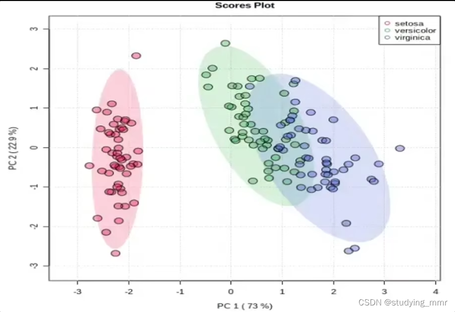
得分:樣本點在新坐標系下的坐標
特點:
- 距離越近的樣本點間相似度越高
- 所有樣本點在某個坐標軸(主成分)上的方差等於該主成分對應的特征值
Scree Plot 碎石圖
將方差由大到小排序。方差最大的主成分稱為PC1,以此類推
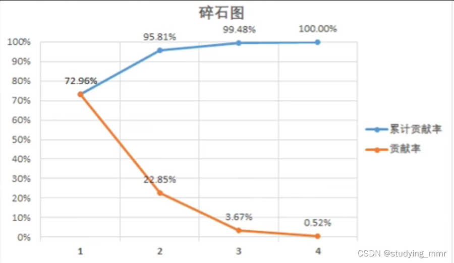
累計貢獻率能評價對原始數據的解釋程度
達到60%即可接受
達到80%即效果良好
主成分≤3才能實現可視化。
最常見是二維得分圖
Loading Plot 載荷圖
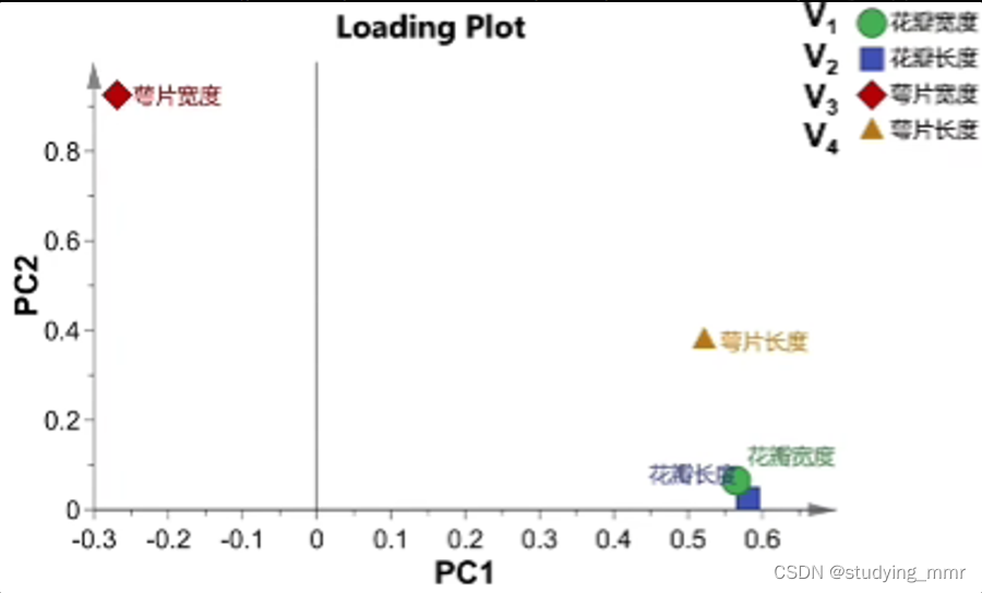
主成分是所有原始變量的線性組合
P C 1 = a 1 ∗ V 1 + b 1 ∗ V 2 + c 1 ∗ V 3 + d 1 ∗ V 4 PC1 = a_1 * V_1 + b_1 * V_2 + c_1 * V_3 + d_1 * V_4 PC1=a1∗V1+b1∗V2+c1∗V3+d1∗V4
P C 2 = a 2 ∗ V 1 + b 2 ∗ V 2 + c 2 ∗ V 3 + d 2 ∗ V 4 PC2 = a_2 * V_1 + b_2 * V_2 + c_2 * V_3 + d_2 * V_4 PC2=a2∗V1+b2∗V2+c2∗V3+d2∗V4
對於一個點來說: a 1 a_1 a1 是橫坐標 a 2 a_2 a2是縱坐標
Loading載荷: 線性組合的係數
性質:在載荷圖中,越靠近的變量間正相關性越強
PCA is not the preferred algorithm to reduce the dimensionality of categorical datasets
Pearson correlation 皮爾遜相關係數
- Measure linear correlation of feature
- Value between -1 and 1
#example
# Perform the necessary imports
import matplotlib.pyplot as plt
from scipy.stats import pearsonr

# Assign the 0th column of grains: width
width = grains[:,0]

# Assign the 1st column of grains: length
length = grains[:,1]

# Scatter plot width vs length
plt.scatter(width, length)
plt.axis('equal')
plt.show()

# Calculate the Pearson correlation
correlation, pvalue = pearsonr(width,length)

# Display the correlation
print(correlation)
Intrinsic dimension 內在維度
- Intrinsic dimension = number of features needed to approcimate the dataset 內在維度 = 近似數據集所需的特征數量
- Essential idea behind dimension reduction 降維背後的基本思維
- What is the most compact representation of the samples?
PCA identifies intrinsic dimension
- Scatter plots work only if samples have 2 or 3 feature
- PCA identifies intrinsic dimension when sample have any number of feathures當樣本具有任意數量的特征的時,PCA可以識別內在維度
- Intrinsic dimension = number of PCA feature with significant variance 內在維度 = 具有顯著方差的PCA特征的數量
房車可用作PCA模型的解釋變量屬性
import matplotlib.pyplot as plt
from sklaern.decomposition import PCA
pca = PCA()
pca.fit(samples)
plt.bar(features, pca.explained_variance_)
plt.xticks(features)
plt.ylabel('variance')
plt.xlabel('PCA feature')
plt.show()
內在維度有助於指導降維
- Intrinsic dimension is an idealization
- there is not always one correct answer
Get the first principal component
#example:
# Make a scatter plot of the untransformed points
plt.scatter(grains[:,0], grains[:,1])

# Create a PCA instance: model
model = PCA()

# Fit model to points
model.fit(grains)

# Get the mean of the grain samples: mean
mean = model.mean_

# Get the first principal component: first_pc
first_pc = model.components_[0,:]

# Plot first_pc as an arrow, starting at mean
plt.arrow(mean[0], mean[1], first_pc[0], first_pc[1], color='red', width=0.01)

# Keep axes on same scale
plt.axis('equal')
plt.show()
variance of the PCA feature
#example:
# Perform the necessary imports
from sklearn.decomposition import PCA
from sklearn.preprocessing import StandardScaler
from sklearn.pipeline import make_pipeline
import matplotlib.pyplot as plt

# Create scaler: scaler
scaler = StandardScaler()

# Create a PCA instance: pca
pca = PCA()

# Create pipeline: pipeline
pipeline = make_pipeline(scaler, pca)

# Fit the pipeline to 'samples'
pipeline.fit(samples)

# Plot the explained variances
features = range(pca.n_components_)
plt.bar(features, pca.explained_variance_)
plt.xlabel('PCA feature')
plt.ylabel('variance')
plt.xticks(features)
plt.show()
与 NMF 不同,PCA 不学习事物的各个部分。当对图像进行训练时,其组件不对应于主题(在文档的情况下)或图像的部分。通过检查 PCA 模型的组件是否适合上一个练习中的 LED 数字图像数据集来亲自验证这一点。这些图像以二维数组 samples 形式提供。还可以使用 show_as_image() 函数的修改版本,如果值为负,则将像素着色为红色。


 3740
3740

 被折叠的 条评论
为什么被折叠?
被折叠的 条评论
为什么被折叠?
 到【灌水乐园】发言


