


HTML5 & CSS3基础笔记
- HTML
- CSS
- css编写的位置
- css基本语法
- 常用选择器
- 复合选择器
- 关系选择器
- 属性选择器
- 伪类选择器
- 超链接的伪类
- 伪元素
- 选择器的权重
- 单位
- RGB值和HLS值
- 盒子模型
- 盒子边框
- 盒子模型——内边距
- 盒子模型——外边距
- 盒子模型——水平方向的布局
- 盒子模型——垂直方向的布局
- 盒子模型——外边距的重叠
- 行内元素的盒模型
- 浏览器的默认样式
- 练习
- 盒子的大小
- 轮廓阴影和圆角
- 浮动介绍
- 浮动的特点
- 简单的布局
- clear
- 使用after伪类解决高度塌陷
- clear fix
- 相对定位
- 绝对定位
- 固定定位
- 粘滞定位
- 绝对定位元素的位置
- 元素的层级
- 字体族
- 图标字体的其他使用方式
- icon font
- 行高
- 字体的简写属性
- 文本的水平和垂直对齐
- 其他的文本样式
- 表格的样式
- 表单
- ----------------------------------------------------------
- 总复习
HTML
html的基本格式
<!-- 声明当前网页的版本 html5 -->
<!doctype html>
<!-- html的根标签 所有内容都要写在里面 -->
<html>
	<!-- 是html的子元素 不会直接的显示在网页里,主要用来帮助网页来帮助浏览器和搜索引擎 -->
	<head>
		<!-- meat属于优化标签 -->
		<meta charset="utf-8">
		<!-- 会在浏览器栏出现 搜索引擎主要通过title来判断里面的内容 -->
		<title>网页的标题</title>

	</head>


	<!--是html的子元素 表示网页的主题 网页的可见的内容都写在这里面  -->
	<body>
		<!-- 网页的一个一级标题 -->
		<h1>网页可见的<font color="red" size="3">标题</font></h1>
	</body>

	<!-- w3school 文档说明	-->


</html>
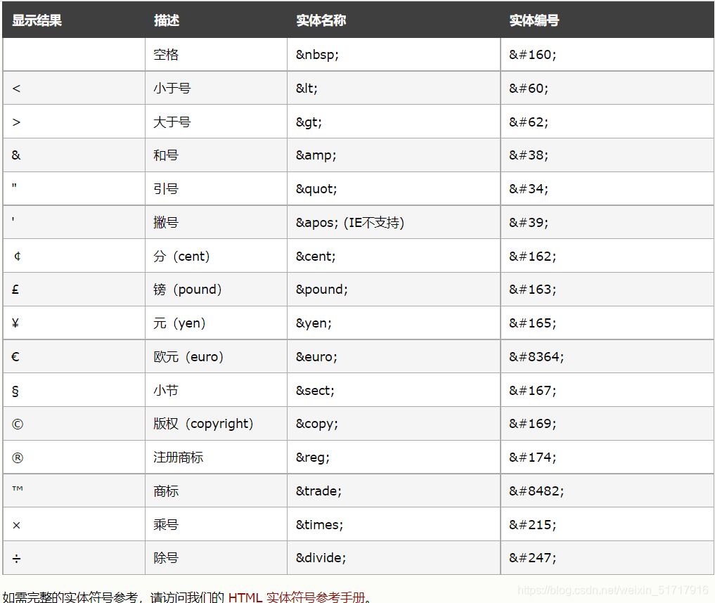
实体
<!doctype html>
<html lang="en">
<head>
<meta charset="utf-8">
<title>实体</title>
</head>
<body>
<!--
网页编写中有许多的空格都会被解析曾一个空格,则需要使用html的实体(转移字符)
常见的转移字符有
表示空格
> 表示大于号
< 表示小于号
© 表示版权
详细的可以见 w3school
-->
<p>今天 浩浩 又变帅了点</p>
<p>a>b<c</p>
</body>
</html>
w3school 中详细的实体
meta标签
<!doctype html>
<html>
<head>
    <!-- keywords 表示关键字,多个关键字用,隔开 -->
    <meta name="keywords" content="浩浩,浩浩很帅,帅哥">
    <!-- distription 表示网页的描述 -->
    <meat name="discription" content="这是一个帅哥的网页">
    <!-- 可以跳转到指定的网页   3 表示时间 后面的表示网站的地址 -->
    <meta  http-equiv="refresh" content="3,url=https://www.baidu.com">
    <!-- 网站的关键字 -->
    <title>meta的使用</title>
</head>
<body>

</body>


</html>
语义化标签—01
<!doctype html>
<html lang="en">
<head>
    <meta charset="utf-8">
    <title>语义话标签 html中点在结构</title>
</head>
<body>
    <!--
        h1的重要性仅次于 title 标签 一般一个页面中最好使用一个
        独占一行的表示 块元素  反之不占一行的称为 行内元素
     -->
    <h1>一级标题</h1>
    <h2>二级标题</h2>
    <h3>三级标题</h3>
    <h4>四级标题</h4>
    <h5>五级标题</h5>
    <h6>六级标题</h6>

    <!-- p标签表示一个段落 也是块元素 -->
    <p> p 表示一个段落</p>

     <!-- hgroup 可以将一组相关的标签放在hgroup中 -->
    <hgroup>
        <h1>浩浩帅</h1>
        <h2>其一</h2>
    </hgroup>

    <!-- em 标签表示一个语音语义的加重 -->
    <p>今天天气<em>真</em>不错</p>

    <!-- strong 表示强调重要内容 -->
    <p>今天<strong>必须</strong>完成作业</p>

    <!-- blockquote 表示一个长引用 -->
    浩浩说:
    <blockquote>
        表示一个长引用
    </blockquote>

    <!-- q表示一个短引用 -->
    浩浩说:<q>表示一个短引用</q>

    <!-- br 表示换行 -->
    <br>
    <br>
    br表示换行


</body>
</html>
块和行内
<!DOCTYPE html>
<html lang="en">
<head>
    <meta charset="UTF-8">
    <title>块元素和行内元素</title>
</head>
<body>
    <!--
        块元素:
            一般通过块元素对页面进行布局
        行内元素:
            一般用来包裹文字

        注意: 一般块元素中放行内元素
              p元素不能放块元素
     -->

     <!--浏览器解析网页时会对错误的代码进行修正  -->
    error
    <p><h1>error</h1></p>

</body>
</html>

错误代码自动解析修正
语义化标签—02
<!DOCTYPE html>
<html lang="en">
<head>
    <meta charset="UTF-8">
    <title>布局标签</title>
</head>
<body>

    <!-- 布局标签

        header      表示网页的头部
        main        表示网页的主体(一个网页只能有一个main)
        footer      表示网页的底部
        nav         表示网页中的导航
        aside       和主题相关的其他内容(侧边栏)
        article     表示一个独立的文章
        section     表示一个独立的区块

        div         没有语义,表示一个区块,主要的布局元素
        span        行内元素,没有语义,一般用来在网页中选中文字

    -->

    <header></header>
    <main></main>
    <footer></footer>
    <nav></nav>
    <aside></aside>
    <article></article>
    <section></section>

    <div></div>
    <span></span>

</body>
</html>
列表
<!DOCTYPE html>
<html lang="en">
<head>
    <meta charset="UTF-8">

    <title>列表</title>
</head>
<body>
    <!--
        无序列表:使用 ul 来创建无序列表
                 使用 li 表示列项
     -->
    <ul>
        <li>结构</li>
        <li>行为</li>
        <li>表现</li>
    </ul>

    <!--
        有序列表:使用 ol 来创建有序列表
                 使用 li 来表示列项
     -->
    <ol>
        <li>结构</li>
        <li>行为</li>
        <li>表现</li>
    </ol>

    <!--
        定义列表: 使用 dl 来创建定义列表
                  使用 dt 来表示内容
                  使用 dd 来解释内容
     -->
    <dl>
        <dt>结构</dt>
        <dd>解释:html主要负责结构</dd>
    </dl>
</body>
</html>
超链接介绍
<!DOCTYPE html>
<html lang="en">
<head>
    <meta charset="UTF-8">
    <title>超链接</title>
</head>
<body>
    <!--
        超链接可以帮我们从一个位置跳转到另一个位置,或者
        这哥页面的其他位置

        使用 a 来定义超链接
        href 指定跳转的路径
                可以时一个外部的网站
                也可以时一个内部的网站

        超链接是一个行内元素,在a标签内可以嵌套除本身外的任何元素

     -->

     <a href="https://www.baidu.com">超链接</a>
     <a href="07_列表list.html">超链接2</a>
</body>
</html>
相对路径
<!DOCTYPE html>
<html lang="en">
<head>
    <meta charset="UTF-8">
    <title>Document</title>
</head>
<body>
    <!--
        ./ 和 ../ 没写相当于默认写了 ./

        ./ 表示当前目录
        ../ 表示上一级目录

     -->
    <a href="08_超链接介绍.html">超链接1</a>
    <a href="09_相对路径.html">超链接2</a>
    <a href="../08_超链接介绍.html">超链接3</a>
    <a href="./09_相对路径.html">超链接4</a>
</body>
</html>
超链接的其他用法
<!DOCTYPE html>
<html lang="en">
<head>
    <meta charset="UTF-8">
    <title>Document</title>
</head>
<body>
    <!--
        属性 target: 来确定超链接打开的位置
                _self    默认值;在当前页面打开
                _blank   在新的一个页面打开
     -->
     <!-- 在当前页面打开超链接1 -->
    <a href="https://www.baidu.com" target="_self">超链接1</a>
    <!-- 重新打开一个页面打开超链接2 -->
    <a href="https://www.baidu.com" target="_blank">超链接2</a>
    <br><br>

    <!--
        - 将 href 设置成 # 可以回到顶部的位置

        - 标签可以加个属性 id 给定一个给定一个唯一的标识符
          可以跳到指定的位置上面
        - 将 href 设置成 Javascript:;进行占位 ,页面不发生任何的条装
     -->
    <a href="#a1">到底部</a>

    <a href="#p2">到指定的位置</a>

    <p>Lorem ipsum dolor sit, amet consectetur adipisicing elit. Natus animi provident illum aliquid incidunt veniam pariatur officiis, nemo ut odio adipisci deleniti obcaecati molestiae sit tenetur cupiditate accusantium optio cumque.</p>
    <br><br><br><br><br><br><br><br><br><br><br><br><br><br><br><br><br><br><br><br>
    <p id=p2>今天天气好</p>
    <br><br><br><br><br><br><br><br><br><br><br><br><br><br><br><br><br><br><br><br>
    <br><br><br><br><br><br><br><br><br><br><br><br><br><br><br><br><br><br><br><br>

    <a id=a1 href="#">回到顶部</a>
    <br>
    <a href="javascript:;">利用 javascript:;进行占位,不会发生任何跳转</a>
</body>
</html>
图片标签
<!DOCTYPE html>
<html lang="en">
<head>
    <meta charset="UTF-8">
    <title>图片标签</title>
</head>
<body>
    <!--
        - img 是一个自结束标签
        - src 指图片的路径
        - alt 指图片的描述,默认情况下不会显示,搜索引擎通过 alt 的内容来识别图片
        - width 图片的宽度 (单位像素)
        - height 图片的高度 (高度和宽度 修改了一个,另一个也会等比例缩放)
     -->

    <!-- 引入一个内部图片 -->
    <img width="500" height="225" src="img/01.jpg" alt="帅照">
    <!-- 引入一个外部图片 -->
    <img height="300" src="https://img2.baidu.com/it/u=3840277674,3692629638&fm=26&fmt=auto&gp=0.jpg" alt="钢铁侠">

</body>
</html>
图片格式
<!DOCTYPE html>
<html lang="en">
<head>
    <meta charset="UTF-8">

    <title>图片的格式</title>
</head>
<body>
    <img src="img/02.jpg" alt="帅照" widtth="200" height="600">
     <!--
        图片的格式有:
            - jpeg(jpg)
                -支持的颜色比较丰富,不支透明效果的,不支持动图
                - 一般用于显示图片
            - gif
                -支持的颜色比较少,支持简单的透明,不支持动图
                - 一般用于颜色单一的图片。动图
            - png
                - 支持的颜色丰富,支持复杂透明,不支持动图
                - 颜色丰富,复杂透明图片(专为网页而生)
            -webp
                - 将图片使用 base64编码,将图片转为字符,通过字符的形式来引入
                图片
                - 一般用于和浏览器和图片一起来显示的使用
                -webp 老的浏览器支持的较少

            base64 直接百度 便可以将图片转为字符
     -->
</body>
</html>
内联框架
<!DOCTYPE html>
<html lang="en">
<head>
    <meta charset="UTF-8">
    <title>内联框架</title>
</head>
<body>
    <!--
        src  - 引入一个网页的地址
        frameborder -指定边框的大小
     -->
    <iframe src="https://www.qq.com"  width="800" height="600" frameborder="0"></iframe>
</body>
</html>
音视频播放
<!DOCTYPE html>
<html lang="en">
<head>
    <meta charset="UTF-8">
    <title>Document</title>
</head>
<body>
    <!--
         controls   - 是否允许客户播放
         autoplay   - 自动播放,但是大多数浏览器不支持客户自动播放
         loop       - 循环播放
     -->
    <audio src="" controls autoplay loop></audio>


    <!--
        除了 src 指定路径 还可以通过 source 指定路径

     -->
    <audio controls>
        对不起你的浏览器不支持播放
        <!-- 两个不会同时使用 优先使用上面的开始播放
             浏览器不支持就会显示上面的文字 -->
        <source src="">
        <source src="">
        <embed src="" type="" width="500" height="300">
    </audio>

    <!--
        embed 几乎支持所有的浏览器
        type - 指定文件的类型
     -->
    <embed src="" type="" width="500" height="300">

    <!--
        video引入视频播放
        下面格式和音频使用基本一样
     -->
    <video src="./img/03.mp4" controls autoplay loop></video>

    <video controls loop>
        <source src="./img/03.webm">
        <source src="./img/03.mp4">

    </video>


    <!--
        以上引入本地的视频
        要想引入网页的 就需要买入别人的服务器
        要不然就用内联框架
     -->
    <iframe src="https://v.qq.com/x/cover/mzc00200lxzhhqz/d0040cqqgtz.html" width="500" height="500" frameborder="0" ></iframe>
</body>
</html>
表格
<!DOCTYPE html>
<html lang="en">
<head>
    <meta charset="UTF-8">
    <meta http-equiv="X-UA-Compatible" content="IE=edge">
    <meta name="viewport" content="width=device-width, initial-scale=1.0">
    <title>Document</title>
</head>
<body>
    <table>
        <!-- tr 表示一列 -->
        <tr>
            <!-- td 表示一格 -->
            <td >
                aa
            </td>
            <!-- 表示合并横向两个单元格 -->
            <td colspan="2">
                aa
            </td>
            <td>
                aa
            </td>
        </tr>
        <tr>
            <!-- 纵向的合并连个单元格 -->
            <td rowspan="2">
                bb
            </td>
            <td>
                bb
            </td>
            <td>
                bb
            </td>
        </tr>
    </table>

    <!-- 长表格 -->
    <table border="1" width="%50" align="center">
        <!--
            可以将一格表格分成为三个部分
                头部 thend
                主体 tbody
                底部 tfoot

                th 表示头部的单元格
         -->
        <thead>
            <tr>
                <th>日期</th>
                <th>收ru</th>
            </tr>
        </thead>
        <tbody>
        </tbody>
        <tfoot>

        </tfoot>
    </table>


</body>
</html>
CSS
css编写的位置
一、html
<!DOCTYPE html>
<html lang="en">
<head>
    <meta charset="UTF-8">
    <meta http-equiv="X-UA-Compatible" content="IE=edge">
    <meta name="viewport" content="width=device-width, initial-scale=1.0">
    <title>Document</title>
    <!--
        第二种方式(内部样式表)
            在head 中通过style 设置
            可以同时为多个标签设置各种样式

     -->
     <style>
         p{
             color: green;
         }
     </style>

     <!--
         第三种方式(外部样式表)最佳样式
            在.css文件中设置
            通过 link 标签引用
      -->
      <link rel="stylesheet" href="./02_css语法.css">
</head>
<body>
        <!--
        网页分成三部分
            结构(htnl)
            表现(css)
            行为(JavaScript)
        css
            重叠样式
     -->

    <!--
        第一种方式(内联样式)不推荐使用
            通过 style 设置
            注:开发中不允许使用

     -->
     <p style="color: red; font: size 30px;">浩浩怎么能这么帅</p>
     <p>浩浩真的太帅了</p>
</body>
</html>
二、css
p{
    color:yellow;
    font-size:20px;
}
css基本语法
<!DOCTYPE html>
<html lang="en">
<head>
    <meta charset="UTF-8">
    <title>Document</title>
    <!--
        css的基本语法
            选择器 声明块

            - 选择器 通过选择指定的页面中的指定元素
            - 声明块 通过声明指定的要素设置样式
     -->
     <style>
         p{
             color:red;
         }
         h1{
             color:green;
         }
     </style>

</head>
<body>
    <h1>浩哥</h1>
    <p>浩哥真自恋 </p>
</body>
</html
常用选择器
<!DOCTYPE html>
<html lang="en">
<head>
    <meta charset="UTF-8">

    <title>Document</title>

     <style>
        /*
        一、id 选择器
            -选中元素中的一个元素
            eg: #id{}
        */
         #id{
             color:red;
         }
         /*
        二、class 选择器
            -选中指定的多个元素
            eg: .class{}
            注意:可以选择多个值
         */
        .class{
            color:green;
        }
        /*
        三、通配选择器
            -选中页面中所有的元素
            语法 *
        */
        *{
            color:rgb(12, 79, 167);
        }
     </style>
</head>
<body>
    <p id="id">今天的天气真不错01</p>
    <p>今天的天气真不错02</p>
    <p>今天的天气真不错03</p>
    <p class="class abc">今天的天气真不错04</p>
    <p class="class">今天的天气真不错05</p>
</body>
</html>
复合选择器
<!DOCTYPE html>
<html lang="en">
<head>
    <meta charset="UTF-8">
    <title>Document</title>
    <style>
        /*
        交集选择器
            - 选中同时复合多个条件的元素
            语法: 选择器1选择器2选择器n{}
        */
        div.aa{
            color: red;
        }
        .mm.jj{
            color:yellow;
        }
        /*
        选择器分组
            - 同时选着多个选择器
            语法:选择器1,选择器

        */
        h1,span{
            color: red;
        }
    </style>
</head>
<body>
    <h1>我是h1</h1>
    <span>我是span</span>
    <div class="aa mm jj">我是div</div>
    <p class="aa">我是p</p>
</body>
</html>
关系选择器
<!DOCTYPE html>
<html lang="en">
<head>
    <meta charset="UTF-8">
    <meta http-equiv="X-UA-Compatible" content="IE=edge">
    <meta name="viewport" content="width=device-width, initial-scale=1.0">
    <title>Document</title>
    <style>
        /*
        一、子元素选择器
            - 选中指定的父元素的指定子子元素
            语法: 父元素>子元素
        */
        div.tag>span{
            color: red;
        }

        /*
        二、后代元素选择器
            - 选中指定元素内的所有子元素
            语法 祖先 后代
        */
        div span{
            color: green;
        }
        /*
        三、兄弟选择器
            -选择下一个选择器,找下一个
            语法: 前一个 + 后一个
        */
        p + span{
            color: lawngreen;
        }
        /*
        选着下面所有的用 ~ 号
        */
        p ~ span{
            color: lawngreen;
        }
    </style>
</head>
<body>
    <div class="tag">
        今天天气真好
        <p>
            真的好哇!
            <span>
                今天星期一
            </span>
        </p>
        <span>
            又有人向我告白了...
        </span>
    </div>
    <div>
    <span>我是div外面的span</span>
    </div>
</body>
</html>
属性选择器
<!DOCTYPE html>
<html lang="en">
<head>
    <meta charset="UTF-8">
    <title>Document</title>
    <style>
        /*
        [属性名]         - 选择含有属性名的
        [属性名=属性值]  -选着含有属性名和属性值的
        [属性名^=属性值] -选着已属性值开头的
        [属性名$=属性值] -选着已属性值结尾的
        [属性名*=属性值] -只要含有指定的值的就可以
        */
        p[title]{
            color: lightcoral;
        }
        p[title=aaa]{
            color:yellow;
        }
        p[title^=aaa]{
            color: turquoise;
        }
        p[title$=fff]{
            color: blue;
        }
        p[title*=a]{
            color: brown;
        }
    </style>
</head>
<body>
    <p title="aaa">今天的天气真不错01</p>
    <p title="bbb">今天的天气真不错02</p>
    <p title="ccc">今天的天气真不错03</p>
    <p title="aaafff">今天的天气真不错04</p>
    <p title="fff">今天的天气真不错05</p>
    <p >今天的天气真不错06</p>
    <p >今天的天气真不错07</p>
</body>
</html>
伪类选择器
<!DOCTYPE html>
<html lang="en">
<head>
    <meta charset="UTF-8">
    <meta http-equiv="X-UA-Compatible" content="IE=edge">
    <meta name="viewport" content="width=device-width, initial-scale=1.0">
    <title>Document</title>
</head>

<style>
    /*
    伪类:选择第一个选择
       选择第一个子元素         :first-child
       选择最后一个子元素       :last-child
       选中第n个子元素          :nth-child(n)
                    特殊值:  n 选择所有
                             2n 或 even 选择偶数
                             2n+1 或 odd 选择奇数
        注:在所有中元素进行排序的....  没有就不会显示
  -------------------------------------------------------------------

                               :first-of-type
                               :last-of-type
                               :nth-of-type()
        注:根上面功能类似,在同元素中进行排序
-------------------------------------------------------------------
        :not() 否定元素
         -符合元素中去除


    */
    ui > li:first-child{
        color: brown;
    }
    ui > li:last-child{
        color: yellow;
    }
    ui > li:nth-child(4){
        color: blue;
    }
    ui > li:first-of-type{
        color: brown;
    }

    /* :not() 指定去除选择器中第三个元素 */
    ui > li:not(:nth-of-type(3)){
        color: brown;
    }

</style>
<body>
    <ui>
        <span>不同元素</span>
        <li>第一个</li>
        <li>第二个</li>
        <li>第三个</li>
        <li>第四个</li>
        <li>第五个</li>
    </ui>
</body>
</html>
超链接的伪类
<!DOCTYPE html>
<html lang="en">
<head>
    <meta charset="UTF-8">
    <meta http-equiv="X-UA-Compatible" content="IE=edge">
    <meta name="viewport" content="width=device-width, initial-scale=1.0">
    <title>Document</title>
    <style>
        /*
        a:link
           - 表示没有访问过的链接(正常的链接)
        */

        a:link{
            color:blue;


        }
        /* --------------------------------------------- */
        /*
        a:visited
          - 表示访问过的链接
            由于隐私问题 visited 只能设置颜色元素
        */
        a:visited{
            color:red;
        }
        /* --------------------------------------------- */
        /*
        a:hover
         - 表示鼠标移动的状态
        */
        a:hover{
            color: burlywood;
        }
        /* --------------------------------------------- */
        /*
        a:active
            - 表示鼠标点击的状态
        */
        a:active{
            color: cyan;
        }

    </style>
</head>
<body>
    <a href="https://www.baidu.com">访问过的链接</a>

    <br><br>

    <a href="https://www.baidu123.com">没访问过的链接</a>
</body>
</html>
伪元素
<!DOCTYPE html>
<html lang="en">
<head>
    <meta charset="UTF-8">
    <meta http-equiv="X-UA-Compatible" content="IE=edge">
    <meta name="viewport" content="width=device-width, initial-scale=1.0">
    <title>Document</title>
    <style>
        p{
            font-size: 20px;
        }
        /*
        伪元素: ::开头
          ::first-letter 表示第一个字母
          ::first-line   表示第一行
          ::selection    表示选中的内容
          ::before       元素的开头
          ::after        元素的结尾
          注意:before 和 after 必须结合 content 属性来使用
        */
        p::first-letter{
            color: red;
            font-size: 50px;
        }
        p::first-line{
            color: blue;
        }
        p::selection{
            color: burlywood;
        }

        div::before{
            content: '周';
            color: red;
        }
        div::after{
            content: '帅';
            color: blue;
        }

    </style>
</head>
<body>
    <div>
        sdahjdsahkhasjkhfjkahfd
    </div>
    <p>凡留下开拓者足迹的地方,便必定有卓越的精神之闪光。
        纵然时代扭曲而此精神不可亵渎,纵然岁月异常而此精神不可轻薄,
        因为它乃是从祖先至我们,以人类的名义所肯定的奋勇……</p>

</body>
</html>
选择器的权重
<!DOCTYPE html>
<html lang="en">
<head>
    <meta charset="UTF-8">
    <meta http-equiv="X-UA-Compatible" content="IE=edge">
    <meta name="viewport" content="width=device-width, initial-scale=1.0">
    <title>Document</title>
    <style>
        /*
        发生样式冲突时,又优先级决定
        选择器的权重
            !important  在样式后面加上 !importtant 会优先显示
            内联样式
            id选择器
            类和伪类选择器
            元素选择器
            通配选择器    *
            继承选择器
        注:
          - 比上优先级时,将所有的元素相加时计算eg:div#tag
          - 同类选择器,优先使用下面代码的元素
        */
        div{
            color: yellow;
        }
        .abc{
            color: red ;
        }
        *{
            color: blue !important;
        }


    </style>
</head>
<body>
    <dir id='tag' class='abc'>我是一个div</dir>
</body>
</html>
单位
<!DOCTYPE html>
<html lang="en">
<head>
    <meta charset="UTF-8">
    <meta http-equiv="X-UA-Compatible" content="IE=edge">
    <meta name="viewport" content="width=device-width, initial-scale=1.0">
    <title>Document</title>
    <style>
        /*
        单位: 像素

              百分比:可以设置成为父元素属性的百分比
                      设置百分比可以使子元素跟随父元素改变而改变
              em    :会根据字体的大小改变计算
              rem   : 相对于根目录的字体大小改变而改变计算
        */
        .tag{
            width: 200px;
            height: 200px;
            background-color:red;

        }
        .tag1{
            width: 50%;
            height: 50%;
            background-color:blue;
        }
        .tag2{
            font-size: 20px;
            width: 10em;
            height: 10em;
            background-color: yellow;
        }
    </style>
</head>
<body>
    <div class="tag">
        <div class="tag1"></div>
    </div>
    <div class="tag2"></div>
</body>
</html>
RGB值和HLS值
<!DOCTYPE html>
<html lang="en">
<head>
    <meta charset="UTF-8">
    <meta http-equiv="X-UA-Compatible" content="IE=edge">
    <meta name="viewport" content="width=device-width, initial-scale=1.0">
    <title>Document</title>
    <style>
        /*
        一、RGB:
           - 通过三种颜色的不同溶度来调配出不同的颜色
           - R  红色(red)  G 绿色(green) B 蓝色(blue)
           - 每一种颜色在(0~255)之间
        */
        .tag{
            width: 100px;
            height: 100px;
            /* 000 黑色 */
            background-color: rgb(0, 0, 0);
            /* 255 255 255 白色 */
            background-color: rgb(255, 255, 255);
            /* background-color: blue; */
            /*
            /* --------------------------------------------------- */
        /*
        二、RGBA
           - 在rgb的基础上a表示颜色的透明度
        */
            background-color: rgba(106, 153, 85,0.5);
            /* --------------------------------------------------- */
        /*
        三、十六进制的RGB值:
                语法 #红色绿色蓝色
                如果颜色两位重复可以简写
                #aabbcc ---> #abc
        */
            background-color: #ff0000;
            background-color: #ff3355;
            background-color: #f35;
        /* --------------------------------------------------- */
        /*
        四、hsl值 和 hsla值
            h   色相(0~360)
            s   饱和度,颜色的溶度(0%~100%)
            l   亮度,颜色的亮度(0%~100%)
            a   透明度(0~1)
        */
        background-color: hsl(0,100%,50%,.5);

        }
    </style>
</head>
<body>
    <div class="tag"></div>
</body>
</html>
盒子模型
<!DOCTYPE html>
<html lang="en">
<head>
    <meta charset="UTF-8">
    <meta http-equiv="X-UA-Compatible" content="IE=edge">
    <meta name="viewport" content="width=device-width, initial-scale=1.0">
    <title>Document</title>
    <style>
        /*
        一、盒子模型:
                - 内容区(content)
                - 内边距(padding)
                - 边框  (border)
                - 外边距 (margin)
        */

        .tag{
        /*
        二、内容区(content)
                - 由 width 和 height 设置内容区的大小
        */
            width: 200px;
            height: 200px;
            background-color: #bfa;
        /*
        三、边框(border)
                - 边框的大小会影响盒子的大小
                - 要设置边框,至少需要三个样式,缺一不可
                    - 边框的宽度 border-width
                    - 边框的颜色 border-color
                    - 边框的样式 border-style
        */
            border-width: 10px;
            border-color:orange;
            border-style: solid;
        }
    </style>
</head>
<body>
    <div class="tag"></div>
</body>
</html>
盒子边框
<!DOCTYPE html>
<html lang="en">
<head>
    <meta charset="UTF-8">
    <meta http-equiv="X-UA-Compatible" content="IE=edge">
    <meta name="viewport" content="width=device-width, initial-scale=1.0">
    <title>Document</title>
    <style>
        .tag{
            width: 200px;
            height: 200px;
            background-color: #bfa;

            /*
            边框
                - 边框的宽度 border-width
                - 边框的颜色 border-color
                - 边框的样式 border-style


            一、边框的宽度 border-width
                - 默认值一般位为 3px
                - border-width 可以表示 4个方向的宽度
                    - 4个值 :上 右 下 左
                    - 3个值 :上 左右 下
                    - 2个值 : 上下 左右
                    - 1个值 : 上下左右
                - 除了border-width 以外还有一组 border - xxx -width
                  xxx 的值可以是  top(上)、right(右)、bottom(下)、left(左)
                  用来单独指定某一个边框
            */
            border-width: 10px 20px 30px 40px;
            border-top-width: 5px;

            /*
            二、边框的颜色 border-color
                - border-width用来指定边框的颜色,
                同时可以分别指定四个边的边框,规则和border-width一样
                - 省略不写会自动使用color颜色值

            */
            border-color:red blue orange green ;
            border-top-color: red;
            /*
            三、边框的样式 border -style
                - 必须写 默认值为 none
                - solid 表示实线
                - dotted 点状虚线
                - dashed 虚线
                - double 双线
                同时可以分别指定四个边的边框,规则和border-width一样
            */
            border-style: solid;
            border-style: dotted solid dashed double;
            border-top-style: solid;

            /*
            四、border简写属性
                - 同时可以设置上面的相关样式,没有顺序要求
                - 除了border 以外 还可以单独设置
                    - border-top
                    - border-right
                    - border-bottom
                    - border-left

            */
            border: 10px red double;
            border-top: none;
            border-top: 10px green double;
            border-right: fuchsia 20px solid;

        }
    </style>
</head>
<body>
    <div class="tag">帅</div>
</body>
</html>
盒子模型——内边距
<!DOCTYPE html>
<html lang="en">
<head>
    <meta charset="UTF-8">
    <meta http-equiv="X-UA-Compatible" content="IE=edge">
    <meta name="viewport" content="width=device-width, initial-scale=1.0">
    <title>Document</title>
    <style>
        .tag{
            width: 200px;
            height: 200px;
            background-color: #bfa;
            border:10px orange solid;
            /*
            内边距(padding)
                - 一共有四个方向的内边距
                    padding-top
                    padding-right
                    padding-bottom
                    padding-left
                - 一盒子的可见大小由 内容区、内边距、边框共同决定
            */
            padding-top: 100px;
            padding-right: 100px;
            padding-bottom: 100px;
            padding-left: 100px;

            /*
            padding 简写属性 和border-width 规则一样的
                - 下面演示
            */
            padding: 10px 20px 30px 40px;
            padding: 10px 20px 30px;
            padding: 10px 20px;
            padding: 10px;

        }
        .tag2{
            width: 100%;
            height: 100%;
            background-color: orange;
        }
    </style>
</head>
<body>
    <div class="tag">
        <div class="tag2">帅</div></div>
</body>
</html>
盒子模型——外边距
<!DOCTYPE html>
<html lang="en">
<head>
    <meta charset="UTF-8">
    <meta http-equiv="X-UA-Compatible" content="IE=edge">
    <meta name="viewport" content="width=device-width, initial-scale=1.0">
    <title>Document</title>
    <style>
        .tag{
            width: 200px;
            height: 200px;
            background-color: #bfa;
            border: 10px red solid;
            /*
            外边距:(margin)
                - 一共有四个方向的外边距
                    - margin-top
                    - margin-right
                    - margin-bottom
                    - margin-left
                - 除了可以设置正值的话,还可以设置负值,会往相反的方向移动
            */
            margin-top: 100px;
            margin-bottom: 100px;
            margin-left: 100px;
            margin-right: 100px;
            margin-top: -10px;
            /*
            margin 的简写属性
                - margin 可以同时设置四个方向的外边距,用法和padding规则一样
            */
            margin: 100px;
            margin: 100px 50px 40px 30px;

        }
    </style>
</head>
<body>
    <div class="tag">帅</div>
</body>
</html>
盒子模型——水平方向的布局
<!DOCTYPE html>
<html lang="en">
<head>
    <meta charset="UTF-8">
    <meta http-equiv="X-UA-Compatible" content="IE=edge">
    <meta name="viewport" content="width=device-width, initial-scale=1.0">
    <title>Document</title>
    <style>
        .tag{
            width: 800px;
            height: 200px;
            border: 10px red solid;
        }
        .tag1{
            width: 200px;
            height: 200px;
            background-color: #bfa;
        }
        /*
        元素的水平方向布局;
            - 子元素在其父元素中水平方向的位置由以下几个属性决定
                - margin-left
                - border-left
                - padding-left
                - width
                - padding-right
                - border-right
                - margin-right
            必须满足以上所有的相加等于其父元素内容区的宽度
            必须满足,如果不满足,则称为过度约束,则会自动的调整
                - 调整情况:
                    - 如果以上七个值之当中没有 auto情况则会自动
                      调整 margin-right值使等式成立
            - 这七个值中有三个值可以设置为auto
                    - width
                    - margin-left
                    - margin-right
                    - 某个值设置为auto,则会自动调整auto那个值使等式成立
                    - 如果将一个宽度和一个外边距设置为auto,则宽度会调整最大
                      设置为auto的外边距会自动为0
                    - 如果将三个值都设置为auto,则外边距都是0 ,宽度最大
                    - 如果将连个外边距设置为auto,宽度固定值,
                      则将外边距设置为相同的(经常使其水平居中)

        */

    </style>
</head>
<body>
    <div class="tag"><div class="tag1"></div></div>
</body>
</html>
盒子模型——垂直方向的布局
<!DOCTYPE html>
<html lang="en">
<head>
    <meta charset="UTF-8">
    <meta http-equiv="X-UA-Compatible" content="IE=edge">
    <meta name="viewport" content="width=device-width, initial-scale=1.0">
    <title>Document</title>
    <style>
        .tag{
            background-color: #bfa;
            /*
                - 默认情况下父元素的高度会被内容撑开
            */
        }
        .tag1{
            width: 100px;
            background-color: yellow;
            height: 100px;
            margin-bottom: 100px;

        }
        /* ----------------------------------------------------- */
        .box{
            width: 300px;
            height: 200px;
            background-color: #bfa;
            overflow: auto;
        /* 子元素在父元素大小的排列
                -如果子元素的大小超过看父元素,子元素会从父元素中溢出
            使用 overflow 属性来设置父元素处理溢出的子元素
                - 可选值:
                    - visible 默认值,子元素会溢出,在父元素在外部显示
                    - hidden 溢出的内容将会被裁剪,多出来部分不会显示
                    - scoroll 生成两个滚动条,通滚动条来查看完整的内容
                    - auto  根据需要生成滚动条
                - overflow-x 处理水平方向的
                - overflow-y 处理垂直方向的
        */
        }
        .box1{
            width: 200px;
            height: 400px;
            background-color: red;

        }

    </style>
</head>
<body>
    <div class="tag"><div class="tag1">
        <div class="tag1"></div></div></div>
    <div class="box">
        <div class="box1"></div>
    </div>
</body>
</html>
盒子模型——外边距的重叠
<!DOCTYPE html>
<html lang="en">
<head>
    <meta charset="UTF-8">
    <meta http-equiv="X-UA-Compatible" content="IE=edge">
    <meta name="viewport" content="width=device-width, initial-scale=1.0">
    <title>Document</title>
    <style>
        .box1,.box2{
            width: 200px;
            height: 200px;
            font-size: 100px;
        }
        .box1{
            background-color: #bfa;
            margin-bottom: 100px;
        }
        /*
        垂直外边距的重叠
            - 相邻垂直方向的外边距会发生重叠现象
        一、兄弟元素外边距重叠
            - 两者都是正值:则取两则中较大的值
            - 一正一负    :则取两则的和
            - 两者都是负值:则取两者中绝对值较大的值
        */
        .box2{
            background-color: orange;
            margin-top: 100px;
        }
        /*
        二、父元素外边距的重叠
            - 通过调 高宽 外边距来达到效果
            - 后边讲解
        */
    </style>
</head>
<body>
    <div class="box1">1</div>
    <div class="box2">2</div>
    <div class="tag">
        <div class="tag1"></div>
    </div>
</body>
</html>
行内元素的盒模型
<!DOCTYPE html>
<html lang="en">
<head>
    <meta charset="UTF-8">
    <meta http-equiv="X-UA-Compatible" content="IE=edge">
    <meta name="viewport" content="width=device-width, initial-scale=1.0">
    <title>Document</title>
    <style>
        .s1{
            background-color: yellow;
        /*
        一、行内元素盒模型
            - 行内元素不支持设置width 和 height
            - 行内元素可以设置 padding、border、margin 垂直方向的布局不会被影响

        */
        }
        .box1{
            width: 200px;
            height: 200px;
            background-color: #bfa;
        }

        a{

        /*
        display 用来设置元素显示的类型
            可选值:
                - inline 将元素设置成行内元素
                - block  将元素设置为块元素
                - inline-block 将元素设置为行内块元素
                - table  将元素设置为表格
                - none  元素不在页面中正常显示
        visibility 用来设置元素的显示状态
            可选值:
                - visible 默认值,元素在页面中正常的显示
                - hidden  元素在页面中隐藏,不显示,但依然占有位置


        */
            display: inline;
            visibility: visible;
            width: 100px;
            height: 100px;
            background-color: orange;
        }
    </style>
</head>
<body>
    <a href="javasrptt">超链接</a>
    <span class="s1">span</span>
    <div class="box1"></div>
</body>
</html>
浏览器的默认样式
<!DOCTYPE html>
<html lang="en">
<head>
    <meta charset="UTF-8">
    <meta http-equiv="X-UA-Compatible" content="IE=edge">
    <meta name="viewport" content="width=device-width, initial-scale=1.0">
    <title>Document</title>
    <style>
        /*
        默认样式:
            - 通常情况下,浏览器都会有些默认样式
            - 默认样式会影响页面的布局,通常情况下编写网页时,
              需要去除默认样式
        去除样式1:通过 *{} 可能会有写残余
        去除样式2:下载专门的 重置样式表
        */
         *{
             margin: 0;
             padding: 0;
         }
    </style>
</head>
<body>
    <div class="box1"></div>
    <p>p</p>
    <ul>
        <li>列表</li>
    </ul>
</body>
</html>
练习
一、京东图片列表
<!DOCTYPE html>
<html lang="en">
<head>
    <meta charset="UTF-8">
    <meta http-equiv="X-UA-Compatible" content="IE=edge">
    <meta name="viewport" content="width=device-width, initial-scale=1.0">
    <title>Document</title>
    <link rel="stylesheet" href="重置样式表.css">
    <style>
        .img-list{
            width: 190px;
            height: 470px;
            /* 裁剪我们溢出的内容 */
            overflow: hidden;
            background-color: #f4f4f4;
        }
        .img-list img{
            width: 100%;
        }
        .img-list li{
            margin-bottom: 9px;
        }
    </style>
</head>
<body>
    <ul class="img-list">
        <li>
            <a href="a">
                <img src="./img/4cfd67de0ee4869a.jpg.webp" alt="奶粉">
            </a>
        </li>
        <li>
            <a href="aa">
                <img src="./img/a2d67865b8a201c0.jpg.webp" alt="变形金刚">
            </a>
        </li>
        <li>
            <a href="aaa">
                <img src="./img/e642ab57f9933c39.jpg.webp" alt="苹果手机">
            </a>
        </li>
    </ul>
</body>
</html>
二、京东左侧导航栏
<!DOCTYPE html>
<html lang="en">

<head>
    <meta charset="UTF-8">
    <meta http-equiv="X-UA-Compatible" content="IE=edge">
    <meta name="viewport" content="width=device-width, initial-scale=1.0">
    <title>Document</title>
    <style>
        body{
            background-color: #bfa;
        }
        .left-nav{
            width: 190px;
            height: 450px;
            padding: 10px 0;
            background-color:#fff;

        }
        /* 设置菜单栏内部 */
        div{
            height: 25px;
            line-height: 25px;
            padding-left: 18px;


        }
        /* 设置一个鼠标移入的状态 */
        div:hover{
            background-color: #d9d9d9;

        }
        /* 设置超链接的样式 */
        a{
            font-size: 14px;
            /* 设置超链接的字体样式 */
            color: #333;
            /* 去除下划线 */
            text-decoration: none;
        }
        div a:hover{
            color: #c81623;
        }
    </style>
</head>

<body>
    <nav class="left-nav">
        <div>
            <a href="#">手机</a> /
            <a href="#">运营商</a> /
            <a href="#">数码</a>
        </div>
        <div>
            <a href="#">电脑</a>/
            <a href="#">办公</a>

        </div>
        <div>
            <a href="#">家居</a>/
            <a href="#">家具</a>/
            <a href="#">家装</a>/
            <a href="#">厨具</a>
        </div>
        <div>
            <a href="#">男装</a>/
            <a href="#">女装</a>/
            <a href="#">童装</a>/
            <a href="#">内衣</a>
        </div>
        <div>
            <a href="#">美妆</a>/
            <a href="#">个人清洁</a>/
            <a href="#">宠物</a>
        </div>
        <div>
            <a href="#">手机</a>/
            <a href="#">运营商</a>/
            <a href="#">数码</a>
        </div>
        <div>
            <a href="#">手机</a>/
            <a href="#">运营商</a>/
            <a href="#">数码</a>
        </div>
        <div>
            <a href="#">手机</a>/
            <a href="#">运营商</a>/
            <a href="#">数码</a>
        </div>
        <div>
            <a href="#">手机</a>/
            <a href="#">运营商</a>/
            <a href="#">数码</a>
        </div>
        <div>
            <a href="#">手机</a>/
            <a href="#">运营商</a>/
            <a href="#">数码</a>
        </div>
        <div>
            <a href="#">手机</a>/
            <a href="#">运营商</a>/
            <a href="#">数码</a>
        </div>
        <div>
            <a href="#">手机</a>/
            <a href="#">运营商</a>/
            <a href="#">数码</a>
        </div>
        <div>
            <a href="#">手机</a>/
            <a href="#">运营商</a>/
            <a href="#">数码</a>
        </div>
    </nav>
</body>

</html>
三、 网易新闻列表
<!DOCTYPE html>
<html lang="en">
<head>
    <meta charset="UTF-8">
    <meta http-equiv="X-UA-Compatible" content="IE=edge">
    <meta name="viewport" content="width=device-width, initial-scale=1.0">
    <title>Document</title>
    <style>
        a{
            /* 去除超链接的下划线 */
            text-decoration: none;
        }
        /* 设置 */
        .new-wrapper{
        width: 300px;
        height: 358px;
        background-color: #fff;
        /* 设置上边框 */
        border-top: #ddd;

        }
        /* 设置news-title */
        .news-title{
            display: inline-block;
            height: 30px;
            /* 设置上边框 */
            border-top: 1px red solid;
            /* 通过margin-top 将h2上移,盖住上边边框 */
            margin-top: -1px;
            margin-top: 10px;
        }
        /* 设置title中超链接的样式 */
        .news-title a{
            /* 去除下划线 */
            /* text-decoration: none; */
            /* 设置颜色 */
            color: #40406B;
            /* 字体加粗 */
            font-weight: bold;
        }
        /* 设置图片的文字的效果 */
        .news-img .img-title{
            /* 向上移动文字 */
            margin-top: -30px;
            color: #fff;
            /* 设置文件加粗 */
            font-weight: bold;
        }

    </style>
</head>
<body>
    <!-- 创建新闻列表的外侧容器 -->
    <div class="news-wrapper">
        <!-- 创建一个标题标签 -->
        <h2 class="news-title">
            <a href="#">体育</a>
        </h2>

        <!-- 创建一个图片容器 -->
        <div class="news-img">
            <img src="img/4cfd67de0ee4869a.jpg.webp" alt="费德勒">
            <h3 class="img-title">
                费德勒首负迪米 扶额头不满发挥
            </h3>
        </div>

    </div>
    <!-- 新闻列表 -->
    <ul>
        <li>
            <a href="#">aaaaaaaaaaaaaaaaaaaaaaaaaaaaaaa</a>
        </li>
        <li>
            <a href="#">aaaaaaaaaaaaaaaaaaaaaaaaaaaaaaa</a>
        </li>
        <li>
            <a href="#">aaaaaaaaaaaaaaaaaaaaaaaaaaaaaaa</a>
        </li>
        <li>
            <a href="#">aaaaaaaaaaaaaaaaaaaaaaaaaaaaaaa</a>
        </li>
    </ul>
</body>
</html>
盒子的大小
<!DOCTYPE html>
<html lang="en">
<head>
    <meta charset="UTF-8">
    <meta http-equiv="X-UA-Compatible" content="IE=edge">
    <meta name="viewport" content="width=device-width, initial-scale=1.0">
    <title>Document</title>
    <style>
        .box1{
            width: 100px;
            height: 100px;
            background-color: #bfa;
            padding: 10px;
            border: 10px red solid;
        /*
        默认情况下,盒子的可见框的大小由内容区,内边距,和边框共同决定
            - box-sizing 用来设置盒子尺寸的计算方式
                可选值:
                    - content-box 默认值,宽度和高度用来设置内容区的大小
                    - border-box 宽度和高度不会改变 ,当设置边框和内边距的
                                 时候会改变 内容区的大小 ,不会被撑开
        */
        box-sizing: content-box;
        box-sizing: border-box;
        }
    </style>
</head>
<body>
    <div class="box1"></div>
</body>
</html>
轮廓阴影和圆角
<!DOCTYPE html>
<html lang="en">
<head>
    <meta charset="UTF-8">
    <meta http-equiv="X-UA-Compatible" content="IE=edge">
    <meta name="viewport" content="width=device-width, initial-scale=1.0">
    <title>Document</title>
    <style>
        .box1{
            width: 200px;
            height: 200px;
            background-color: #bfa;
            /*
            一、outline - 用来设置元素的轮廓,不会撑开下面的内容
                    - 轮廓和边框的不同点,就是轮廓不会影响可见框的大小

            */
            outline:10px red solid;

            /*
            二、box-shadow - 用来设置元素的阴影效果,阴影效果不会影响页面布局
                    第一个值 水平偏移量 正值向右移动 负值向左移动
                    第二个值 垂直偏移量 正值向下移动 负值向上移动
                    第三个值 阴影的模糊半径
                    第四个值 阴影颜色
            */
            box-shadow: 20px -30px 50px orange;
        }
        .box1:hover{
            outline: 10px red solid;
        }
        .box2{
            width: 200px;
            height: 200px;
            background-color: orange;
            /*
            三、border-radius 用来设置圆角,设置圆角的半径的大小
                    - border-top-left-radius 设置 左上角
                    - border-top-right-radius 设置右上角
                    - border-bottom-left radius 设置 左下角
                    - border-bottom-right-radius 设置右上角
            */
            /* 第一个值是水平方向 第二个是水平方向 */
            border-top-left-radius: 50px 100px;
            /*
            值: 四个值  左上 右上 右下 左下
                三个值  左上  右上/左下 右下
                两个值  左上/右上  右上/左下
                一个值  全部共享
            */
            border-radius: 50px 5px 3px 70px;
            /* x  y 结构 */
            border-radius: 20px/70px;
            /* 设置为一个圆形 */
            border-radius: 50%;


        }


    </style>

</head>

<body>
    <div class="box1"></div>
    <br><br><br><br>

    <div class="box2"></div>

</body>
</html>
浮动介绍
<!DOCTYPE html>
<html lang="en">
<head>
    <meta charset="UTF-8">
    <meta http-equiv="X-UA-Compatible" content="IE=edge">
    <meta name="viewport" content="width=device-width, initial-scale=1.0">
    <title>Document</title>
    <style>
        .box1{
            width: 200px;
            height: 200px;
            background-color: #bfa;
            /*
            一、通过浮动可以使一个元素向其父元素的左侧和右侧移动
                    - 使用 float 属性来设置元素的浮动
                    - 可选值:
                        - none 默认值 ,元素不浮动
                        - left 元素向左浮动
                        - right 元素向右浮动
                    - 元素设置浮动后 ,水平布局公式就不用强制满足
                    - 元素设置浮动以后,完全从文档流中脱离,不会占用文档流的位置,
                      所以下面的元素会自动上来
            */
            float: left;

        }
        .box2{
            width: 200px;
            height: 200px;
            background-color: orange;
            float: left;
        }
    </style>
</head>
<body>
    <div class="box1"></div>
    <div class="box2"></div>
</body>
</html>
浮动的特点
<!DOCTYPE html>
<html lang="en">
<head>
    <meta charset="UTF-8">
    <meta http-equiv="X-UA-Compatible" content="IE=edge">
    <meta name="viewport" content="width=device-width, initial-scale=1.0">
    <title>Document</title>
    <style>
        .box1{
            width: 100px;
            height: 100px;
            background-color: #bfa;
            float: left;
            /*
            - 浮动元素不会盖住文字,文字会自动环绕在浮动元素的周围
                所以我们可以利用浮动来设置文字环绕图片的效果
            */
        }
        .box2{
            background-color: yellowgreen;
            float: left;
            /*
            - 浮动后会脱离文档流
                -脱离文档流的特点
                    - 块元素:
                        1、块元素不会独占一行
                        2、宽度和高度和内容撑开
                    - 行内元素:
                        1、行内元素脱离文档流变成块元素,和块元素的特点是一样的
                    - 脱离文档流后不区分块和行内元素了
            */
        }
        .s1{
            float: left;
            width: 100px;
            height: 100px;
            background-color: blue;
        }
    </style>
</head>
<body>
    <span class="s1">我是span</span>
    <!-- <div class="box1"></div> -->
    <!-- <div class="box2">hello</div> -->
</body>
</html>
简单的布局
<!DOCTYPE html>
<html lang="en">
<head>
    <meta charset="UTF-8">
    <meta http-equiv="X-UA-Compatible" content="IE=edge">
    <meta name="viewport" content="width=device-width, initial-scale=1.0">
    <title>Document</title>
    <style>

        .outer{
            border: 10px red solid;
        /*
        BFC:块级格式化环境
                - bfc是一个css的隐含的属性,可以为一个元素开启bfc
                  开启bfc该元素会变成一个独立的布局区域
                - 开启 bfc后的特点
                        1. 开启bfc的元素不会被浮动元素所覆盖
                        2. 开启bfc的元素子元素和父元素外边距不会重叠
                        3. 开启bfc的元素可以包含浮动的子元素
                - 可以通过一些特殊的方式开启bfc
                    - 设置元素浮动(不推荐)
                    - 将元素设置为块元素
                    - 将元素的overflow 设置为一个非visible的值
        */
        /* float: left; */
        /* display: inline-block; */
        overflow: hidden;
        }
                /*
        高度塌陷:
            - 在浮动布局中 ,父元素的高度是被撑开的
              当子元素浮动后,其完全会脱离文档流,子元素从文档流脱离
              从而无法撑起父元素的高度
        */
        .inner{
            width: 100px;
            height: 100px;
        background-color: #bfa;
        }

    </style>
</head>
<body>
    <div class="outer">
        <div class="inner"></div>
    </div>
</body>
</html>
clear
<!DOCTYPE html>
<html lang="en">
<head>
    <meta charset="UTF-8">
    <meta http-equiv="X-UA-Compatible" content="IE=edge">
    <meta name="viewport" content="width=device-width, initial-scale=1.0">
    <title>Document</title>
    <style>
        .box1{
            font-size: 50px;
            width: 200px;
            height: 200px;
            background-color: #bfa;
            float: left;
        }
        .box2{
            font-size: 50px;
            width: 400px;
            height: 400px;
            background-color:orange;
            float: right;
        }
        .box3{
            font-size: 50px;
            width: 200px;
            height: 200px;
            background-color: orange;
            /*
            clear
                - 作用: 清除浮动元素对当前元素所产生的影响
                - 可选值:
                    left 清除左侧浮动元素对当前元素的影响
                    right 清除右侧浮动元素对当前元素的影响
                    both  请除两侧中最大影响的那一侧
            */
            clear: left;
        }
    </style>
</head>
<body>
    <div class="box1">1</div>
    <div class="box2"></div>
    <div class="box3">3</div>
</body>
</html>
使用after伪类解决高度塌陷
<!DOCTYPE html>
<html lang="en">
<head>
    <meta charset="UTF-8">
    <meta http-equiv="X-UA-Compatible" content="IE=edge">
    <meta name="viewport" content="width=device-width, initial-scale=1.0">
    <title>Document</title>
    <style>
        .box1{
            border: 10px red solid;
        }
        .box2{
            width: 100px;
            height: 100px;
            background-color: #bfa;
            float: left;
        }
        .box3{
            clear: both;
        }
        /* 使用after伪类,来解决高度塌陷的问题 */
        .box1::after{
            content: "";
            /* 一、先把行内元素转为 块元素 */
            display: block;
            /* 使用clear 忽略浮动元素的影响 */
            clear: both;
        }
    </style>
</head>
<body>
    <div class="box1">
        <div class="box2"></div>
        <div class="box3">

        </div>
    </div>
</body>
</html>
clear fix
<!DOCTYPE html>
<html lang="en">
<head>
    <meta charset="UTF-8">
    <meta http-equiv="X-UA-Compatible" content="IE=edge">
    <meta name="viewport" content="width=device-width, initial-scale=1.0">
    <title>Document</title>
    <style>
        .box1{
            width: 200px;
            height: 200px;
            background-color: #afc;
        }
        .box2{
            width: 100px;
            height: 100px;
            background-color: blue;
            margin-top: 100px;
        }
        .clearfix::before,
        .clearfix::after{
            content: "";
            display: table;
            clear: both;
        }
    </style>
</head>
<body>
    <div class="box1 clearfix">
        <div class="box2"></div>
    </div>
</body>
</html>
相对定位
<!DOCTYPE html>
<html lang="en">
<head>
    <meta charset="UTF-8">
    <meta http-equiv="X-UA-Compatible" content="IE=edge">
    <meta name="viewport" content="width=device-width, initial-scale=1.0">
    <title>Document</title>
    <style>
        .box1{
            width: 200px;
            height: 200px;
            background-color: blue;
        }
        .box2{
            width: 200px;
            height: 200px;
            background-color: red;
            /*
            定位:(position)
                - 通过定位可以将元素摆放那个到页面的任意位置
                - 可选值
                    - static 默认值 元素不会发生任何改变
                    - relative 开启元素的相对定位
                    - absolute 开启元素的绝对定位
                    - fixed 开启元素的固定定位
                    - sticky 开启元素的粘滞定位
            */
            /*
            相对定位 relation
                - 开启相对定位后,要设置偏移量
                - 偏移量:
                    - top 定位的上边距离
                    - bottom 同上
                    - left  同上
                    - right 同上
            */
            position: relative;
            left: 200px;
            top: -200px;
        }
        .box3{
            width: 200px;
            height: 200px;
            background-color: yellow;
        }
    </style>
</head>
<body>
    <div class="box1"></div>
    <div class="box2"></div>
    <div class="box3"></div>
</body>
</html>
绝对定位
<!DOCTYPE html>
<html lang="en">
<head>
    <meta charset="UTF-8">
    <meta http-equiv="X-UA-Compatible" content="IE=edge">
    <meta name="viewport" content="width=device-width, initial-scale=1.0">
    <title>Document</title>
</head>
<body>
    <!DOCTYPE html>
<html lang="en">
<head>
    <meta charset="UTF-8">
    <meta http-equiv="X-UA-Compatible" content="IE=edge">
    <meta name="viewport" content="width=device-width, initial-scale=1.0">
    <title>Document</title>
    <style>
        .box1{
            width: 200px;
            height: 200px;
            background-color: blue;
        }
        .box2{
            width: 200px;
            height: 200px;
            background-color: red;
            /*
            绝对定位:
                - 属性position属性设置为 absolute,则开启了绝对定位
                - 如果不设置偏移量元素的位置不会发生改变
                - 开启绝对定位后,元素会脱离文档流
                - 绝对定位元素是相对于包含块进行定位的
               -包含快 containing block
                    - 正常情况下 :包含块就是离当前元素最近的祖先元素
                    - 绝对定位包含块: 离他开启最近的定位的祖先元素
                                      如果所有的祖先元素都没有开启定位元素
                                      则根元素就是他的块元素(html)

            */
            position: absolute;
            top: 0;
            left: 0;

        }
        .box3{
            width: 200px;
            height: 200px;
            background-color: yellow;
        }
        .box4{
            width: 300px;
            height: 300px;
            background-color: orange;
            position: relative;
        }
    </style>
</head>
<body>
    <div class="box1"></div>
    <div class="box4">
    <div class="box2"></div>
    </div>
    <div class="box3"></div>
</body>
</html>
</body>
</html>
固定定位
<!DOCTYPE html>
<html lang="en">
<head>
    <meta charset="UTF-8">
    <meta http-equiv="X-UA-Compatible" content="IE=edge">
    <meta name="viewport" content="width=device-width, initial-scale=1.0">
    <title>Document</title>
</head>
<body>
    <!DOCTYPE html>
<html lang="en">
<head>
    <meta charset="UTF-8">
    <meta http-equiv="X-UA-Compatible" content="IE=edge">
    <meta name="viewport" content="width=device-width, initial-scale=1.0">
    <title>Document</title>
    <style>
        .box1{
            width: 200px;
            height: 200px;
            background-color: blue;
        }
        .box2{
            width: 200px;
            height: 200px;
            background-color: red;
            /*
            固定定位:
                - 将元素的position属性设置为fixed则开启了元素的固定定位
                - 固定定位也是一种绝对定位,所以固定得的大部分特点和绝对定位一样
                        唯一不同的是固定定位永远参考于浏览器的视口进行定位
                        固定定位的元素不会随着网页的滚动而滚动
                - 一般用于广告 不动的视口使用
            */
            position: fixed;
            left: 0;
            top:  0;


        }
        .box3{
            width: 200px;
            height: 200px;
            background-color: yellow;
        }
        .box4{
            width: 400px;
            height: 400px;
            background-color: orange;

        }
        .box5{
            width: 300px;
            height: 300px;
            background-color: aliceblue;

        }
    </style>
</head>
<body>
    <div class="box1">1</div>
    <div class="box4">4
    <div class="box5">5
    <div class="box2">2</div>
    </div>
    </div>
    <div class="box3">3</div>
</body>
</html>
</body>
</html>
粘滞定位
<!DOCTYPE html>
<html lang="en">
<head>
    <meta charset="UTF-8">
    <meta http-equiv="X-UA-Compatible" content="IE=edge">
    <meta name="viewport" content="width=device-width, initial-scale=1.0">
    <title>Document</title>
    <link rel="stylesheet" href="../lianxi/重置样式表.css">
    <style>
        body{
            height: 3000px;
        }
        ul{
            width: 1210px;
            height: 48px;
            background-color: #E8e7E3;
            margin: 100PX auto;
        }
        ul li{
            float: left;
            /* line 在父元素中 居中 */
            line-height: 48px;
        }
        ul a{
            /* 将 a 转化为一个块元素 */
            display: block;
            text-decoration: none;
            color: #777777;
            font-size: 18px;
            padding: 0 38px;
        }
        /* 设置鼠标移入的状态 */
        ul a:hover{
            background-color: #3f3f3f;
        }
        /*
        粘滞定位
            - 当元素的position属性设置为sticky时则开启了元素的粘滞定位
            - 粘滞定位和相对定位的特点基本一致
                不同的是粘滞点位可以在元素达到某个位时将其固定
        */

        .box1{
            width: 100px;
            height: 100px;
            background-color: blue;
            position: sticky;
            top: 0px;
            margin-top: -100px;
        }
    </style>
</head>
<body>
    <ul>
        <li>
            <a href="#">HTML/CSS</a>
        </li>
        <li>
            <a href="#">Browser Side</a>
        </li>
        <li>
            <a href="#">Server Side</a>
        </li>
        <li>
            <a href="#">Progrm ming</a>
        </li>
        <li>
            <a href="#">Xml/a>
        </li>
        <li>
            <a href="#">Web Building</a>
        </li>
        <li>
            <a href="#">Refernce</a>
        </li>
    </ul>
    <div class="box1">1</div>
</body>
</html>
绝对定位元素的位置
<!DOCTYPE html>
<html lang="en">
<head>
    <meta charset="UTF-8">
    <meta http-equiv="X-UA-Compatible" content="IE=edge">
    <meta name="viewport" content="width=device-width, initial-scale=1.0">
    <title>Document</title>
    <style>
        .box1{
            width: 500px;
            height: 500px;
            background-color: #bfa;
            position: relative;
        }
        .box2{
            width: 100px;
            height: 100px;
            background-color:orange;
            position: absolute;
            /*
            水平布局
                left + margin-left +border-left + padding-left width +paddin ...+right

                - 当我们开启了绝对定位后:
                        -水平方向的布局等式就需要加上 left 和 right 两个值
                            此时规则和之前一样的只是多添加了两个值:
                                当发生了过度约束:
                                    如果9个值没有auto 则自动调整right 值已使等式成立
                                    如果有auto 就会自动调整 auto值,使等式成立满足
                                    - 可设置auto的值
                                        margin width left right

            垂直方向的布局等式也必须满足
                top +  marght-top/bottom + padding-top、bottom-top/bottom +height =包含快的高度


            */
            margin-top: auto;
            margin-bottom: auto;

            top: 0;
            bottom: 0;


            margin-left: auto;
            margin-right: auto;
            right: 0;
            left: 0;


        }
    </style>
</head>
<body>
    <div class="box1">
        <div class="box2"></div>
    </div>
</body>
</html>
元素的层级
<!DOCTYPE html>
<html lang="en">
<head>
    <meta charset="UTF-8">
    <meta http-equiv="X-UA-Compatible" content="IE=edge">
    <meta name="viewport" content="width=device-width, initial-scale=1.0">
    <title>Document</title>
    <style>
        body{
            font-size: 100px;
        }
        .box1{
            width: 200px;
            height: 200px;
            background-color: #bfa;
            position: absolute;
            z-index: 1;
        }
        .box2{
            width: 200px;
            height: 200px;
            background-color: orange;
            position: absolute;
            z-index: 2;
            /*
            开启定位元素,可以通过z-index属性来指定元素的层级
                - z-index 需要一个整数作为参数,值越大元素的层级越高

                如果元素的层级一样的话,则优先显示靠下的代码

                祖先的元素的层级在高也不会盖住后代元素

                z-index:3;
            */
        }
        .box3{
            width: 200px;
            height: 200px;
            background-color: yellow;
            position: absolute;
            z-index: 3;
        }

        .box4{
            width: 100px;
            height: 100px;
            background-color: tan;

        }
    </style>
</head>
<body>
    <div class="box1">1</div>
    <div class="box2">2</div>
    <div class="box3">3
        <div class="box4">4</div>
    </div>
</body>
</html>
字体族
在这里插入代码片<!DOCTYPE html>
<html lang="en">
<head>
    <meta charset="UTF-8">
    <meta http-equiv="X-UA-Compatible" content="IE=edge">
    <meta name="viewport" content="width=device-width, initial-scale=1.0">
    <title>Document</title>
    <style>
        /* font-face 可以将服务器中的字体直接提供给用户体验 */
        @font-face {
            /* 指定字体的名字 */
            font-family: '浩浩';
            /* 服务器中字体的路径 */
            src: url();
        }
        p{
            color: red;
            font-size: 40px;
            /*
            字体的相关样式
                - color 设置字体的颜色
                - font-size 字体的大小
                    em 相当于当前元素的一个font-size
                    rem 相当于根元素的一个font-size
                - font - family
                    -可选值
                        serif  衬线字体
                        sans-serif 非衬线字体
                        monospace 等宽字体
                - font-family 可以选择多个字体 之间用,隔开
                    第一个字体无法生效 使用第二个 以此类推

            */
            font-family: 'Courier New', Courier, monospace;
        }
    </style>
</head>
<body>
    <p>
        今天的天气真不错,Hello Hello How are you !
    </p>
</body>
</html>```

###  图标字体简介

```html
<!DOCTYPE html>
<html lang="en">
<head>
    <meta charset="UTF-8">
    <meta http-equiv="X-UA-Compatible" content="IE=edge">
    <meta name="viewport" content="width=device-width, initial-scale=1.0">
    <title>Document</title>
    <link rel="stylesheet" href="../HTML5_code/fas/css/all.css">
</head>
<body>
    <!--
        导入下好的 font awesome
        通过类名来使用图标字体
     -->
    <i class="fas fa-bell" ></i>
    <i class="fas fa-cat"></i>
</body>
</html>
图标字体的其他使用方式
<!DOCTYPE html>
<html lang="en">
<head>
<meta charset="UTF-8">
<meta http-equiv="X-UA-Compatible" content="IE=edge">
<meta name="viewport" content="width=device-width, initial-scale=1.0">
<title>Document</title>
<link rel="stylesheet" href="../lianxi/重置样式表.css">
<link rel="stylesheet" href="../HTML5_code/fas/css/all.css">
<style>
/*
使用方式一
*/
li::before{
content: '\f1b0';
font-family: 'Font Awesome 5 Free';
font-weight: 900;
color: blue;
margin-right: 10px;
}
</style>
</head>
<body>
<ul>
<li>浩今天真的帅</li>
<li>浩今天真的帅</li>
<li>浩今天真的帅</li>
<li>浩今天真的帅</li>
</ul>
<!--
使用方式二
-->
<i class="fas fa-bell"></i>
<!--
使用方式三
&#x图标编码
-->
<span class="fas"></span>
</body>
</html>
icon font
<!DOCTYPE html>
<html lang="en">
<head>
<meta charset="UTF-8">
<meta http-equiv="X-UA-Compatible" content="IE=edge">
<meta name="viewport" content="width=device-width, initial-scale=1.0">
<title>Document</title>
<link rel="stylesheet" href="../HTML5_code/fas/font_2827863_08quhd4q9hag/iconfont.css">
<style>
i.iconfont{
font-size: 100px;
}
p::before{
content: '\e602';
font-family: "iconfont";
font-size: 100px;
}
</style>
</head>
<body>
<!-- 第一种方式 -->
<i class="iconfont"></i>
<!-- 第种方式 -->
<i class="iconfont icon-aichegujiabeifen7"></i>
<!-- 第三种 -->
<p>hello</p>
</body>
</html>
行高
<!DOCTYPE html>
<html lang="en">
<head>
    <meta charset="UTF-8">
    <meta http-equiv="X-UA-Compatible" content="IE=edge">
    <meta name="viewport" content="width=device-width, initial-scale=1.0">
    <title>Document</title>
    <style>
        div{

            font-size: 50px;
            border: 1px red solid;
            /*
            行高(line height)
                - 通过line-height 来设置行高的大小
                    - 可以直接指定像素的大小
                    - 如果使数值的话就是字体大小的倍数
                - 行高的字体在字体框下上线平均分配
            */
            line-height: 100px;
            line-height: 1;
        }
    </style>
</head>
<body>
    <div>今天天气真不错 hello</div>
</body>
</html>
字体的简写属性
<!DOCTYPE html>
<html lang="en">
<head>
    <meta charset="UTF-8">
    <meta http-equiv="X-UA-Compatible" content="IE=edge">
    <meta name="viewport" content="width=device-width, initial-scale=1.0">
    <title>Document</title>
    <style>
        div{
            border: 1px red solid;
            /*
            font 可以设置字体相关的所有属性
                语法
                    font:字体的大小 / 行高 字体族
                    行高 可以省略不写 ,不写使用默认值
            */
            /* font-size: 50px;
            font-family: 'Courier New', Courier, monospace;
            line-height: 1; */
            /* 上下两行代码是等价的 */
            font:normal normal 50px/1  'Courier New', Courier, monospace;

            /*
            font-weight 字重 字体加粗
                可选值:
                    normal 默认值不加粗
                    bold   加粗
                    100-900 九个级别

            font-style 字体的风格
                可选值:
                    normal 正常的
                    italic 斜体

            */
            font-weight: 200;
            font-style: italic;
        }
    </style>
</head>
<body>
    <div>今天的天气真不错 hello hello</div>
</body>
</html>
文本的水平和垂直对齐
<!DOCTYPE html>
<html lang="en">
<head>
    <meta charset="UTF-8">
    <meta http-equiv="X-UA-Compatible" content="IE=edge">
    <meta name="viewport" content="width=device-width, initial-scale=1.0">
    <title>Document</title>
    <style>
        div{
            width: 500px;
            border: 1px red solid;
            /*
            text-align 文本水平对齐
                可选值:
                    left 左侧对齐
                    right 右侧对齐
                    center 居中对齐
                    justify 两端对齐
            */
            text-align: center;


        }
        .tag1{
            font-size: 50px;
            width: 500px;
            border: 1px blue solid;
            color:burlywood;
        }
        span{
            font-size: 10px;
            border: 1px yellow solid;
            /*
            vertical-align 元素垂直对齐的方式
                可选值:
                    baseline 默认值 基线对齐
                    top      顶部对齐
                    bottom   底部对齐
                    middle   居中对齐
                还可以直接指定值

            */
            vertical-align: top;
            vertical-align: 10px;
        }
        p{
            border: 1px red solid;
        }
        /*
         不设置 这个图片会基线对齐 会和底部有些距离
        */
        img{
            vertical-align: bottom;
        }
    </style>
</head>
<body>
    <div class="tag">大大的标题hello hello</div>
    <div class="tag1">
        今天天气<span>真不错he</span>llo,hello!

    </div>
    <p>
        <img src="../HTML5_code/img/01.jpg" alt="">
    </p>
</body>
</html>
其他的文本样式
<!DOCTYPE html>
<html lang="en">
<head>
    <meta charset="UTF-8">
    <meta http-equiv="X-UA-Compatible" content="IE=edge">
    <meta name="viewport" content="width=device-width, initial-scale=1.0">
    <title>Document</title>
    <style>
        .tag{
            font-size: 50px;
            /*
            text-decoration 设置文本修饰
                可选值:
                    - none 什么都没有
                    - underline 下划线
                    - line-through 删除线
                    - overline 上划线
            */
            text-decoration: underline;
        }
        .tag1{
            width: 200px;
            /*
            white-space 设置网页如何处理空白
                可选值:
                    - normal    默认值 正常
                    - nowrap    不换行
                    - pre       保留空白

            */
            white-space: nowrap;
            /* 裁剪 */
            overflow: hidden;
            /* 多余部分省略号来显示 */
            text-overflow: ellipsis;
        }
    </style>
</head>
<body>
    <div class="tag1">Lorem ipsum dolor sit amet, consectetur adipisicing elit. Esse eveniet repellendus reprehenderit eos dicta tempora. Quod, nesciunt vitae sapiente ab molestias amet perspiciatis quis, nam ill
        um fuga possimus beatae necessitatibus.</div>
    <div class="tag">今天的天气真不错</div>

</body>
</html>
表格的样式
<!DOCTYPE html>
<html lang="en">
<head>
    <meta charset="UTF-8">
    <meta http-equiv="X-UA-Compatible" content="IE=edge">
    <meta name="viewport" content="width=device-width, initial-scale=1.0">
    <title>Document</title>
    <style>
        table{
            width: 300px;
            height: 300px;
            border: 1px solid black;
            margin: 0 auto;
            /* 指定边块之间的距离 */
            border-spacing: 0px;
            /* 设置边框的合并 */
            border-collapse: collapse;

        }
        td{
            border: 1px solid black;
             /* 向下 */
            vertical-align:bottom;
            /* 居中 */
            text-align: center;
        }
        /* 利用伪类指定第几行变色 */
        tr:nth-child(2n){
            background-color: #bfa;


        }


    </style>
</head>
<body>
    <table>
        <tr>
            <td>
                学号
            </td>
            <td>
                姓名
            </td>
            <td>性别</td>
            <td>年龄</td>
            <td>地址</td>
        </tr>
        <tr>
            <td>1</td>
            <td>孙悟空</td>
            <td>男</td>
            <td>18</td>
            <td>花果山</td>
        </tr>
        <tr>
            <td>1</td>
            <td>孙悟空</td>
            <td>男</td>
            <td>18</td>
            <td>花果山</td>
        </tr>
        <tr>
            <td>1</td>
            <td>孙悟空</td>
            <td>男</td>
            <td>18</td>
            <td>花果山</td>
        </tr>
    </table>
</body>
</html>
表单
<!DOCTYPE html>
<html lang="en">
<head>
    <meta charset="UTF-8">
    <meta http-equiv="X-UA-Compatible" content="IE=edge">
    <meta name="viewport" content="width=device-width, initial-scale=1.0">
    <title>Document</title>
</head>
<body>
    <!--
        form的属性
            action 表单要提交的服务器的地址
     -->
    <form action="">
        <!-- 文本框 -->
        <br><br>
        <input type="text" name="name">
        <br><br>
        <!-- 密码框 -->
        <input type="password" name="password">
        <br><br>
        <!-- 单选按钮 -->
        <input type="radio" name="hello" value='a'>
        <!-- checked 默认选中 -->
        <input type="radio" name="hello" value='b' checked>
        <br><br>
        <!-- 多选框 -->
        <input type="checkbox" name="1">
        <input type="checkbox" name="2" checked>
        <input type="checkbox" name="3">


        <!-- =========================================== -->
        <!-- 下拉列表 -->
        <br>
        <select name="hello" id="">
            <option value="q">选项一</option>
            <option value="qq">选项二</option>
            <option value="qqq">选项三</option>
        </select>


        <!-- 用于提交 -->
        <br>
        <input type="submit" value="提交">
    </form>
</body>
</html>
----------------------------------------------------------
总复习
.zh{
    /* 文字斜体 */
    font-style: initial;

    /* 文字不斜体 */
    font-style: normal;

    /* 文字水平居中对齐  center    right 向右对齐*/
    text-align: center;

    /* 下划线 */
    text-decoration: underline;

    /* 删除线 */
    text-decoration: line-through;

    /* 上划线 */
    text-decoration: overline;

    /* 取消a默认的下划线 */
    text-decoration: none;

    /* 文本的第一行首行缩进 多少距离  */
    text-indent: 50px;

    /* 如果此时写了2em 则是缩进当前元素 2个文字大小的距离  */
    text-indent: 2em;

    /* 文字不加粗 */
    font-weight: 400;

    /* 把行内元素 a 转换为 块级元素 */
    display: block;

    /* 把 div 块级元素转换为行内元素 */
    display: inline;

    /* 把div转为行内块级元素 */
    display: inline-block;

    /* 背景图片 */
    background-image: url(images/logo.png);
    /* 1.背景图片不平铺 */
    background-repeat: no-repeat;
    /* 2.默认的情况下,背景图片是平铺的 */
    background-repeat: repeat;
    /* 3. 沿着x轴平铺 */
    background-repeat: repeat-x;
    /* 4. 沿着Y轴平铺 */
    background-repeat: repeat-y;
    /* 页面元素既可以添加背景颜色也可以添加背景图片 只不过背景图片会压住背景颜色 */

    /* 控制背景图片方位名词 */
    background-image: url(images/logo.png);
    background-repeat: no-repeat;
    /* background-position:  方位名词; */
    /* background-position: center top; */
    /* background-position: right center; */
    /* 如果是方位名词  right center 和 center right 效果是等价的 跟顺序没有关系 */
    /* background-position: center right; */
    /* 此时 水平一定是靠右侧对齐  第二个参数省略 y 轴是 垂直居中显示的 */
    /* background-position: right; */
    /* 此时 第一个参数一定是 top y轴 顶部对齐   第二个参数省略x  轴是 水平居中显示的 */
    background-position: top;

    /* 把背景图片固定住 */
    background-attachment: fixed;

    /* 背景图片复写 */
    background: black url(images/bg.jpg) no-repeat fixed center top;


    /* =================================边框==================================== */

    /* 表单合并相邻的边框 */
    border-collapse: collapse;

    /* 圆角边框 */
    border-radius: 10px;

    /* 边框变为圆形 */
    border-radius: 50%;

    /* 单独设置一个角上面的圆角 */
    border-top-left-radius: 20px;

    /* 盒子阴影效果 */
    box-shadow: 10px 10px 10px -4px rgba(0, 0, 0, .3);

    /* 设置文字的阴影的效果 */
    text-shadow: 5px 5px 6px rgba(0, 0, 0, .3);

    /* =================================浮动==================================== */
    /* 清除浮动对当前元素重最大一侧的影响 */
    clear: both;

    /* 裁剪 */
    overflow: hidden;

}


 扫一扫
扫一扫


 被折叠的 条评论
为什么被折叠?
被折叠的 条评论
为什么被折叠?
 到【灌水乐园】发言


