


文章目录
一.动画
1.动画的基本使用
2.@keyframes 定义动画
3.初步使用
二 动画常见的基本属性
1.常见的一些属性
2.复合属性和拆分属性
3.动画帧(steps实现逐帧动画)
一动画
动画( animation)是CSS3 https://so.youkuaiyun.com/so/search?q=CSS3&spm=1001.2101.3001.7020中具有颠覆性的特征之ー,可通过设置多个节点来精确控制一个或一组动画常用来实现复杂的动画效果。动画效果:实现多个状态间的变化过程,动画过程可控(重复播放、最终画面、是否暂停)
相比较过渡,动画可以实现更多变化,更多控制,连续自动插放等效果。
2.@keyframes 定义动画
基本的俩种使用的方法
第一种:from 起始的时候 to 最后的时候
/* 一. 定义动画:从200变大到600 */
        /* @keyframes change {
            from {
                width: 200px;
            }
            to {
                width: 600px;
            }
        } */
第二种 :百分比的状态
/* 二. 定义动画:200 到 500*300 到 800*500 */
        /* 百分比表示的是占用动画时长的百分比 */
        @keyframes change {
            0% {
                width: 200px;
            }
            30% {
                width: 500px;
                height: 300px;
            }
            100% {
                width: 800px;
                height: 500px;
            }
        }
1.0%是动画的开始,100%是动画的完成 就相当于 from{ } 和 to{ } 相同。
2.在使用的时候可以根据需求来选择相应的动画。
3 初步使用
在使用的时候,使用animation添加动画效果,动画名称和动画时长必须赋值。
 <style>
        .box {
            width: 200px;
            height: 100px;
            background-color: pink;
            animation: change 1s;

        }

        /* 一. 定义动画:从200变大到600 */
        /* @keyframes change {
            from {
                width: 200px;
            }
            to {
                width: 600px;
            }
        } */


        /* 二. 定义动画:200 到 500*300 到 800*500 */
        /* 百分比表示的是占用动画时长的百分比 */
        @keyframes change {
            0% {
                width: 200px;
            }
            30% {
                width: 500px;
                height: 300px;
            }
            100% {
                width: 800px;
                height: 500px;
            }
        }

    </style>
二 动画常见的基本属性
1.使用animation相关属性控制动画执行过程
2.常见的动画属性
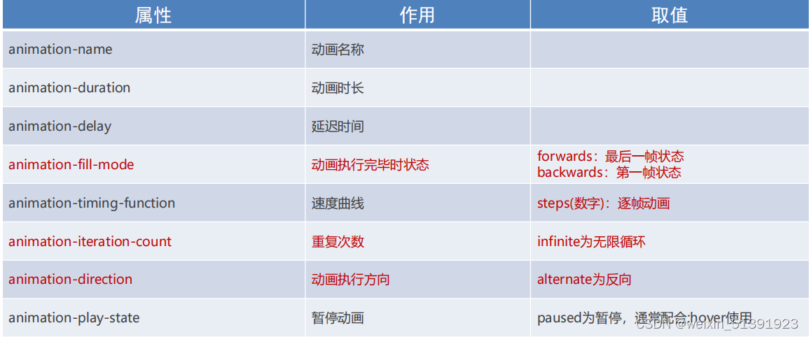
3.复合属性
 /* linear 速度曲线: 匀速 */
            animation: change 1s linear;

            /* 第二个时间表示延迟时间 */
            animation: change 1s 2s;

            /* 3:播放次数; infinite: 无限循环 */
            animation: change 1s 3;
            animation: change 1s infinite;

            /* alternate: 反向 */
            animation: change 1s infinite alternate;

            /* 播放完毕时的状态, 删除掉infinite alternate */

            /* backwards: 默认值, 动画停留在开始的状态 */
            animation: change 1s backwards;

            /* forwards: 动画停留在结束的状态 */
            animation: change 1s forwards;
基本的使用方法:
<!DOCTYPE html>
<html lang="en">
<head>
    <meta charset="UTF-8">
    <meta http-equiv="X-UA-Compatible" content="IE=edge">
    <meta name="viewport" content="width=device-width, initial-scale=1.0">
    <title>animation复合属性</title>
    <style>
        .box {
            width: 200px;
            height: 100px;
            background-color: pink;

            /* linear 速度曲线: 匀速 */
            animation: change 1s linear;

            /* 第二个时间表示延迟时间 */
            animation: change 1s 2s;

            /* 3:播放次数; infinite: 无限循环 */
            animation: change 1s 3;
            animation: change 1s infinite;

            /* alternate: 反向 */
            animation: change 1s infinite alternate;

            /* 播放完毕时的状态, 删除掉infinite alternate */

            /* backwards: 默认值, 动画停留在开始的状态 */
            animation: change 1s backwards;

            /* forwards: 动画停留在结束的状态 */
            animation: change 1s forwards;
        }

        @keyframes change {
            from {
                width: 200px;
            }
            to {
                width: 600px;
            }
        }
    </style>
</head>
<body>
    <div class="box"></div>
</body>
</html>
拆分写法:
<!DOCTYPE html>
<html lang="en">
<head>
    <meta charset="UTF-8">
    <meta http-equiv="X-UA-Compatible" content="IE=edge">
    <meta name="viewport" content="width=device-width, initial-scale=1.0">
    <title>animation拆分写法</title>
    <style>
        .box {
            width: 200px;
            height: 100px;
            background-color: pink;

            animation-name: change;
            animation-duration: 1s;
            animation-iteration-count: infinite;

            /* animation-play-state: paused; */
            animation-timing-function: steps(3);

        }

        .box:hover {
           animation-play-state: paused;
        }


        @keyframes change {
            from {
                width: 200px;
            }
            to {
                width: 600px;
            }
        }
    </style>
</head>
<body>
    <div class="box"></div>
</body>
</html>动画帧(steps实现逐帧动画)
1.动画帧使用的时候要配合精灵图的使用。在写steps的时候一定不能忘记最后的s字母
2.animation-timing-function: steps(N); 将动画过程等分成N份
3.
!DOCTYPE html>
<html lang="en">
<head>
  <meta charset="UTF-8">
  <title>精灵动画</title>
  <style>
    .box {
      /* 1680/12 */
      /***** 盒子的尺寸和一个精灵小图的尺寸是一样 */
      width: 140px;
      height: 140px;
      /* border: 1px solid #000; */
      background-image: url(./images/bg.png);

      /* steps(12) : 数字和精灵小图的个数是一样的 */
      animation:
        run 2s steps(12) infinite,
        move 3s forwards
      ;
      /* animation: ; */
    }


    /* 定义动画: 让背景图向左移动 */
    @keyframes run {
      from {
        background-position: 0 0;
      }
      to {
        background-position: -1680px 0;
      }
    }

    /* 定义动画: 位移 */
    @keyframes move {
      0% {
        transform: translateX(0);
      }
      100% {
        transform: translateX(600px);
      }
    }
  </style>
</head>
<body>
  <div class="box"></div>
</body>
</html>


 扫一扫
扫一扫


 被折叠的 条评论
为什么被折叠?
被折叠的 条评论
为什么被折叠?
 到【灌水乐园】发言


