


目录
一.样式
1.内部样式表:
语法:选择器(选择符){属性:属性值;}
<head>
    <meta charset="UTF-8">
    <meta http-equiv="X-UA-Compatible" content="IE=edge">
    <meta name="viewport" content="width=device-width>, initial-scale=1.0">
    <title>Document</title>
    <style>
        h1{
            color:red;
        }
        h2{
            color: aqua;
        }
    </style>
</head>
<body>
    <h1>
        从此无心爱凉夜
    </h1>
    <h2>任他明月下西楼</h2>
</body>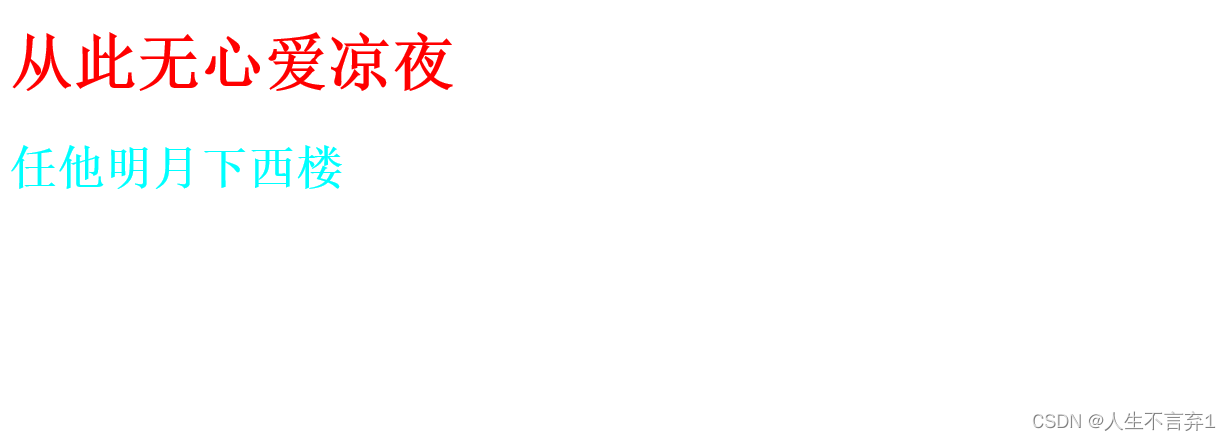
2.外部样式表
.class{
    color: aqua;
}
<head>
<meta charset="UTF-8">
<meta http-equiv="X-UA-Compatible" content="IE=edge">
<meta name="viewport" content="width=device-width, initial-scale=1.0">
<title>Document</title>
<link rel="stylesheet" type="text/css" href="E:\web\css\外部样式.css">
</head>
<body>
<h1 class="class">在天愿做比翼鸟</h1>
</body>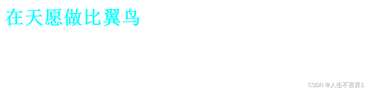
3.行内样式
<div style="color: blue; ">我是div</div>4.样式表的优先级
行内>内部>外部
二.选择器
1.标签选择器
对某种标签进行样式设计
2.类选择器
语法:.class名{属性:属性值;}
说明:
a)应为每个元素定义一个class名称
b)class选择器的语法格式:
<div class="top" ></div>
.top{
width:200px;
height:100px;
}
class选择器适合定义一类样式 :
 <style>
        .div1{
            background: rgb(163, 42, 42);
    }
        .div2{

            color:red;
            background: rgb(204, 207, 18);

        }
    </style>

</head>
<body>
    <div class="div1">走着走着就散了</div>
    <div class="div1 div2">星光也暗了</div>
</body>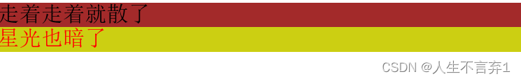
3.id选择器
语法:#id名{属性:属性值;}
说明:
a)应为每个元素定义一个id名称
b)id选择器的语法格式:
<div id="top" ></div>
#top{
width:200px;
height:100px;
}
id选择器:一个id名称只能对应文档中一个具体的元素对象(唯一性)
4.通配符选择器
语法:*{属性:属性值;}
*表示所有应用
一般用来去掉边距
5.群组选择器 (并集选择器)
语法:选择符1,选择符2,选择符3....(属性:属性值;)
说明:有多个选择符应用同一个声明时,可用“,”隔开的方式
h1,p,div,span{
color:red;}
6.后代选择器
语法: 选择符1 选择符2{
属性:属性值;
}
语义:选择器1中包含的所有选择符2
7.伪类选择器
语法:
a:link{属性:属性值;}超链接的初始状态
a:visited{属性:属性值}超链接被访问后的状态
a:hover{属性:属性值}鼠标悬停
a:active{属性:属性值}超链接被激活时的状态,即鼠标按下时超链接的状态
注意:
1.使用顺序:a:link,a:visited;a:hover;a:active
  /*链接初始状态*/
        a:link{
            color: #000;
        }
          /*访问*/
          a:visited{
            color:blueviolet;
        }
        /*鼠标悬浮*/
        a:hover{
            color: aqua;
        }
        /*鼠标按下*/
        a:active{
            color:brown;
}注意:顺序声明为lvha(:link, :visited, :hover, :active)
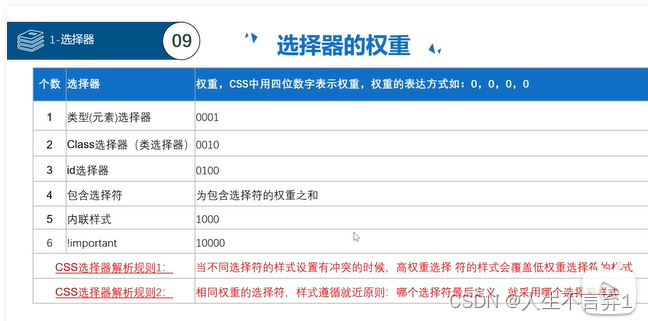
8.选择器的权重
三.CSS的元素显示模式
3.1HTML元素分类
.块元素
.行内元素
3.2块元素
1.常见的块元素
<h1> ...<h6>
<p>,<div>,<ul>,<ol>,<li>
2.块元素的特点
.独占一行
.高度,宽度,外边距,内边距都可以控制
.宽度默认是父级的100%
.是一个盒子里面可以放其他元素
3.3行内元素
1.常见的行内元素
<a> <strong> <b> <span>等
2. 行内元素的特点
.一行可以有多个行内元素
.宽高直接设置是无效的
. 默认宽度是他本身宽度
.行内元素只能容纳文本或其他行内元素
3.4显示模式的转换
转换为块元素: display:block
转换为行内元素:display:inline
转换为行内块元素:display:inline-block
3.5行内块元素
- 和相邻行内块元素再一行显示,但是他们之间会有空白缝隙。一行上可显示多个。
- 默认宽度就是它本身内容的宽度。
- 高度,宽度,行高,内边距,外边距都可以自己控制。
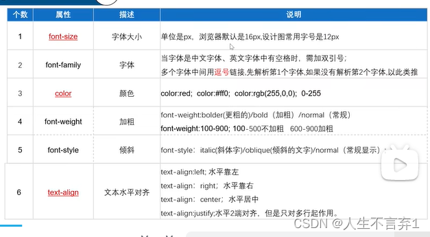
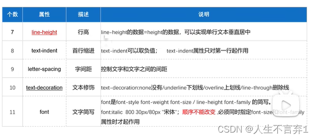
三.文本属性
案例
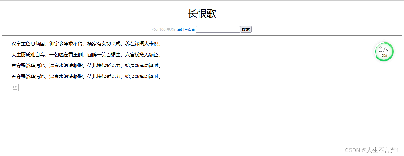
<!DOCTYPE html>
<html lang="en">
<head>
    <meta charset="UTF-8">
    <meta http-equiv="X-UA-Compatible" content="IE=edge">
    <meta name="viewport" content="width=device-width, initial-scale=1.0">
    <title>唐诗三百首</title>
    <style>
        body{
            font-size: 16px/28px;
            font-family:"Microsoft YaHei" ;
        }
        h1{
            text-align: center;
            font-weight: 400;
        }
        .gray{
            text-align: center;
            color:#8888;
            font-size: 12px;
        }
        a{
            text-decoration: none;
        }
        .serch{
            color: #6666;
            width: 170px;
        }
        .btn{
            font-weight: 700;
        }
        p{
            text-indent: 2em;
        }
    </style>
</head>
<body>
 <h1> 长恨歌</h1>
 <div class="gray">公元300   来源:<a href="#">唐诗三百首 </a>
     <input type="text" name="请输入查询条件" id="serch"><button class="btn">搜索</button>
    </div>
 <hr>

<p>汉皇重色思倾国,御宇多年求不得。
杨家有女初长成,养在深闺人未识。</p>

<p>
    天生丽质难自弃,一朝选在君王侧。
    回眸一笑百媚生,六宫粉黛无颜色。
</p>

<p>
    春寒赐浴华清池,温泉水滑洗凝脂。

    侍儿扶起娇无力,始是新承恩泽时。
</p>
<p>
    春寒赐浴华清池,温泉水滑洗凝脂。

    侍儿扶起娇无力,始是新承恩泽时。
</p>
<p>
    <img src="css\js\img\0036036359903134_b.jpg">
</p>
</body>
</html>
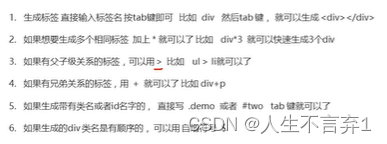
 emmet语法:
五.背景属性
七.盒子模型
1.盒子模型-内边距
(1)代码实现
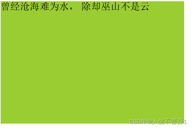
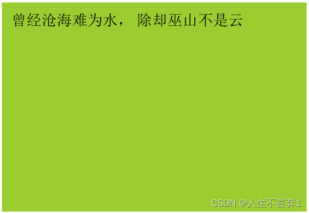
<style>
div{
width: 300px;
height: 200px;
text-align: justify;
/*内边距
1.一个值,四个方向都一样
2.两个值上下,左右
3.三个值,上,左右,下
4.四个值,上右下左*/
padding: 10px;
background-color: yellowgreen;
}
</style>
</head>
<body>
<div>
曾经沧海难为水,
除却巫山不是云
</div>
</body>
(2)效果图对比:
(3)内边距特性:
1.背景色蔓延到内边距
2.可以设置单个方向的内边距
(1)padding-right:设定值; 设置右边内边距
(2)padding-left:设定值; 设置左边内边距
(3)padding-top:设定值; 设置上边内边距
(4)padding-bottom设定值; 设置下边内边距
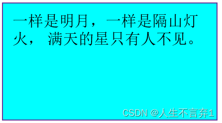
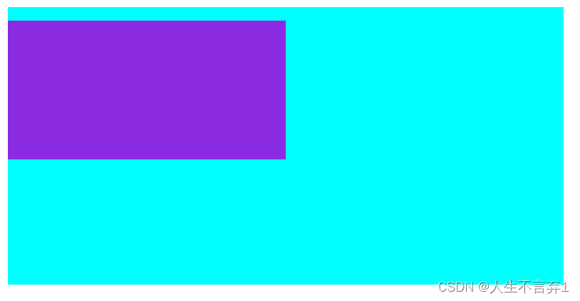
2.盒子模型-边框
(1)代码实现
<style>
      .box{
          width: 200px;
          height: 100px;
          padding: 10px;
          background-color: aqua;
          /*边框*/
          border: 1px solid rebeccapurple;
         }
    </style>

</head>
<body>
    <div class="box">
        一样是明月,一样是隔山灯火,
        满天的星只有人不见。
    </div>
</body>
</html>
效果图:
3.盒子模型-外边距
(1)代码实现
<style>
.box1{
width: 100px;
height: 100px;
background: rgb(16, 84, 185);
border: 1px solid red;
padding: 5px;
float: left;
/*设置顶部的外边距*/
margin-top: 10px;
}
.box2{
width: 100px;
height: 100px;
background: rgb(52, 67, 90);
border: 1px solid rgb(9, 211, 110);
padding: 5px;
float: left;
/*外边距
1.外边距:(1) 一个值:四个方向
(2)2个值:上下,左右
(3)3个值:上,左右,下
(4)4个值:上下左右
2.分别设置四个方向的外边距:margin-top,margin-bottom,
margin-left,margin-right
3.背景色不蔓延;
4.用于去除外边距:*{margin:0;}
5.支持负值
6.横向居中:margin:0 auto*/
margin: 10px;
}
.box3{
width: 200px;
height: 100px;
background-color: blueviolet;
border: 1px solid green;
margin: 0 auto;
text-align: center;
}
</style>
</head>
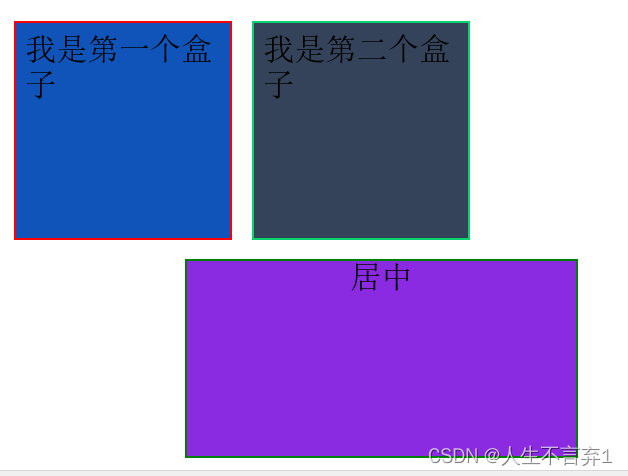
<body>
<div class="box1">我是第一个盒子</div>
<div class="box2">我是第二个盒子</div>
<div style="clear: both;"></div>
<div class="box3">居中</div>
</body>效果图:
3.盒子模型-外边距特性
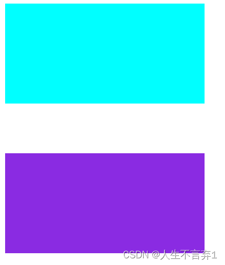
(1)兄弟关系:两个盒子垂直外边距和水平外边距的问题
垂直方向:外边距取最大值
代码:
<style>
        .box1,.box2{
            width: 200px;
            height: 100px;
        }
        .box1{
            background-color: aqua;
            margin-bottom: 50px;
        }
        .box2{
            background-color:blueviolet;
            margin-top: 20px;
        }

    </style>
</head>
<body>
    <div class="box1"></div>
    <div class="box2"></div>
</body>
示意图:
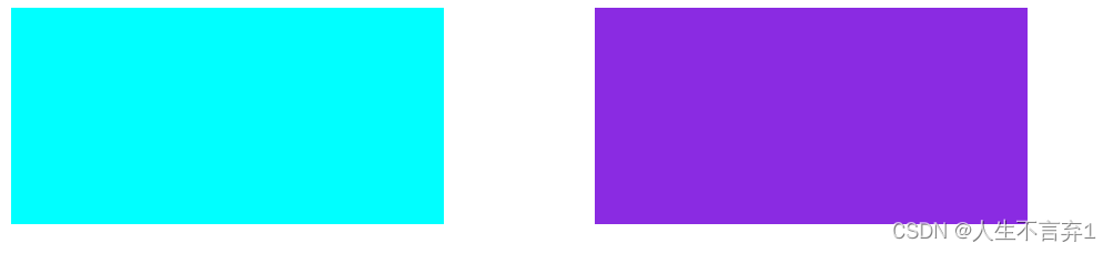
水平方向:水平方向外边距会进行合并
<style>
        .box1,.box2{
            width: 200px;
            height: 100px;
        }
        .box1{
            float: left;
            background-color: aqua;
            margin-right: 50px;
        }
        .box2{
            float: left;
            background-color:blueviolet;
            margin-left: 20px;
        }

    </style>
</head>
<body>
    <div class="box1"></div>
    <div class="box2"></div>
</body>
示意图:
(2)父子关系:给子盒子加外边距但作用与父盒子怎么解决?
1.子盒子的外边距margin-top转换为父盒子的内边距padding-top(需要重新计算父盒子高度)
2.给父盒子设置边框(需要重新计算高度)
3.让父盒子或者子盒子浮动
4.overflow:hidden
给子盒子加外边距但作用与父盒子
 <style>

        .box1{
            width: 400px;
            height:200px ;
            background-color: aqua;
        }
        .box2{
            width: 200px;
            height:100px ;
            background-color:blueviolet;
            margin-top: 10px;
        }

    </style>
</head>
<body>
    <div class="box1">
        <div class="box2"></div>
    </div>
</body> 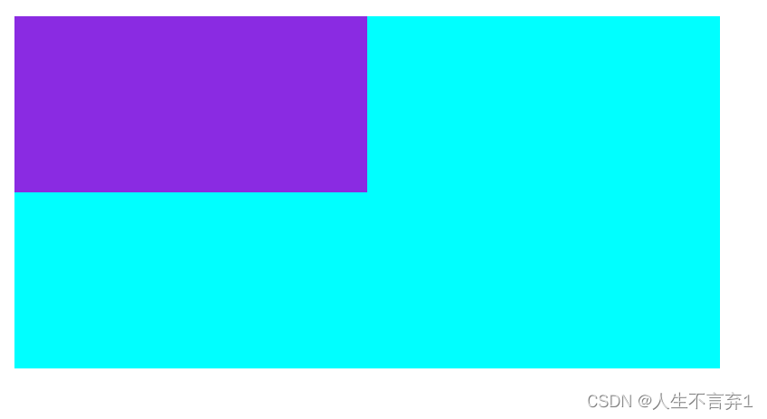
解决:
.box1{
            width: 400px;
            height:200px ;
            background-color: aqua;
            /*padding-top: 10px;*子盒子的外边距margin-top转换为父盒子的内边距padding-top*/
            /*border: 1px solid green;给父盒子设置边框*/
            /*float: left;浮动*/
            overflow: hidden;
        }
        .box2{
            width: 200px;
            height:100px ;
            background-color:blueviolet;
            margin-top: 10px;
        }

    </style>
</head>
<body>
    <div class="box1">
        <div class="box2"></div>
    </div>
</body>
效果图:
4.圆角边框
(1)原理:
.Css3中新增了圆角边框的样式,使盒子可以变圆角
语法:border-radius:10px(半径);
讲盒子变成圆形:border-radius:50%;(正方形)
  <style>
        div{
            width: 300px;
            height: 200px;
            border: 1px rosybrown solid;
            background-color: aqua;
            border-radius: 10px;
        }
    </style>
</head>
<body>
    <div>我是圆角边框</div>
</body>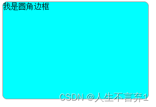
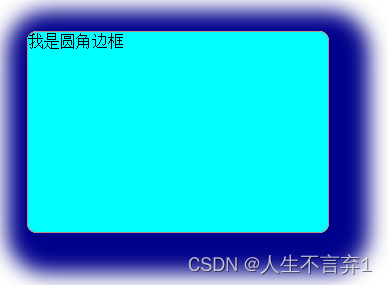
5.盒子阴影
CSS3中使用box-shadow为盒子添加阴影
语法:
box-shadow:h-shadow v-shadow blur spread color
text-shadow:给文字添加阴影
注意:盒子阴不占用空间不会影响其他盒子排列影
 div{
            width: 300px;
            height: 200px;
            border: 1px rosybrown solid;
            background-color: aqua;
            border-radius: 10px;
            box-shadow: 10px 10px 10px 10px darkblue;
            margin: 100px auto;
        }
八.浮动
8.1什么是浮动
为了让块元素在一行内显示
语法:
选择器{
float:属性值;
}
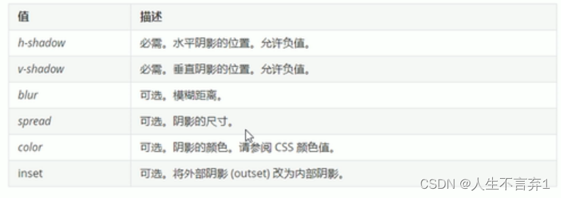
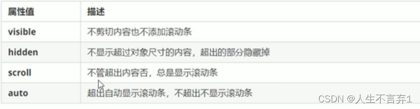
| 属性值 | 描述 |
| none | 元素不浮动(默认值) |
| left | 元素向左浮动 |
| right | 元素向右浮动 |
8.2浮动特性
1.脱标—浮动最重要的特性
.脱离标准普通流的控制,移动到指定位置(俗称脱标)。
.浮动的盒子不在保留原先的位置。
<style>
        .box1{
            width: 200px;
            height: 300px;
            background-color: aqua;
            float: left;
        }
        .box2{
            width: 300px;
            height: 400px;
            background-color: blueviolet;
        }
    </style>
</head>
<body>
    <div class="box1">我浮动</div>
    <div class="box2">我不浮动</div>

</body>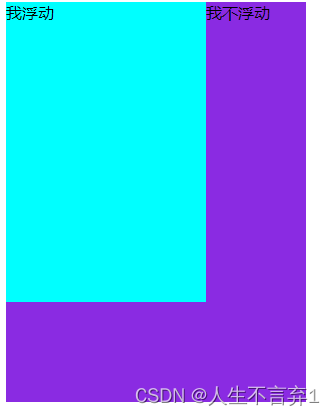
2.行显示
多个盒子都设置浮动 ,行内显示,顶端对齐。父元素装不下另起一行。
3.行内块元素特性
行内元素有了浮动,不需要转换成行内块元素/或者块元素,可以直接给高和宽。
小米 案例
 <style>
        .box{
            width: 1226px;
            height: 285px;
            background-color: antiquewhite;
            margin: 0 auto;
        }
      .box  li{
            width: 296px;
            height: 285px;
            background-color: blueviolet;
            float: left;
            margin-right:14px;

        }
      .box  .last{
            width: 296px;
            height: 285px;
            background-color: blueviolet;
            float: left;
            margin-right:0;
        }
    </style>
</head>
<body>
    <div class="box">
        <li>1</li>
        <li>2</li>
        <li>3</li>
        <li class="last">4</li>
    </div>
</body>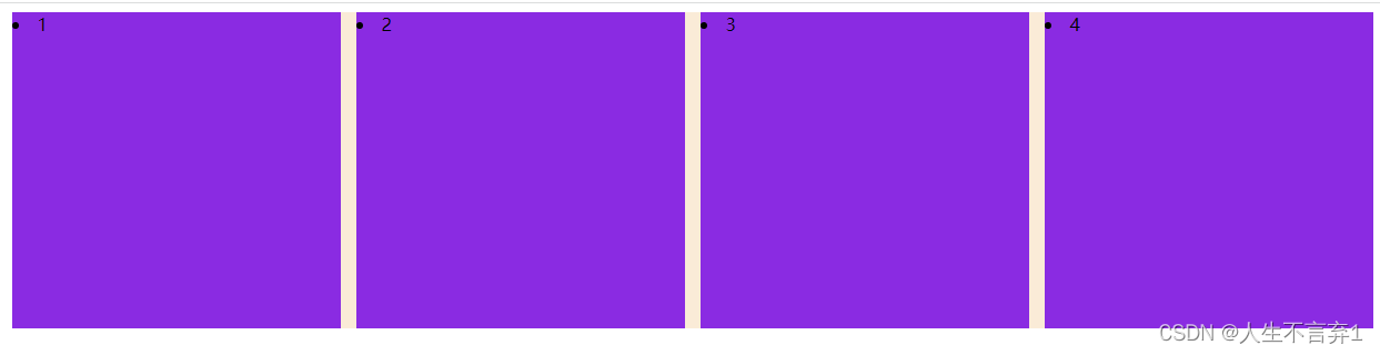
手机案例:
  <style>
        .box {
            width: 1226px;
            height: 615px;
            background-color: cadetblue;
            margin: 0 auto;
        }
         .left {
            width: 234px;
            height: 615px;
            background-color: antiquewhite;
            float: left;
        }
        .right {
            width: 992px;
            height: 615px;
            background-color:darkmagenta;
            float: left;
        }
        .right>div{
            width: 234px;
            height: 300px;
            float: left;
            background-color: chartreuse;
            margin-left: 14px;
            margin-bottom: 14px;
        }
    </style>
</head>
<body>
    <div class="box">
    <div class="left"></div>
    <div class="right">
        <div>1</div>
        <div>2</div>
        <div>3</div>
        <div>4</div>
        <div>5</div>
        <div>6</div>
        <div>7</div>
        <div>8</div>
    </div>
    </div>
</body> 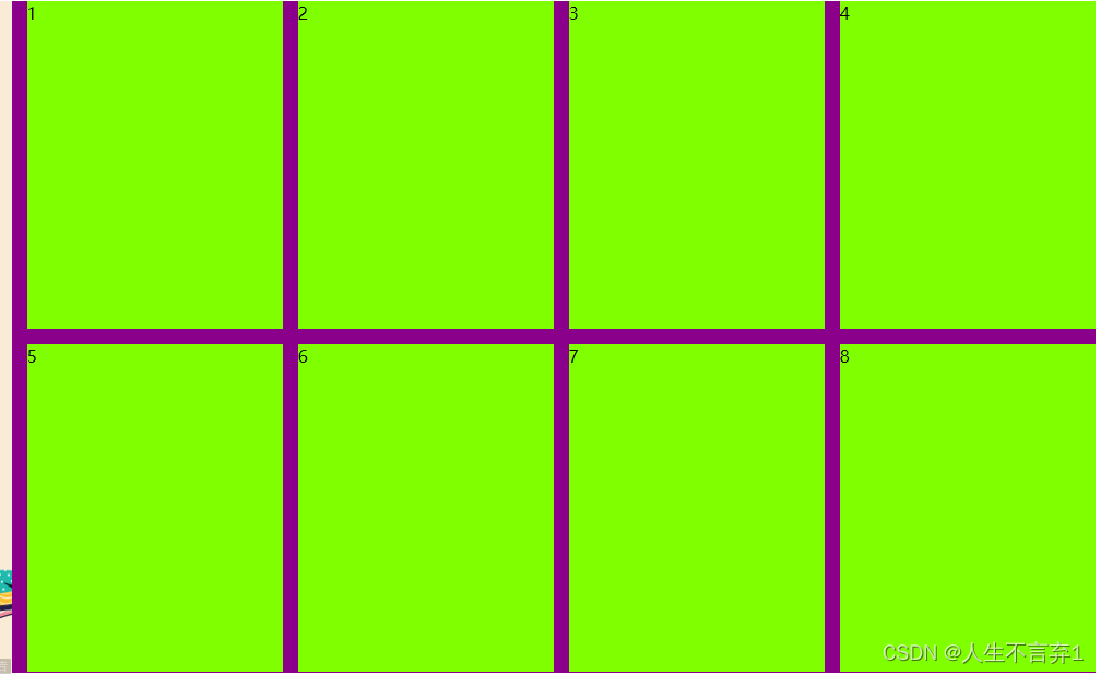
浮动的两个注意点:
浮动和标准流父盒子搭配 。
一个元素浮动理论上其他兄弟元素也要浮动。
8.3清除浮动
1.清除浮动的原因
父级盒子很多情况下不方便给定高度,由子盒子撑开。但是当子盒子浮动不占位置,父盒子高度会变为0,影响下面的标准流盒子。
2.清除浮动的本质
.清除浮动造成的影响
.父盒子本身有高度就不需要清除浮动
.清除浮动之后,父盒子就会根据 浮动的子盒子自动检测高度。父级有了高度就不会影响下面的标准流。
3.语法
选择器{
clear:属性值;
}
属性值 描述 left 清除左侧浮动影响 right 清除右侧浮动影响 both 清除两侧浮动影响
4.清除浮动的方法
1.额外标签法:W3C推荐
2.父元素添加overflow属性
3.父元素添加after伪元素
4.父元素添加双伪 元素
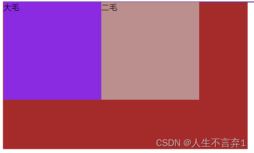
(1)额外标签法:
在最后面的子盒子添加一个盒子清除浮动
<style>
        .father{
            width: 600px;
            border: 1px solid  rebeccapurple;
        }
        .son1{
            width: 200px;
            height: 200px;
            background-color: blueviolet;
            float: left;
        }
        .son2{
            width: 200px;
            height: 200px;
            background-color: rosybrown;
            float: left;
        }
        .footer{
            width: 500px;
            height: 300px;
            background-color: brown;
        }
        .clear{
            clear: both;
        }
    </style>
</head>
<body>
    <div class="father">
        <div class="son1">大毛</div>
        <div class="son2">二毛</div>
        <!--额外标签法-->
        <div class="clear"></div>
    </div>
    <div class="footer"></div>
</body>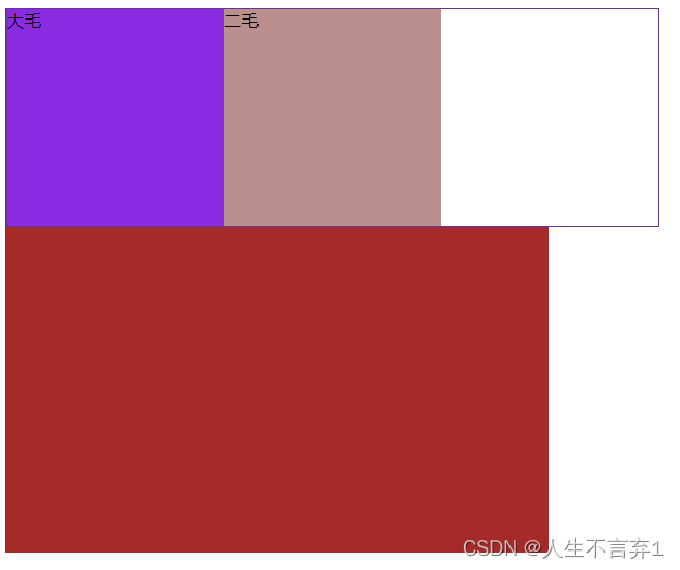
注意:新增的盒子必须是块标签或<br>
优缺点:
优点: 通俗易懂
缺点:结构比较差
(2)父级添加overflow
父级添加overflow属性,将其属性值设置为hidden,auto或scroll
语法 :overflow:(hidden,auto或scroll)
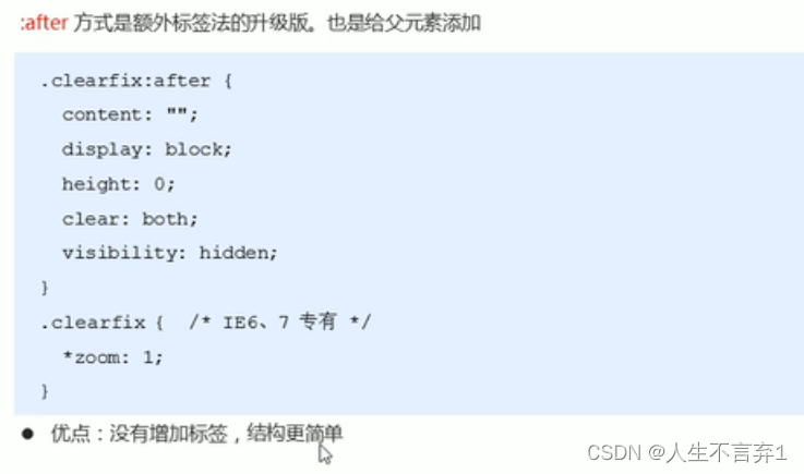
(3):after伪元素法
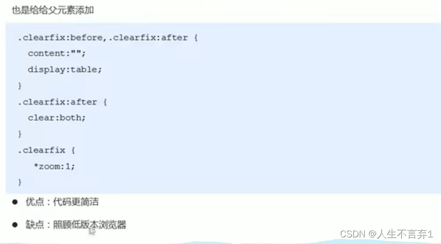
(4)双伪元素清除浮动
九.定位
定位:让盒子在某个盒子内自由移动位置或者固定在屏幕中的某个位置,并且可以压住其他盒子。
浮动:让多个块级盒子在一行没有缝隙排列显示,经常用于横向显示盒子。
9.1定位组成
将盒子定在某一个位置,定位就是在摆盒子,将盒子定位在某一个位置
定位=定位模式+边偏移
定位模式:用于指定一个元素在文档中的定位方式,
边偏移:决定了该元素的最终位置。
1.定位模式:用于指定一个元素在文档中的定位方式,css中position属性来设置
| 值 | 语义 |
| static | 静态定位 |
| relative | 相对定位 |
| absolute | 决定定位 |
| fixed | 固定定位 |
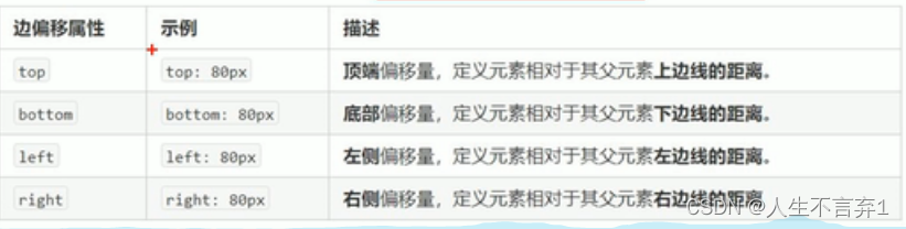
2.边偏移:定位的盒子移动到最终位置,通过top,bottom,left,right四个属性。
3.静态定位:static
静态定位是元素的默认定位方式,无定位的意思。
语法:
选择器{position:static;}
特点:1.静态定位按照标准流特性摆放位置,它没有偏移量。
2.静态定位在布局中很少用到。
4.相对定位:relative
相对定位是元素在移动位置的时候,是相对于它原来的位置来说的(自恋型)
语法:
选择器{position:relative}
特点:
1.盒子是相对于自己原来的位置移动的(移动参照点是自己原来的位置)
2.原来在标准流中的位置继续占用,后面的盒子继续以标准流的形式对待它(不脱标,继续保留原来的位置)
 <style>
        .box{
            width: 200px;
            height: 200px;
            background-color: aqua;
            position: relative;
            top:100px;
            left: 100px;
        }
        .box1{
            width: 200px;
            height: 200px;
            background-color: rgb(145, 43, 48);
        }
    </style>
</head>
<body>
    <div class="box">相对定位</div>
    <div class="box1"></div>
</body>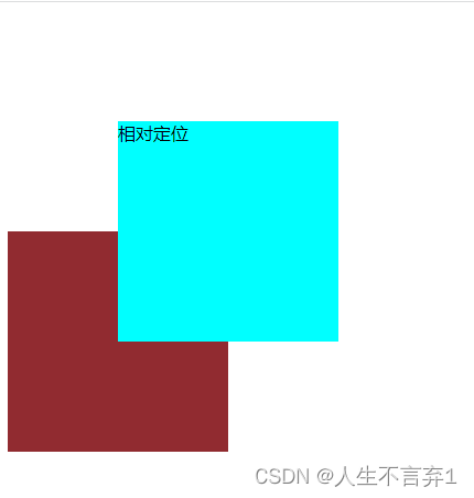
5.绝对定位 :absolute
绝对定位是元素在移动位置的时候,是相对与它祖先元素来说的
语法:
选择器{position:absolute;}
绝对定位的特点:
1.如果没有祖先元素或者祖先元素没有定位,则以浏览器为准定位。
 <style>
        .father{
            width: 600px;
            height: 600px;
            background-color: aqua;
        }
        .son{
            position: absolute;
            top: 100px;
            right: 100px;
            width: 300px;
            height: 300px;
            background-color: blueviolet;

        }
    </style>
</head>
<body>
    <div class="father">
        <div class="son"></div>
    </div>
</body>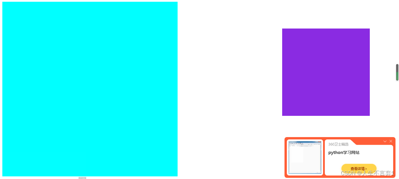
2.如果祖先元素有定位(相对,绝对,固定),则以最近一级有定位的祖先元素为准。
 <style>
        .gfather{
            position: relative;
            width: 700px;
            height: 700px;
            background-color: antiquewhite;

        }
        .father{
            width: 600px;
            height: 600px;
            background-color: aqua;
        }
        .son{
            position: absolute;
            top: 50px;
            right: 50px;
            width: 300px;
            height: 300px;
            background-color: blueviolet;

        }
    </style>
</head>
<body>
    <div class="gfather">
    <div class="father">
        <div class="son"></div>
    </div>
</div>
</body> 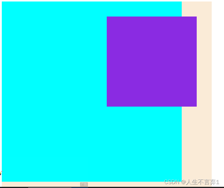
3.绝对定位脱离标准流,不占用原来的位置。
9.2定位的应用场景
1.子绝父相的由来:
1.子盒子绝对定位,不占用原来的位置,可以放在父盒子任意的位置,不会影响其他的兄弟盒子
2.父盒子需要加定位,限制子盒子在父盒子内移动
3.父盒子布局时需要占用位置
总结:因为父盒子需要占用位置所以采用相对定位,子盒子 不需要占用位置采用绝对定位。
6.固定定位
固定定位是元素固定于浏览器可视区的位置。
使用场景:可以在浏览器滚动时,元素的位置不会改变。
语法:
position:fixed;
特点:
1.以浏览器可视窗口为参照点移动元素。
. 跟父元素没有任何关系
. 不随滚动条滚动
2.固定定位不在占有原先的位置
.固定定位也是脱标的,固定定位可以看做是一种特殊的绝对定位
3.让盒子固定在版心右侧位置
算法:
第一步:让固定定位的盒子left50%,走到浏览器可视区 的一半的位置
第二步:让固定定位的盒子margin-left版心宽度的一半距离
 <style>
        .main{
            width: 800px;
            height: 1600px;
            margin: 0 auto;
            background-color: aquamarine;
        }
        .left{
            position: fixed;
         /*第一步*/
            left: 50%;
            /*第二步*/
            margin-left: 400px;
            width: 100px;
            height: 100px;
            background-color: blue;
        }
    </style>
</head>
<body>
    <div class="left"></div>
    <div class="main"></div>
</body> 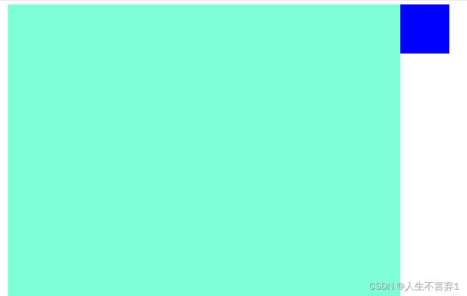
7.定位的叠放次序
在使用定位布局时,可能会出现盒子重叠的情况,可以使用z-index来控制盒子的前后次序。
语法:
选择器{z-index:num;}
注意:
数值可以是正整数,负整数或者0,默认是auto,数值越大盒子越靠上。
如果属性值相同,则按照书写顺序后来居上
数值后面不能加单位
只有定位的盒子才有z-index属性
 <style>
        .box{
            position: absolute;
            left:0;
            top:0;
        }
        .fist{
            width: 300px;
            height: 200px;
            background-color: antiquewhite;
            z-index: 1;
        }
        .se{
            top:20px;
            left: 30px;
            width: 300px;
            height: 200px;
            background-color: darkcyan;
        }
        .th{
            top:40px;
            left: 50px;
            position: absolute;
            left:20;
            top:20;
            width: 300px;
            height: 200px;
            background-color: aqua;
        }
    </style>
</head>
<body>
    <div class="box fist">大毛</div>
    <div class="box se">二毛</div>
    <div class="box th">三毛</div>
</body>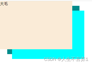
8.绝对定位的盒子居中
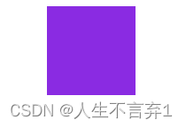
第一步:让固定定位的盒子left50%,走到浏览器可视区 的一半的位置
第二步:让固定定位的盒子margin-left自身宽度的一半距离
  .box{
            position: absolute;
            left:50%;
            margin-left: -50px;
            width: 100px;
            height: 100px;
            background-color: blueviolet;
        }
    </style>
</head>
<body>
    <div class="box"></div>
</body>
案例:
淘宝焦点图:
<style>
*{
margin: 0;
padding: 0;
}
li{
list-style: none;
}
.tb-promo{
position: relative;
width: 630px;
height: 315px;
margin: 100px auto;
border-radius: 12px;
}
.tb-promo img{
width: 630px;
height: 315px;
border-radius: 12px;
}
.pro,.next{
position: absolute;
top:50%;
width: 20px;
height: 30px;
background-color:rgb(0,0,0,.3);
margin-top: -15px;
text-align: center;
text-decoration: none;
line-height: 30px;
color: #fff;
}
.pro{
left: 0;
border-top-right-radius: 15px;
border-bottom-right-radius: 15px;
}
.next{
right: 0;
border-top-left-radius: 15px;
border-bottom-left-radius: 15px;
}
.nav{
position: absolute;
width: 70px;
height: 13px;
background-color: rgb(255,255,255,.3);
left: 50%;
margin-left: -35px;
bottom: 15px;
border-radius: 7px;
}
.nav li{
width: 8px;
height: 8px;
float: left;
margin: 3px;
border-radius: 50%;
background-color: #fff;
}
</style>
</head>
<body>
<div class="tb-promo">
<img src="..\img\tb1.png" title="图片显示异常">
<div class="pro"><</div>
<div class="next">></div>
<ul class="nav">
<li></li>
<li></li>
<li></li>
<li></li>
<li></li>
</ul>
</div>
</body>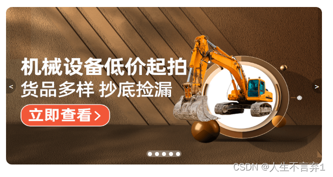
9.元素的显示与隐藏
让元素在页面中隐藏或者显示出来
1.display属性:用于设置一个元素应如何显示
display: none; 隐藏对象
display: block ; 除了转换为块级元素之外,还有显示元素的意思。
注意:display隐藏元素后不在占有原来的位置
2.visibility可见性
visibility属性指定一个元素是可见还是隐藏
visibility:visible; 元素显示
visibility: hidden; 元素隐藏
注意:隐藏元素后继续占有元素的位置
3.overflow溢出
overrflow属性指定了如果一个内容溢出了指定的框时,会发生。


 扫一扫
扫一扫


 157
157

 被折叠的 条评论
为什么被折叠?
被折叠的 条评论
为什么被折叠?
 到【灌水乐园】发言


