


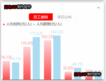
需求问题重现:

带表格式儿可拖动的图表还是第一次整:下面的代码应该能帮到你们吧
var myChart;
// 员工效益
var _myChartemployfits = function () {
if (myChart != null && myChart != "" && myChart != undefined) {
myChart.dispose();
}
myChart = echarts.init(document.getElementById('main0'));
let option = {
tooltip: {
trigger: 'axis',
axisPointer: { // 坐标轴指示器,坐标轴触发有效
type: 'line' // 默认为直线,可选为:'line' | 'shadow'
},
formatter: function (params) {
var res = params[0].name;
res += '<br/>' + params[0].seriesName.slice(0, 4) + ": " + params[0].data + '万元/人';
res += '<br/>' + params[1].seriesName.slice(0, 4) + ": " + params[1].data + '万元/人';
return res;
}
},
// 图表上方的label
legend: {
data: ['人均创利(元/人)', "人均薪酬(元/人)"],
selectedMode: false,
textStyle: {
color: "#333",
fontSize: 12
},
itemWidth: 6, // 图例标记的图形宽度。
itemGap: 5, // 图例每项之间的间隔。
itemHeight: 6, // 图例标记的图形高度。
left: 1,
top: 1,
width: 'auto',
color: '#333',
icon: 'circle'
},
// 控制图例在容器的位置
grid: {
left: '-10%',
right: '0%',
bottom: '1%',
top: '27',
containLabel: true
},
// x轴数值
xAxis: {
show: true,
type: "category",
data: ['2009', '2010', '2011', '2012', '2013', '2014', '2015', '2016', '2017', '2018', '2019', '2020'],
textStyle: {
color: "#333",
fontSize: 12
},
axisLine: {
show: true,
lineStyle: {
show: false,
lineStyle: {
color: '#6A989E'
}
}
},
axisTick: {
show: false,
lineStyle: {
color: '#f0f0f0',
}
},
axisLabel: {
show: false,
textStyle: {
fontFamily: 'Microsoft YaHei',
color: '#ccc',
fontWeight: 'normal',
fontSize: '14',
lineHeight: 22
}
}
},
// y轴数值
yAxis: {
show: false,
type: 'value',
name: "金额( 单位: 万元 )",
nameTextStyle: {
color: '#ffffff'
},
axisLine: {
show: false,
lineStyle: {
type: 'dashed',
color: 'rgba(135,140,147,0.8)'
}
},
splitLine: {
show: true,
lineStyle: {
color: 'rgba(135,140,147,1)' //左侧显示线
}
},
axisLabel: {
formatter: '{value}',
color: '#fff',
fontSize: 14
}
},
series: [
{
name: '人均创利(元/人)',
type: 'bar',
barMaxWidth: '30',
data: [2.0, 4.9, 7.0, 23.2, 25.6, 76.7, 135.6, 162.2, 32.6, 20.0, 6.4, 3.3, 2.6, 5.9, 9.0, 26.4, 28.7, 70.7, 175.6, 182.2, 48.7, 18.8, 6.0, 2.3, 2.0, 4.9, 7.0, 23.2, 25.6, 76.7, 135.6, 162.2, 32.6, 20.0, 6.4, 3.3, 2.6, 5.9, 9.0, 26.4, 28.7, 70.7, 175.6, 182.2, 48.7, 18.8, 6.0, 2.3, 2.0, 4.9, 7.0, 23.2, 25.6, 76.7, 135.6, 162.2, 32.6, 20.0, 6.4, 3.3, 2.6, 5.9, 9.0, 26.4, 28.7, 70.7, 175.6, 182.2, 48.7, 18.8, 6.0, 2.3, 2.0, 4.9, 7.0, 23.2, 25.6, 76.7, 135.6, 162.2, 32.6, 20.0, 6.4, 3.3, 2.6, 5.9, 9.0, 26.4, 28.7, 70.7, 175.6, 182.2, 48.7, 18.8, 6.0, 2.3, 2.0, 4.9, 7.0, 23.2, 25.6, 76.7, 135.6, 162.2, 32.6, 20.0, 6.4, 3.3, 2.6, 5.9, 9.0, 26.4, 28.7, 70.7, 175.6, 182.2, 48.7, 18.8, 6.0, 2.3, 2.0, 4.9, 7.0, 23.2, 25.6, 76.7, 135.6, 162.2, 32.6, 20.0, 6.4, 3.3, 2.6, 5.9, 9.0, 26.4, 28.7, 70.7, 175.6, 182.2, 48.7, 18.8, 6.0, 2.3, 2.0, 4.9, 7.0, 23.2, 25.6, 76.7, 135.6, 162.2, 32.6, 20.0, 6.4, 3.3, 2.6, 5.9, 9.0, 26.4, 28.7, 70.7, 175.6, 182.2, 48.7, 18.8, 6.0, 2.3, 2.0, 4.9, 7.0, 23.2, 25.6, 76.7, 135.6, 162.2, 32.6, 20.0, 6.4, 3.3, 2.6, 5.9, 9.0, 26.4, 28.7, 70.7, 175.6, 182.2, 48.7, 18.8, 6.0, 2.3],
label: {
show: true,//文字是否显示
position: "top",//文字位置
formatter: function (params) {
return `${params.data}万`
}
},
itemStyle: {
opacity: .7,
color: new echarts.graphic.LinearGradient(0, 0, 0, 1, [{
offset: 0,
color: 'pink'
}, {
offset: 1,
color: 'red'
}]),
barBorderRadius: 0,
},
textStyle: {
color: '#ff4b50'
}
},
{
name: '人均薪酬(元/人)',
type: 'bar',
barMaxWidth: '30',
data: [2.6, 5.9, 9.0, 26.4, 80, 70.7, 175.6, 182.2, 48.7, 18.8, 6.0, 2.3, 2.6, 5.9, 9.0, 26.4, 28.7, 70.7, 175.6, 182.2, 48.7, 18.8, 6.0, 2.3, 2.0, 4.9, 7.0, 23.2, 25.6, 76.7, 135.6, 162.2, 32.6, 20.0, 6.4, 3.3, 2.6, 5.9, 9.0, 26.4, 28.7, 70.7, 175.6, 182.2, 48.7, 18.8, 6.0, 2.3, 2.0, 4.9, 7.0, 23.2, 25.6, 76.7, 135.6, 162.2, 32.6, 20.0, 6.4, 3.3, 2.6, 5.9, 9.0, 26.4, 28.7, 70.7, 175.6, 182.2, 48.7, 18.8, 6.0, 2.3, 2.0, 4.9, 7.0, 23.2, 25.6, 76.7, 135.6, 162.2, 32.6, 20.0, 6.4, 3.3, 2.6, 5.9, 9.0, 26.4, 28.7, 70.7, 175.6, 182.2, 48.7, 18.8, 6.0, 2.3, 2.0, 4.9, 7.0, 23.2, 25.6, 76.7, 135.6, 162.2, 32.6, 20.0, 6.4, 3.3, 2.6, 5.9, 9.0, 26.4, 28.7, 70.7, 175.6, 182.2, 48.7, 18.8, 6.0, 2.3, 2.0, 4.9, 7.0, 23.2, 25.6, 76.7, 135.6, 162.2, 32.6, 20.0, 6.4, 3.3, 2.6, 5.9, 9.0, 26.4, 28.7, 70.7, 175.6, 182.2, 48.7, 18.8, 6.0, 2.3, 2.0, 4.9, 7.0, 23.2, 25.6, 76.7, 135.6, 162.2, 32.6, 20.0, 6.4, 3.3, 2.6, 5.9, 9.0, 26.4, 28.7, 70.7, 175.6, 182.2, 48.7, 18.8, 6.0, 2.3, 2.0, 4.9, 7.0, 23.2, 25.6, 76.7, 135.6, 162.2, 32.6, 20.0, 6.4, 3.3, 2.6, 5.9, 9.0, 26.4, 28.7, 70.7, 175.6, 182.2, 48.7, 18.8, 6.0, 2.3],
label: {
show: true,//文字是否显示
position: "top",//文字位置
formatter: function (params) {
return `${params.data}万`
}
},
itemStyle: {
opacity: .7,
color: new echarts.graphic.LinearGradient(0, 0, 0, 1, [{
offset: 0,
color: 'pink'
}, {
offset: 0,
color: 'skyblue'
}])
},
textStyle: {
color: '#87ceeb'
}
}
],
// 图例是否可拖动
dataZoom: {
show: false, // 为true 滚动条出现
realtime: true,
zoomLock: true,
type: 'inside', // 有type这个属性,滚动条在最下面,也可以不行,写y:36,这表示距离顶端36px,一般就是在图上面。
height: 20, // 表示滚动条的高度,也就是粗细
start: 45, // 表示默认展示20%~80%这一段。
end: 80
}
}
myChart.setOption(option, true);
// 监听点击事件
// window.addEventListener("click", function () {
// // myChart.resize();
// _myChartemployfits();
// });
// 监听浏览器页面缩放事件
// window.addEventListener("resize", function () {
// myChart.resize();
// });
}首先说一下jq的解决方案:
切换时,监听点击事件,然后在调用对应的图表方法,但是点击多次之后发现展示的速度越来越慢,我就点击之后判断e.target指向然后在展示对应的图表内容,主要方法都在代码里面。还有关于图表重绘也在其中。关于width设置100%显示不全,需要在echart的grid里面进行调试一下,主要点看文档。
vue也出现这种情况:
调用绘制ehcarts时图表的时候,用 Vue.nextTick(function () { // DOM 更新了 }) 主动触发一下图表,使之强制渲染就可以正常显示了。
解决之后方案和效果:
上述那个是在单个里面写重置方法,这里采用的是全局,只要不匹配就不会走进分支
window.onclick = function (e) {
     myChart.resize();
     console.log(e)
     if (e.target.classList[0] == 'empSalary') {
         this._myChartemployfits();
      }


}
window.onresize = function () {
    this._myChartemployfits.resize();
    this._myChartEducationdistribut.resize();
    this._NetProfit.resize();
    this._TotalOperatingIncome.resize();
    this._DividendFinancing.resize();
}
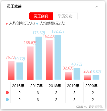
效果如下: 下面还有一个数据表格对应着图表的拖动serices的数据是一个联动效果。
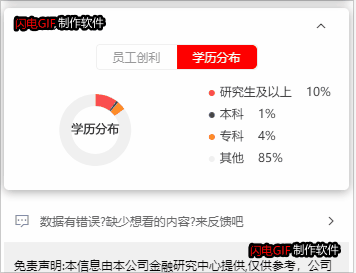
在这添加一个饼图效果:之前没有加上。
var _myChartEducationdistribut = function () {
        if (myChart2 != null && myChart2 != "" && myChart2 != undefined) {
            myChart2.dispose();
        }
        myChart2 = echarts.init(document.getElementById('chartMain'));
        var color = [
            '#0CD2E6',
            '#3751E6',
            '#FFC722',
            '#886EFF',
        ];
        var legend = [
            '研究生及以上',
            '本科',
            '专科',
            '其他'
        ];

        var seriesData = [
            { "name": "研究生及以上", "value": 10 },
            { "name": "本科", "value": 10 },
            { "name": "专科", "value": 15 },
            { "name": "其他", "value": 12 }
        ]

        var option = {
            width: 'auto',
            color: color,
            silent: true,
            title: {
                top: 20,
                textStyle: {
                    fontSize: 20,
                    color: '#DDEEFF',
                },
            },
            grid: {
                top: '1%',
                left: '1%',
                right: '1%',
                bottom: 10,
                containLabel: true,
            },
            legend: {
                orient: 'vertical',
                selectedMode: false,
                top: '10%',
                left: "50%",
                icon: 'circle',
                itemWidth: 6,
                itemHeight: 6,
                textStyle: {
                    align: 'right',
                    verticalAlign: 'middle',
                    rich: {
                        name: {
                            color: '#333',
                            fontSize: 12,
                        },
                        value: {
                            color: '#333',
                            fontSize: 12,
                        },
                        rate: {
                            color: '#333',
                            fontSize: 12,
                        },
                    },
                },
                data: legend,
                formatter: (name) => {
                    if (seriesData.length) {
                        const item = seriesData.filter((item) => item.name === name)[0];
                        return `{name|${name}} {rate|   ${item.value}%}`;
                    }
                },
            },
            markArea: {
                silent: false,
            },
            series: [{
                name: '学历分布占比',
                type: 'pie',
                radius: ["40%", "60%"],
                center: ["20%", "40%"],
                label: {
                    normal: {
                        show: true,
                        position: 'center',
                        formatter: '学历分布',
                        color: "#333",
                        textStyle: {
                            fontSize: '12',
                        },
                    },
                    emphasis: {
                        show: true,
                        textStyle: {
                            fontSize: '12',
                        },
                    },
                },
                labelLine: {
                    show: false,
                    length: 0,
                    length2: 0,
                },
                data: seriesData,
            }],
        };

        myChart2.setOption(option);

        window.addEventListener("resize", function () {
            myChart.resize();
        });
    }
最终效果图:


 被折叠的 条评论
为什么被折叠?
被折叠的 条评论
为什么被折叠?
 到【灌水乐园】发言


