


生信碱移
Marsilea 库
复杂数据可视化神器,Marsilea。
随着数据集规模和复杂性的指数级增长,科学研究和数据分析领域对数据可视化工具提出了更高的要求。然而,传统的数据可视化工具在处理多特征、多维度数据时往往面临显著挑战,难以直观展示数据之间复杂的交互关系或揭示隐藏的模式。
为了解决这一痛点,来自澳门大学的研究者提出了 Marsilea,于2025年1月6日见刊于Genome Biology [IF:10.1]。Marsilea 是一个使用声明方式创建可组合可视化图表的Python库。它基于Matplotlib,可以像拼图一样组合不同的可视化图表。
▲ DOI: 10.1186/s13059-024-03469-3。
与之前的传统可视化工具相比,Marsilea 显著减少了代码量。例如,在对比同样的可视化任务时,Marsilea 所需的代码量只有 Matplotlib 的一半,同时提供了更高的定制性和直观性。除了代码的可视化工具以外,Marsilea还提供了在线可视化工具:
-
https://marsilea.streamlit.app/
本文主要介绍 Marsilea 的使用,想更深入了解该软件的同学可以通过以下链接学习:
-
https://marsilea.readthedocs.io/en/stable/index.html
软件安装
在安装了python的前提下,可以使用以下代码安装该库:
pip install marsilea
使用概念
① 首先导入一些必要的库:
import numpy as np
import marsilea as ma
import marsilea.plotter as mp
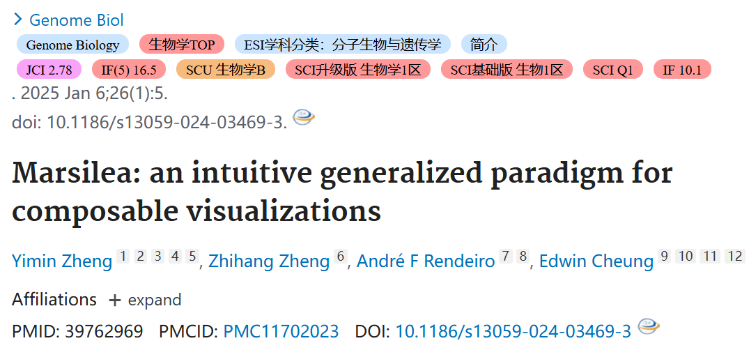
② 生成模拟数据data并创建一个图表框架:
data = np.random.randn(10, 6)
cb = ma.ClusterBoard(data, height=2, margin=0.5)
cb.add_layer(mp.Violin(data, color="#FF6D60"))
cb.render()
上面三个函数分别代表三个步骤:
-
首先,创建一个
ClusterBoard来绘制主要的可视化图形,画布的高度初始化为 2,边距为 0.5; -
其次,使用
add_layer()来在画布上添加一个 Violin 图表; -
最后,
render()被调用来显示可视化结果
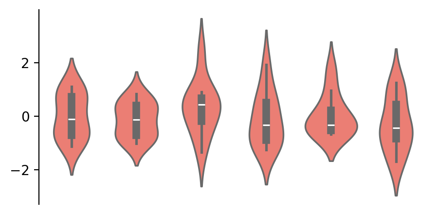
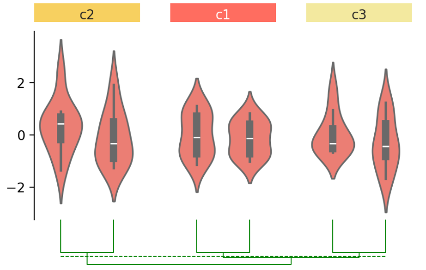
③ 创建完图表框架以后,针对示例的这个小提琴图,可以使用group_cols函数进行分组:
cb.group_cols(["c1", "c1", "c2", "c2", "c3", "c3"],
            order=["c1", "c2", "c3"], spacing=.08)
cb.render()
-
group_cols()将画布分为三组; -
group 参数指定每列的组,order 参数指定将在图中呈现的组的顺序。
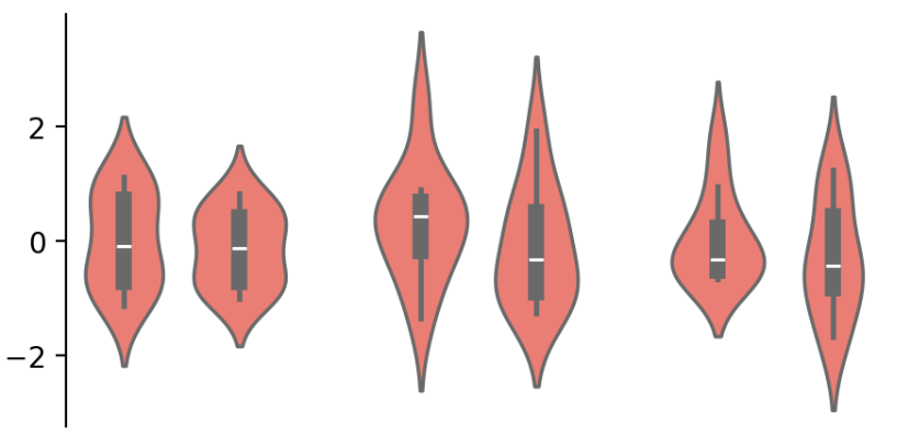
④ 随后,还可以根据分组创建注释。同样是两个命名清晰且易懂的函数:
group_labels = mp.Chunk(["c1", "c2", "c3"],
                        ["#FF6D60", "#F7D060", "#F3E99F"])
cb.add_top(group_labels, size=.2, pad=.1)
cb.render()
-
add_top() 来在画布顶部添加一个 Chunk 图表,Chunk 图表是一个注解图表,用于标注组别;
-
此外,可以使用 size 和 pad 参数调整图表的大小和图表之间的间距
⑤ 为样本添加层次聚类:
cb.add_dendrogram("bottom", colors="g")
cb.render()
-
使用 add_dendrogram() 将 dendrogram 添加到画布底部。在 Marsilea 中,聚类可以在不同的可视化中进行,不限于热图
⑥ 最后,添加一个标题:
cb.add_bottom(ma.plotter.Bar(data, color="#577D86"), size=2, pad=.1)
cb.add_title(top="My First Marsilea Example")
cb.render()
-
使用 add_title() 在顶部添加了一个标题;
-
同时,还使用 Bar 在底部添加了一个图表。
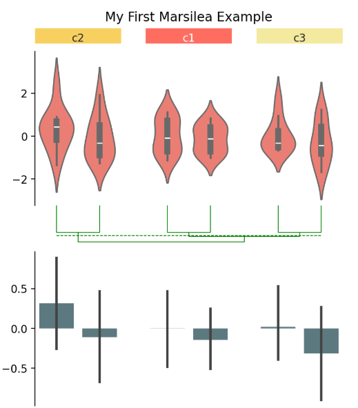
⑦ 保存生成的图片,可以像保存所有 matplotlib 图表一样保存,也可以通过.figure访问图表对象,建议以 bbox_inches="tight" 模式保存以避免裁剪:
cb.figure.savefig("my_first_marsilea_example.png", bbox_inches="tight")
真实数据集上的应用
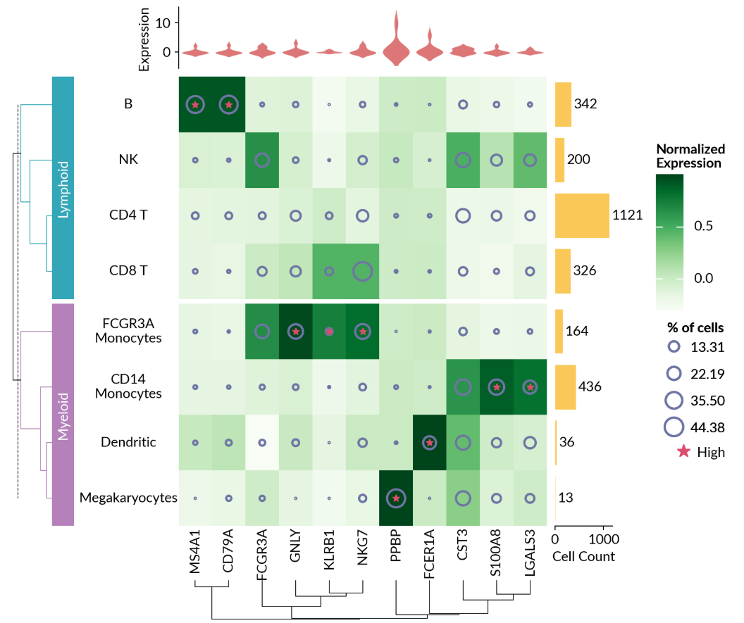
① 单细胞测序数据可视化:
import matplotlib as mpl
import matplotlib.pyplot as plt
from matplotlib.colors import Normalize
import marsilea as ma
import marsilea.plotter as mp

from sklearn.preprocessing import normalize


pbmc3k = ma.load_data("pbmc3k")
exp = pbmc3k["exp"]
pct_cells = pbmc3k["pct_cells"]
count = pbmc3k["count"]

matrix = normalize(exp.to_numpy(), axis=0)

cell_cat = [
    "Lymphoid",
    "Myeloid",
    "Lymphoid",
    "Lymphoid",
    "Lymphoid",
    "Myeloid",
    "Myeloid",
    "Myeloid",
]
cell_names = [
    "CD4 T",
    "CD14\nMonocytes",
    "B",
    "CD8 T",
    "NK",
    "FCGR3A\nMonocytes",
    "Dendritic",
    "Megakaryocytes",
]

# Make plots
cells_proportion = mp.SizedMesh(
    pct_cells,
    size_norm=Normalize(vmin=0, vmax=100),
    color="none",
    edgecolor="#6E75A4",
    linewidth=2,
    sizes=(1, 600),
    size_legend_kws=dict(title="% of cells", show_at=[0.3, 0.5, 0.8, 1]),
)
mark_high = mp.MarkerMesh(matrix > 0.7, color="#DB4D6D", label="High")
cell_count = mp.Numbers(count["Value"], color="#fac858", label="Cell Count")
cell_exp = mp.Violin(
    exp, label="Expression", linewidth=0, color="#ee6666", density_norm="count"
)
cell_types = mp.Labels(cell_names, align="center")
gene_names = mp.Labels(exp.columns)

# Group plots together
h = ma.Heatmap(
    matrix, cmap="Greens", label="Normalized\nExpression", width=4.5, height=5.5
)
h.add_layer(cells_proportion)
h.add_layer(mark_high)
h.add_right(cell_count, pad=0.1, size=0.7)
h.add_top(cell_exp, pad=0.1, size=0.75, name="exp")
h.add_left(cell_types)
h.add_bottom(gene_names)

h.group_rows(cell_cat, order=["Lymphoid", "Myeloid"])
h.add_left(mp.Chunk(["Lymphoid", "Myeloid"], ["#33A6B8", "#B481BB"]), pad=0.05)
h.add_dendrogram("left", colors=["#33A6B8", "#B481BB"])
h.add_dendrogram("bottom")
h.add_legends("right", align_stacks="center", align_legends="top", pad=0.2)
h.set_margin(0.2)
h.render()
② SeqLogo可视化:
from marsilea.plotter import SeqLogo
import numpy as np
import pandas as pd
import matplotlib.pyplot as plt

matrix = pd.DataFrame(data=np.random.randint(1, 10, (4, 10)), index=list("ACGT"))
_, ax = plt.subplots()
colors = {"A": "r", "C": "b", "G": "g", "T": "black"}
SeqLogo(matrix, color_encode=colors).render(ax)

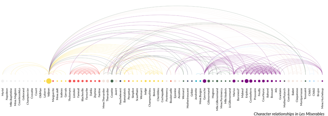
③ 网络弧图:
import marsilea as ma
import marsilea.plotter as mp

data = ma.load_data("les_miserables")
nodes = data["nodes"]
links = data["links"]

sizes = nodes["value"].to_numpy().reshape(1, -1)
colors = nodes["group"].to_numpy().reshape(1, -1)

palette = {
    0: "#3C486B",
    1: "#F0F0F0",
    2: "#F9D949",
    3: "#F45050",
    4: "#F2E3DB",
    5: "#41644A",
    6: "#E86A33",
    7: "#009FBD",
    8: "#77037B",
    9: "#4F4557",
    10: "#B0DAFF",
}

link_colors = [palette[nodes.iloc[i].group] for i in links["source"]]

height = 0.5
width = height * len(nodes) / 3

sh = ma.SizedHeatmap(
    sizes,
    colors,
    palette=palette,
    sizes=(10, 200),
    frameon=False,
    height=height,
    width=width,
)
sh.add_bottom(mp.Labels(nodes["name"], fontsize=8))
arc = mp.Arc(nodes.index, links.to_numpy(), colors=link_colors, lw=0.5, alpha=0.5)
sh.add_top(arc, size=3)
sh.add_title(
    bottom="Character relationships in Les Miserables",
    align="right",
    fontstyle="italic",
)
sh.render()
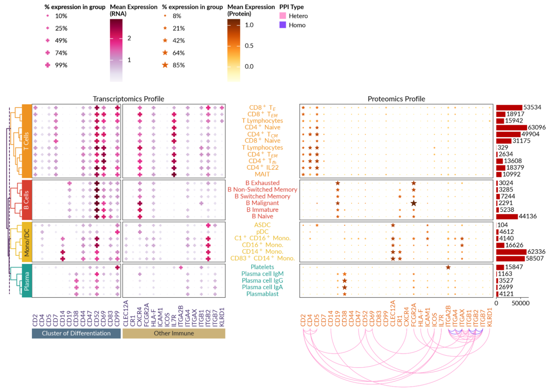
④ 单细胞多组学数据可视化:
import matplotlib as mpl
from matplotlib.ticker import FuncFormatter


import marsilea as ma

dataset = ma.load_data("sc_multiomics")

fmt = FuncFormatter(lambda x, _: f"{x:.0%}")
lineage = ["B Cells", "T Cells", "Mono/DC", "Plasma"]
lineage_colors = ["#D83F31", "#EE9322", "#E9B824", "#219C90"]
m = dict(zip(lineage, lineage_colors))
cluster_data = dataset["gene_exp_matrix"]
interaction = dataset["interaction"]
lineage_cells = dataset["lineage_cells"]
marker_names = dataset["marker_names"]
cells_count = dataset["cells_count"]
display_cells = dataset["display_cells"]
with mpl.rc_context({"font.size": 14}):
    gene_profile = ma.SizedHeatmap(
        dataset["gene_pct_matrix"],
        color=dataset["gene_exp_matrix"],
        height=6,
        width=6,
        cluster_data=cluster_data,
        marker="P",
        cmap="PuRd",
        sizes=(1, 100),
        color_legend_kws={"title": "Mean Expression\n(RNA)"},
        size_legend_kws={
            "colors": "#e252a4",
            "fmt": fmt,
            "title": "% expression in group",
        },
    )
    gene_profile.group_rows(lineage_cells, order=lineage)
    gene_profile.add_left(ma.plotter.Chunk(lineage, lineage_colors, padding=10))
    gene_profile.add_dendrogram(
        "left",
        method="ward",
        colors=lineage_colors,
        meta_color="#451952",
        linewidth=1.5,
    )
    gene_profile.add_bottom(
        ma.plotter.Labels(marker_names, color="#392467", align="bottom", padding=10)
    )
    gene_profile.cut_cols([13])
    gene_profile.add_bottom(
        ma.plotter.Chunk(
            ["Cluster of Differentiation", "Other Immune"],
            ["#537188", "#CBB279"],
            padding=10,
        )
    )
    gene_profile.add_right(
        ma.plotter.Labels(
            display_cells,
            text_props={"color": [m[c] for c in lineage_cells]},
            align="center",
            padding=10,
        )
    )
    gene_profile.add_title("Transcriptomics Profile", fontsize=16)

    protein_profile = ma.SizedHeatmap(
        dataset["protein_pct_matrix"],
        color=dataset["protein_exp_matrix"],
        cluster_data=cluster_data,
        marker="*",
        cmap="YlOrBr",
        height=6,
        width=6,
        color_legend_kws={"title": "Mean Expression\n(Protein)"},
        size_legend_kws={
            "colors": "#de600c",
            "fmt": fmt,
            "title": "% expression in group",
        },
    )
    protein_profile.group_rows(lineage_cells, order=lineage)
    protein_profile.add_bottom(
        ma.plotter.Labels(marker_names, color="#E36414", align="bottom", padding=10)
    )
    protein_profile.add_dendrogram("left", method="ward", show=False)
    score = interaction["STRING Score"]
    protein_profile.add_bottom(
        ma.plotter.Arc(
            marker_names,
            interaction[["N1", "N2"]].values,
            # weights=score,
            colors=interaction["Type"].map({"Homo": "#864AF9", "Hetero": "#FF9BD2"}),
            labels=interaction["Type"],
            width=1,
            legend_kws={"title": "PPI Type"},
        ),
        size=2,
    )
    protein_profile.add_right(ma.plotter.Numbers(cells_count, color="#B80000"), pad=0.1)
    protein_profile.add_title("Proteomics Profile", fontsize=16)

    comb = gene_profile + protein_profile
    comb.add_legends("top", stack_size=1, stack_by="column", align_stacks="top")
    comb.render()
虽然complexheatmap也有py版
但是感觉这个工具也蛮好用的


 被折叠的 条评论
为什么被折叠?
被折叠的 条评论
为什么被折叠?
 到【灌水乐园】发言


