


下面包含了一些常用的 Flex 布局样式。这些样式定义了如何创建灵活的布局和排列方式。在前端项目中使用这些样式可以通过类名来快速应用到元素上,让布局管理更加方便和统一。
下面是我提供的样式的总结和使用说明:
CSS定义全局样式 (globalStyle.css)
/* 排列方式 (横排开始)*/
.justify-start {
	display: flex;
	justify-content: flex-start;
}

/* 排列方式 (横排居中)*/
.justify-center {
	display: flex;
	justify-content: center;
}

/* 排列方式 (横排结束)*/
.justify-end {
	display: flex;
	justify-content: flex-end;
}

/* 排列方式 (横排之间)*/
.justify-between {
	display: flex;
	justify-content: space-between;
}

/* 排列方式 (横排中间)*/
.justify-around {
	display: flex;
	justify-content: space-around;
}

/* 排列方式(竖排) */

.flex-direction-column {
	display: flex;
	flex-direction: column;
}

/* 平均分配 */
.flex-1 {
	flex: 1;
}
/* 平均分配 */
/*
scs可以这样定义
@for $i from 1 to 12 {
  .flex-#{$i} {
    flex: $i;
  }
}
*/

/* 内容对齐 */
.align-items-center {
	align-items: center;
}


/* 是否换行 (不能换行)*/
.flex-wrap-nowrap {
	flex-wrap: nowrap;
}

/* 是否换行 (允许换行)*/
.flex-wrap-wrap {
	flex-wrap: wrap;
}
页面引入全局样式使用
<template>
<view>
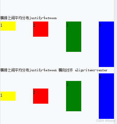
<view style="font-size: 24rpx;">横排之间平均分布justify-between</view>
<view class="justify-between">
<view style="width: 50px;height: 30px; background-color: yellow;">1</view>
<view style="width: 50px;height: 50px; background-color: red;">2</view>
<view style="width: 50px;height: 100px; background-color: green;">3</view>
<view style="width: 50px;height: 150px; background-color: blue;">4</view>
</view>
<view style="font-size: 24rpx;">横排之间平均分布justify-between 横向对齐 align-items-center</view>
<view class="justify-between align-items-center">
<view style="width: 50px;height: 30px; background-color: yellow;">1</view>
<view style="width: 50px;height: 50px; background-color: red;">2</view>
<view style="width: 50px;height: 100px; background-color: green;">3</view>
<view style="width: 50px;height: 150px; background-color: blue;">4</view>
</view>
</view>
</template>
<style>
/* 引入你定义的全局样式类globalStyle.css 或在全局引用 */
</style>
示例展示
解释每个类的作用:
- 横向排列开始(左对齐)
.justify-start {
   display: flex;
   justify-content: flex-start;
}

*将子元素横向排列,并且左对齐。
- 横向排列居中
.justify-center {
      display: flex;
      justify-content: center;
   }

*将子元素横向排列,并且在容器中居中对齐。
- 横向排列结束(右对齐)
.justify-end {
      display: flex;
      justify-content: flex-end;
   }

*将子元素横向排列,并且右对齐。
- 横向排列之间平均分布
.justify-between {
      display: flex;
      justify-content: space-between;
  }

*将子元素横向排列,并且在它们之间平均分布空间,第一个元素在容器的起始位置,最后一个元素在容器的结束位置。
- 横向排列中间平均分布
.justify-around {
      display: flex;
      justify-content: space-around;
  }

*将子元素横向排列,并且在它们周围平均分布空间,每个元素两侧的空间相等。
- 纵向排列
.flex-direction-column {
      display: flex;
      flex-direction: column;
   }

*将子元素纵向排列。
- 平均分配
.flex-1 {
      flex: 1;
     }

*让元素自动填充剩余空间,平均分配额外的空间。
8 内容对齐
.align-items-center {
      align-items: center;
   }
*将子元素在交叉轴上(纵向或横向,取决于 flex-direction)居中对齐。
9 不换行
.flex-wrap-nowrap {
    flex-wrap: nowrap;
}
*禁止子元素换行,保持在一行显示
10 允许换行
.flex-wrap-wrap {
    flex-wrap: wrap;
}
*允许子元素在需要时换行显示,根据空间情况自动调整布局。


 扫一扫
扫一扫


 被折叠的 条评论
为什么被折叠?
被折叠的 条评论
为什么被折叠?
 到【灌水乐园】发言


