


- 矩形框(Rectangle)
- 标签(Label)
- 加载器(Loader)
- 输入框(TextField)
- 下拉框(ComboBox)
- 对话框(Dialog)
- 抽屉(Drawer)
- 滑动视图与页面切换(SwipeView)
1. 矩形框(Rectangle)
Rectangle
import QtQuick 2.6
import QtQuick.Window 2.2
Window {
visible: true
width: 640
height: 480
title: qsTr("Qt 交流群:723516989")
Item {
id: root
width: 200; height: 300
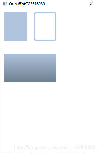
Rectangle {
id: rect1
x: 12; y: 12
width: 76; height: 96
color: "lightsteelblue"
}
Rectangle {
id: rect2
x: 112; y: 12
width: 76; height: 96
//边界颜色
border.color: "lightsteelblue"
//边界宽度
border.width: 4
//半径
radius: 8
}
Rectangle {
id: rect3
x: 12; y:150
width: 176; height: 96
/*一个渐变色是由一系列的梯度值定义的。每一个值定义了一个位置与颜色。
位置标记了y轴上的位置(0 = 顶,1 = 底)。
GradientStop(倾斜点)的颜色标记了颜色的位置*/
gradient: Gradient {
GradientStop { position: 0.0; color: "lightsteelblue" }
GradientStop { position: 1.0; color: "slategray" }
}
border.color: "slategray"
}
}
}
import QtQuick 2.6
import QtQuick.Window 2.2
Window {
visible: true
width: 640
height: 480
title: qsTr("Qt 交流群:723516989")
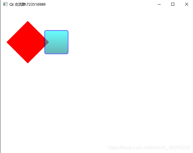
Rectangle {
property alias mouseArea: mouseArea
property alias topRect:topRect
width: 360
height: 360
MouseArea {
id: mouseArea
anchors.fill: parent
}
Rectangle{
rotation:45
x:40
y:60
width:100
height:100
color:"red"
}
Rectangle{
id:topRect
opacity:0.6
scale:0.8
x:135
y:60
width:100
height:100
radius:8
gradient:Gradient{
GradientStop{position:0.0;color:"aqua"}
GradientStop{position:1.0;color:"teal"}
}
border{width:3;color:"blue"}
}
}
}
其中的属性rotation是可以转换矩形的角度。
1.颜⾊的命名是来⾃SVG颜⾊的名称(查看http://www.w3.org/TR/css3-color/#svg-color可以获取更多的颜⾊名称)。你也可以使⽤其它的⽅法来指定颜⾊,⽐如RGB字符串(’#FF4444’),或者⼀个颜⾊名字(例如’white’)。
2.⼀个矩形框如果没有width/height(宽度与⾼度)将不可⻅。如果你有⼏个相互关联width/height(宽度与⾼度)的矩形框,在你组合逻辑中出了错后可能就会发⽣矩形框不可⻅,请注意这⼀点。
3.这个函数⽆法创建⼀个梯形,最好使⽤⼀个已有的图像来创建梯形。有⼀种可能是在旋转梯形时,旋转的矩形⼏何结构不会发⽣改变,但是这会导致⼏何元素相同的可⻅区域的混淆。从作者的观点来看类似的情况下最好使⽤设计好的梯形图形来完成绘制。
2. 标签(Label)
Label
    {
        x:100
        y:100
        width: 100
        height: 50

        text: qsTr("我是标签")  //可被翻译
        color: "red"  //设置Label字体颜色
        font.pixelSize: 22 //字体大小
        font.italic: true  //斜体

        //字体对其方式
        horizontalAlignment:Text.AlignHCente
        verticalAlignment:Text.AlignVCenter

        //设置背景颜色
        background: Rectangle{
            color: "gray"
        }
    }
3. 加载器(Loader)
Loader元素用来动态加载可见的QML组件,它可以加载一个QML组件,它可以加载一个QML文件(使用source属性)或者一个组件对象(使用sourceComponent属性)。
对于拖延组件的创建有帮助的场景:例如,当一个组件需要在要求的时候被创建,或者由于性能原因一个组件不应该被创建时。
Item {
    width: 200; height: 200
    Loader {id: pageLoader}
    MouseArea {
        anchors.fill: parent
        onClicked: pageLoader.source = "Page1.qml"<span style="white-space:pre">	</span>//单击加载“Page1.qml”作为一个组件
    }
}
可以通过item属性来访问被加载的项目,如果source或者sourceComponent更改了,任何先前实例化的项目都将被销毁。
将source设置为空字符串或者sourceComponent设置为undefined,则销毁当前加载的项目,释放资源,并将Loader设置为空。
.1. Loader的大小行为
Loader和其他任何可见的项目一样,必须对其进行位置和大小的设置,这样它才能成为可见的。
如果没有明确指定Loader的大小,那么Loader将会在组件加载完成后自动设置为组件的大小,如果通过设置width和height或者使用锚明确指定了Loader的大小,那么被加载的项目将会改变为Loader的大小
.2. 从加载的项目中接收信号
任何被加载的项目中发射的信号都可以使用Connections元素进行接收。
.3. 焦点和键盘事件
Loader是一个焦点作用域,对于它的任何获得活动焦点的子项目都必须将focus属性设置为true。任何在被加载的项目中的键盘事件也应该被接收,从而使它们不传播到Loader。
4. 输入框(TextField)
说到输入框,我们QML有两个控件供选择,TextField和TextInput
最大区别就是当数据很长的时候,TextInput这个控件输入的字符串会在界面溢出。所以这种情况我们可以选择现在用户输入的字符长度。但他的优点相对而言是会比较灵活的。
TextField{
    height: userNameText.height
    width: loginBtn.width * 1.5
    font.pointSize: passwdNormalSize - 5
    focus: true
}
TextInput {
        id: passwdInput
        anchors.fill: parent
        anchors.margins: 2
        font.pointSize: passwdNormalSize
        focus: true
        anchors.horizontalCenter: passwdText.Center
    }


 扫一扫
扫一扫


 718
718

 被折叠的 条评论
为什么被折叠?
被折叠的 条评论
为什么被折叠?
 到【灌水乐园】发言


