


日常总结(一)
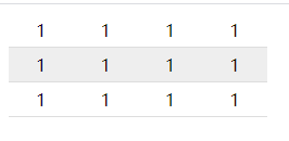
1. 条纹式表格
使用伪类子选择器 nth-child(number)
number值:
even: 匹配偶数位元素
odd: 匹配奇数位元素
2n+1: 匹配第一个及其后面间隔2的元素
例如:
    <style>
        table {
            border-collapse: collapse;
            border-spacing: 0;
        }

        tr:nth-child(even) {
            background-color: #eee;
        }

        td {
            padding: 5px 25px;
            border-bottom: 1px solid #ddd;
        }
    </style>
     <table>
        <tr>
            <td>1</td>
            <td>1</td>
            <td>1</td>
            <td>1</td>
        </tr>
        <tr>
            <td>1</td>
            <td>1</td>
            <td>1</td>
            <td>1</td>
        </tr>
        <tr>
            <td>1</td>
            <td>1</td>
            <td>1</td>
            <td>1</td>
        </tr>
    </table>
运行结果:
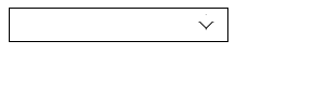
2.小三角
运用transform:rotate(angle)和定位
代码:
<style>
        div {
            position: relative;
            width: 200px;
            height: 30px;
            border: 1px solid black;
        }

        div::after {
            position: absolute;
            top: 8px;
            right: 15px;
            content: "";
            width: 8px;
            height: 8px;
            border-right: 1px solid #000;
            border-bottom: 1px solid #000;
            transform: rotate(45deg);
            transition: all 0.2s ease;
        }

        div:hover::after {
            transform: rotate(225deg);

        }
    </style>

	<body>
		<div></div>
	</body>
3.加载
使用CSS3动画
<style>
        .loading-css {
            width: 50px;
            height: 50px;
            display: inline-block;
            border: 3px solid #f3f3f3;
            border-top: 3px solid red;
            border-radius: 50%;
            animation: loading-360 0.8s infinite linear;
        }
        @keyframes loading-360 {
            0% {
                transform: rotate(0deg);
            }
            100% {
                transform: rotate(360deg);
            }
        }
    </style>

    <div class="loading-css"></div>

4.容易忽略的表单聚焦
input:focus
使用此CSS就可做聚焦,当然如果要做自动聚焦必须上JS
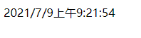
5.动态显示日期
		var divText = document.getElementsByTagName('div')[0];
        function getTime() {
            var date = new Date();
            var date1 = date.toLocaleString();
            divText.innerHTML = date1;
        }
        setInterval(getTime,1000);
运行结果:
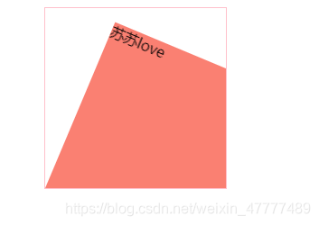
6.旋转中心点案例
<style>
        div {
            overflow: hidden;
            width: 200px;
            height: 200px;
            margin: 0 auto;
            border: 1px solid pink;
        }

        div::before {
            content: "苏苏love";
            display: block;
            width: 100%;
            height: 100%;
            background-color: salmon;
            transform: rotate(180deg);
            transform-origin: left bottom;
            transition: all .4s;
        }

        div:hover::before {
            transform: rotate(0deg);
        }
    </style>
    <div></div>
7.鼠标悬过图片放大案例
运用transform:scale(1.1)放大1.1倍
外加过渡transition效果
    <style>
        div {
            overflow: hidden;
            float: left;
            margin: 10px;
        }
        div img {
            width: 200px;
            height: 200px;
            transition: all .4s;
        }
        div img:hover {
            transform: scale(1.1);
        }
    </style>

    <div><a href="#"><img src="./assets/head-profile.jpg" alt=""></a></div>
    <div><a href="#"><img src="./assets/head-profile.jpg" alt=""></a></div>
    <div><a href="#"><img src="./assets/head-profile.jpg" alt=""></a></div>
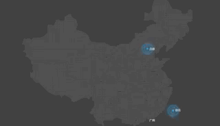
8.大数据热点图案例
使用CSS动画@keyframes
 <style>
        body {
            background-color: #000;
        }

        .map {
            position: relative;
            width: 750px;
            height: 669px;
            margin: 0 auto;
            background: url(./ditu.jpg) no-repeat;
        }

        .city {
            position: absolute;
            top: 186px;
            right: 236px;
            color: white;
        }

        .dotted {
            width: 8px;
            height: 8px;
            background-color: #09f;
            border-radius: 50%;
        }

        .city div[class^="pulse"] {
            position: absolute;
            top: 50%;
            left: 50%;
            transform: translate(-50%,-50%);
            width: 8px;
            height: 8px;
            box-shadow: 0 0 12px #009dfd;
            border-radius: 50%;
            animation: pulse 1.2s linear infinite;
        }

        .city div.pulse2 {
            animation-delay: 0.4s;
        }

        .city div.pulse3 {
            animation-delay: 0.8s;
        }

        @keyframes pulse {
            0% {

            }
            70% {

                width: 40px;
                height: 40px;
                opacity: 1;
            }
            100% {
                width: 70px;
                height: 70px;
                opacity: 0;
            }
        }
    </style>

	 <div class="map">
        <div class="city">
            <div class="dotted"></div>
            <div class="pulse1"></div>
            <div class="pulse2"></div>
            <div class="pulse3"></div>
        </div>
    </div>
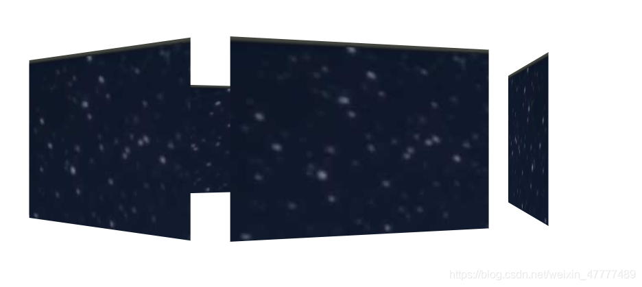
9.3D旋转木马
	<style>
        body {
            perspective: 1000px;
        }
        section {
            position: relative;
            width: 300px;
            height: 200px;
            margin: 150px auto;
            transform-style: preserve-3d;
            animation: rotate 3s linear infinite;
            background: url(./assets/head-picture.jpg);
        }
        section:hover {
            animation-play-state: paused;
        }

        @keyframes rotate {
            0% {
                transform: rotateY(0);
            }
            100% {
                transform: rotateY(360deg);
            }
        }
        section div {
            position: absolute;
            top: 0;
            left: 0;
            width: 100%;
            height: 100%;
            background: url(./assets/head-profile.jpg) no-repeat;
        }
        section div:nth-child(1) {
            transform: translateZ(350px);
        }
        section div:nth-child(2) {
            transform: rotateY(60deg) translateZ(300px);
        }
        section div:nth-child(3) {
            transform: rotateY(120deg) translateZ(300px);
        }
        section div:nth-child(4) {
            transform: rotateY(180deg) translateZ(300px);
        }
        section div:nth-child(5) {
            transform: rotateY(240deg) translateZ(300px);
        }
        section div:nth-child(6) {
            transform: rotateY(300deg) translateZ(300px);
        }
    </style>

	<section>
        <div></div>
        <div></div>
        <div></div>
        <div></div>
        <div></div>
        <div></div>
    </section>


 扫一扫
扫一扫


 被折叠的 条评论
为什么被折叠?
被折叠的 条评论
为什么被折叠?
 到【灌水乐园】发言


