


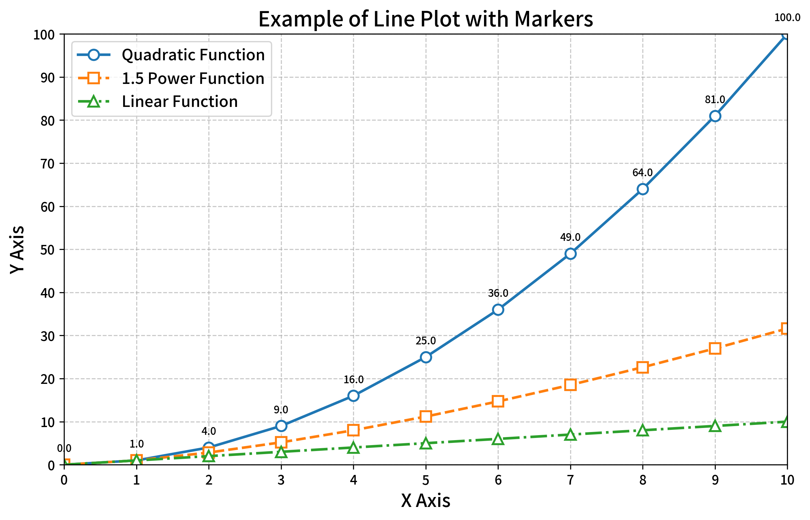
带标记的折线图在日常生活中十分常见,如果使用Python实现带标记的折线图呢?下面是Python代码。需要的小伙伴请点赞保存哦~
import matplotlib.pyplot as plt
import numpy as np

# 设置图片清晰度
plt.rcParams['figure.dpi'] = 300

# 英文显示设置
plt.rcParams["font.family"] = ["Arial", "sans-serif"]
plt.rcParams['axes.unicode_minus'] = False  # 解决负号显示问题

# 创建示例数据
x = np.linspace(0, 10, 11)
y1 = x**2
y2 = x**1.5
y3 = x

# 创建图表和子图
plt.figure(figsize=(10, 6))

# 绘制三条不同的线,每条线使用不同的标记样式
plt.plot(x, y1, 'o-', label='Quadratic Function', linewidth=2, markersize=8, markerfacecolor='white', markeredgewidth=1.5)
plt.plot(x, y2, 's--', label='1.5 Power Function', linewidth=2, markersize=8, markerfacecolor='white', markeredgewidth=1.5)
plt.plot(x, y3, '^-.', label='Linear Function', linewidth=2, markersize=8, markerfacecolor='white', markeredgewidth=1.5)

# 设置图表标题和坐标轴标签
plt.title('Example of Line Plot with Markers', fontsize=16)
plt.xlabel('X Axis', fontsize=14)
plt.ylabel('Y Axis', fontsize=14)

# 添加网格线
plt.grid(True, linestyle='--', alpha=0.7)

# 添加图例
plt.legend(fontsize=12)

# 设置坐标轴范围和刻度
plt.xlim(0, 10)
plt.ylim(0, 100)
plt.xticks(np.arange(0, 11, 1))
plt.yticks(np.arange(0, 101, 10))

# 添加数据标签
for i, (x_val, y_val) in enumerate(zip(x, y1)):
    plt.annotate(f'{y_val:.1f}', (x_val, y_val), textcoords="offset points",
                 xytext=(0,10), ha='center', fontsize=8)


plt.savefig('marked_line_plot.png', bbox_inches='tight')

plt.show()
可视化结果:


 1157
1157

 被折叠的 条评论
为什么被折叠?
被折叠的 条评论
为什么被折叠?
 到【灌水乐园】发言


