


 本文详细介绍了CSS的基础知识,包括如何构造背景框、设置尺寸和对齐方式。通过实例展示了如何设置边框、边距、浮动和定位,以及如何处理元素溢出和调整不透明度。此外,还探讨了CSS中的盒模型和浮动属性在实际布局中的应用。
一、CSS简介
层叠样式表(英文全称:Cascading Style Sheets)是一种用来表现HTML(标准通用标记语言的一个应用)或XML(标准通用标记语言的一个子集)等文件样式的计算机语言。CSS不仅可以静态地修饰网页,还可以配合各种脚本语言动态地对网页各元素进行格式化。
CSS 能够对网页中元素位置的排版进行像素级精确控制,支持几乎所有的字体字号样式,拥有对网页对象和模型样式编辑的能力。
二、如何用CSS构造背景框
1.初步认识CSS
html:
<html>
<head>
<meta charset="utf-8">
<!-- 注意下面这个语句,将导入外部的 mycss.css 样式表文件 -->
<link rel="stylesheet" type="text/css" href="./css/3.css">
<title>页面标题</title>
</head>
<body>
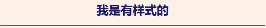
<h1>我是有样式的</h1>
<hr>
<p class="haha">还是有点丑:)</p>
</body>
</html>
css
body {
    background-color: linen;
    text-align: center;
  }
  h1 {
    color: red;
  }
  .haha {
    margin-top: 100px;
    color: chocolate;
    font-size: 50px;
  }
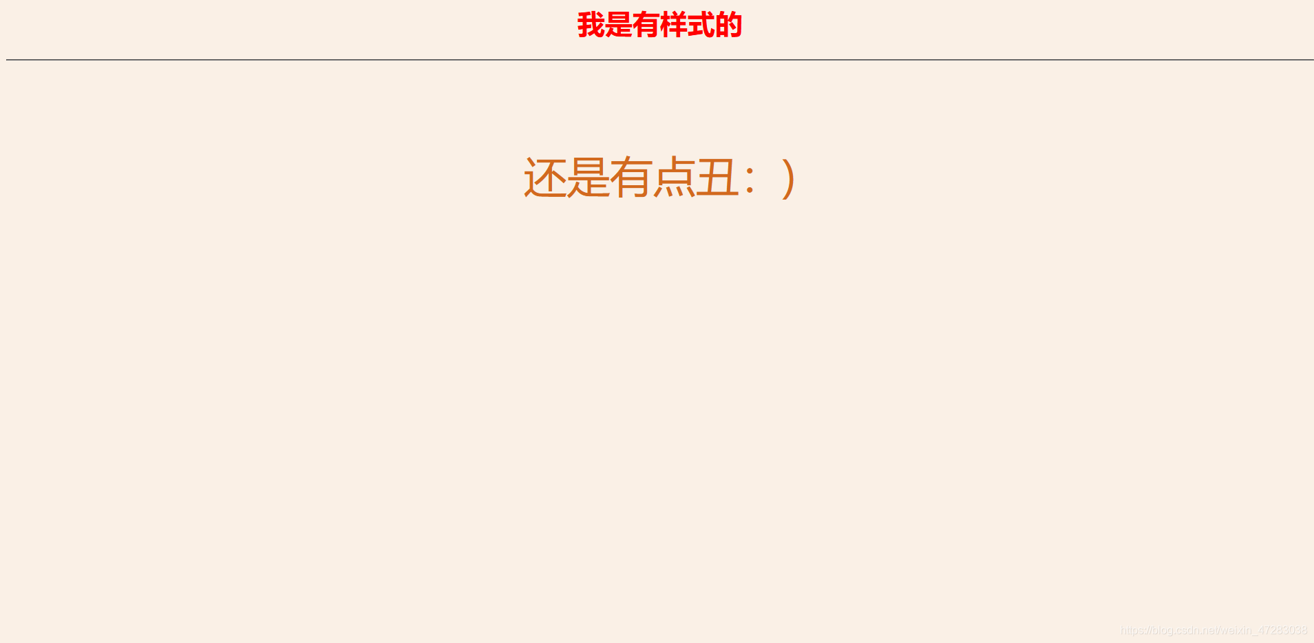 这里的CSS表达的含义是内容背景框用的是亚麻色,内容居中。一级标题用红色。对于haha这个类的外边距我们设置成100个像素点,颜色是巧克力色,标签的字体大小为50个像素点。
当然你也可以直接将样式放到html中这样就叫内部样式表,示例如下:
<html>
<head>
  <meta charset="utf-8">
  <!-- 注意下面这个语句,将导入外部的 mycss.css 样式表文件 -->
  <link rel="stylesheet" type="text/css" href="mycss.css">
  <title>页面标题</title>
  <style>
    body {
      background-color: linen;
      text-align: center;
    }
    h1 {
      color: red;
    }
    .haha {
      margin-top: 100px;
      color: chocolate;
      font-size: 50px;
    }
  </style>
</head>
<body>
  <h1>我是有样式的</h1>
  <hr>
  <p class="haha">还是有点丑:)</p>
</body>
</html>
当然如果你同时在html中以内联的形式展示背景的时候他会以内联里的背景为准。因为内联的优先级要高于内部样式或外部样式。
<h1 style='color:midnightblue'>
 2.css如何设置尺寸?如何对齐?
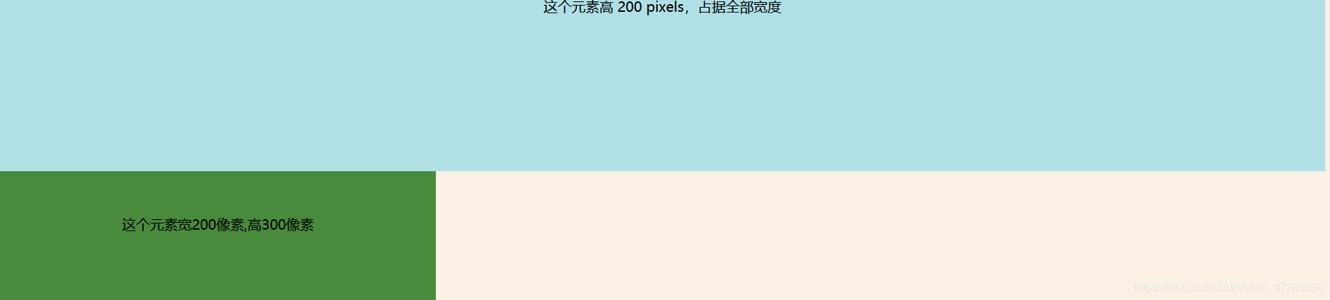
我们先来看看下面的代码
 <div class="example-1">
    这个元素高 200 pixels,占据全部宽度
  </div>
  <div class="example-2">
    这个元素宽200像素,高300像素
  </div>
这是两个标签,设置标签方便我们在css中对这两个特定的标签设置相应的背景。
下面是CSS的代码:
 .example-1 {
    width: 100%;
    height: 200px;
    background-color: powderblue;
    text-align: center;
  }
  .example-2 {
    padding-top: 50px;
    height: 100px;
    width: 500px;
    background-color: rgb(73, 138, 60);
    text-align: center;
  }
注:padding是内边距
关于边距的图框如下:
height代表它的高度
width代表它的宽度
text-align:代表文本对齐 center是居中所以我的文本是居中。
效果如下:
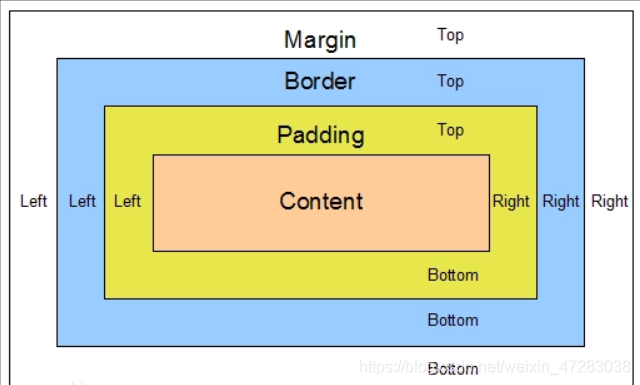
3.什么是盒子模型(跟我们之前提到的边距有关)
盒子模型指的是一个 HTML 元素可以看作一个盒子。从内到外,这个盒子是由内容 content, 内边距 padding, 边框 border, 外边距 margin构成的,如下图所示:
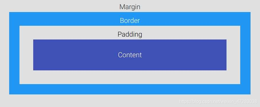 注:
注:
Content 盒子的内容,如文本、图片等
Padding 填充,也叫内边距,即内容和边框之间的区域
Border 边框,默认不显示
Margin 外边距,边框以外与其它元素的区域
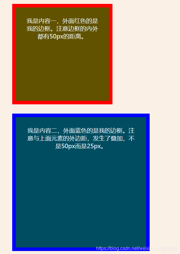
示例如下:
html代码:
 <div class="box1">我是内容一,外面红色的是我的边框。注意边框的内外都有50px的距离。</div>
  <div class="box2">我是内容二,外面蓝色的是我的边框。注意与上面元素的外边距,发生了叠加,不是50px而是25px。</div>
css代码:
  .box1 {
    height: 200px;
    width: 200px;
    background-color:#615200;
    color: aliceblue;
    border: 10px solid red;
    padding: 25px;
    margin: 25px;
  }
  .box2 {
    height: 300px;
    width: 300px;
    background-color:#004d61;
    color: aliceblue;
    border: 10px solid blue;
    padding: 25px;
    margin: 25px;
  }
效果如下
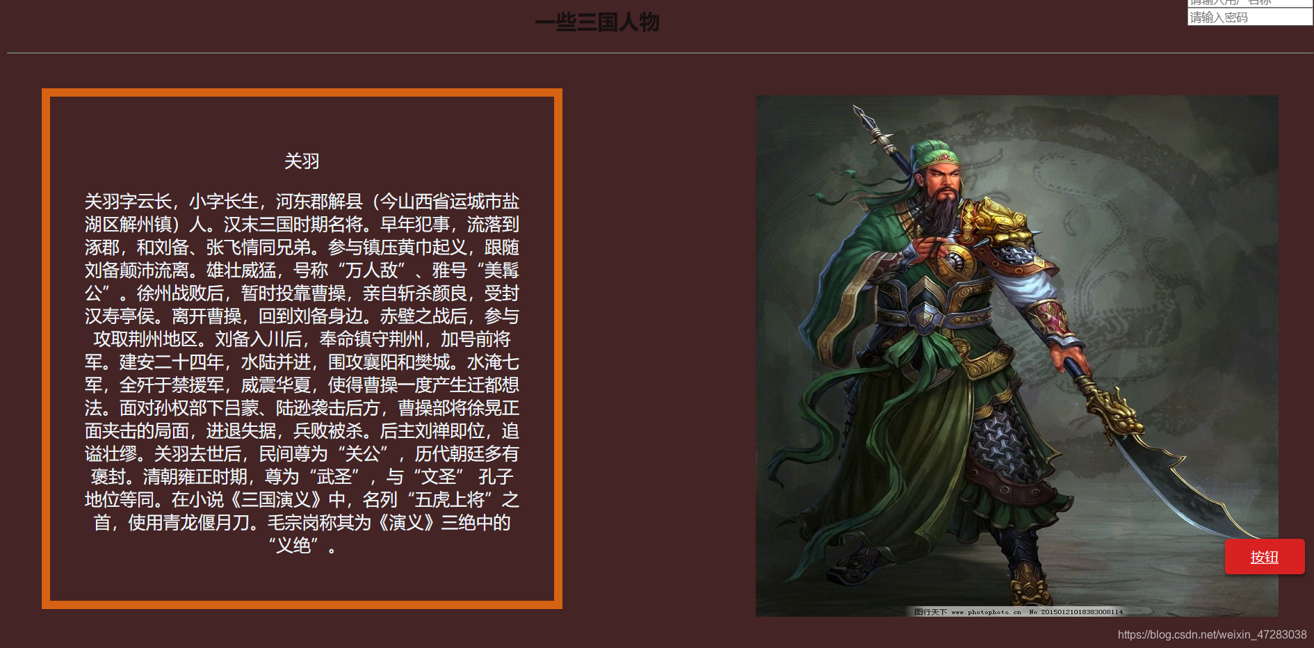
下面是我自己写了一段代码,简述三国时期关羽与展示关羽的图片;
html:
<html>
<head>
    <meta charset="utf-8">
    <link rel="stylesheet" type="text/css" href="./css/4.css">
    <title>页面标题</title>
      <style>
        .denglu{
          float:right;
          color:orange;
        }
        </style>
        <style>
        .example-relative {
          position: relative;
          left: 60px;
          top: 40px;
          background-color: rgb(173, 241, 241);
        }
        </style>
</head>
<body>
    <div class=denglu>
      <form style=text-align:center>
      账号登录:<br>
      <input type="text" name="name" placeholder="请输入用户名称"><br>
      <input type="password" name="ps" placeholder="请输入密码">
        </form>
    </div>
    <br>
    <h2 id="c1">一些三国人物</h2>
    <hr>
    <img src="https://pic34.photophoto.cn/20150121/0005018383008114_b.jpg"  class="example-float-right" alt="">
    <div class="guanyu">
    <p>关羽</p>
    <p>
    关羽字云长,小字长生,河东郡解县(今山西省运城市盐湖区解州镇)人。汉末三国时期名将。
早年犯事,流落到涿郡,和刘备、张飞情同兄弟。参与镇压黄巾起义,跟随刘备颠沛流离。雄壮威猛,号称“万人敌”、雅号“美髯公”。徐州战败后,暂时投靠曹操,亲自斩杀颜良,受封汉寿亭侯。离开曹操,回到刘备身边。赤壁之战后,参与攻取荆州地区。刘备入川后,奉命镇守荆州,加号前将军。建安二十四年,水陆并进,围攻襄阳和樊城。水淹七军,全歼于禁援军,威震华夏,使得曹操一度产生迁都想法。面对孙权部下吕蒙、陆逊袭击后方,曹操部将徐晃正面夹击的局面,进退失据,兵败被杀。后主刘禅即位,追谥壮缪。
关羽去世后,民间尊为“关公”,历代朝廷多有褒封。清朝雍正时期,尊为“武圣”,与“文圣” 孔子地位等同。在小说《三国演义》中,名列“五虎上将”之首,使用青龙偃月刀。毛宗岗称其为《演义》三绝中的“义绝”。
    </p>
    </div>
    <div class="broad"></div>
    <a href="#c1" class="example-fixed">按钮</a>
</body>
CSS
body {
    background-color: rgb(68, 36, 36);
    text-align: center;
    position: relative;
  }
  h2 {
    color: rgb(24, 16, 16);
  }
  .guanyu {
    height: 500px;
    width: 500px;
    color: aliceblue;
    border: 10px solid rgb(214, 98, 20);
    padding: 40px;
    margin: 40px;
    font-size: 20px
  }
  .example-float-right {
    float: right;
    height: 600px;
    width: 40%;
    margin: 40px;
  }
  .example1-float-right {
    float: right;
    height: 600px;
    width: 40%;
    margin: 40px;
  }
  .example-fixed {
    position: absolute;
    bottom: 40px;
    right: 10px;
    padding: 10px 30px;
    border-radius: 5px;
    color: #fff;
    background-color: rgb(216, 34, 34);
    cursor: pointer;
    box-shadow: 0 3px 3px 0 rgba(0,0,0,0.3), 0 1px 5px 0 rgba(0,0,0,0.12), 0 3px 1px -2px rgba(0,0,0,0.2);
  }
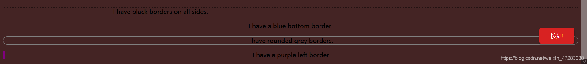
4.边框与边距
我们来试一下一下代码:
html:
    <p class="example-1">I have black borders on all sides.</p>
    <p class="example-2">I have a blue bottom border.</p>
    <p class="example-3">I have rounded grey borders.</p>
    <p class="example-4">I have a purple left border.</p>
css:
  .example-1 {
    border: 1px dotted black; /* 上下左右都相同 */
  }
  .example-2 {
    border-bottom: 1px solid blue; /* 只设置底部边框 */
  }
  .example-3 {
    border: 1px solid grey;
    border-radius: 15px; /* 边框圆角 */
  }
  .example-4 {
    border-left: 5px solid purple;
  }
以上是对边框的设定当然你可以设定你的内边距如
padding: 25px 50px 75px 100px这个顺序是按照上下左右的顺序来设定的。
展示效果如图
 5.定位
5.定位
看到我们之前图片中的按钮两个字了,他就起到定位的效果。因为我定的是回到id=c1这个链接,而正好我的二级标题的id就是c1所以当你点击按钮的时候他就会回到二级标题的位置不信你可以试试。
我用的定位是固定位置就是固定离底部40个像素点的距离当你上下拉动界面的时候你会发现它的位置是不改变的。
它还有绝对,相对,静态等属性。
相对:relative 把元素相对于他的静态(正常)位置进行偏移
可以试试如下代码:
<!-- HTML -->
<div class="example-relative">我偏移了正常显示的位置。去掉我的样式对比看看?</div>
<!-- CSS -->
.example-relative {
  position: relative;
  left: 60px;
  top: 40px;
  background-color: rgb(173, 241, 241);
}
绝对:absolute 使元素相对于其最近设置了定位属性(非static)的父元素进行偏移。如果该元素的所有父元素都没有设置定位属性,那么就相对于body这个父元素。
<!-- HTML -->
<div class="example-relative">这是父元素,有 relative 定位属性
  <div class="example-absolute">
    这是子元素,有 absolute 定位属性
  </div>
</div>
<!-- CSS -->
.example-relative {
  position: relative;
  width: 400px;
  height: 200px;
  border: 3px solid rgb(87, 33, 173);
}
.example-absolute {
  position: absolute;
  top: 80px;
  right: 5px;
  width: 200px;
  height: 100px;
  border: 3px solid rgb(218, 73, 16);
}
6.溢出
当元素内容超过其指定的区域时,我们通过溢出overflow属性来处理这些溢出的部分。
溢出属性有一下几个值:
visible 默认值,溢出部分不被裁剪,在区域外面显示
hidden 裁剪溢出部分且不可见
scroll 裁剪溢出部分,但提供上下和左右滚动条供显示
auto 裁剪溢出部分,视情况提供滚动条
7.浮动:
在一个区域或容器内,我们可以设置float属性让某元素水平方向上向左或右进行移动,其周围的元素也会重新排列。我们常用这种样式来使图像和文本进行合理布局
我之前上面关羽那张图片就是通过浮动移到了右边
html
<img src="https://pic34.photophoto.cn/20150121/0005018383008114_b.jpg" class="example-float-right" alt="">
css
  .example1-float-right {
    float: right;
    height: 600px;
    width: 40%;
    margin: 40px;
  }
8.我们可以用opacity对任何元素(不过常用于图片)设置不透明度。
值在[0.0~1.0]之间,值越低,透明度越高.
如以下样式:
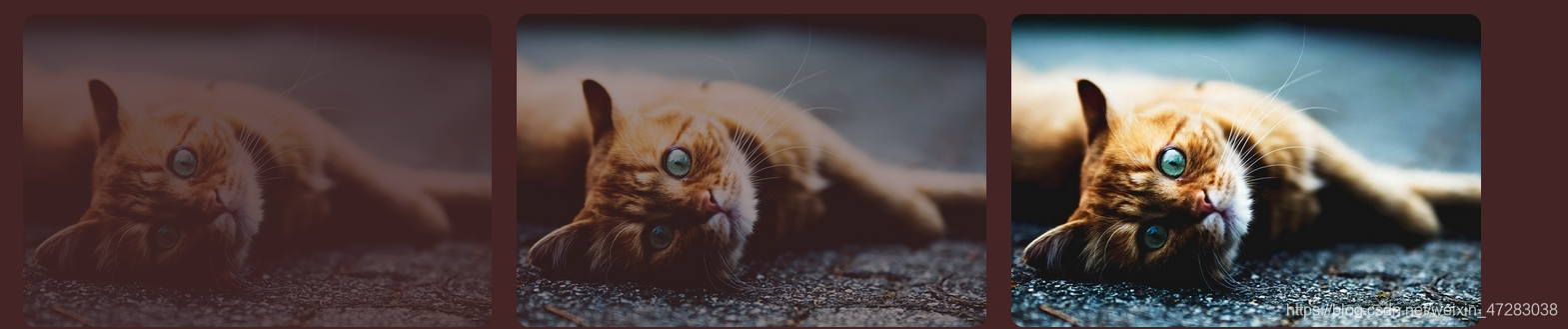 代码如下
代码如下
<html>
<head>
  <style>
    img {
      width: 25%;
      border-radius: 10px;
      float: left;
      margin: 10px;
    }
    .opacity-2 {
      opacity: 0.2;
    }
    .opacity-5 {
      opacity: 0.5;
    }
    .opacity-10 {
      opacity: 1;
    }
  </style>
</head>
<body>
  <img class="opacity-2" src="https://mdbootstrap.com/img/Photos/Horizontal/Nature/4-col/img%20(87).jpg">
  <img class="opacity-5" src="https://mdbootstrap.com/img/Photos/Horizontal/Nature/4-col/img%20(87).jpg">
  <img class="opacity-10" src="https://mdbootstrap.com/img/Photos/Horizontal/Nature/4-col/img%20(87).jpg">
</body>
</html>


 扫一扫
扫一扫


 118
118

 被折叠的 条评论
为什么被折叠?
被折叠的 条评论
为什么被折叠?
 到【灌水乐园】发言


