


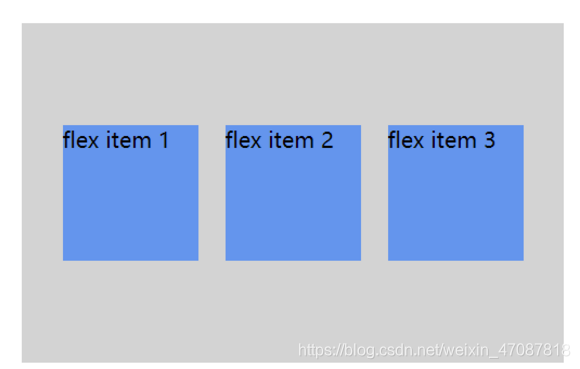
1.弹性布局——盒子居中
.flex-container {
    display: -webkit-flex;
    display: flex;
    width: 400px;
    height: 250px;
    background-color: lightgrey;
    justify-content: center;
    align-items: center;
}
详细链接:https://www.runoob.com/w3cnote/flex-grammar.html
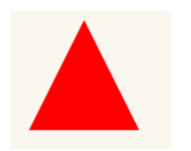
2.三角行
#triangle-up {
    width: 0;
    height: 0;
    border-left: 50px solid transparent;
    border-right: 50px solid transparent;
    border-bottom: 100px solid red;
}
详细链接:https://www.runoob.com/w3cnote/flex-grammar.html
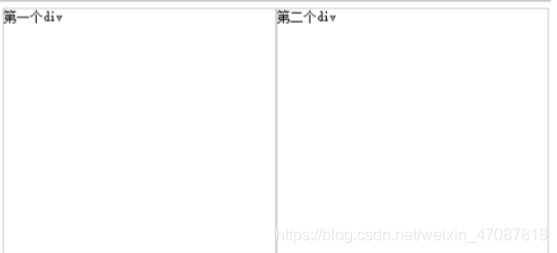
3.两个块元素在同一行显示
.one,.two{
       width:50%;
       height:300px;
       border:1px solid #ccc;
       float:left;
       box-sizing:border-box;
}
4.CSS中如何选择ul下li的奇数、偶数行
<style>
ul li:nth-of-type(odd){color:red} //奇数行
ul li:nth-of-type(even){color:yellow}//偶数行
</style>
<ul>
  <li>1</li>
  <li>2</li>
  <li>3</li>
  <li>4</li>
  <li>5</li>
  <li>6</li>
</ul>
5.让页面的字体变清晰,变细
body{
-webkit-font-smoothing: antialiased
-moz-osx-font-smoothing: grayscale
text-shadow: 1px 1px 1px 1px rgba(0,0,0,0.005)
text-rendering: optimizeLegibility
}
详细链接:https://blog.youkuaiyun.com/weixin_43392489/article/details/113810752}
6.请写出position跟display、overflow、float这些特性相互叠加后会怎么样?
display 属性规定元素应该生成的框的类型。 block 象块类型元素一样显示,none 缺省值。象行内元素类型一样显示, inline-block 象行内元素一样显示,但其内容象块类型元素一样显示,list-item 象块类型元素一样显示,并添加样式列表标记(display 还有很多其他值设置,读者自行查找)。
position 属性规定元素的定位类型。 absolute表示生成绝对定位的元素,相对于 static 定位以外的第一个父元素进行定位;fixed(老IE不支持)生成绝对定位的元素,相对于浏览器窗口进行定位;relative生成相对定位的元素,相对于其正常位置进行定位;static 默认值。没有定位,元素出现在正常的流中(忽略 top, bottom, left, right z-index 声明)。
Float也是是一种布局方式,它定义元素在哪个方向浮动。以往这个属性总应用于图像,使文本围绕在图像周围,不过在 CSS 中,任何元素都可以浮动。浮动元素会生成一个块级框,而不论它本身是何种元素。 在布局过程中也经常会使用它来达到左右并排布局的效果。
详细链接:https://blog.youkuaiyun.com/YouYi__/article/details/108578701
7.假如有一个高度自适应的div,里面有两个div,一个高度100px,希望别一个填满剩下的高度?
<!DOCTYPE html>
<html>
<head>
    <meta charset="UTF-8">
    <meta name="viewport" content="width=device-width, initial-scale=1.0, minimum-scale=1.0, maximum-scale=1.0, user-scalable=no">
    <title>有一个高度自适应的div,里面有两个div,一个高度100px,希望另一个填满剩下的高度(三种方案)</title>
    <style type="text/css">
        html,
        body { height: 100%; padding: 0; margin: 0; }

        /*方案一*/
        /*.outer { height: 100%; padding: 100px 0 0; box-sizing: border-box ; }
        .A { height: 100px; margin: -100px 0 0; background: #BBE8F2; }
        .B { height: 100%; background: #D9C666; }*/

        /*方案二*/
        /*.outer { height: 100%; padding: 100px 0 0; box-sizing: border-box ; position: relative; }
        .A { height: 100px; background: #BBE8F2; position: absolute; top: 0 ; left: 0 ; width: 100%; }
        .B { height: 100%; background: #D9C666; }*/

        /*方案三*/
        .outer { height: 100%; position: relative; }
        .A { height: 100px; background: #BBE8F2; }
        .B { background: #D9C666; width: 100%; position: absolute; top: 100px ; left: 0 ; bottom: 0; }
    </style>
</head>
<body>
    <div class="outer">
        <div class="A"></div>
        <div class="B"></div>
    </div>
</body>
</html>
8.CSS3 ::before 和 :after中双冒号和单冒号 有什么区别?
单冒号(:)用于CSS3伪类,双冒号(::)用于CSS3伪元素。(伪元素由双冒号和伪元素名称组成)
双冒号是在当前规范中引入的,用于区分伪类和伪元素。不过浏览器需要同时支持旧的已经存在的伪元素写法,
比如:first-line、:first-letter、:before、:after等,
而新的在CSS3中引入的伪元素则不允许再支持旧的单冒号的写法。
想让插入的内容出现在其它内容前,使用::before,否者,使用::after;
在代码顺序上,::after生成的内容也比::before生成的内容靠后。
如果按堆栈视角,::after生成的内容会在::before生成的内容之上
什么是伪元素?
CSS 伪元素用于设置元素指定部分的样式。
例如,它可用于:
设置元素的首字母、首行的样式
在元素的内容之前或之后插入内容


 扫一扫
扫一扫


 871
871

 被折叠的 条评论
为什么被折叠?
被折叠的 条评论
为什么被折叠?
 到【灌水乐园】发言


