


利用js制作动态小时钟
在学完Date()函数之后,可以用来与CSS结合制作一个能转动的时钟。
新建html文件,写好基本结构,代码如下:
<!DOCTYPE html>
<html>
 <head>
  <meta charset="utf-8">
  <title>Clock</title>
  <style>
   #box{width: 600px;
        height: 600px;
     background: url(./img/clock.png) no-repeat;
     background-size: cover;
     position: relative;
     overflow: hidden;

   }
   #h{
    width: 9px;
    height: 160px;
    background: black;
    position:absolute;
    top:170px;
    left:293px ;
    transform-origin: bottom;
   }
   #m{
    width: 5px;
    height: 190px;
    background: red;
    background-size: cover;
    position:absolute;
    top:130px;
    left:300px ;
    transform-origin: bottom;
   }
   #s{
    width: 5px;
    height: 270px;
    background:blue;
    background-size: cover;
    position:absolute;
    top:45px;
    left:300px ;
    transform-origin: bottom;
   }
  </style>
 </head>
 <body>
  <div id="box">
   <div id="h"></div>
   <div id="m"></div>
   <div id="s"></div>
  </div>
    <script src="js/clock.js" type="text/javascript" charset="utf-8"></script> --> -->
 </body>
</html>
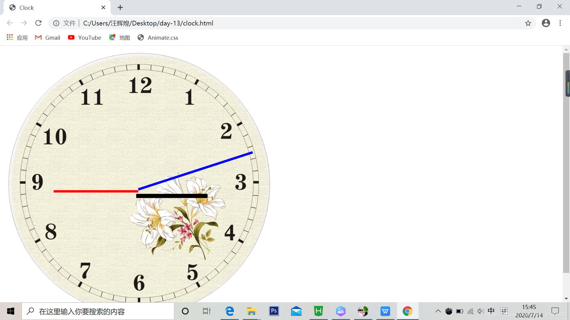
以上的时钟表盘是一个背景图,网上可以下载,而指针直接使用的DIV,使用图片的话效果更佳。
引用js文件为:
window.onload = function(){
 //找到三个元素
 var h = document.getElementById("h")
 var m = document.getElementById("m")
 var s = document.getElementById("s")
 setInterval(function(){
  var date = new Date();
  var H = (date.getHours()%12);
  var M = date.getMinutes();
  var S = date.getUTCSeconds();
  h.style.transform = "rotate("+(H*30)+"deg)";
  m.style.transform = "rotate("+(M*6)+"deg)";
  s.style.transform = "rotate("+(S*6)+"deg)";

 },1000)
}
实现效果如下:


 扫一扫
扫一扫


 433
433

 被折叠的 条评论
为什么被折叠?
被折叠的 条评论
为什么被折叠?
 到【灌水乐园】发言


