


优点
- css绘制图标体积更小,本质上只是文本
- 有效减少http请求,css绘制的图标直接嵌入在HTML中,不需要额外的在向服务器请求
- 方便维护和更新,修改css属性即可全局性的修改样式
- 可以使用em,rem,百分比,响应式设计更方便。直接使用psd切图,如有移动端需求还需要使用媒体查询去修改移动端图片的大小
- css绘制图标基于矢量图形原理,无限缩放不失真
缺点
使用css绘制图标缺点也很明显,有些图标css绘制不出来。或者说使用css绘制过于复杂,代码也会显得冗余。并且也需要考虑到一些浏览器兼容性的问题。
开整
绘制一个简单的图标

.icon1 {
  width: 20px;
  height: 20px;
  border-radius: 50%;
  border: 1px solid #000;
  color: #000;
  /* 控制问号居中 */
  display: flex;
  justify-content: center;
  align-items: center;
  /* 控制问号大小 */
  font-size: 16px;
}
<div class="icon1">?</div>绘制箭头

/* 向下的箭头 */
.arrow-down {
  /* 当设置border-top时,箭头会向上,线的颜色即为border-top的颜色。
    设置左右边框的宽度,可以控制箭头的宽度。
    原理:当元素的宽度和高度都为 0 时,边框会从元素的中心点向外扩展,每个边框会以三角形的形式呈现
    */
  width: 0;
  height: 0;
  border-left: 10px solid transparent;
  border-right: 10px solid transparent;
  border-top: 15px solid orange;
}
<div class="arrow-down"></div>标题前小图标
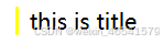
.icon2 {
  padding: 0px 10px;
  position: relative;
  box-sizing: border-box;
}
.icon2::after {
  /* 使用伪元素,不需要添加内容 content属性则可以为空字符串*/
  content: "";
  position: absolute;
  left: 0;
  top: 0;
  width: 2px;
  height: 100%;
  background-color: yellow;
  border-radius: 5px;
}
<div class="icon2">this is title</div>绘制月亮
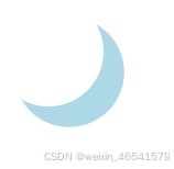
.moon {
  /* 通过border-radius控制元素为圆形,通过box-shadow给圆形设置阴影来控制月亮的大小和颜色 */
  width: 80px;
  height: 80px;
  border-radius: 50%;
  box-shadow: 15px 15px 0px 0px lightblue;
  background-color: transparent;
}
<div class="moon"></div>绘制云彩
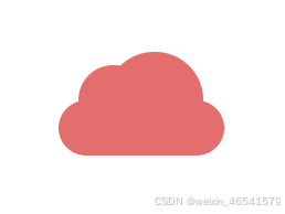
.cloud {
  /*    绘制云彩,
        原理:盒子本身是一个椭圆
        使用伪元素绘制出两个圆形,然后使用z-index控制云彩的层级。
        使用绝对定位来控制伪元素的位置
        通过background设置云彩的颜色
        */
  width: 120px;
  height: 40px;
  background: #e46e6e;
  border-radius: 100px;
  position: relative;
  margin: 120px auto 20px;
}

.cloud::before,
.cloud::after {
  content: "";
  position: absolute;
  background: #e46e6e;
  z-index: -1;
}

.cloud::before {
  width: 50px;
  height: 50px;
  top: -25px;
  left: 15px;
  border-radius: 50px;
}

.cloud::after {
  width: 70px;
  height: 70px;
  top: -35px;
  right: 15px;
  border-radius: 100px;
}
<div class="cloud"></div>绘制心形
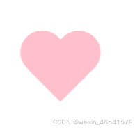
.heart {
  position: relative;
  margin: 0px 440px;
  /*    绘制心形原理:
        本质上是两个长方形,通过绝对定位来控制两个伪元素的位置和
        使用transform进行旋转配合设置圆 角来绘制出心形。
        使用伪元素绘制出两个长方形,然后使用border-radius控制长方形的圆角,
        使用left和top控制长方形的位置,
        使用transform-origin控制长方形的旋转中心,
        使用transform:rotate 控制一个长方形的旋转,
        */
}

.heart::before,
.heart::after {
  position: absolute;
  content: "";
  left: 50px;
  top: 0;
  width: 50px;
  height: 80px;
  background: pink;
  border-radius: 50px 50px 0 0;
  transform: rotate(-45deg);
  transform-origin: 0 100%;
}

.heart::after {
  left: 0;
  transform: rotate(45deg);
  transform-origin: 100% 100%;
}
<div class="heart"></div>end
总结:在使用css绘制图标中,或者其他页面样式中。定位,伪元素,阴影,圆角等都是常用的属性。对于图标的选择方案上具体根据项目实际情况来。(如有误欢迎指正)


 扫一扫
扫一扫


 740
740

 被折叠的 条评论
为什么被折叠?
被折叠的 条评论
为什么被折叠?
 到【灌水乐园】发言


