


 本文介绍了如何使用CSS3的3D旋转和动画属性创建旋转木马效果。关键步骤包括设置3D舞台、图片定位、设置旋转原点、添加关键帧动画,并通过animation属性应用动画。通过调整相关参数,可以实现不同的3D旋转效果。
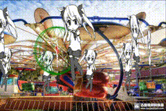
3D旋转-旋转木马特效
首先给大家展示一下效果和代码。
在这里插入代码片
<!DOCTYPE html>
<html lang="en">
<head>
    <meta charset="UTF-8">
    <meta name="viewport" content="width=device-width, initial-scale=1.0">
    <title>Document</title>
    <style>
        *{

            margin:0;
            padding:0;
        }
        body,html{

            height:100%;
        }
        ul,li{

            list-style:none;
        }
        body{

            background:url(./images/yly1.jpg) no-repeat;
            background-size:100% 100%;
            perspective:2000px;
        }
        .box{

            width:350px;
            height:350px;
            background:url(./images/a.gif) no-repeat center;
            position: fixed;
            left:0;top:0;
            right:0;bottom:0;
            margin:auto;
            transform-style: preserve-3d;
            animation: imgRotate 20S linear infinite;
        }
        .box .imgBox{

            width:280px;
            height:400px;
            position:absolute;
            transform-origin:center center -600px;
        }
        .box img{

            display:block;
            width:100%;
            height:100%;
        }
        .imgBox1{

            transform:translateZ(600px);
 最低0.47元/天 解锁文章


 扫一扫
扫一扫


 3217
3217

 被折叠的 条评论
为什么被折叠?
被折叠的 条评论
为什么被折叠?
 到【灌水乐园】发言


