


背景
好久没更新了,博主现在上班主要是做风控相关的机器学习模型,所以案例可能偏这个方面的多一点。
本身带来的的风险评分模型,其实也是常见的机器学习模型,只是数据的背景是KYC(Know Your Customer) 是金融机构、银行、加密货币交易所、支付公司等机构用于验证客户身份的一套合规流程,目的是防止洗钱(AML)、恐怖融资、欺诈和其他非法金融活动。
我们用特征去判断这个客户的信用风险等级,评估其信用等级,然后决定是不是要贷款给他。比人工审核要快,具有更高的效率和效果。
数据介绍
数据集已经是洗过的,很简洁,就一个表:
含义下面都会介绍的。
当然需要本文的全部数据和代码文件的同学还是可以参考:KYC数据
代码实现
导入包
import numpy as np
import pandas as pd
import matplotlib.pyplot as plt
import seaborn as sns
读取数据,展示前2行
df=pd.read_csv('kyc_data.csv')
df.head(2)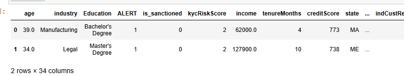
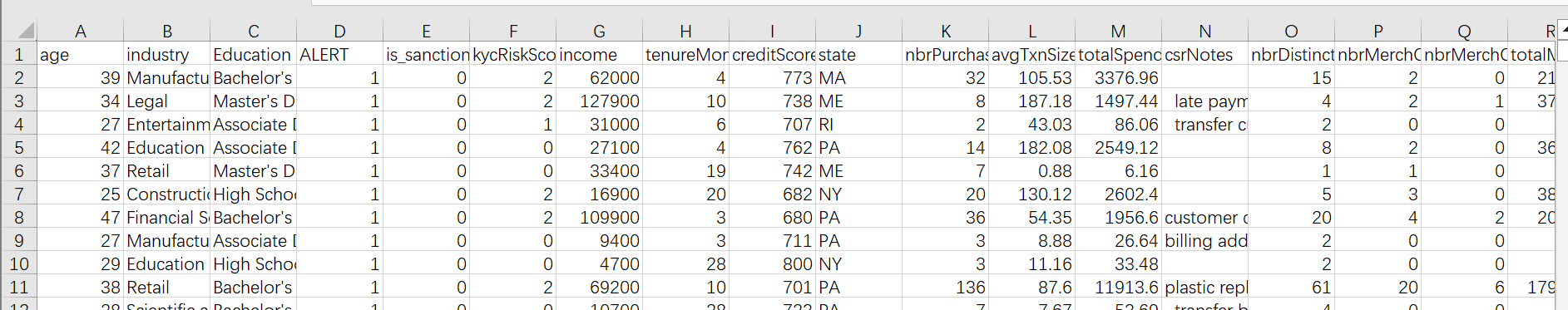
数据的变量含义:
| Variable Name | English Meaning | Variable Type | Chinese Meaning |
|---|---|---|---|
| age | Age | Numeric | 年龄 |
| industry | Industry | Categorical | 行业 |
| Education | Education | Categorical | 教育程度 |
| ALERT | Alert | Binary | 警报 |
| is_sanctioned | Is Sanctioned | Binary | 是否受制裁 |
| kycRiskScore | KYC Risk Score | Numeric | 风险评分 |
| income | Income | Numeric | 收入 |
| tenureMonths | Tenure Months | Numeric | 工龄(月) |
| creditScore | Credit Score | Numeric | 信用评分 |
| state | State | Categorical | 州 |
| nbrPurchases90d | Number of Purchases 90 Days | Numeric | 90天内购买次数 |
| avgTxnSize90d | Average Transaction Size 90 Days | Numeric | 90天内平均交易规模 |
| totalSpend90d | Total Spend 90 Days | Numeric | 90天内总支出 |
| csrNotes | CSR Notes | Text | 客服备注 |
| nbrDistinctMerch90d | Number of Distinct Merchants 90 Days | Numeric | 90天内独特商家数量 |
| nbrMerchCredits90d | Number of Merchant Credits 90 Days | Numeric | 90天内商家退款次数 |
| nbrMerchCreditsRndDollarAmt90d | Number of Merchant Credits Round Dollar Amount 90 Days | Numeric | 90天内商家退款次数(整数金额) |
| totalMerchCred90d | Total Merchant Credit 90 Days | Numeric | 90天内商家退款总额 |
| nbrMerchCreditsWoOffsettingPurch | Number of Merchant Credits Without Offsetting Purchases | Numeric | 无抵消购买的商家退款次数 |
| nbrPayments90d | Number of Payments 90 Days | Numeric | 90天内付款次数 |
| totalPaymentAmt90d | Total Payment Amount 90 Days | Numeric | 90天内付款总额 |
| overpaymentAmt90d | Overpayment Amount 90 Days | Numeric | 90天内超额支付金额 |
| overpaymentInd90d | Overpayment Indicator 90 Days | Binary | 90天内超额支付标志 |
| nbrCustReqRefunds90d | Number of Customer Requested Refunds 90 Days | Numeric | 90天内客户请求退款次数 |
| indCustReqRefund90d | Indicator of Customer Requested Refund 90 Days | Binary | 90天内客户请求退款标志 |
| totalRefundsToCust90d | Total Refunds to Customer 90 Days | Numeric | 90天内退款给客户总额 |
| nbrPaymentsCashLike90d | Number of Cash-Like Payments 90 Days | Numeric | 90天内类现金支付次数 |
| maxRevolveLine | Maximum Revolve Line | Numeric | 最大循环信贷额度 |
| indOwnsHome | Indicator Owns Home | Binary | 是否有房 |
| nbrInquiries1y | Number of Inquiries 1 Year | Numeric | 1年内询问次数 |
| nbrCollections3y | Number of Collections 3 Years | Numeric | 3年内收账次数 |
| nbrWebLogins90d | Number of Web Logins 90 Days | Numeric | 90天内网络登录次数 |
| nbrPointRed90d | Number of Point Redemptions 90 Days | Numeric | 90天内积分兑换次数 |
| PEP | Politically Exposed Person | Binary | 政治敏感人物 |
kycRiskScore就是我们的响应变量Y,就是我们要预测的目标,其他的列都是特征。
查看数据形状
# data frame shape
print('Number of rows: ', df.shape[0])
print('Number of columns: ', df.shape[1])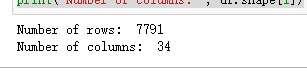
数据探索分析(EDA)
df.info()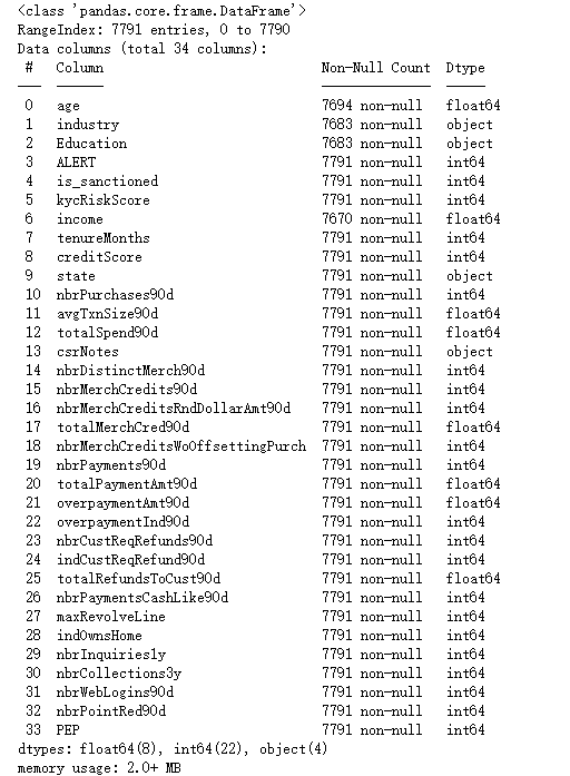
可以看到基本所有的列都是7791条非空的值。但是,industry,income等是有缺失值的,我们需要进行填充。
查看缺失值
null_counts = df.isnull().sum()
# 过滤掉缺失值数量为0的列
null_counts[null_counts > 0]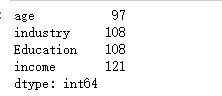
观察缺失值分布
import missingno as msno
msno.matrix(df)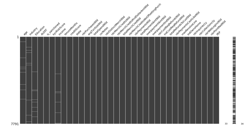
可以看到白色的线就是缺失的,数据样本的缺失分布很散。
数值变量描述性统计
df.select_dtypes(include=['int64','float64']).describe()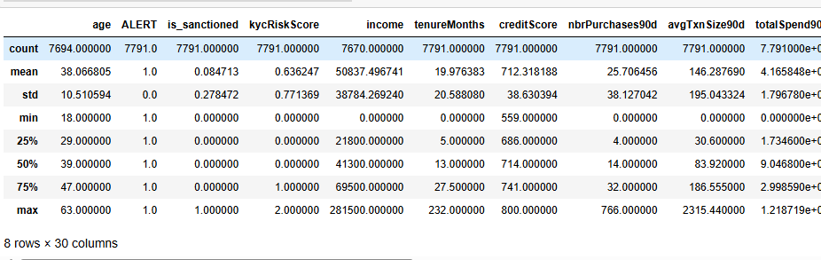
非数值变量描述性统计
df.select_dtypes(exclude=['int64','float64']).describe()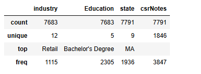
industry Education state三个变量可以作为类别变量,csrNotes是纯文本没可能没啥用
可视化分析
# Create a count plot for the 'kycRiskScore' column
plt.figure(figsize=(4, 3))
sns.countplot(data=df, x='kycRiskScore', palette='viridis')

# Add titles and labels
plt.title('Distribution of kycRiskScore Values')
plt.xlabel('kycRiskScore')
plt.ylabel('Count')

# Show the plot
plt.show()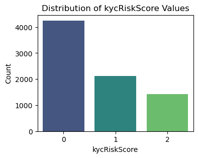
# Create a count plot for the 'is_sanctioned' column
plt.figure(figsize=(4, 3))
sns.countplot(data=df, x='is_sanctioned', palette='viridis')

# Add titles and labels
plt.title('Distribution of is_sanctioned Values')
plt.xlabel('SAR')
plt.ylabel('Count')

# Show the plot
plt.show()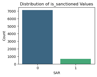
数值型变量画图
先查看哪些是数值变量
df.select_dtypes(exclude=['object']).columns#.tolist()画图
#查看数值特征变量的箱线图分布
num_columns = ['age','income',  'tenureMonths', 'creditScore', 'nbrPurchases90d', 'avgTxnSize90d',
       'totalSpend90d', 'nbrDistinctMerch90d', 'nbrMerchCredits90d', 'nbrMerchCreditsRndDollarAmt90d',
        'totalMerchCred90d', 'nbrMerchCreditsWoOffsettingPurch', 'nbrPayments90d',
       'totalPaymentAmt90d', 'overpaymentAmt90d', 'nbrCustReqRefunds90d',
        'indCustReqRefund90d', 'totalRefundsToCust90d','nbrPaymentsCashLike90d', 'maxRevolveLine',
       'nbrInquiries1y', 'nbrCollections3y', 'nbrWebLogins90d', 'nbrPointRed90d',]# 列表头
dis_cols = 6                   #一行几个
dis_rows = len(num_columns)
plt.figure(figsize=(3 * dis_cols, 2.5 * dis_rows),dpi=128)

for i in range(len(num_columns)):
    plt.subplot(dis_rows,dis_cols,i+1)
    sns.boxplot(data=df[num_columns[i]], orient="v",width=0.5)
    plt.xlabel(num_columns[i],fontsize = 12)
plt.tight_layout()
#plt.savefig('特征变量箱线图',formate='png',dpi=500)
plt.show()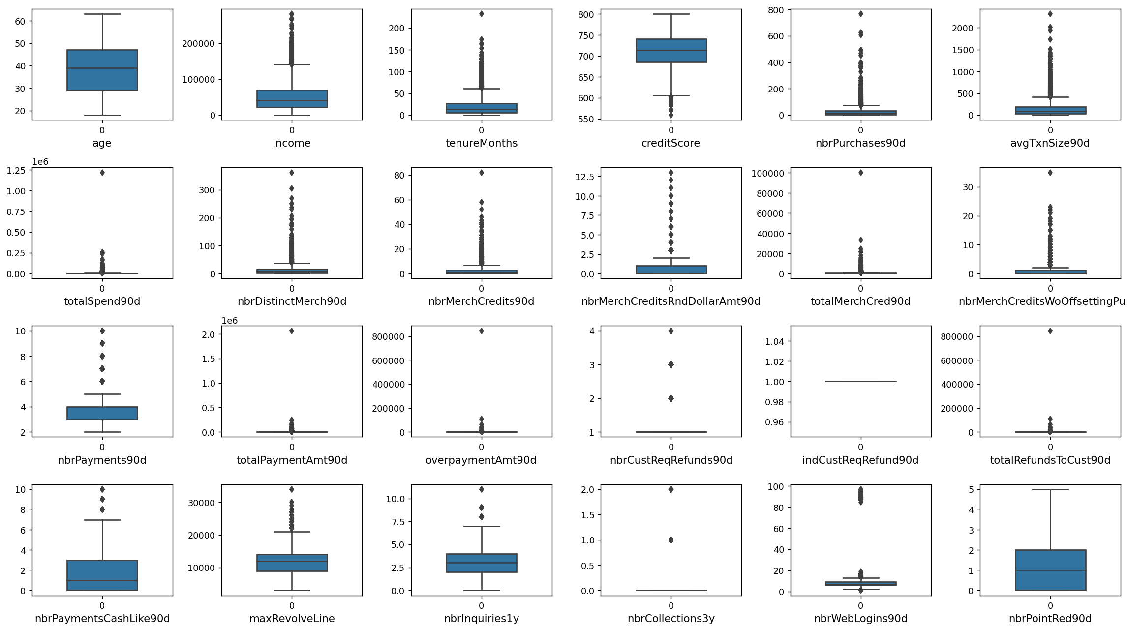
画密度图
dis_cols = 6                   #一行几个
dis_rows = len(num_columns)
plt.figure(figsize=(3 * dis_cols, 2 * dis_rows),dpi=256)

for i in range(len(num_columns)):
    ax = plt.subplot(dis_rows, dis_cols, i+1)
    ax = sns.kdeplot(df[num_columns[i]], color="skyblue" ,fill=True)
    ax.set_xlabel(num_columns[i],fontsize = 14)
plt.tight_layout()
#plt.savefig('训练测试特征变量核密度图',formate='png',dpi=500)
plt.show()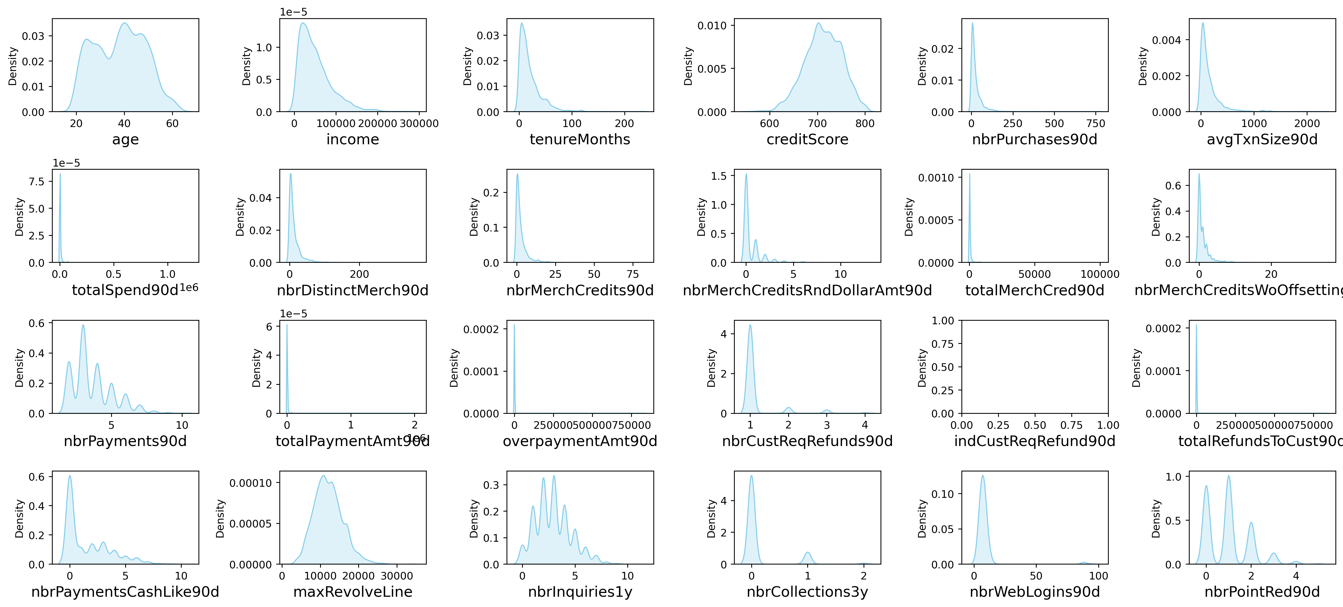
较多变量存在极大值,可能等下需要进行异常值处理
分类型变量画图
先查看哪写变量是非数值型
df.select_dtypes(exclude=['int64','float64']).columns# Select non-numeric columns
non_numeric_columns =['industry', 'Education', 'state','overpaymentInd90d','indOwnsHome']
# Set up the matplotlib figure with 2x4 subplots
f, axes = plt.subplots(2, 3, figsize=(12,8),dpi=128)
# Flatten axes for easy iterating
axes_flat = axes.flatten()
# Loop through the non-numeric columns and create a countplot for each
for i, column in enumerate(non_numeric_columns):
if i < len(non_numeric_columns): # Check to avoid IndexError if there are more than 8 non-numeric columns
sns.countplot(x=column, data=df, ax=axes_flat[i])
axes_flat[i].set_title(f'Count of {column}')
for label in axes_flat[i].get_xticklabels():
label.set_rotation(90)
# Hide any unused subplots
for j in range(i + 1, 2*3):
f.delaxes(axes_flat[j])
plt.tight_layout()
plt.show()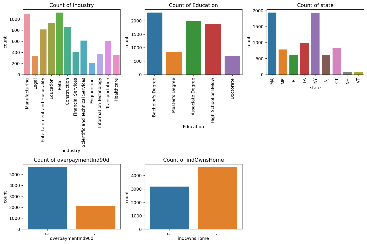
文本变量词云图
from wordcloud import WordCloud

text = ' '.join(df['csrNotes'].dropna())  # Drop NaN values

wordcloud = WordCloud(width=800, height=400, background_color='white').generate(text)

plt.figure(figsize=(10, 5))
plt.imshow(wordcloud, interpolation='bilinear')
plt.axis('off')  # Turn off axis
plt.show()
和KYC相关性的分析可视化
'creditScore','age','income', 'tenureMonths',
fig, axs = plt.subplots(2, 2, figsize=(15, 10))

# 第一幅图:KYC Risk Score vs Credit Score
sns.boxplot(data=df, x='kycRiskScore', y='creditScore', ax=axs[0, 0])
axs[0, 0].set_title('BOX Plot between KYC Risk Score and Credit Score')
axs[0, 0].set_xlabel('KYC Risk Score')
axs[0, 0].set_ylabel('Credit Score')
axs[0, 0].grid(True)

# 第二幅图:KYC Risk Score vs Age
sns.boxplot(data=df, x='kycRiskScore', y='age', ax=axs[0, 1])
axs[0, 1].set_title('BOX Plot between KYC Risk Score and Age')
axs[0, 1].set_xlabel('KYC Risk Score')
axs[0, 1].set_ylabel('Age')
axs[0, 1].grid(True)

# 第三幅图:KYC Risk Score vs Income
sns.boxplot(data=df, x='kycRiskScore', y='income', ax=axs[1, 0])
axs[1, 0].set_title('BOX Plot between KYC Risk Score and Income')
axs[1, 0].set_xlabel('KYC Risk Score')
axs[1, 0].set_ylabel('Income')
axs[1, 0].grid(True)

# 第四幅图:KYC Risk Score vs Tenure Months
sns.boxplot(data=df, x='kycRiskScore', y='tenureMonths', ax=axs[1, 1])
axs[1, 1].set_title('BOX Plot between KYC Risk Score and Tenure Months')
axs[1, 1].set_xlabel('KYC Risk Score')
axs[1, 1].set_ylabel('Tenure Months')
axs[1, 1].grid(True)

# 设置布局以避免重叠
plt.tight_layout()

# 显示图形
plt.show()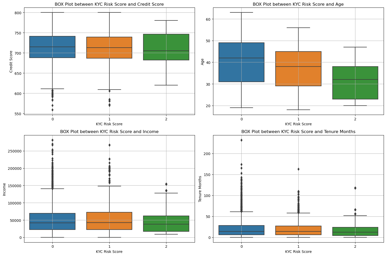
可以看清楚的看到这些变量取值不一样的时候,风险等级的变化。
可以看到年龄和信用分数 不同的kyc是有显著性差异的
'industry', 'Education', 'state','overpaymentInd90d','indOwnsHome'
fig, axs = plt.subplots(3, 2, figsize=(15, 15),dpi=128)
axs = axs.flatten()  # 将子图转换为一维数组以便于迭代

# Define each category variable and corresponding titles
category_vars = ['industry', 'Education', 'state', 'overpaymentInd90d', 'indOwnsHome']
titles = [
    'KYC Risk Score Distribution by Industry',
    'KYC Risk Score Distribution by Education',
    'KYC Risk Score Distribution by State',
    'KYC Risk Score Distribution by Overpayment Indicator (90d)',
    'KYC Risk Score Distribution by Home Ownership'
]

# Different colormaps for each subplot
colormaps = ['viridis', 'plasma', 'cividis_r', 'magma_r', 'cool_r']

# Plot each category variable
for ax, category_var, title, cmap in zip(axs, category_vars, titles, colormaps):
    # 使用Pandas进行数据整理
    category_counts = df.groupby([category_var, 'kycRiskScore']).size().unstack().fillna(0)
    category_counts.plot(kind='bar', stacked=True, ax=ax, colormap=cmap)

    # 设置标题和标签
    ax.set_title(title)
    ax.set_xlabel(category_var)
    ax.set_ylabel('Count')
    ax.legend(title='KYC Risk Score')

# 隐藏最后一个空白子图
axs[-1].axis('off')

plt.tight_layout()
plt.show()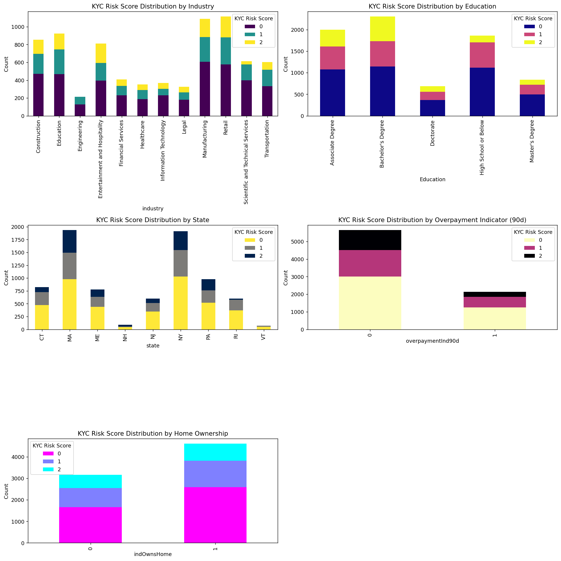
看数值可能不明显,我们要转为比例再来画图
fig, axs = plt.subplots(3, 2, figsize=(15, 15),dpi=128)
axs = axs.flatten()  # 将子图转换为一维数组以便于迭代

# Define each category variable and corresponding titles
category_vars = ['industry', 'Education', 'state', 'overpaymentInd90d', 'indOwnsHome']
titles = [
    'KYC Risk Score Distribution by Industry',
    'KYC Risk Score Distribution by Education',
    'KYC Risk Score Distribution by State',
    'KYC Risk Score Distribution by Overpayment Indicator (90d)',
    'KYC Risk Score Distribution by Home Ownership'
]

# Different colormaps for each subplot
colormaps = ['viridis', 'plasma', 'cividis', 'magma', 'cool']

# Plot each category variable
for ax, category_var, title, cmap in zip(axs, category_vars, titles, colormaps):
    # 使用Pandas进行数据整理并计算比例
    category_counts = df.groupby([category_var, 'kycRiskScore']).size().unstack().fillna(0)
    category_proportions = category_counts.div(category_counts.sum(axis=1), axis=0)

    # 绘制堆积柱状图
    category_proportions.plot(kind='bar', stacked=True, ax=ax, colormap=cmap)

    # 设置标题和标签
    ax.set_title(title)
    ax.set_xlabel(category_var)
    ax.set_ylabel('Proportion')
    ax.legend(title='KYC Risk Score')

axs[-1].axis('off')
plt.tight_layout()
plt.show()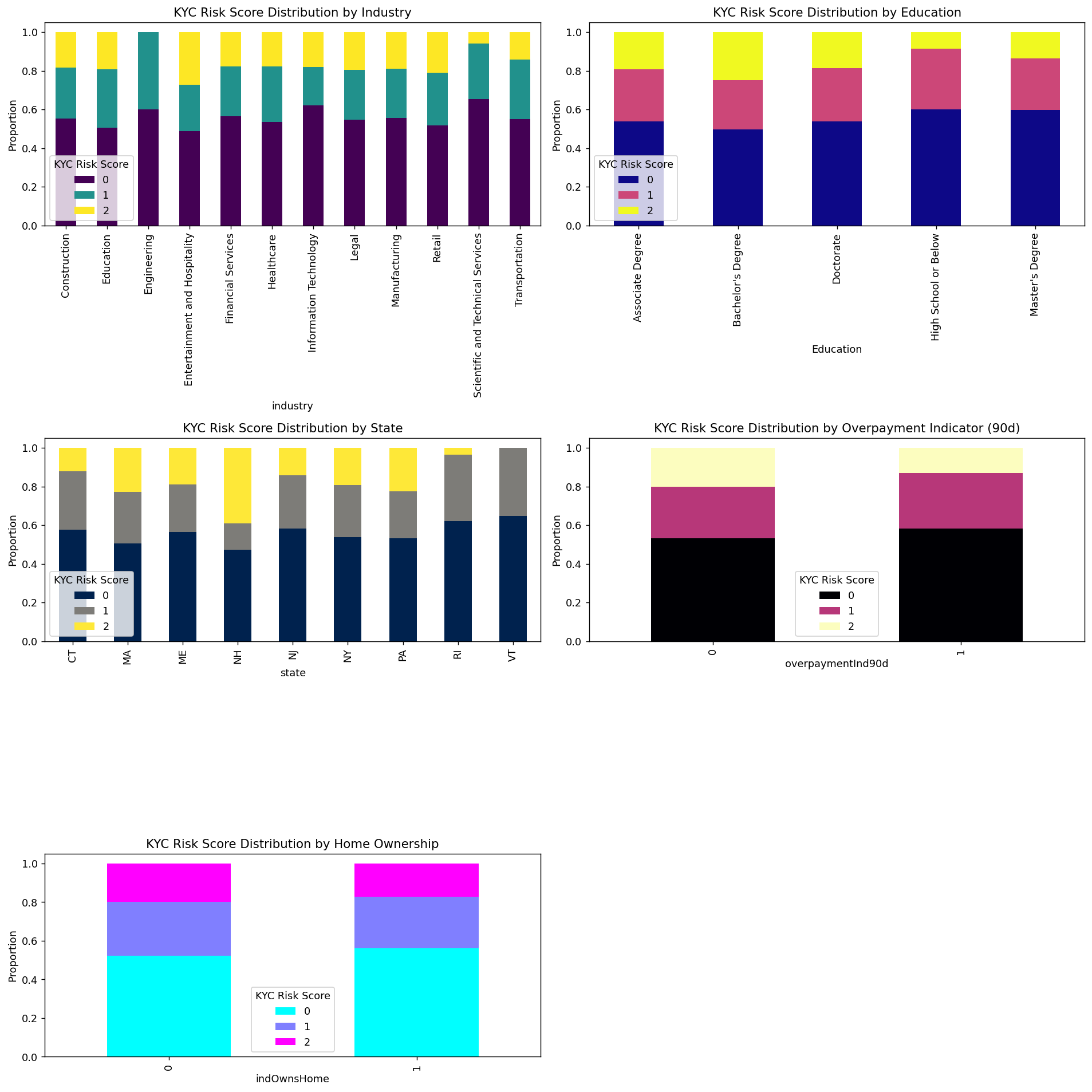
可以很清楚的看到这些变量不同的取值的时候风险比例的情况。
数据预处理
缺失值处理
null_counts = df.isnull().sum()
# 过滤掉缺失值数量为0的列
null_counts[null_counts > 0]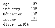
age industry Education income 四个变量存在缺失值
income 和age使用均值填充, industry Education用众数填充
# 使用均值填充数值变量缺失值
df['age'].fillna(df['age'].mean(), inplace=True)
df['income'].fillna(df['income'].mean(), inplace=True)

# 使用众数填充类别变量缺失值
df['industry'].fillna(df['industry'].mode()[0], inplace=True)
df['Education'].fillna(df['Education'].mode()[0], inplace=True)
检查一下
df.isnull().sum().sum()没有缺失值了
特征工程
取值唯一的处理
#取值唯一的变量删除
for col in df.columns:
    if len(df[col].value_counts())==1:
        print(col)
        df.drop(col,axis=1,inplace=True)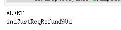
做机器学习当然需要特征越分散越好,因为这样就可以在X上更加有区分度,从而更好的分类。所以那些数据分布很集中的变量可以扔掉。我们用异众比例来衡量数据的分散程度
#计算异众比例
variation_ratio_s=0.05
for col in df.select_dtypes(exclude=['object']).columns:
    df_count=df[col].value_counts()
    kind=df_count.index[0]
    variation_ratio=1-(df_count.iloc[0]/len(df[col]))
    if variation_ratio<variation_ratio_s:
        print(f'{col} 最多的取值为{kind},异众比例为{round(variation_ratio,4)},太小了,没区分度删掉')
        df.drop(col,axis=1,inplace=True)
PEP 最多的取值为0,异众比例为0.0001,太小了,没区分度删掉
非数值型变量处理
df.select_dtypes(exclude=['int64','float64']).describe()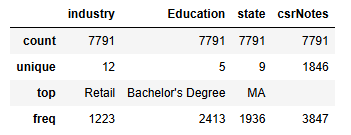
四个类别变量需要进行处理
csrNotes删除,Education进行顺序变量因子化,state做地区映射之后因子化,industry直接进行label encode
### 原始数据备份一下
df1=df.copy()df.drop(columns=['csrNotes'],inplace=True)# 对 'industry' 列进行标签编码
df['industry'], industry_mapping = pd.factorize(df['industry'])#Education进行顺序变量因子化,
education_order = [
    'High School or Below', 'Associate Degree', "Bachelor's Degree",
    "Master's Degree", 'Doctorate'
]

# 将教育列转换为按顺序编码的类别类型
df['Education'] = pd.Categorical(df['Education'], categories=education_order, ordered=True)

# 将类别转换为整数编码
df['Education'] = df['Education'].cat.codes
df['Education'].head(2)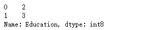
查看一下已经变成数值型数据了。
查看state分布:
df.state.value_counts()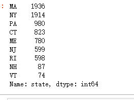
一样,因子化,labelencode
df['state'], state_mapping = pd.factorize(df['state'])
state_mapping
查看洗完的数据:
df.info()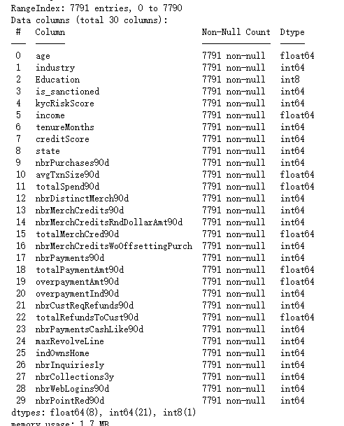
全部都是数值型变了,可以进行计算
异常值处理
取出所有的数值型数据:
df_number=df.select_dtypes(include=['int64', 'float64']).copy()
df_number.shape![]()
#X异常值处理,先标准化
from sklearn.preprocessing import StandardScaler
scaler = StandardScaler()
df_number_s = scaler.fit_transform(df_number)
plt.figure(figsize=(20,8))
plt.boxplot(x=df_number_s,labels=df_number.columns)
#plt.hlines([-10,10],0,len(columns))
plt.show()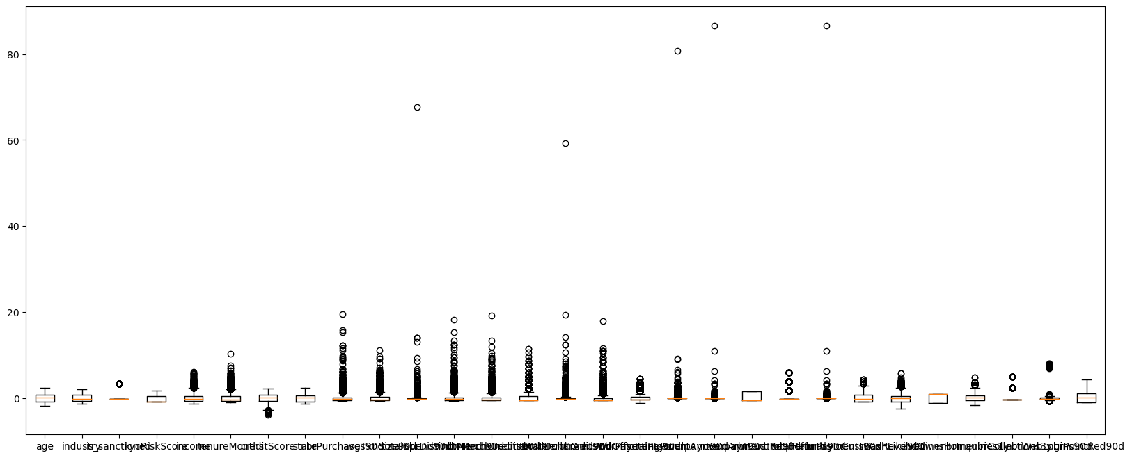
可以看到,很多变量都存在一些异常值,我们需要进行异常值处理
#异常值多的列进行处理
#异常值多的列进行处理
def deal_outline(data,col,n):   #数据,要处理的列名,几倍的方差
    for c in col:
        #print(c)
        mean=data[c].mean()
        std=data[c].std()
        data=data[(data[c]>mean-n*std)&(data[c]<mean+n*std)]
        #print(data.shape)
    return data
#5倍的方差之外都删除
df_number=deal_outline(df_number,df_number.columns,5)
df_number.shape ![]()
### 处理完成后将数据筛选给原始数据
df=df.loc[df_number.index,:]
df.shape
可以看到筛选掉了7791-7199条样本
相关性分析
corr = plt.subplots(figsize = (18,16),dpi=128)
corr= sns.heatmap(df.corr(),annot=True,square=True) #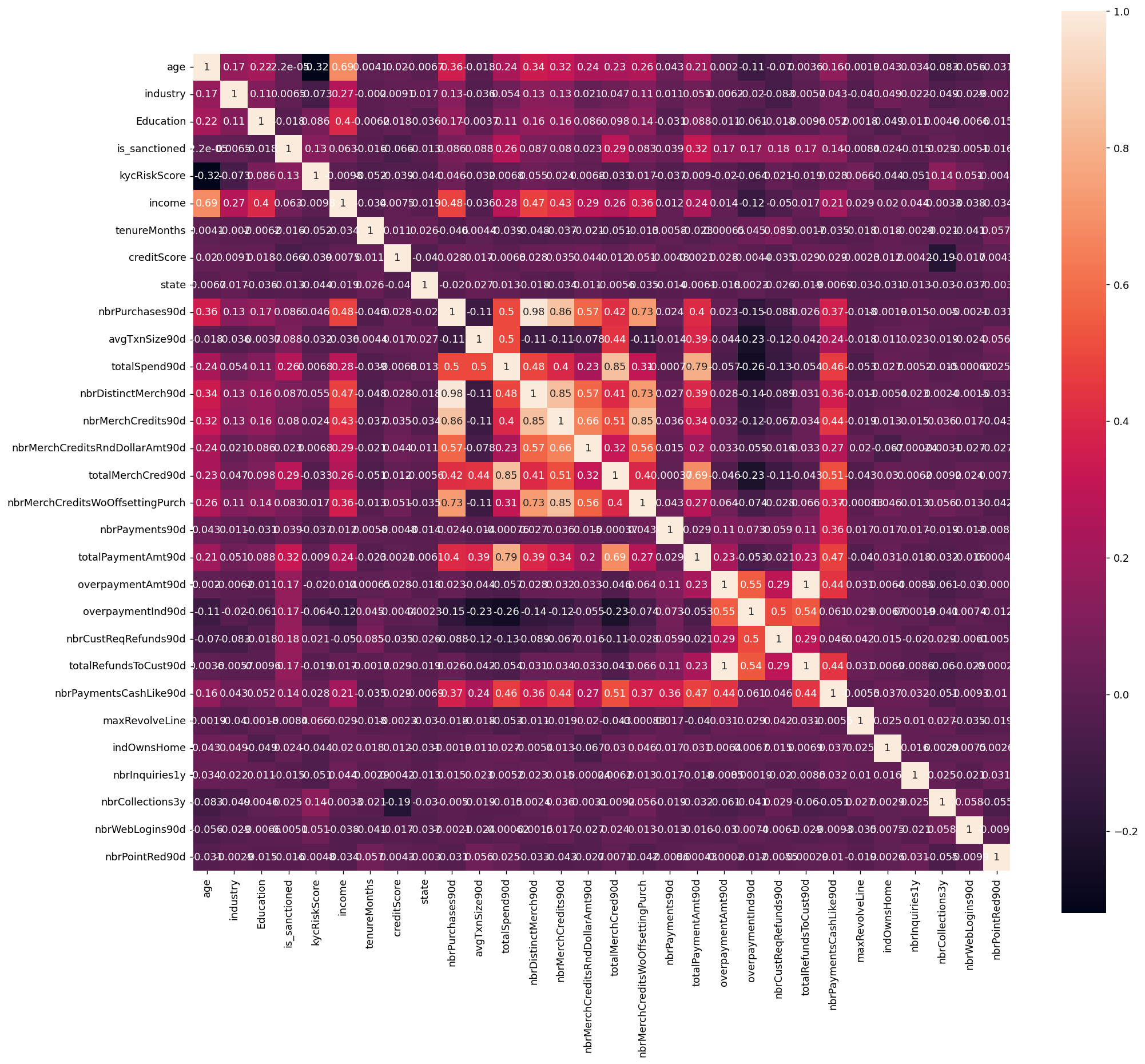
可以看到,'nbrPurchases90d', 'avgTxnSize90d', 'totalSpend90d', 'nbrDistinctMerch90d', 'nbrMerchCredits90d', 'nbrMerchCreditsRndDollarAmt90d', 'totalMerchCred90d', 'nbrMerchCreditsWoOffsettingPurch', 这几个变量的相关性都很高,存在多重共线性的问题
计算皮尔逊相关系数
##皮尔逊相关系数
correlation_matrix = df.corr()
response_correlation = correlation_matrix['kycRiskScore'].drop('kycRiskScore').sort_values(key=abs, ascending=False)
pd.DataFrame(response_correlation)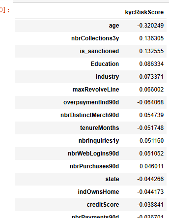
这些相关系数反映了不同变量与kycRiskScore之间的线性关系,提供了关于每个变量对风险评估潜在贡献的初步见解。值得注意的是,age与kycRiskScore之间存在显著的负相关(-0.320249),这表明随着年龄的增加,个体在KYC风险评分中的风险倾向降低。这种关系可能反映出年龄增长与财务稳定性之间的关联,通常而言,较年长的个体可能具有更稳定的收入来源和更保守的财务行为。
此外,is_sanctioned展示了相对较高的正相关(0.132555),暗示被制裁状态可能导致更高的风险评分。这一发现可能支持这样一种观点:被列入制裁名单的个体由于可能涉及不当或非法行为,而被金融机构视作更高风险的客户。
其他变量(如creditScore、indOwnsHome等)尽管存在一定的相关性,但其相关系数绝对值较小,暗示它们对kycRiskScore的直接线性影响有限。然而,这并不排除它们在非线性关系或交互效应中可能发挥重要作用。
整体来看,这些相关分析结果强调了在构建KYC风险评分模型时,应考虑多维度的变量,并结合非线性特征工程,以更准确地反映客户风险特征。这为未来的研究提供了方向,表明仅依赖线性相关可能不足以全面捕捉金融风险中的复杂性,需要进一步的多方法交叉验证和模型优化。
特征筛选
随机森林筛选
取出X和y
X=df.drop(columns=['kycRiskScore'])
y=df['kycRiskScore']
X.shape,y.shape![]()
from sklearn.feature_selection import SelectFromModel
from sklearn.ensemble import RandomForestClassifier
model = RandomForestClassifier(n_estimators=500, max_features=int(np.sqrt(X.shape[-1])), random_state=0)
model.fit(X,y)
selection =SelectFromModel(model,threshold=0.02,prefit=True)
select_X=selection.transform(X)
select_X.shape![]()
sorted_index = model.feature_importances_.argsort()[::-1]
plt.figure(figsize=(10, 8),dpi=128) # 可以调整尺寸以适应所有特征

sns.barplot(x=model.feature_importances_[sorted_index], y=X.columns[sorted_index], orient='h')
plt.xlabel('Feature Importance')  # x轴标签
plt.ylabel('Feature')             # y轴标签
plt.show()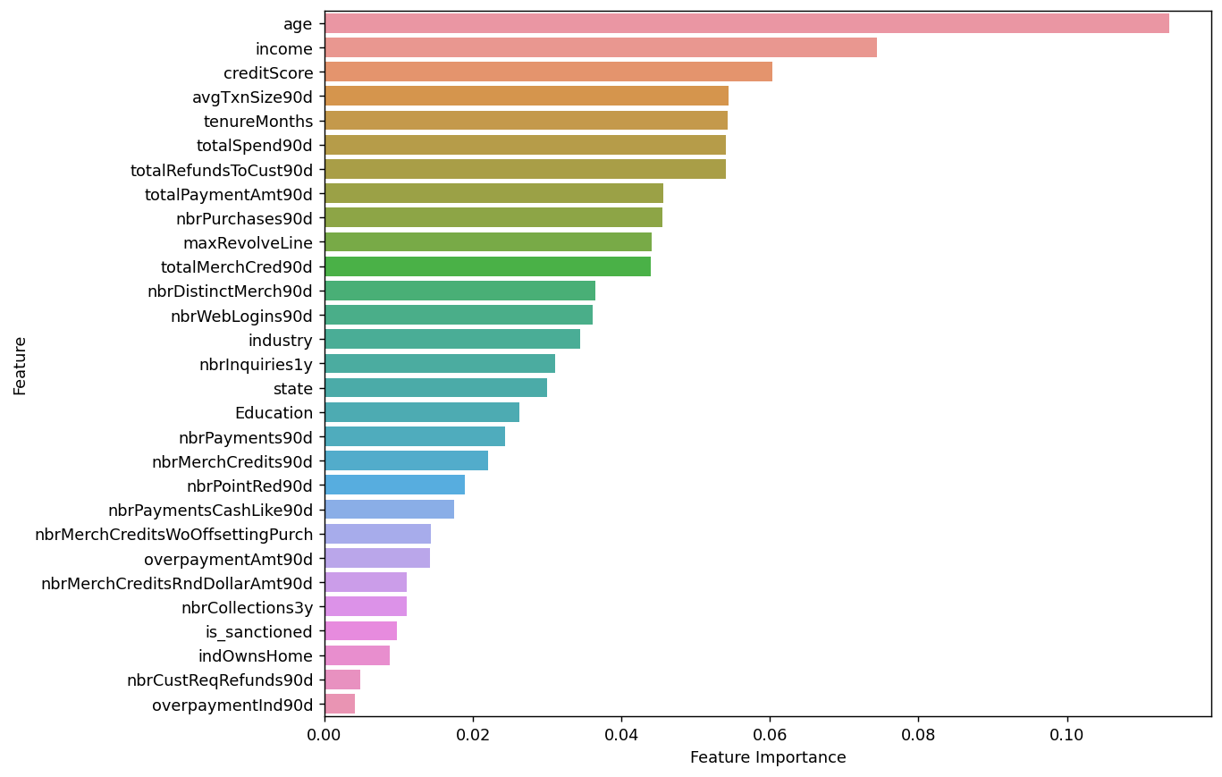
变量贡献度小于0.02的就去掉了
print(selection.get_support())
print(selection.get_support(True))
use_cols=[X.columns[i] for i in selection.get_support(True)]
use_cols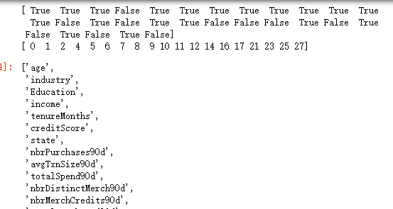
查看一下哪些变量被删除了
set(X.columns)-set(use_cols)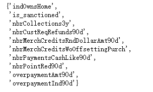
这些变量因为对y没有很好的区分能力,被剔除了
多重共线性筛选
X=df[use_cols]
X.shape![]()
使用VIF筛选
from statsmodels.stats.outliers_influence import variance_inflation_factor

vif_data = pd.DataFrame()
vif_data["feature"] = X.columns
vif_data["VIF"] = [variance_inflation_factor(X.values, i) for i in range(X.shape[1])]
vif_data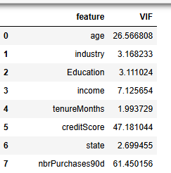
nbrPurchases90d,brDistinctMerch90d的 VIF大于50,进行剔除
final_col=list(set(use_cols)-set(['nbrPurchases90d','brDistinctMerch90d']))
len(final_col)![]()
print(f"最终留下来的变量:{', '.join(final_col)}")
机器学习模型构建
数据标准化
先取出X和y。
#取出X和y
X=df[final_col]
y=df['kycRiskScore']
X.shape,y.shape![]()
# 进行标准化
#数据标准化
from sklearn.preprocessing import StandardScaler
scaler = StandardScaler()
scaler.fit(X)
X_s = scaler.transform(X)
print('标准化后数据形状:')
print(X_s.shape,y.shape)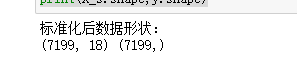
训练集测试集划分
#划分训练集和测试集
from sklearn.model_selection import train_test_split
X_train,X_test,y_train,y_test=train_test_split(X_s,y,stratify=y,test_size=0.2,random_state=0)
print(X_train.shape,X_test.shape,y_train.shape,y_test.shape)![]()
### 查看训练和测试集的y的类别占比
y_train.value_counts(normalize=True)
y_test.value_counts(normalize=True)
训练集和测试集的比例是类似的。两者比例类似,分布类似,可以进行训练。
计算评价指标函数定义
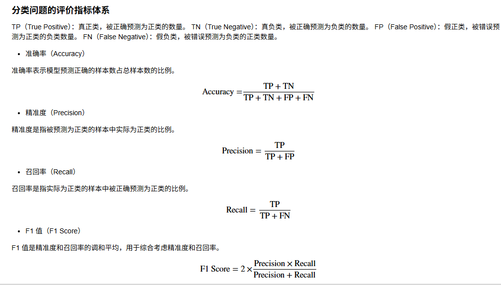
下面是py实现
from sklearn.metrics import confusion_matrix
from sklearn.metrics import classification_report
from sklearn.metrics import cohen_kappa_score

def evaluation(y_test, y_predict):
    accuracy=classification_report(y_test, y_predict,output_dict=True)['accuracy']
    s=classification_report(y_test, y_predict,output_dict=True)['weighted avg']
    precision=s['precision']
    recall=s['recall']
    f1_score=s['f1-score']
    #kappa=cohen_kappa_score(y_test, y_predict)
    return accuracy,precision,recall,f1_score #, kappa
建立分类模型
使用十种机器学习模型进行对比
#导包
from sklearn.linear_model import LogisticRegression
from sklearn.discriminant_analysis import LinearDiscriminantAnalysis
from sklearn.neighbors import KNeighborsClassifier
from sklearn.tree import DecisionTreeClassifier
from sklearn.ensemble import RandomForestClassifier
from sklearn.ensemble import GradientBoostingClassifier
from xgboost.sklearn import XGBClassifier
from lightgbm import LGBMClassifier
from sklearn.svm import SVC
from sklearn.neural_network import MLPClassifier

from sklearn.ensemble import StackingClassifier
num_classes=y.nunique()
num_classes ![]()
3分类问题。
实例化分类器
#逻辑回归
model1 =  LogisticRegression(C=1e10,max_iter=10000)

#线性判别分析
model2 = LinearDiscriminantAnalysis()

#K近邻
model3 = KNeighborsClassifier(n_neighbors=10)

#决策树
model4 = DecisionTreeClassifier(random_state=7,max_features='sqrt',class_weight='balanced')

#随机森林
model5= RandomForestClassifier(n_estimators=300,  max_features='sqrt',random_state=10)

#梯度提升
model6 = GradientBoostingClassifier(random_state=123)

#极端梯度提升
model7 = XGBClassifier(objective='multi:softmax', num_class=num_classes, random_state=1)

#轻量梯度提升
model8 = LGBMClassifier(objective='multiclass', num_class=num_classes, random_state=1, verbose=-1)

#支持向量机
model9 = SVC(kernel="rbf", random_state=77)

#神经网络
model10 = MLPClassifier(hidden_layer_sizes=(16,8), random_state=77, max_iter=10000)


model_list=[model1,model2,model3,model4,model5,model6,model7,model8,model9,model10]
model_name=['逻辑回归','线性判别','K近邻','决策树','随机森林','梯度提升','极端梯度提升','轻量梯度提升','支持向量机','神经网络']
再加一个stacking模型
# 创建 stacking 模型
estimators = [
    ('逻辑回归', model1),
    ('线性判别', model2),
    ('K近邻', model3),
    ('决策树', model4),
    ('随机森林', model5),
    ('梯度提升', model6),
    ('支持向量机', model9),
    ('神经网络', model10)
]

stacking_model = StackingClassifier(estimators=estimators, final_estimator=LogisticRegression())

model_list.append(stacking_model)
model_name.append('Stacking模型')

print(model_list)
print(model_name)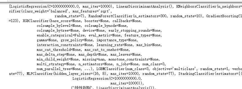
模型的训练和评估
#遍历所有的模型,训练,预测,评估
#遍历所有的模型,训练,预测,评估
df_eval=pd.DataFrame(columns=['Accuracy','Precision','Recall','F1_score'])
for i in range(len(model_list)):
    model_C=model_list[i]
    name=model_name[i]
    model_C.fit(X_train, y_train)
    pred=model_C.predict(X_test)
    #s=classification_report(y_test, pred)
    s=evaluation(y_test,pred)
    df_eval.loc[name,:]=list(s)
    print(f'{name}模型完成')
查看模型的测试集上的效果对比
df_eval.astype('float').style.bar(color='gold')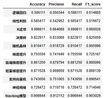
评价指标可视
import matplotlib.pyplot as plt
plt.rcParams['font.sans-serif'] = ['KaiTi']  #中文
plt.rcParams['axes.unicode_minus'] = False   #负号

bar_width = 0.4
colors=['c', 'b', 'g', 'tomato', 'm', 'y', 'lime', 'k','orange','pink','grey','tan']
fig, ax = plt.subplots(2,2,figsize=(10,8),dpi=128)
for i,col in enumerate(df_eval.columns):
    n=int(str('22')+str(i+1))
    plt.subplot(n)
    df_col=df_eval[col]
    m =np.arange(len(df_col))
    plt.bar(x=m,height=df_col.to_numpy(),width=bar_width,color=colors)

    #plt.xlabel('Methods',fontsize=12)
    names=df_col.index
    plt.xticks(range(len(df_col)),names,fontsize=10)
    plt.xticks(rotation=40)
    plt.ylabel(col,fontsize=14)

plt.tight_layout()
#plt.savefig('柱状图.jpg',dpi=512)
plt.show()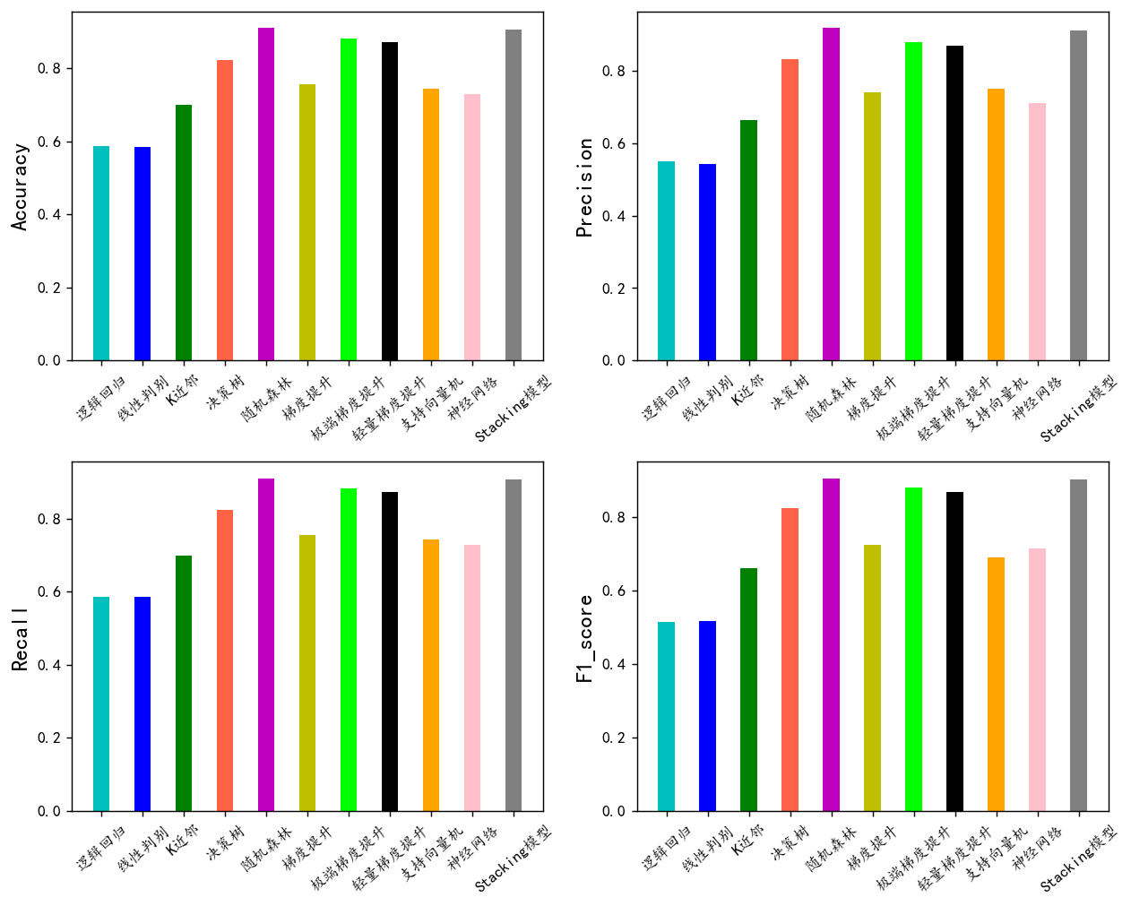
随机森林,极端梯度提升,轻量梯度提升三个模型的F1值最高,下面我们用这三个模型进行K折交叉验证。其他模型效果一般就不考虑了。
模型的选择和超参数优化
重复的K折交叉验证
from sklearn.model_selection import KFold
from sklearn.metrics import classification_report, confusion_matrix, accuracy_score, precision_score, recall_score, f1_score

def evaluate_metrics(y_true, y_pred):
    return {
        'Accuracy': accuracy_score(y_true, y_pred),
        'Precision': precision_score(y_true, y_pred, average='weighted'),
        'Recall': recall_score(y_true, y_pred, average='weighted'),
        'F1_score': f1_score(y_true, y_pred, average='weighted')  }

def print_metrics(metrics, fold_number):
    print(f'    第{fold_number}折的准确率为:{metrics["Accuracy"]:.4f},Precision为{metrics["Precision"]:.4f},Recall为{metrics["Recall"]:.4f},F1_score为{metrics["F1_score"]:.4f}')

def cross_val(model=None, X=None, y=None, K=5, repeated=1, show_confusion_matrix=True):
    df_mean = pd.DataFrame(columns=['Accuracy', 'Precision', 'Recall', 'F1_score'])
    df_std = pd.DataFrame(columns=['Accuracy', 'Precision', 'Recall', 'F1_score'])

    for n in range(repeated):
        print(f'正在进行第{n+1}次重复K折.....随机数种子为{n}\n')
        kf = KFold(n_splits=K, shuffle=True, random_state=n)

        metrics_list = {metric: [] for metric in ['Accuracy', 'Precision', 'Recall', 'F1_score']}

        for i, (train_index, test_index) in enumerate(kf.split(X), 1):
            print(f'        正在进行第{i}折的计算')
            X_train, X_test = X.to_numpy()[train_index], X.to_numpy()[test_index]
            y_train, y_test = np.array(y)[train_index], np.array(y)[test_index]

            model.fit(X_train, y_train)
            pred = model.predict(X_test)
            metrics = evaluate_metrics(y_test, pred)

            for key, value in metrics.items():
                metrics_list[key].append(value)

            if show_confusion_matrix:
                print("混淆矩阵:")
                table = pd.crosstab(y_test, pred, rownames=['Actual'], colnames=['Predicted'])
                plt.figure(figsize=(4,3))
                sns.heatmap(table, cmap='Blues', fmt='.20g', annot=True)
                plt.tight_layout()
                plt.show()
                print('混淆矩阵的各项指标为:')
                print(classification_report(y_test, pred))

            print_metrics(metrics, i)

        print(f'    ———————————————完成本次的{K}折交叉验证———————————————————\n')
        mean_values = {key: np.mean(values) for key, values in metrics_list.items()}
        std_values = {key: np.std(values) for key, values in metrics_list.items()}

        print('第{}次重复K折,本次{}折交叉验证的总体指标均值和方差:'.format(n+1, K))
        for metric in metrics_list.keys():
            print('    {}均值为{:.4f},方差为{:.4f}'.format(metric, mean_values[metric], std_values[metric]))

        print("\n====================================================================================================================\n")

        df_mean = df_mean.append(mean_values, ignore_index=True)
        df_std = df_std.append(std_values, ignore_index=True)

    return df_mean, df_std
LGBM模型
model = LGBMClassifier(objective='multiclass',num_class=7,random_state=1, verbose=-1)
lgb_crosseval,lgb_crosseval2=cross_val(model=model,X=X,y=y,K=5,repeated=4)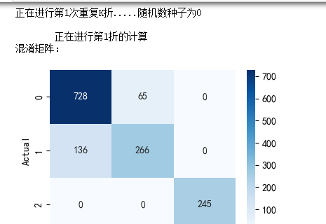
XGboost模型
model = XGBClassifier(use_label_encoder=False,eval_metric=['logloss','auc','error'],
                        objective='multi:softmax',random_state=0)
xgb_crosseval,xgb_crosseval2=cross_val(model=model,X=X,y=y,K=5,repeated=4,show_confusion_matrix=True)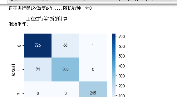
梯度提升模型
model = RandomForestClassifier(n_estimators=200,  max_features='sqrt',random_state=10)
rf_crosseval, rf_crosseval2 = cross_val(model=model, X=X, y=y, K=5, repeated=4, show_confusion_matrix=True)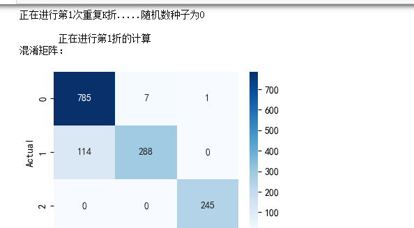
最后对三个模型的每一次K折交叉验证的四个指标计算其均值和方差,来全方面地对比他们的预测性能。
plt.subplots(1,4,figsize=(16,3),dpi=128)
for i,col in enumerate(lgb_crosseval.columns):
    n=int(str('14')+str(i+1))
    plt.subplot(n)
    plt.plot(lgb_crosseval[col], 'k', label='LGB')
    plt.plot(xgb_crosseval[col], 'b-.', label='XGB')
    plt.plot(rf_crosseval[col], 'r-^', label='RF')
    plt.title(f'不同模型的{col}对比')
    plt.xlabel('重复交叉验证次数')
    plt.ylabel(col,fontsize=16)
    plt.legend()
plt.tight_layout()
plt.show()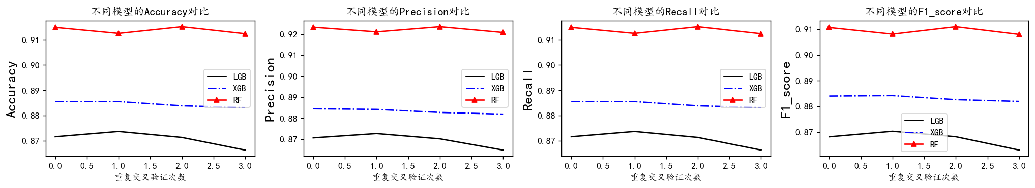
黑色的实线是LGBM模型,蓝色的虚线是XGB模型,红色的点线是RF模型。从上图可以看到从准确率、精确度、召回率和F1值四个指标上来看, AUC和recall上,RF模型较好。RF在F1值表现最好。我们较为看重F1值。 再来看他们的方差图对比:
plt.subplots(1,4,figsize=(16,3),dpi=128)
for i,col in enumerate(lgb_crosseval2.columns):
    n=int(str('14')+str(i+1))
    plt.subplot(n)
    plt.plot(lgb_crosseval2[col], 'k', label='LGB')
    plt.plot(xgb_crosseval2[col], 'b-.', label='XGB')
    plt.plot(rf_crosseval2[col], 'r-^', label='RF')
    plt.title(f'不同模型的{col}方差对比')
    plt.xlabel('重复交叉验证次数')
    plt.ylabel(col,fontsize=16)
    plt.legend()
plt.tight_layout()
plt.show()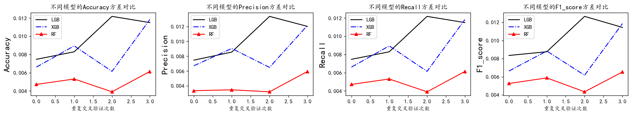
方差代表稳定性,可以看到RF模型方差最小,效果最好
综合来看,随机森林表现算是较好的,F1值高,下面对随机森林进行超参数搜索。
超参数搜索
#利用K折交叉验证搜索最优超参数
from sklearn.model_selection import KFold, StratifiedKFold
from sklearn.model_selection import GridSearchCV,RandomizedSearchCV
param_distributions = {
'max_depth': range(3, 10),
'max_features': ['sqrt', 'log2', None],
'n_estimators': [100, 200, 300, 400, 500]
}
# 设置KFold交叉验证
kfold = KFold(n_splits=5, shuffle=True, random_state=1)
# 创建RandomForestClassifier模型
rf_model = RandomForestClassifier(random_state=10)
# 使用RandomizedSearchCV进行参数搜索
model = RandomizedSearchCV(estimator=rf_model, param_distributions=param_distributions,
n_iter=100, cv=kfold, random_state=10)
# 训练模型
model.fit(X_train, y_train)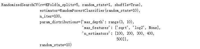
# 输出最佳参数和最佳得分
print("Best Parameters:", model.best_params_)
print("Best Score:", model.best_score_)bp=model.best_params_然后将寻找到的最优参数传入模型,再次进行拟合评价,轻微修改调试。
model = RandomForestClassifier(random_state=10,**bp)
model.fit(X_train, y_train)
# 使用测试集进行预测
pred = model.predict(X_test)
# 评估模型性能
print(classification_report(y_test, pred))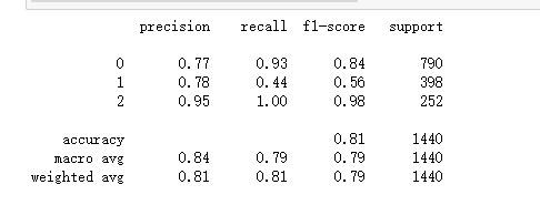
评价指标图
混淆矩阵
查看结果的混淆矩阵
# 绘制混淆矩阵
conf_matrix = confusion_matrix(y_test, pred)
plt.figure(figsize=(8, 6))
sns.heatmap(conf_matrix, annot=True, fmt='d', cmap='Blues', xticklabels=model.classes_, yticklabels=model.classes_)
plt.ylabel('Actual')
plt.xlabel('Predicted')
plt.title('Confusion Matrix')
plt.show()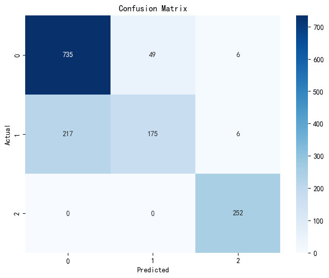
ROC图
from sklearn.metrics import roc_curve, auc, confusion_matrix, classification_report
# 绘制 ROC 曲线
if len(model.classes_) == 2:
    # 二分类情况
    probs = model.predict_proba(X_test)[:, 1]
    fpr, tpr, _ = roc_curve(y_test, probs)
    roc_auc = auc(fpr, tpr)

    plt.figure()
    plt.plot(fpr, tpr, color='darkorange', lw=2, label='ROC curve (area = %0.2f)' % roc_auc)
    plt.plot([0, 1], [0, 1], color='navy', lw=2, linestyle='--')
    plt.xlim([0.0, 1.0])
    plt.ylim([0.0, 1.05])
    plt.xlabel('False Positive Rate')
    plt.ylabel('True Positive Rate')
    plt.title('Receiver Operating Characteristic')
    plt.legend(loc="lower right")
    plt.show()
else:
    # 多分类情况:为每个类别绘制 ROC 曲线
    y_score = model.predict_proba(X_test)
    for i in range(len(model.classes_)):
        fpr, tpr, _ = roc_curve(y_test == i, y_score[:, i])
        roc_auc = auc(fpr, tpr)
        plt.plot(fpr, tpr, lw=2, label='Class %d ROC curve (area = %0.2f)' % (i, roc_auc))

    plt.plot([0, 1], [0, 1], color='navy', lw=2, linestyle='--')
    plt.xlim([0.0, 1.0])
    plt.ylim([0.0, 1.05])
    plt.xlabel('False Positive Rate')
    plt.ylabel('True Positive Rate')
    plt.title('Receiver Operating Characteristic - Multiclass')
    plt.legend(loc="lower right")
    plt.show()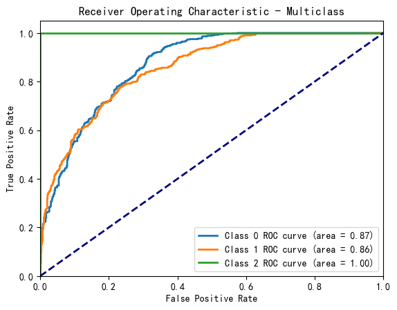
#使用所有数据训练
#model = RandomForestClassifier(random_state=10,**bp)
model =RandomForestClassifier(n_estimators=300,  max_features='sqrt',random_state=10)
model.fit(np.r_[X_train,X_test],np.r_[y_train,y_test])
pred=model.predict(np.r_[X_train,X_test])
evaluation(np.r_[y_train,y_test],pred)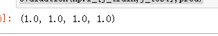
变量重要性
sorted_index = model.feature_importances_.argsort()[::-1]
mfs=model.feature_importances_[sorted_index]
plt.figure(figsize=(7,4),dpi=128)
sns.barplot(y=np.array(range(len(mfs))),x=mfs,orient='h')
plt.yticks(np.arange(X.shape[1]), X.columns[sorted_index])
plt.xlabel('Feature Importance')
plt.ylabel('Feature')
plt.title('LGBM')
plt.show() 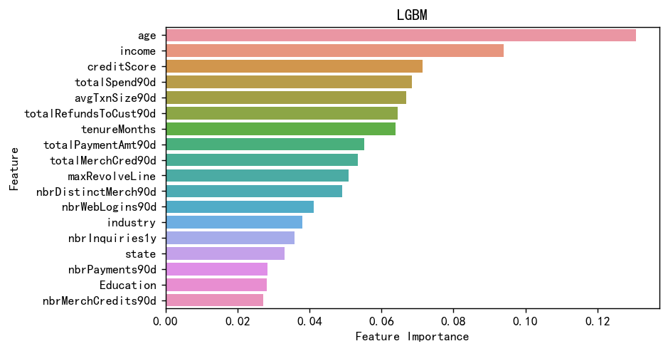
可以看到年龄,收入对于风险分时影响最大的,这也很合理。
总结
本文基于KYC(了解你的客户)合规流程数据,构建了机器学习风控模型。
机器学习全流程,读取数据,探索性分析,可视化,预处理,特征工程,异常值处理。建模,模型对比,交叉验证,超参数搜索,模型评估,特征变量重要性。
首先对7791条客户数据进行了EDA分析,发现年龄、收入等关键特征与风险评分显著相关。通过随机森林特征选择剔除低贡献变量,并使用VIF处理多重共线性问题。对比10种机器学习模型后,随机森林在5折交叉验证中表现最优(F1=0.84)。最终模型显示年龄(负相关)和收入是影响风险评分的核心因素。该研究为金融机构客户风险评估提供了有效解决方案,验证了机器学习在反洗钱风控中的实用价值。
创作不易,看官觉得写得还不错的话点个关注和赞吧,本人会持续更新python数据分析领域的代码文章~


 1172
1172

 被折叠的 条评论
为什么被折叠?
被折叠的 条评论
为什么被折叠?
 到【灌水乐园】发言


