


用this.$confirm固定高度是420px,在移动端显示太宽,需要重新修改el-message-box的样式。
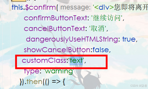
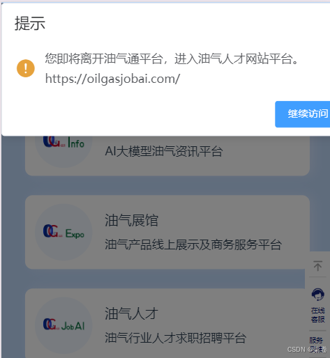
      this.$confirm('You are about to leave the platform', 'Tips', {
        confirmButtonText: 'continue visit',
      dangerouslyUseHTMLString: true,
        cancelButtonText: 'Cancel',
      showCancelButton:false,
        type: 'warning'
      }).then(() => {

      console.log("success")
    }).catch(() => {

      });
当采用customClass之后,在页面css中重新设置宽度,但起不到一点作用,
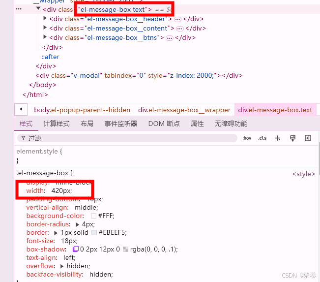
注意1
样式需要写在scoped之外,表示全局样式,不局限在页面中,于是有了三种写法,直接重写el-message-box、定义类text、两个一起定义。
第一种
<style>
  .el-message-box{
    width: 325px !important;
    margin: 100px 0 !important;
  }
</style>
第二种
<style>
.text{
    width: 325px !important;
    margin: 100px 0 !important;
  }
  </style>
第三种
<style>
.el-message-box .text{
    width: 325px !important;
    margin: 100px 0 !important;
  }
  </style>
但是,第一种、第二种可以实现重定义el-message-box的样式
第三种就不行了,不知道为啥,不理解!
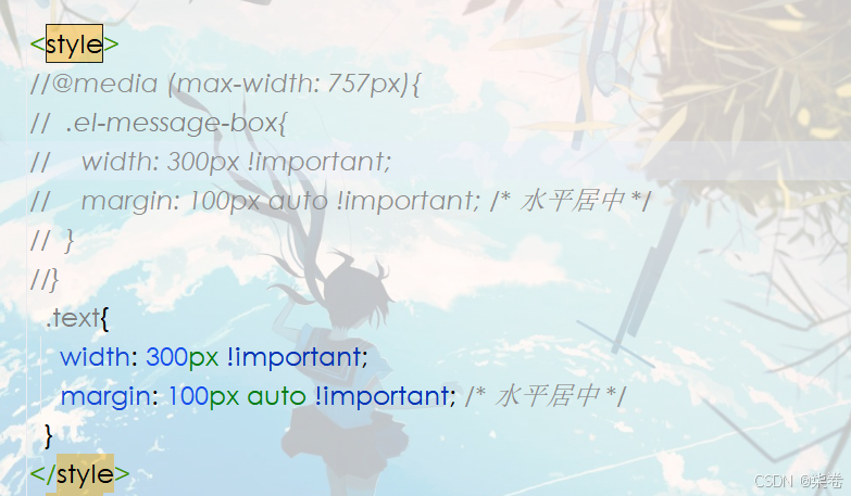
注意2
限制移动端的el-message-box宽度,而PC中的el-message-box宽度不变,用到media,“可以指定一个媒体查询和一个 CSS 块,当且仅当该媒体查询与正在使用其内容的设备匹配时,该 CSS 块才能起作用。”
<style>
@media (max-width: 757px){
  .el-message-box{
    width: 300px !important;
    margin: 100px auto !important; /* 水平居中 */
  }
}
</style>


 扫一扫
扫一扫


 6155
6155

 被折叠的 条评论
为什么被折叠?
被折叠的 条评论
为什么被折叠?
 到【灌水乐园】发言


