


CSS学习(三)网页元素美化
1,文字样式
| 名称 | 作用 |
|---|---|
| font-family | 字体 |
| font-size | 字体大小 |
| font-weight | 字体粗细 |
| color | 字体颜色 |
| font-style | 字体样式 oblique(斜体) |
@font-face 自定义字体
<style>
@font-face
{
    font-family: myFont;   /*自命名字体*/
    src: url(字体路径);
    font-weight:bold   /*使用粗体*/
}

div
{
    font-family:myFont;
}
</style>
2,文本样式
| 名称 | 作用 |
|---|---|
| color | 文本颜色 |
| text-align | 文字排版 (center:水平居中) |
| text-indent | 文字缩进 单位:em |
| line-height | 行高(通常用来对一行进行垂直居中) |
| text-decoration | 文本装饰 (underline:下划线 line-through:中划线…) |
| text-showed | 文本阴影 |
| box-shadow | 盒子阴影 |
| Text Overflow | 文本溢出属性指定应向用户如何显示溢出内容 |
| word-wrap | 对不可分割单词进行分割 |
text-showed
水平阴影,垂直阴影,模糊的距离,以及阴影的颜色:
h1
{
    text-shadow: 5px 5px 5px #FF0000;
}
box-shadow
水平阴影,垂直阴影,模糊的距离,以及阴影的颜色:
div
{
	width:300px;
	height:100px;
	background-color:yellow;
	box-shadow: 10px 50px 15px #000000;
}
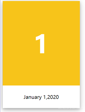
实例:卡片状阴影制作
<!DOCTYPE html>
<html lang="en">
<head>
    <meta charset="UTF-8">
    <title>Title</title>
    <style>
        .card{
            width:250px;
            box-shadow: 0 4px 8px 0 rgba(0,0,0,0.2),0 6px 20px 0 rgba(0,0,0,0.19);
            text-align: center;
        }
        .header{
            background-color: #f7c41a;
            color: white;
            padding: 30px;
            font-size: 40px;
        }
        .container{
            padding: 10px;
        }
    </style>
</head>
<body>
<div class="card">
    <div class="header">
        <h1>1</h1>
    </div>
    <div class="container">
        <p>
            January 1,2020
        </p>
    </div>
</div>
</body>
</html>
3,超链接伪类
a:link {color:#000000;}      /* 未访问链接*/
a:visited {color:#00FF00;}  /* 已访问链接 */
a:hover {color:#FF00FF;}  /* 鼠标移动到链接上 */
a:active {color:#0000FF;}  /* 鼠标点击时 */
tip: a:hover 必须在 a:link 和 a:visited 之后,需要严格按顺序才能看到效果。
a:active 必须在 a:hover 之后。
a:hover常用
4,列表样式
| 名称 | 效果 |
|---|---|
| list-style | 列表样式(none:无样式)主要用于去除不好看的列表样式 |
5,背景图片
| 名称 | 效果 |
|---|---|
| background-image:URL | 设置背景图片,默认显示方式:铺满 |
| background-repeat | 设置平铺方式(x,y,none) |
| background-color | 直接设置背景颜色 |
| background-position | 背景定位 |
| background-image: linear-gradient(direction, color-stop1, color-stop2, …); | 渐变色 |


 扫一扫
扫一扫


 2133
2133

 被折叠的 条评论
为什么被折叠?
被折叠的 条评论
为什么被折叠?
 到【灌水乐园】发言


