


一、导入模块
import numpy as np
import pandas as pd
import matplotlib.pyplot as plt
import seaborn as sns
plt.rcParams['font.sans-serif'] = ['SimHei']
二、载入数据
from sklearn import datasets
# 加载波士顿房价的数据集
boston = datasets.load_boston()
print(boston)
打印结果:
# 先要查看数据的类型,是否有空值,数据的描述信息等等。
boston_df = pd.DataFrame(boston.data, columns=boston.feature_names)
boston_df['PRICE'] = boston.target
# 先要查看数据的类型,是否有空值,数据的描述信息等等。
boston_df = pd.DataFrame(boston.data, columns=boston.feature_names)
boston_df['PRICE'] = boston.target
# 先要查看数据的类型,是否有空值,数据的描述信息等等。
boston_df = pd.DataFrame(boston.data, columns=boston.feature_names)
boston_df['PRICE'] = boston.target
# 查看数据的描述信息,在描述信息里可以看到每个特征的均值,最大值,最小值等信息。
boston_df.describe()
# 清洗'PRICE' = 50.0 的数据
boston_df = boston_df.loc[boston_df['PRICE'] != 50.0]
三、数据可视化
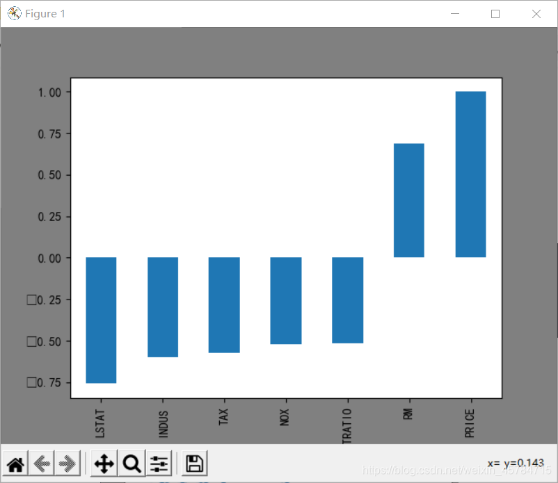
# 计算每一个特征和房价的相关系数
boston_df.corr()['PRICE']
# 可以看出LSTAT、PTRATIO、RM三个特征的相关系数大于0.5,这三个特征和价格都有明显的线性关系。
plt.figure(facecolor='gray')
corr = boston_df.corr()
corr = corr['PRICE']
corr[abs(corr) > 0.5].sort_values().plot.bar()
结果:
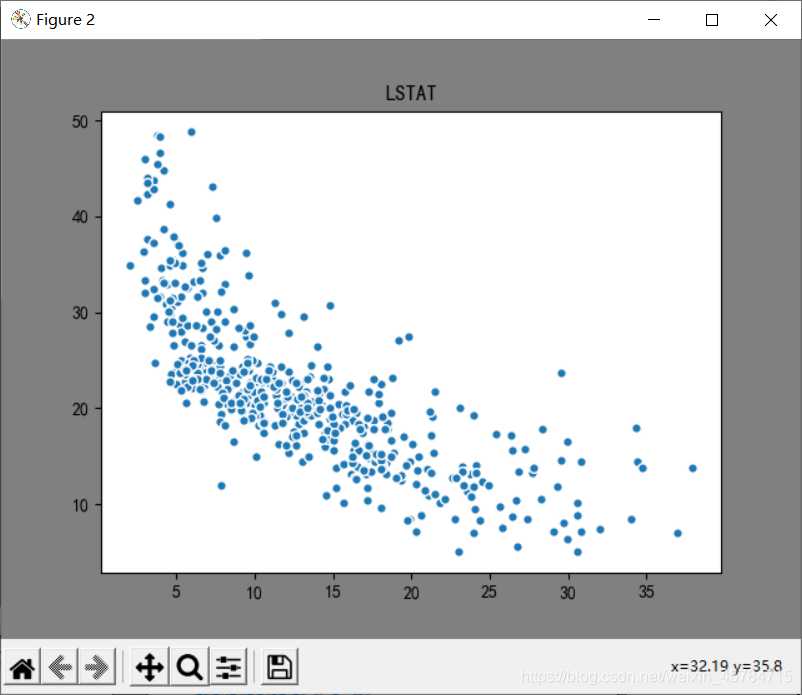
# LSTAT 和房价的散点图
plt.figure(facecolor='gray')
plt.scatter(boston_df['LSTAT'], boston_df['PRICE'], s=30, edgecolor='white')
plt.title('LSTAT')
plt.show()
结果:
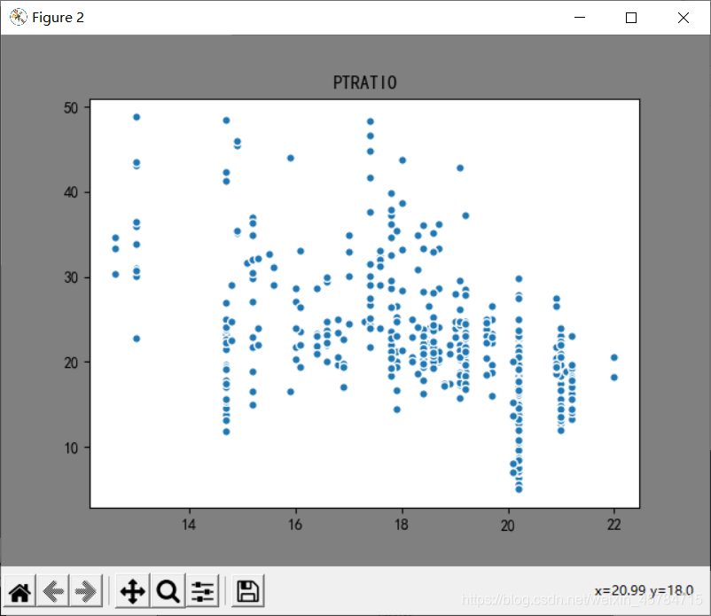
# PTRATIO 和房价的散点图
plt.figure(facecolor='gray')
plt.scatter(boston_df['PTRATIO'], boston_df['PRICE'], s=30, edgecolor='white')
plt.title('PTRATIO')
plt.show()
结果:
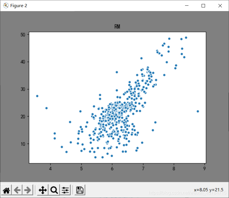
# RM 和房价的散点图
plt.figure(facecolor='gray')
plt.scatter(boston_df['RM'], boston_df['PRICE'], s=30, edgecolor='white')
plt.title('RM')
plt.show()
结果:
四、数据预处理
#异常数据处理
boston_df = boston_df[['LSTAT', 'PTRATIO', 'RM', 'PRICE']]
# 目标值
y = np.array(boston_df['PRICE'])
boston_df = boston_df.drop(['PRICE'], axis=1)
# 特征值
X = np.array(boston_df)
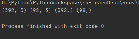
#划分训练集与测试集
from sklearn.model_selection import train_test_split
X_train, X_test, y_train, y_test = train_test_split(X,
                                                    y,
                                                    test_size=0.2,
                                                    random_state=0)
print(X_train.shape, X_test.shape, y_train.shape, y_test.shape)
结果:
#数据统一化
from sklearn import preprocessing
# 初始化标准化器
min_max_scaler = preprocessing.MinMaxScaler()
# 分别对训练和测试数据的特征以及目标值进行标准化处理
X_train = min_max_scaler.fit_transform(X_train)
y_train = min_max_scaler.fit_transform(y_train.reshape(-1,1)) # reshape(-1,1)指将它转化为1列,行自动确定
X_test = min_max_scaler.fit_transform(X_test)
y_test = min_max_scaler.fit_transform(y_test.reshape(-1,1))
五、模型训练
from sklearn.linear_model import LinearRegression
lr = LinearRegression()
# 使用训练数据进行参数估计
lr.fit(X_train, y_train)
# 使用测试数据进行回归预测
y_test_pred = lr.predict(X_test)
六、模型评估
# 使用r2_score对模型评估
from sklearn.metrics import mean_squared_error, r2_score
# 绘图函数
def figure(title, *datalist):
    plt.figure(facecolor='gray', figsize=[16, 8])
    for v in datalist:
        plt.plot(v[0], '-', label=v[1], linewidth=2)
        plt.plot(v[0], 'o')
    plt.grid()
    plt.title(title, fontsize=20)
    plt.legend(fontsize=16)
    plt.show()
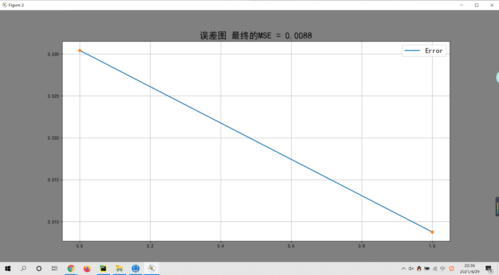
# 训练数据的预测值
y_train_pred = lr.predict(X_train)

# 计算均方差
train_error = [mean_squared_error(y_train, [np.mean(y_train)] * len(y_train)),
               mean_squared_error(y_train, y_train_pred)]
# 绘制误差图
figure('误差图 最终的MSE = %.4f' % (train_error[-1]), [train_error, 'Error'])
结果:
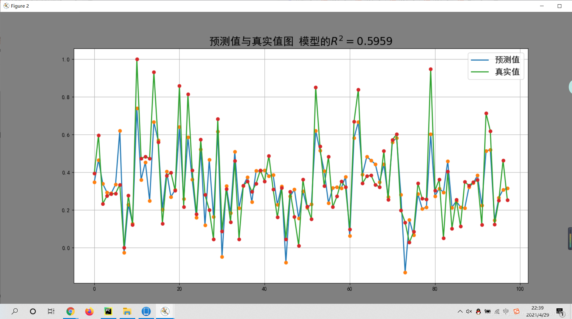
# 绘制预测值与真实值图
figure('预测值与真实值图 模型的' + r'$R^2=%.4f$' % (r2_score(y_train_pred, y_train)), [y_test_pred, '预测值'],
       [y_test, '真实值'])
结果:
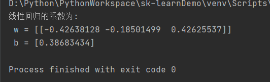
# 线性回归的系数
print('线性回归的系数为:\n w = %s \n b = %s' % (lr.coef_, lr.intercept_))
结果:


 8065
8065

 被折叠的 条评论
为什么被折叠?
被折叠的 条评论
为什么被折叠?
 到【灌水乐园】发言


