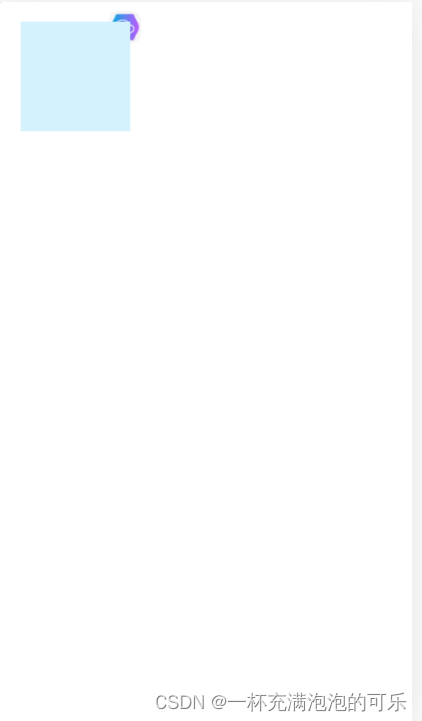
css使用伪元素时遇到的层级问题
有时使用伪元素就会出现伪元素影响了元素内部的布局结构;这时可以给被影响元素加上 transform-style: preserve-3d;,伪元素加上 transform: translateZ(-1px); // Z轴方向位移-1px
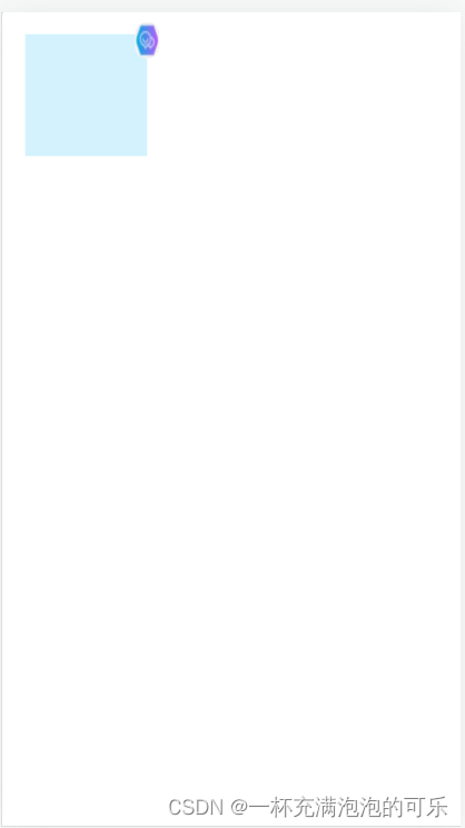
这样就可以了,代码如下
<!DOCTYPE html>
<html lang="en">

<head>
  <meta charset="UTF-8">
  <meta http-equiv="X-UA-Compatible" content="IE=edge">
  <meta name="viewport" content="width=device-width, initial-scale=1.0">
  <title>Document</title>
  <style>
    .wrap {
      position: relative;
      padding: 10px;
      width: 100px;
      height: 100px;
      transform-style: preserve-3d;
    }

    .wrap::after {
      position: absolute;
      top: 0;
      right: 0;
      border-radius: 10px;
      content: "";
      background: url('https://gimg2.baidu.com/image_search/src=http%3A%2F%2Fbpic.588ku.com%2Felement_origin_min_pic%2F19%2F04%2F10%2Fea5dbef5f0a2187b4abce223709d2d40.jpg&refer=http%3A%2F%2Fbpic.588ku.com&app=2002&size=f9999,10000&q=a80&n=0&g=0n&fmt=auto?sec=1657174366&t=0868870bad7607ddbe36f3f1d7ecc87c') no-repeat center;
      background-size: 100% 100%;
      width: 30px;
      height: 30px;
      transform: translateZ(-1px);
    }

    .wrap .inner {
      background: #d3f2fd;
      width: 100px;
      height: 100px;

    }
  </style>
</head>

<body>
  <div class='wrap'>
    <div class='inner'></div>
  </div>
</body>

</html>


 本文介绍了在CSS中使用伪元素时遇到的层级问题,通过设置`transform-style:preserve-3d`和`transform:translateZ(-1px)`来确保元素布局不受伪元素影响,提供了一个实例代码来演示如何应用这些技术。


 扫一扫
扫一扫


 362
362

 被折叠的 条评论
为什么被折叠?
被折叠的 条评论
为什么被折叠?
 到【灌水乐园】发言


