


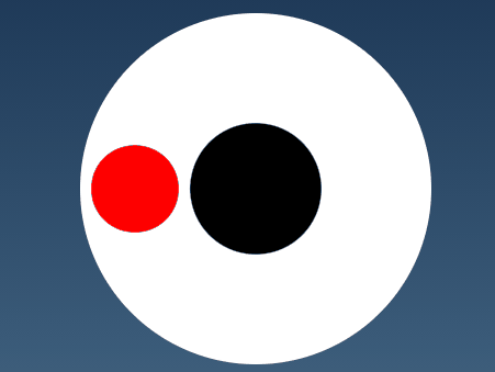
 该文章展示了如何使用HTML和CSS创建一个粘性小球动画效果,这个效果可用于制作加载动画。主要技术包括设置对比度、模糊度、绝对定位以及CSS关键帧动画(@keyframes)来控制小球的位置和大小变化。
提示:粘性小球动画效果,可以修改当做加载动画
前言
提示:以下是本篇文章的代码内容,供大家参考,相互学习
一、html代码
<!DOCTYPE html>
<html>

<head>
    <meta http-equiv="content-type" content="text/html; charset=utf-8">
    <meta name="viewport" content="width=device-width,initial-scale=1,maximum-scale=1,user-scalable=no">

    <title>粘性球球</title>
    <link rel="stylesheet" href="../css.css">
</head>

<body>
    <div class="effect">
        <div class="bigball"></div>
        <div class="smallball"></div>
    </div>
</body>

</html>
二、css代码
*{
    margin: 0;
    padding: 0;
}
body{
    display: flex;
    justify-content: center;
    align-items: center;
    height: 100vh;
    background: linear-gradient(to top,#537895,#09203f);
}
.effect{
    position: relative;
    width: 320px;
    height: 320px;
    border-radius: 50%;
    background-color: white;
    /* 设置对比度 */
    filter: contrast(10);
}
.bigball,.smallball{
    position: absolute;
    top: 50%;
    left: 50%;
    transform: translate(-50%,-50%);
    padding: 10px;
    border-radius: 50%;
    /* 设置模糊度,配合上面的contrast来显示圆球的粘性效果 */
    filter: blur(5px);
}
.bigball{
    width: 100px;
    height: 100px;
    background-color: black;
}
.smallball{
    width: 60px;
    height: 60px;
    background-color: red;
    /* 动画:名称 时长 infinite是无限次播放 */
    animation: ball 3s infinite;
}

/* 我们来定义小球的动画 */
@keyframes ball{
    0%,100%{
        left: 50px;
        width: 60px;
        height: 60px;
    }
    4%,54%{
        width: 60px;
        height: 60px;
    }
    10%,60%{
        width: 50px;
        height: 70px;
    }
    20%,70%{
        width: 60px;
        height: 60px;
    }
    34%,90%{
        width: 70px;
        height: 50px;
    }
    41%{
        width: 60px;
        height: 60px;
    }
    50%{
        left: 270px;
        width: 60px;
        height: 60px;
    }
}
总结
- 重置默认的 margin 和 padding
- 让页面主体元素 body 垂直居中,并设置了渐变背景色
- .effect 元素,设置了它的样式,包括大小、位置、圆角和背景色,并使用了 filter 属性设置了对比度效果
- 创建两个小球 .bigball 和 .smallball,使用了绝对定位,居中位置并且设置了圆角和模糊度效果
- ball 动画,设置了 7 个关键帧,控制小球的位置和大小


 扫一扫
扫一扫


 被折叠的 条评论
为什么被折叠?
被折叠的 条评论
为什么被折叠?
 到【灌水乐园】发言


