


flex布局
常见父项属性
| 属性 | 作用 |
|---|---|
| flex-direction | 设置主轴的方向 |
| justify-content | 设置子元素的排列方式 |
| flex-wrap | 设置子元素是否换行 |
| align-content | 设置侧轴上子元素的排列方式(多行) |
| align-items | 设置侧轴上子元素的排列方式(单行) |
| flex-flow | 复合属性,相当于同时设置了flex-direction和flex-wrap |
flex-dirction
**作用:**设置子元素沿x轴或y轴来排列
| 参数 | 作用 |
|---|---|
| row | 默认值, 沿着x轴排列 |
| row-reverse | 从右到左 |
| column | 从上到下 |
| column-reverse | 从下到上 |
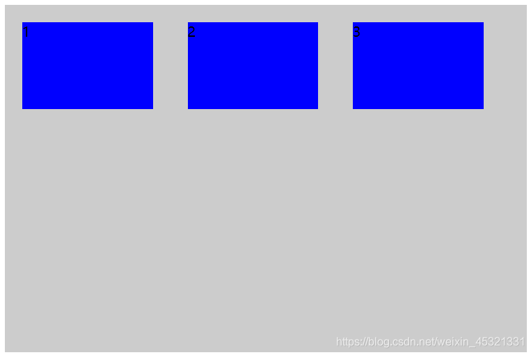
1.0 flex-direction
1.0 沿着X轴来排列,默认值(flex-direction: row)
代码:
<style>
        .box {
            display: flex;
            width: 600px;
            height: 400px;
            background-color: #ccc;
            flex-direction: row;
        }

        .son {
            margin:20px;
            width: 150px;
            height: 100px;
            background-color: blue;
        }
</style>
<body>
    <div class="box">
        <span class="son">1</span>
        <span class="son">2</span>
        <span class="son">3</span>
    </div>
</body>
实现效果:
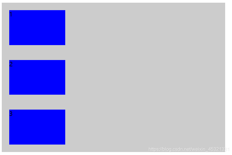
2.0 沿着Y轴排列(flex-direction:column)
代码:
<style>
        .box {
            display: flex;
            width: 600px;
            height: 400px;
            background-color: #ccc;
            flex-direction: column;
        }

        .son {
            margin:20px;
            width: 150px;
            height: 100px;
            background-color: blue;
        }
</style>
<body>
    <div class="box">
        <span class="son">1</span>
        <span class="son">2</span>
        <span class="son">3</span>
    </div>
</body>
实现效果:
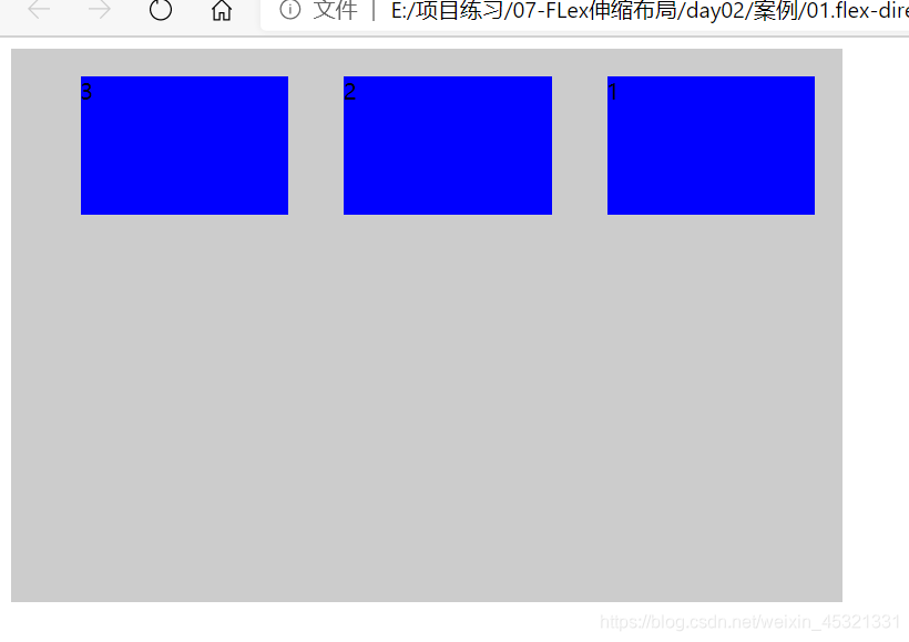
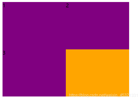
3.0 里面的子元素,沿着x轴,从右往左排列
实现效果:
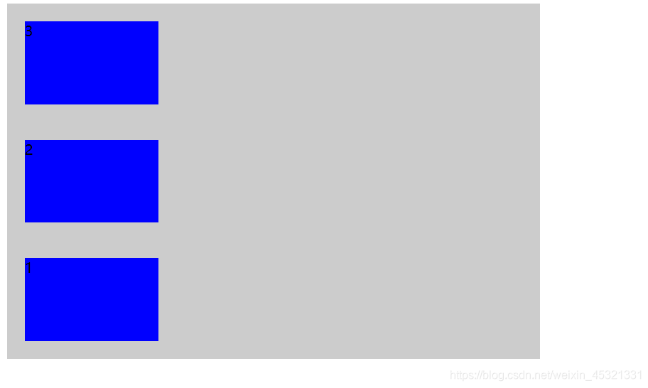
4.0 里面的子元素,沿着y轴,从下到上排列(flex-direction: column-reverse)
2.0 设置主轴上子元素的排列方式
justify-content
- 作用:设置主轴上的子元素排列方式
- 注意: flex伸缩布局中,子元素是不换行的,当添加元素时,会缩小其他元素的大小
| 属性 | 作用 |
|---|---|
| flex-start | 默认值,从头开始 |
| flex-end | 从尾部开始排序 |
| center | 在主轴居中对齐 |
| space-around | 平分剩余空间 |
| space-between | 先两边贴边,在平分剩余空间 |
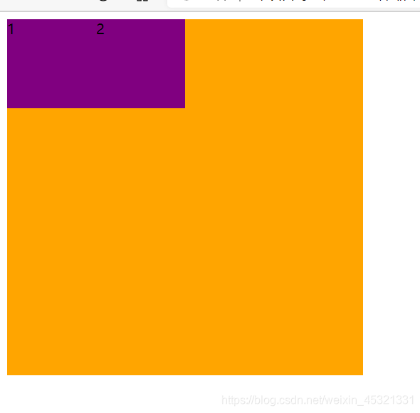
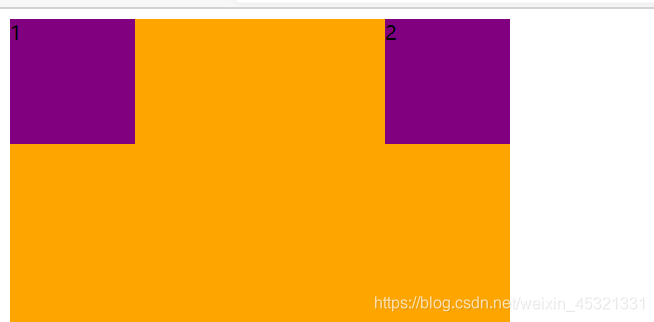
1.0 设置主轴上子元素从头开始排列(justify-content: flex-start)
演示代码:
<style>
        .box {
            display: flex;
            width: 400px;
            height: 400px;
            background-color: orange;
            justify-content: flex-start;
        }

        .son {
            width: 100px;
            height: 100px;
            background-color: purple;
        }
</style>

<body>
    <div class="box">
        <div class="son">1</div>
        <div class="son">2</div>

    </div>
</body>
实现效果:
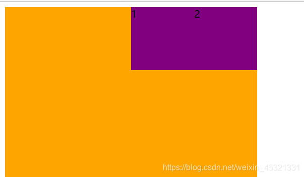
2.0 主轴上子元素沿着尾部开始排列(flex-end)
演示效果:
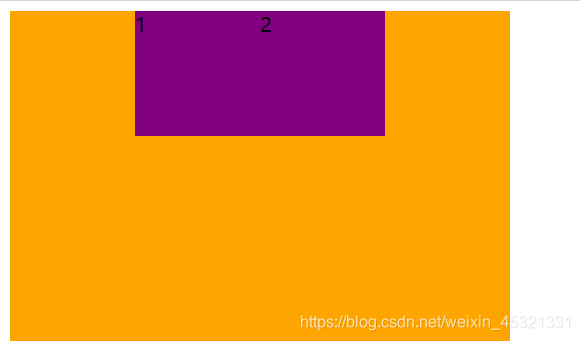
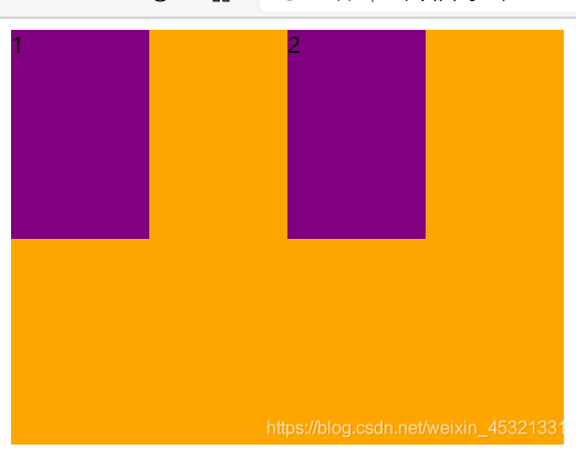
3.0 主轴上子元素居中对齐(center)
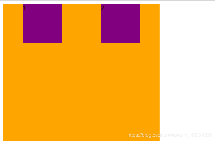
4.0 主轴上的子元素平分剩余空间(space-around)
5.0 主轴上子元素先两边贴平,在平分剩余空间(space-between)
实现效果:
3.0 设置子元素是否换行
flex-wrap
作用:设置子元素是否换行,默认为不换行。
| 参数 | 作用 |
|---|---|
| nowrap | 默认值,不换行 |
| warp | 换行 |
3.0.1 设置子元素不换行
演示代码:
<style>
        .box {
            display: flex;
            width: 600px;
            height: 400px;
            background-color: orange;
            flex-wrap: nowrap;
        }

        .son {
            width: 220px;
            height: 200px;
            background-color: purple;
            border: 1px solid red;
        }
</style>

<body>
    <div class="box">
        <div class="son">1</div>
        <div class="son">2</div>
        <div class="son">3</div>
    </div>
</body>
实现效果:
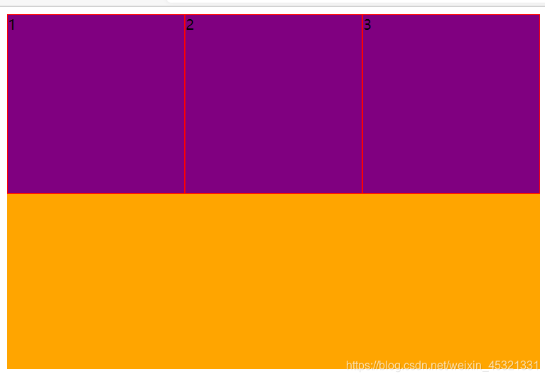
注意事项:
- flex布局中,当子元素的宽度大于父元素的宽度时,多出来的子元素不会
另起一行显示,而是和其他子元素平分父元素。
3.0.2 设置子元素换行
演示效果:
4.0 设置侧轴上子元素的排列方式(单行)
align-items
作用:设置侧轴(y轴)上的子元素排列方式
注意:
- 默认侧轴为y轴
- 当设置主轴为y轴时,侧轴为x轴
- 只有子元素为单行时,才有效果
| 属性 | 作用 |
|---|---|
| centent | 沿着侧轴居中显示 |
| flex-start | 沿着侧轴从头开始 |
| flex-end | 沿着侧轴从尾开始 |
| stretch | 沿着从上到下侧轴拉伸 |
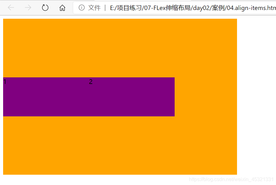
1.0 侧轴上的子元素居中演示(align-items:center)
演示代码:
<style>
        .box {
            display: flex;
            width: 600px;
            height: 400px;
            background-color: orange;
            align-items: center;
        }

        .son {
            width: 220px;
            height: 100px;
            background-color: purple;
        }
    </style>

<body>
    <div class="box">
        <div class="son">1</div>
        <div class="son">2</div>
    </div>
</body>
演示效果:
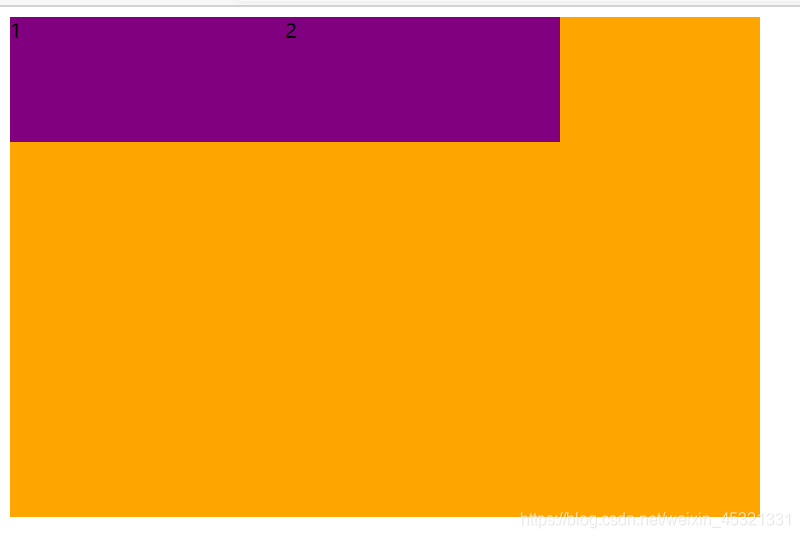
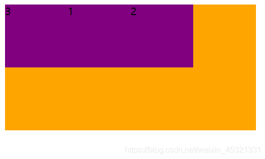
2.0 沿着侧轴从头开始(align-items:flex-start)
演示效果:
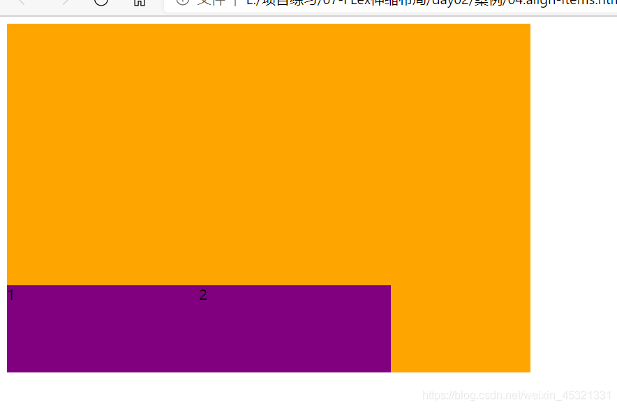
3.0沿着侧轴从尾开始(align-items:flex-end)
演示效果:
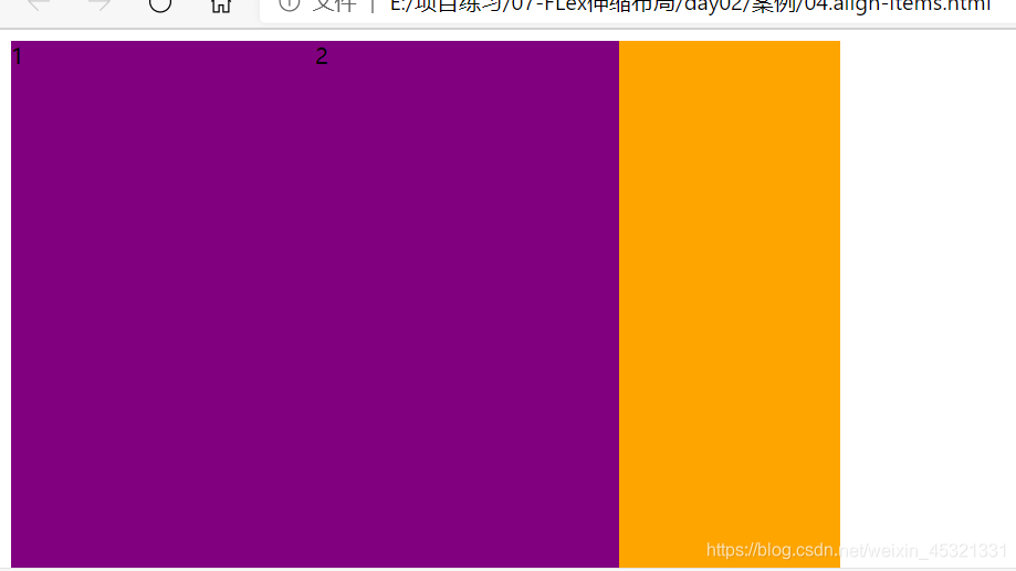
4.0 沿着侧轴从上到下拉伸(align-items:stretch)
注意事项:
- 沿着y轴拉伸时,不要给子元素高度,否则没有效果
- 沿着x轴拉伸时,不要给子元素宽度,否则没有效果
演示效果:
5.0 设置侧轴上子元素的排列方式(多行)
align-content
作用:设置子元素在侧轴上的排列方式,只能用于子元素出现换行的情况(多行),才会发生作用,单行是没有效果的
| 属性 | 作用 |
|---|---|
| flex-start | 默认值,在侧轴的开始头部排序 |
| flex-end | 在侧轴的尾部开始排序 |
| centent | 在侧轴中间显示 |
| space-around | 子项在侧轴平分剩余空间 |
| space-between | 子项在侧轴先分布在两头,在平分剩余空间 |
| stretch | 设置子项元素高度平分父元素空间(子项如果有高度,就没有效果了) |
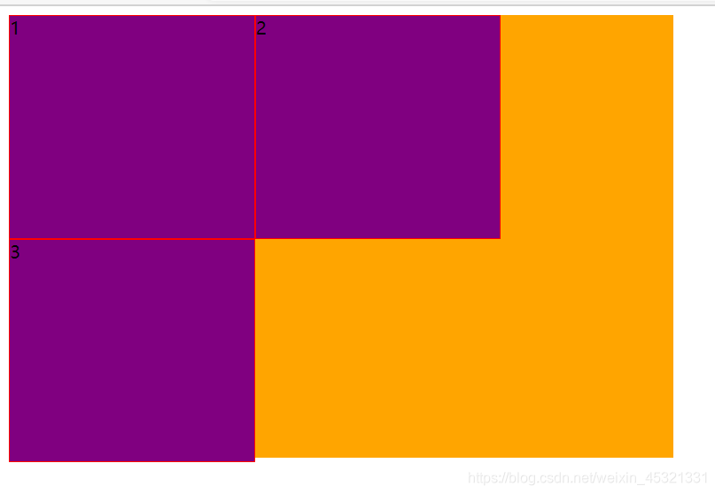
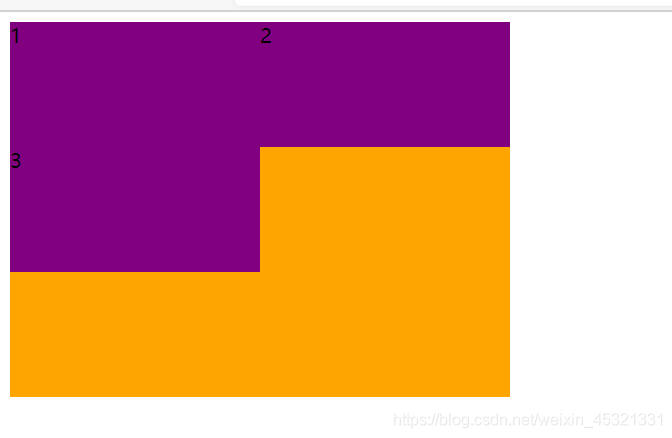
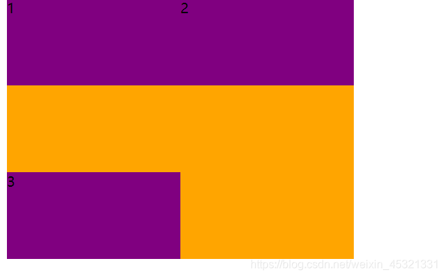
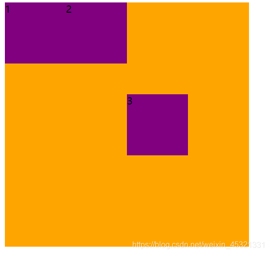
1.0沿着侧轴居中显示(align-content:centent)
演示代码:
 <style>
        .box {
            display: flex;
            width: 400px;
            height: 300px;
            background-color: orange;
            flex-wrap: wrap;
            align-content: center;
        }

        .son {
            width: 200px;
            height: 100px;
            background-color: purple;
        }
 </style>


<body>
    <div class="box">
        <div class="son">1</div>
        <div class="son">2</div>
        <div class="son">3</div>
    </div>
</body>
演示效果:
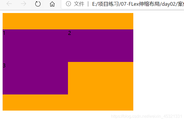
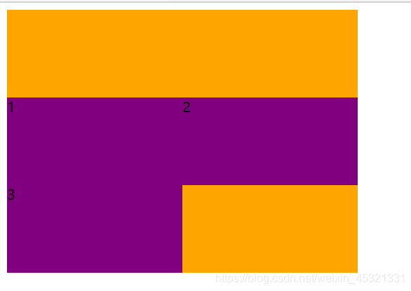
2.0 子元素在侧轴头部开始排列(align-content:flex-start),默认值
演示效果:
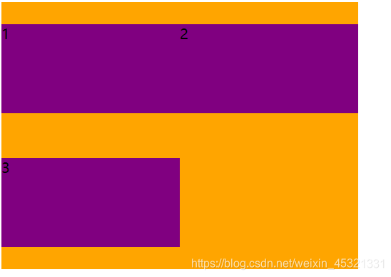
3.0子元素沿着侧轴尾部开始排列(align-content: flex-end)
演示代码:
4.0子元素在侧轴平分剩余空间(align-content: space-around)
演示代码:
5.0 子元素在侧轴先分布在两头,之后在平分剩余空间(align-content: space-between)
演示效果:
6.0设置子元素的高度平分剩余空间(align-content: stretch)
注意事项:
- 当侧轴为y轴时,不要给子元素设置高度,否则没有效果
- 当侧轴为x轴时,不要设置宽度,否则没有效果
演示效果:
6.0设置主轴和换行
flex-flow
作用:复合属性,相当于同时设置了flex-direction和flex-wrap
flex-wrap: column wrap
演示代码:
<style>
        .box {
            display: flex;
            width: 400px;
            height: 300px;
            background-color: orange;
            flex-flow: column wrap;
        }

        .son {
            width: 100px;
            height: 150px;
            background-color: purple;
        }
</style>

<body>
    <div class="box">
        <div class="son">1</div>
        <div class="son">2</div>
    </div>
</body>
演示效果:
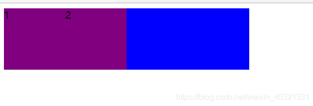
7.0 flex属性
作用:划分剩余空间,用flex表示来占多少份数。
flex: number
| 属性 | 参数 | 作用 |
|---|---|---|
| flex | number | 划分剩余空间 |
演示代码:
    <style>
        .box {
            display: flex;
            width: 400px;
            height: 100px;
            background-color: orange;
        }

        .son {
            width: 100px;
            height: 100px;
            background-color: purple;
        }

        .onw {
            flex: 1;
            background-color: blue;
        }
</style>

<body>
    <div class="box">
        <div class="son">1</div>
        <div class="son">2</div>
        <div class="onw"></div>
    </div>
</body>
演示效果:
8.0 控制子元素在侧轴上的排列方式
align-self属性
作用:控制子元素在侧轴上得排列方式
align-self可以对单独子元素设置,可以覆盖align-items
语法:
align-self: flex-end,里面的参数和align-items相同.
演示代码:
    <style>
        .box {
            display: flex;
            width: 400px;
            height: 400px;
            background-color: orange;
        }

        .son {
            width: 100px;
            height: 100px;
            background-color: purple;
        }

        .son:last-child {
        	/* 最后一个子元素在侧轴的排列方式*/
            align-self: center;
        }
</style>

<body>
    <div class="box">
        <div class="son">1</div>
        <div class="son">2</div>
        <div class="son">3</div>
    </div>
</body>
演示效果:
9.0 order属性
order属性
作用:定义子元素排列顺序
| 属性 | 参数 |
|---|---|
| order | 数字 |
默认数字为0,数值越小,排列越靠前,数值越大,排列越靠后。
演示代码:
  <style>
        .box {
            display: flex;
            width: 400px;
            height: 200px;
            background-color: orange;
        }

        .son {
            width: 100px;
            height: 100px;
            background-color: purple;
        }

        .son:last-child {
            /*最后一个子元素显示在了第一个位置上*/
            order: -1;
        }
</style>

<body>
    <div class="box">
        <div class="son">1</div>
        <div class="son">2</div>
        <div class="son">3</div>
    </div>
</body>
演示效果:


 扫一扫
扫一扫


 被折叠的 条评论
为什么被折叠?
被折叠的 条评论
为什么被折叠?
 到【灌水乐园】发言


