


简介
- 是Material Design的组件
- 继承于LinearLayout
使用
- 导入库
compile 'com.android.support:design:28.+'
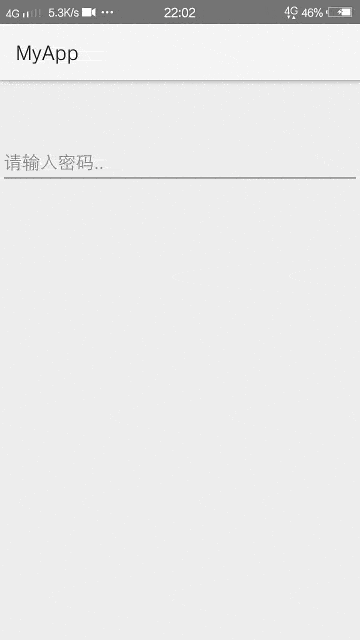
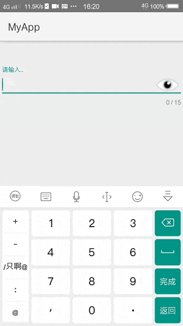
- 我们先写一个最简单的TextInputLayout
<?xml version="1.0" encoding="utf-8"?>
<FrameLayout
   xmlns:android="http://schemas.android.com/apk/res/android"
   android:layout_height="match_parent"
   android:layout_width="match_parent"
   android:focusable="true"
   android:focusableInTouchMode="true">

   <android.support.design.widget.TextInputLayout
      android:layout_width="match_parent"
      android:layout_height="wrap_content"
      android:id="@+id/mainTextInputLayout1"
      android:layout_marginTop="50dp">

      <EditText
         android:layout_width="match_parent"
         android:layout_height="wrap_content"
         android:hint="请输入.."
         android:id="@+id/mainEditText1"/>

   </android.support.design.widget.TextInputLayout>

</FrameLayout>
-
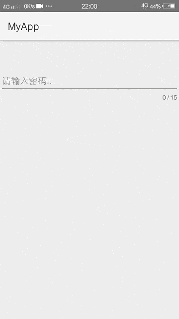
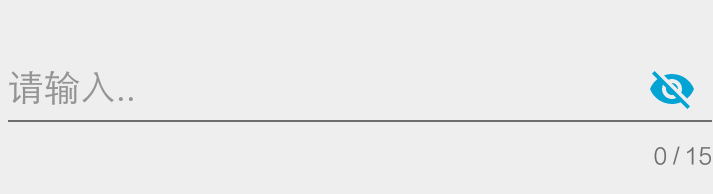
接下来,我们为TextInputLayout开启计数器,并为它设置一个最大值
-
app:counterEnabled
是否开启计数器,默认关闭 -
app:counterMaxLength
设置计数器的最大值
<?xml version="1.0" encoding="utf-8"?>
<FrameLayout
   xmlns:android="http://schemas.android.com/apk/res/android"
   xmlns:app="http://schemas.android.com/apk/res-auto"
   android:layout_height="match_parent"
   android:layout_width="match_parent"
   android:focusable="true"
   android:focusableInTouchMode="true">

   <android.support.design.widget.TextInputLayout
      android:layout_width="match_parent"
      android:layout_height="wrap_content"
      android:id="@+id/mainTextInputLayout1"
      app:counterEnabled="true"
      app:counterMaxLength="15"
      android:layout_marginTop="50dp">

      <EditText
         android:layout_width="match_parent"
         android:layout_height="wrap_content"
         android:hint="请输入.."
         android:id="@+id/mainEditText1"/>

   </android.support.design.widget.TextInputLayout>

</FrameLayout>
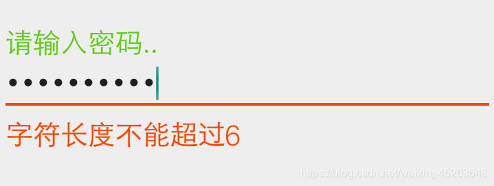
- 当用户输入的数值不满足条件时,TextInputLayout也支持错误提示,可以用于提醒用户
- .setError
设置错误提示内容(开启错误提示功能) - .setErrorEnabled
是否开启错误提示,false表示关闭
(可以将错误提示的内容设置为null,也能够关闭错误提示功能,如:textInputLayout.setError(null);
editText.addTextChangedListener(new TextWatcher(){

   @Override
   public void beforeTextChanged(CharSequence p1, int p2, int p3, int p4){}

   @Override
   public void onTextChanged(CharSequence p1, int p2, int p3, int p4)
   {
      // TODO: 实现这个方法
        if(p1.length()>6){
           textInputLayout.setError("字符长度不能超过6");
        }else{
           textInputLayout.setErrorEnabled(false);
      }
   }

   @Override
   public void afterTextChanged(Editable p1){}
});
- app:passwordToggleEnabled
是否显示控制密码可见开关,默认是false,当EditText的属性inputType参数为密码类型时生效
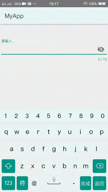
- app:passwordToggleTint
指定图标渲染颜色,默认是灰色,不想要渲染图标设置为@null即可,例示:app:passwordToggleTint="#FF03A4D4"
- app:passwordToggleDrawable
设置控制密码可见开关的图标,默认是一个小眼睛
<?xml version="1.0" encoding="utf-8"?>
<FrameLayout
   xmlns:android="http://schemas.android.com/apk/res/android"
   xmlns:app="http://schemas.android.com/apk/res-auto"
   android:layout_height="match_parent"
   android:layout_width="match_parent"
   android:focusable="true"
   android:focusableInTouchMode="true">

   <android.support.design.widget.TextInputLayout
      android:layout_width="match_parent"
      android:layout_height="wrap_content"
      android:id="@+id/mainTextInputLayout1"
      app:counterEnabled="true"
      app:counterMaxLength="15"
      app:passwordToggleEnabled="true"
      app:passwordToggleTint="@null"
      app:passwordToggleDrawable="@drawable/password_visibility_eye"
      android:layout_marginTop="50dp">

      <EditText
         android:layout_width="match_parent"
         android:layout_height="wrap_content"
         android:hint="请输入.."
         android:id="@+id/mainEditText1"
         android:inputType="numberPassword"/>

   </android.support.design.widget.TextInputLayout>

</FrameLayout>
<?xml version="1.0" encoding="utf-8"?>
<selector xmlns:android="http://schemas.android.com/apk/res/android">

   <item
      android:drawable="@drawable/password_ic_visibility"
      android:state_checked="true"/>

   <item
      android:drawable="@drawable/password_ic_visibility_off"/>

</selector>
- 其他属性
- app:hintAnimationEnabled
是否显示hint动画,默认是true - app:hintEnabled
是否使用hint属性
样式修改
- TextInputLayout 与 EditText的颜色风格默认是使用 colorAccent 的颜色,所以我们只需要修改colorAccent的颜色
- app:counterTextAppearance
设置正常情况下计数器的文字样式 - app:counterOverflowTextAppearance
设置计数器越位后的文字样式 - app:hintTextAppearance
设置 hint 文本样式 - app:errorTextAppearance
设置错误文本样式
例示:
<android.support.design.widget.TextInputLayout
   android:layout_width="match_parent"
   android:layout_height="wrap_content"
   android:id="@+id/mainTextInputLayout1"
   app:hintTextAppearance="@style/hintTextStyle"
   app:errorTextAppearance="@style/errorTextStyle"
   android:layout_marginTop="50dp">
<style name="hintTextStyle">
   <item name="android:textColor">#5DCC14</item>
   <item name="android:textSize">20sp</item>
</style>

<style name="errorTextStyle">
   <item name="android:textColor">#FF4500</item>
   <item name="android:textSize">20sp</item>
</style>
效果图


 扫一扫
扫一扫


 757
757

 被折叠的 条评论
为什么被折叠?
被折叠的 条评论
为什么被折叠?
 到【灌水乐园】发言


