


代码部分
<!DOCTYPE html>
<html lang="en">
<head>
<meta charset="UTF-8">
<meta http-equiv="X-UA-Compatible" content="IE=edge">
<meta name="viewport" content="width=device-width, initial-scale=1.0">
<title>Document</title>
<style>
.box {
width: 600px;
height: 400px;
margin: 40px auto;
background:linear-gradient(blue ,purple 60%);
padding: 20px;
}
.inner {
width: 600px;
height: 400px;
}
.inner img {
width: 100%;
height: 100%;
}
</style>
</head>
<body>
<div class="box">
<div class="inner">
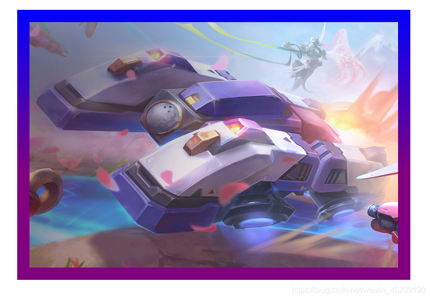
<img src="./w04.jpg" alt="">
</div>
</div>
</body>
</html>实现效果:
关于gradient:
- 线性渐变(Linear Gradients)- 向下/向上/向左/向右/对角方向
- 径向渐变(Radial Gradients)- 由它们的中心定义
语法:
background: linear-gradient(direction, color-stop1, color-stop2, ...);
线性渐变说明:
            /* 从上到下(默认情况) */
            background: linear-gradient(blue,purple);


            /* 从左到右 */
            background: linear-gradient( right,blue,purple);


            /* 对角渐变 */
            background: linear-gradient(bottom right ,blue,purple);


            /* 使用角度
                 0deg 将创建一个从下到上的渐变,90deg 将创建一个从左到右的渐变。
            */
            background: linear-gradient(180deg, blue,purple);


            /* 使用多个颜色节点 */
            background: linear-gradient(blue,purple,lightgreen);


            /* 带有透明度 */
            background: linear-gradient( right, rgba(255,0,0,0), rgba(255,0,0,1));


            /* 重复的线性渐变
               repeating-linear-gradient() 函数用于重复线性渐变:
            */
            background: repeating-linear-gradient(red, yellow 10%, green 20%);


 扫一扫
扫一扫


 821
821

 被折叠的 条评论
为什么被折叠?
被折叠的 条评论
为什么被折叠?
 到【灌水乐园】发言


