


 本文深入探讨了CSS的Scroll Snap特性,包括`scroll-snap-type`、`scroll-snap-align`和`scroll-padding`。重点强调`scroll-snap-type`必须在直接父容器上设置才能生效,并通过实例解释了`scroll-snap-align`如何影响滚动临界线,以及`scroll-padding`在处理带有sticky元素时的重要性。
css滚动贴合ScrollSnap
参考资料:
scroll-snap-type
/*滚动方向x轴,任何时候都强制滚动*/
scroll-snap-type: x mandatory;

/*滚动方向y轴,接近容器边缘时才滚动*/
scroll-snap-type: y proximity;

/*滚动方向任意,强制滚动*/
scroll-snap-type: both mandatory;
语法:
none | [ x | y | block | inline | both ] [ mandatory | proximity ]?
-
mandatory如果它当前没有被滚动,这个滚动容器的可视视图将静止在临时点上。意思是当滚动动作结束,如果可能,它会临时在那个点上。如果内容被添加、移动、删除或者重置大小,滚动偏移将被调整为保持静止在临时点上。
-
proximity如果它当前没有被滚动,这个滚动容器的可视视图将基于基于用户代理滚动的参数去到临时点上。如果内容被添加、移动、删除或者重置大小,滚动偏移将被调整为保持静止在临时点上。
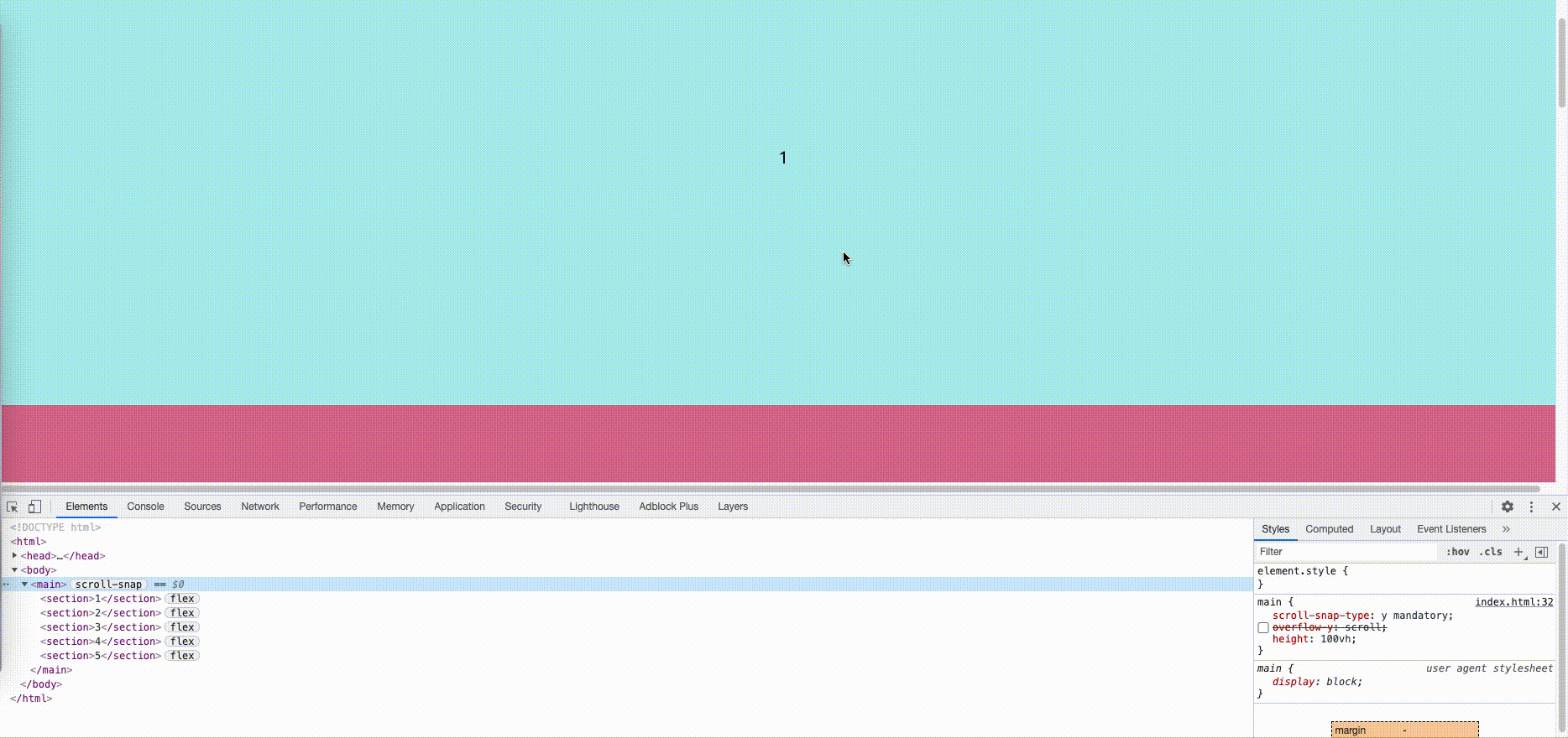
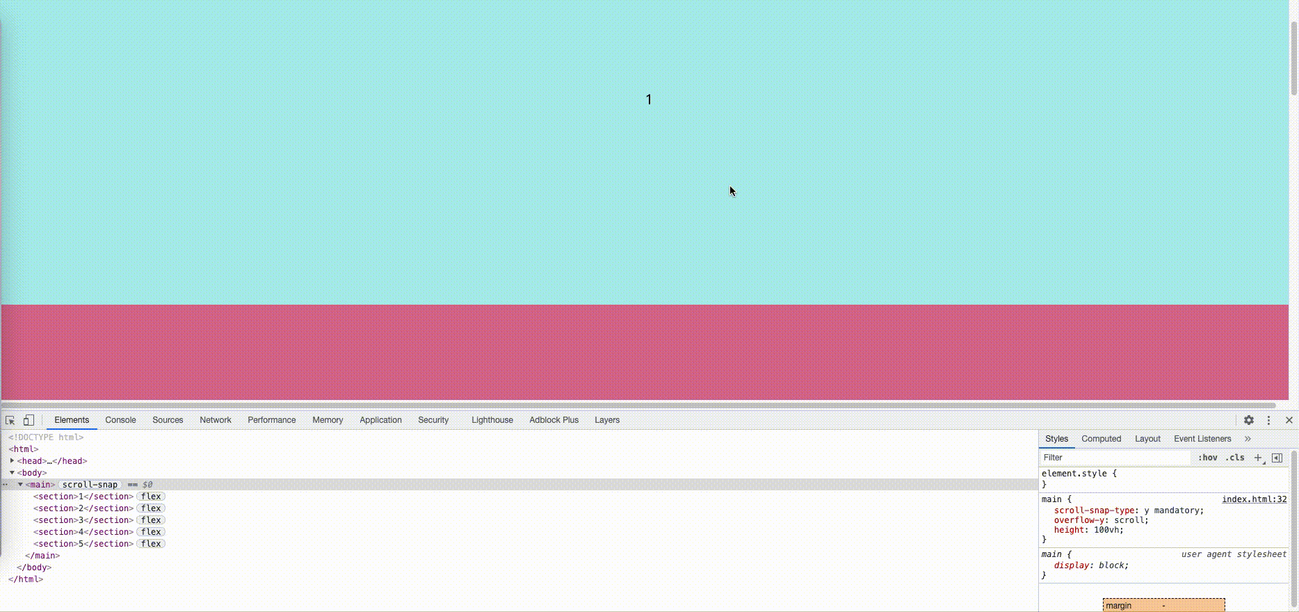
需要把滚动条设置在直接父容器上,scroll-snap-type才能生效:
下图是滚动条在body上而非直接父容器上,导致scroll-snap-type失效
下图是在直接父容器中使用overflow:scroll使得scroll-snap生效
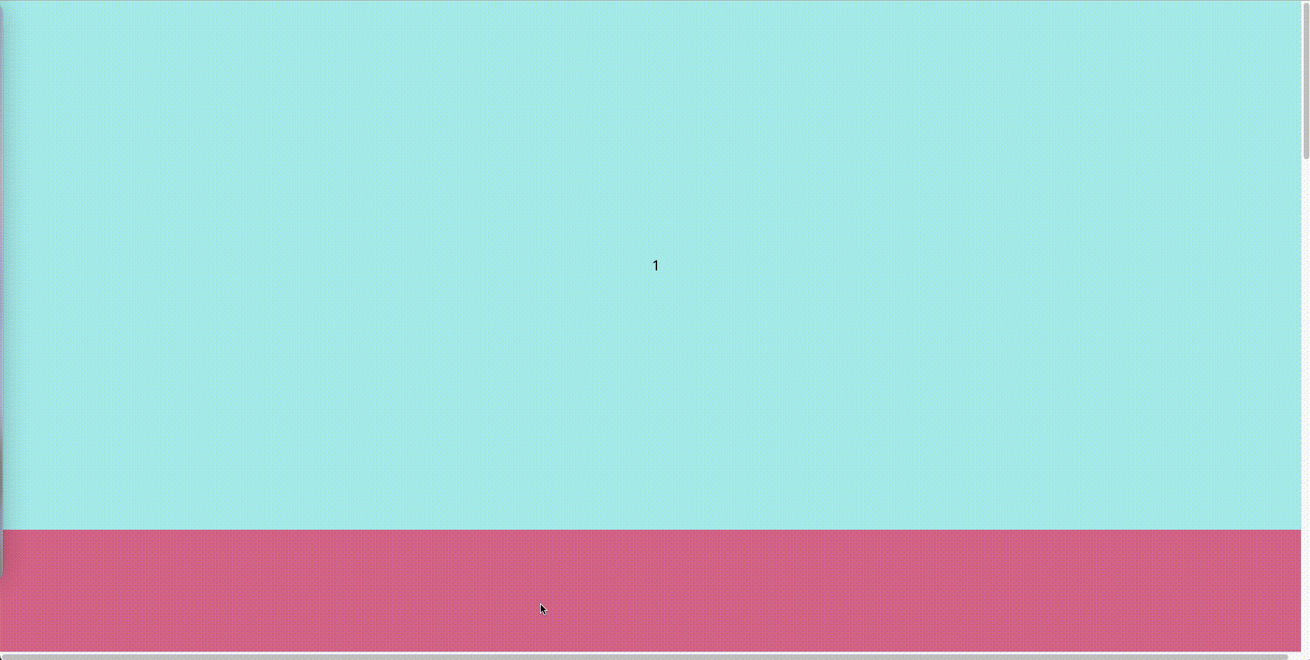
scroll-snap-align
scroll-snap-align: center

scroll-snap-align: start

scroll-snap-align: end
源码:
<!DOCTYPE html>
<html>

<head>
  <meta charset="UTF-8">
  <meta http-equiv="X-UA-Compatible" content="IE=edge">
  <meta name="viewport" content="width=device-width, initial-scale=1.0">
  <title>css-scrollsnap</title>
</head>
<style>
  body {
    margin: 0;
  }

  iframe {
    border: none;
    width: 80%;
    height: 80%;
  }

  section {
    display: flex;
    flex-direction: column;
    align-items: center;
    justify-content: center;
    font-size: 20px;
  }

  section:nth-child(odd) {
    background: paleturquoise;
  }

  section:nth-child(even) {
    background: palevioletred;
  }
</style>

<style>
  main {
    scroll-snap-type: y mandatory;
    /* scroll-snap-type: y proximity; */
    /* 需要把滚动条设置在直接父容器上,
    scroll-snap-type才能生效,
    默认是body上,现在使用了overflow:scroll滚动条在main上了
    */
    overflow-y: scroll;
    height: 100vh;
  }

  section {
    width: 100vw;
    height: 80vh;
    scroll-snap-align: center;
    /* scroll-snap-align: start; 容器顶部和元素顶部对齐 */
    /* scroll-snap-align: end; 容器底部和元素底部对齐 */

  }
</style>

<body>
  <main>
    <section>1</section>
    <section>2</section>
    <section>3</section>
    <section>4</section>
    <section>5</section>
  </main>
</body>

</html>
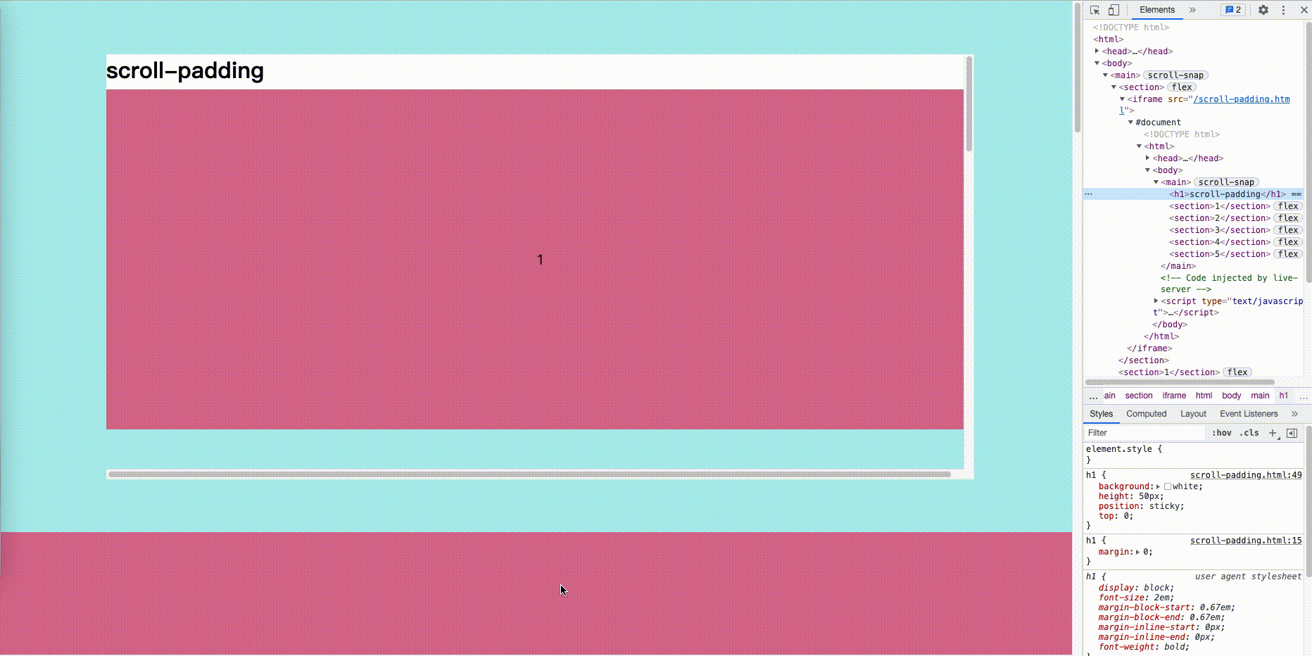
scroll-padding
用于有sticky元素时的滚动内边距。
但我们容器中有一个sticky元素时,直接父级容器元素不使用scroll-padding,则会将sticky元素的顶部作为滚动临界线,效果如下:
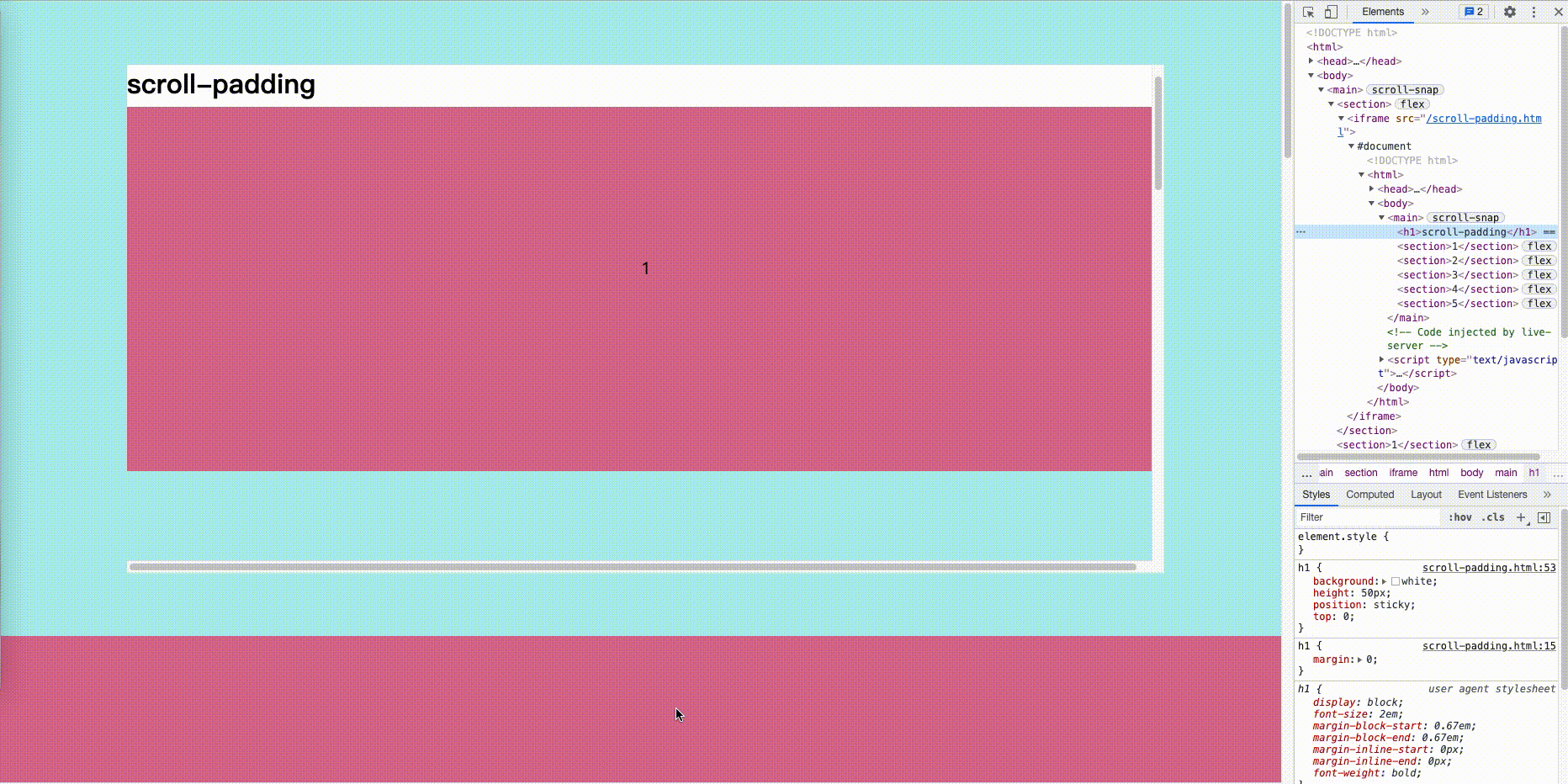
当我们使用scroll-padding时,则会将sticky元素的底部作为滚动临界线,并达到预期效果。
源码:
<!DOCTYPE html>
<html>

<head>
  <meta charset="UTF-8">
  <meta http-equiv="X-UA-Compatible" content="IE=edge">
  <meta name="viewport" content="width=device-width, initial-scale=1.0">
  <title>scroll-padding</title>
</head>
<style>
  body {
    margin: 0
  }

  h1 {
    margin: 0;
  }

  section {
    display: flex;
    align-items: center;
    justify-content: center;
    font-size: 20px;
  }

  section:nth-child(odd) {
    background: paleturquoise;
  }

  section:nth-child(even) {
    background: palevioletred;
  }
</style>

<style>
  main {
    scroll-snap-type: y mandatory;
    overflow-y: scroll;
    height: 100vh;
    scroll-padding: 50px;
  }

  section {
    width: 100vw;
    height: 80vh;
    scroll-snap-align: start;
  }

  h1 {
    background: white;
    height: 50px;
    position: sticky;
    top: 0;
  }
</style>

<body>
  <main>
    <h1>scroll-padding</h1>
    <section>1</section>
    <section>2</section>
    <section>3</section>
    <section>4</section>
    <section>5</section>
  </main>
</body>

</html>


 扫一扫
扫一扫


 275
275

 被折叠的 条评论
为什么被折叠?
被折叠的 条评论
为什么被折叠?
 到【灌水乐园】发言


