


matplotlib库可视化常用的图
主要是四种图:直方图、柱状图、饼图、散点图。
由官方文档复现。
import matplotlib
import numpy as np
import matplotlib.pyplot as plt
import pandas as pd
from pandas import Series,DataFrame
from matplotlib.ticker import MaxNLocator
from collections import namedtuple
import matplotlib.cbook as cbook
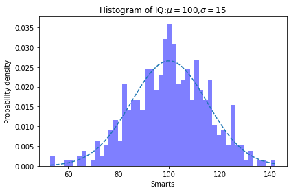
一、直方图plt.hist()
matplotlib.pyplot.hist(x, bins=None, range=None, density=False, weights=None, cumulative=False,
bottom=None, histtype='bar', align='mid', orientation='vertical', rwidth=None, log=False, color=None,
label=None, stacked=False, *, data=None, **kwargs)
输入值:
x:输入值单一数组或者数组序列,
bins等间隔列个数,
density是否以概率密度显示,
alpha不透明度;
range箱子的最小值最大值。
返回值:
n数组或数组列表:直方图每一列对应的高;
bins列表:每一列的左右边缘值,长度是列数加1;
patches列表,每一列包含的数据。
np.random.seed(19680801)
mu=100#均值(对称轴)
sigma=15#标准差
x=mu+sigma*np.random.randn(437)
num_bins=50
fig,ax=plt.subplots()
#fig代表绘图窗口,ax是绘图区域中的子图
n,bins,patches=ax.hist(x,num_bins,density=1,color='blue',alpha=0.5)
#x:输入值单一数组或者数组序列,bins等间隔箱子个数,density是否以概率密度显示,alpha不透明度
#返回值:n数组或数组列表:直方图每一列对应的高;bins每一列的左右边缘值,长度是列数加1;patches列表,每一列包含的数据

y=((1/(np.sqrt(2*np.pi)*sigma))*np.exp(-0.5*(1/sigma*(bins-mu))**2))
ax.plot(bins,y,'--')
ax.set_xlabel('Smarts')
ax.set_ylabel('Probability density')
ax.set_title(r'Histogram of IQ:$\mu=100$,$\sigma=15$')

fig.tight_layout()
plt.show()
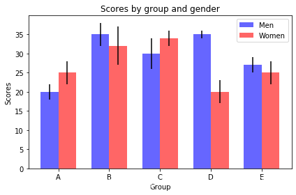
二、plt.bar条形图
对于可视化计数或带有误差栏的汇总统计信息非常有用。
matplotlib.pyplot.bar(x, height, width=0.8, bottom=None, *, align='center', data=None, **kwargs)
x:柱的横坐标
height:柱的高度
width:柱的宽度
color:柱的颜色
alpha:不透明度
label:不同颜色柱的分类,和legend结合使用
yerr:纵坐标的相对误差
n_groups=5
means_men=(20,35,30,35,27)
std_men=(2,3,4,1,2)

means_women=(25,32,34,20,25)
std_women=(3,5,2,3,3)

fig,ax=plt.subplots()
index=np.arange(n_groups)
bar_width=0.35

opacity=0.6
error_config={'ecolor':0.3}

rects1=ax.bar(index,means_men,bar_width,alpha=opacity,color='b',label='Men',yerr=std_men)
rects2=ax.bar(index+bar_width,means_women,bar_width,alpha=opacity,color='r',label='Women',yerr=std_women)

ax.set_xlabel('Group')
ax.set_ylabel('Scores')
ax.set_title('Scores by group and gender')
ax.set_xticks(index+bar_width/2)
ax.set_xticklabels(('A','B','C','D','E'))
ax.legend()

fig.tight_layout()
plt.show()
三、plt.pie饼图
matplotlib.pyplot.pie(x, explode=None, labels=None, colors=None, autopct=None, pctdistance=0.6, shadow=False, labeldistance=1.1, startangle=0, radius=1, counterclock=True, wedgeprops=None, textprops=None, center=(0, 0), frame=False, rotatelabels=False, *, normalize=None, data=None)
x:一维数组,绘图数据
expode:数组,指定每个扇形的半径偏移
labels:数组,每个扇形的标签
colors:数组,每个扇形的颜色
shadow:是否显示阴影
radius:半径,默认为1
autopct:字符串或者函数,设置后将在每个扇形内部显示所占比例
wedgeprops:字典,设置扇形边缘线颜色
startangle:浮点数。饼图开始的角度(以x轴逆时针旋转)
textsprops:设置文本特性
返回值
patches:列表,一组扇形实例
texts:标签文本实例列表
autotexts:列表,数字标签的文本实例列表
1.基本饼图
labels=['Frogs','Hogs','Dogs','Logs']
sizes=[15,30,45,10]
explode=(0,0.1,0,0)

fig1,ax1=plt.subplots()
ax1.pie(sizes,explode=explode,labels=labels,autopct='%1.1f%%',shadow=True,startangle=90)
ax1.axis('equal')
ax1.set(title='Pie plot')
ax1.legend()
plt.show()

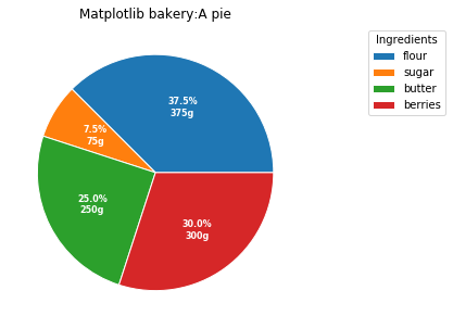
fig,ax=plt.subplots(figsize=(6,5),subplot_kw=dict(aspect='equal'))

recipe=['375 g flour',
       '75 g sugar',
       '250 g butter',
       '300 g berries']
data=[float(x.split()[0]) for x in recipe]
ingredients=[x.split()[-1] for x in recipe]

def func(pct,allvals):
    absolute=int(pct/100*np.sum(allvals))
    return "{:.1f}%\n{:d}g".format(pct,absolute)

wedges,texts,autotexts=ax.pie(data,autopct=lambda pct:func(pct,data),wedgeprops=dict(edgecolor='w'),
                              textprops=dict(color='w'))

ax.legend(wedges,ingredients,title='Ingredients',loc='best',bbox_to_anchor=(1,0,0.5,1))

plt.setp(autotexts,size=8,weight='bold')
ax.set_title('Matplotlib bakery:A pie')

plt.show()
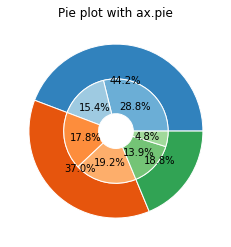
2.环形饼图
fig,ax=plt.subplots()
size=0.4
vals=np.array([[60,32],[37,40],[29,10]])

cmap=plt.get_cmap('tab20c')
outer_colors=cmap(np.arange(3)*4)
inner_colors=cmap([1,2,5,6,9,10])

ax.pie(vals.sum(axis=1),radius=1,colors=outer_colors,autopct='%1.1f%%',
       wedgeprops=dict(width=size,edgecolor='w'))

ax.pie(vals.flatten(),radius=1-size,colors=inner_colors,autopct='%1.1f%%',
       wedgeprops=dict(width=size,edgecolor='w'))

ax.set(aspect='equal',title='Pie plot with ax.pie')
plt.show()
四、plt.scatter散点图
matplotlib.pyplot.scatter(x, y, s=None, c=None, marker=None, cmap=None,
norm=None, vmin=None, vmax=None, alpha=None, linewidths=None,
verts=<deprecated parameter>, edgecolors=None, *, plotnonfinite=False,
data=None, **kwargs)
x,y:点的位置
s:点的大小
c:点的颜色;单一颜色用color
marker:标记样式,默认为圆点
linewidths:点边缘线宽
edgecolors:点边缘颜色,face/none
np.random.seed(19680801)

N=50
x=np.random.rand(N)
y=np.random.rand(N)
colors=np.random.rand(N)
area=(30*np.random.rand(N))**2#圆点半径

fig,ax=plt.subplots()
ax.scatter(x,y,alpha=0.6,edgecolors='r',c=colors,s=area,linewidths=0.5)

ax.set_xlabel(r'$x$',fontsize=15,c='w')
ax.set_ylabel(r'$y$',fontsize=15,c='w')
ax.set_title('x and y change',fontsize=15,c='w')

ax.grid(True)
plt.show()


 被折叠的 条评论
为什么被折叠?
被折叠的 条评论
为什么被折叠?
 到【灌水乐园】发言


