


 这篇博客探讨了如何利用纯JavaScript来创建各种有趣的特效。内容涉及到背景图片的处理,例如使用'纽扣1.png'和'纽扣2.png'等命名规则的图片进行操作,并提供了实际的图片示例作为展示。
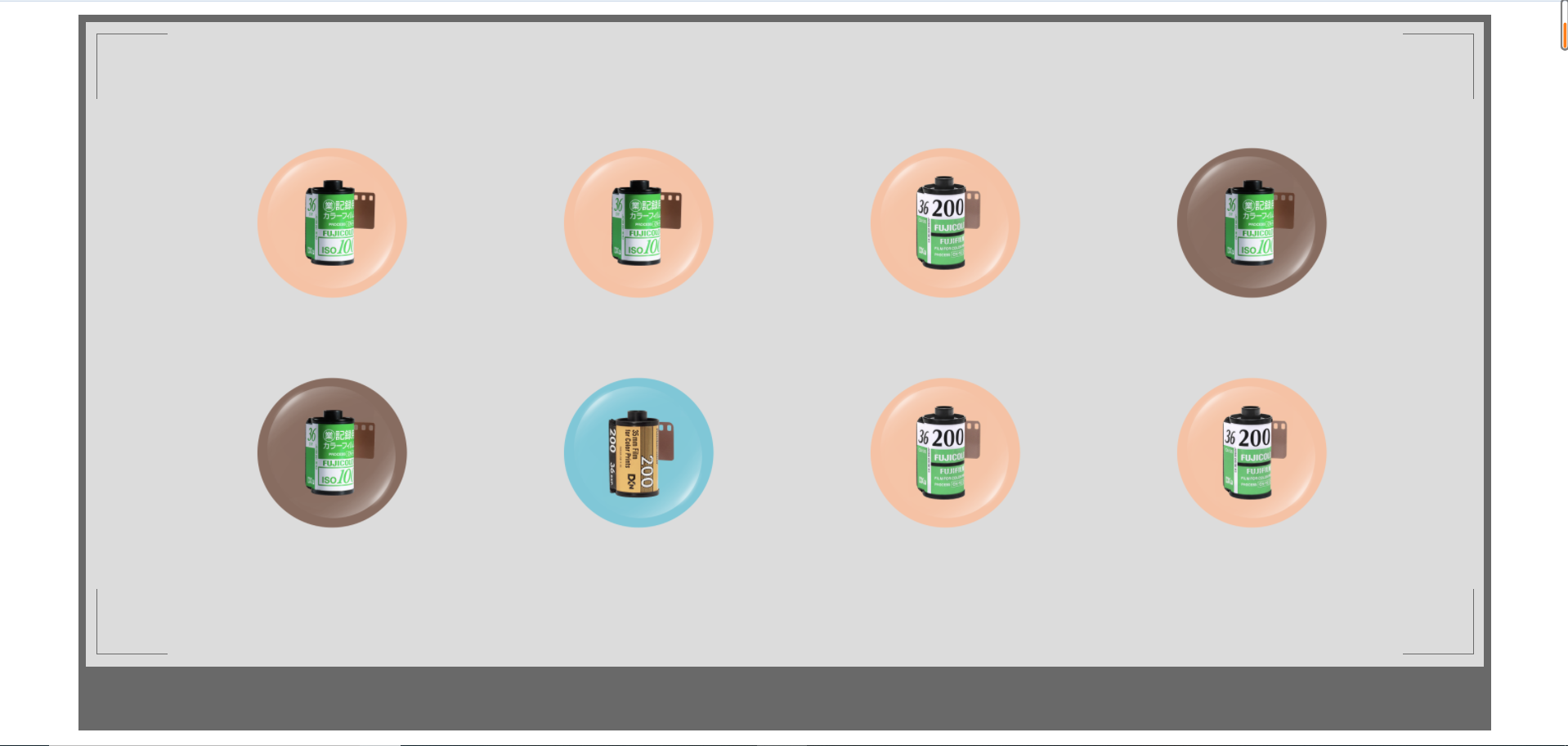
这里背景图片命名格式为:纽扣1.png,纽扣2.png
最后有图片示例
<!DOCTYPE html>
<html>
 <head>
  <meta charset="utf-8">
  <title></title>
  <style type="text/css">
   *{
    margin: 0px;
    padding: 0px;
    list-style: none;
   }
   #box{
    width: 90%;
    height: 700px;
    background: dimgray;
    margin: 13px auto;
    position: relative;
   }
   #backgray{
    position: absolute;
    width: 99%;
    height: 90%;
    background: gainsboro;
    top: 1%;
    left: 0.5%;
   }
   .tl,.tr,.bl,.br{
    border: 1px solid dimgray;
    position: absolute;
    width: 5%;
    height: 10%;
   }
   .tl{
    top: 1.8%;
    left: 0.8%;
    border-bottom: none;
    border-right: none;
   }
   .tr{
    top: 1.8%;
    left: 94.2%;
    border-left: none;
    border-bottom: none;
   }
   .bl{
    top: 88%;
    left: 0.8%;
    border-right: none;
    border-top: none;
   }
   .br{
    top: 88%;
    left: 94.2%;
    border-top: none;
    border-left: none;
   }
   #ul1,#ul2{
    width: 80%;
    height: 35%;
    /* border: #000000 1px solid; */
    position: absolute;
    z-index: 1;
   }
   #ul1{
    top: 15%;
    left: 10%;

   }
   #ul2{
    margin-top: 10px;
    top: 49%;
    left: 10%;
   }
   li{
    position: absolute;
    float: right;
    display: inline-block;
    border-radius: 50%;
    background-size: 108% 108%;
   }
   #hidden{
    width: 800px;
    height: 600px;
    position: absolute;
    top: -300px;
    left: 150px;
    background-size: 100% 100%;
    background-repeat: no-repeat;
    opacity: 0;
    display: none;
   }
   #hiddentop{
    width: 1000px;
    height: 800px;
    background-repeat: no-repeat;
    background-size: 100%;
    position: absolute;
    top: -320px;
    left: -250px;
    transform: translateY(-700px);
   }
   #hiddenmin{
    width: 1000px;
    height: 800px;
    background-repeat: no-repeat;
    background-size: 100%;
    position: absolute;
    top: -310px;
    left: -550px;
    transform: scale(0,0);
   }
   #hiddenlast{
    width: 400px;
    height: 250px;
    background-repeat: no-repeat;
    background-size: 100%;
    position: absolute;
   }
   #hiddenbox{
    width: 400px;
    height: 250px;
    position: absolute;
    top: -150px;
    left: -545px;
    display: none;
    transform: scale(0);
   }
  </style>
 </head>
 <body>
  <div id="box">
   <div id="backgray">
    <div class="tl"></div>
    <div class="tr"></div>
    <div class="bl"></div>
    <div class="br"></div>
    <ul id="ul1">
     <li></li>
     <li></li>
     <li></li>
     <li></li>
    </ul>
    <ul id="ul2">
     <li><div id="hidden" style="background-image: url(img/电视塔.jpg);"></div></li>

     <li><div id="hiddentop" style="background-image: url(img/夏.png);"></div></li>

     <li><div id="hiddenmin" style="background-image: url(img/冬.png);"></div></li>

     <li><div id="hiddenbox"><div id="hiddenlast" style="background-image: url(img/春.jpg);"></div></div></li>
    </ul>
   </div>
  </div>
 </body>
 <script type="text/javascript">
  (function(){
   var box=document.querySelector('#box');
   var ul1=document.querySelector('#ul1'); // 第一行ul
   var ul2=document.querySelector('#ul2'); // 第二行ul
   var liList1=ul1.children; // 第一行li的集合
   var liList2=ul2.children; // 第二行li的集合
   for (i=0;i<liList1.length;i++) {
    liList1[i].style.width=180+'px';
    liList1[i].style.height=180+'px';
    liList1[i].style.position='absolute';
    liList1[i].style.left=(i)*300+'px';
    liList1[i].style.top=5+'px';
    liList1[i].style.marginLeft=0+'px';
    liList1[i].style.backgroundImage='url(img/纽扣'+(Math.round(Math.random()*5+1))+'.png)'; // 背景图片随机
    liList1[0].onmouseover=function(){
     liList1[0].style.transform='rotate('+360+'deg)'; // 旋转360°
     liList1[0].style.transition='transform 1s linear';
    }
    liList1[0].onmouseleave=function(){
     liList1[0].style.backgroundImage='url(img/纽扣'+(Math.round(Math.random()*5+1))+'.png)'; // 背景图片随机
     liList1[0].style.transform='rotate('+(0)+'deg)';
    }
    liList1[1].onmouseover=function(){
     liList1[1].style.width=220+'px'; // 宽高改变
     liList1[1].style.height=220+'px';
     liList1[1].style.transition='width 0.5s,height 0.5s';
    }
    liList1[1].onmouseleave=function(){
     liList1[1].style.backgroundImage='url(img/纽扣'+(Math.round(Math.random()*5+1))+'.png)';
     liList1[1].style.width=180+'px';
     liList1[1].style.height=180+'px';
    }
    liList1[2].onmouseover=function(){
     liList1[2].style.opacity=0;  // "消失"
     liList1[2].style.transition='opacity .5s';
    }
    liList1[2].onmouseleave=function(){
     liList1[2].style.backgroundImage='url(img/纽扣'+(Math.round(Math.random()*5+1))+'.png)';
     liList1[2].style.opacity=1;
    }
    liList1[3].onmouseover=function(){
     liList1[3].style.backgroundImage='url(img/纽扣'+(Math.round(Math.random()*5+1))+'.png)'; // 切换图片
     liList1[3].style.transition='background-image 1s';
    }
    liList1[3].onmouseleave=function(){
    }
   }

   for (var i=0;i<liList2.length;i++) {
    liList2[i].style.width=180+'px';
    liList2[i].style.height=180+'px';
    liList2[i].style.left=450+'px';
    liList2[i].style.top=5+'px';
    liList2[i].style.marginLeft=0+'px';
    liList2[i].style.backgroundImage='url(img/纽扣'+(Math.round(Math.random()*5+1))+'.png)';
    let hidden=document.querySelector('#hidden');
     let k=true;
     liList2[0].onclick=function(){
      liList2[0].style.width=170+'px';
      liList2[0].style.height=170+'px';
      setTimeout(
       function () {
        liList2[0].style.width=180+'px';
        liList2[0].style.height=180+'px';
       }
      ,100);
      if (k==true) {
       setTimeout(function(){
        hidden.style.opacity=0.9;
        hidden.style.transition='opacity 1s ease-out';
        hidden.style.zIndex=999;
        liList2[1].style.zIndex=0;
        liList2[2].style.zIndex=0;
        liList1[1].style.zIndex=0;
        liList1[2].style.zIndex=0;
        liList1[3].style.zIndex=0;
       },100)
       hidden.style.display='block';
       k=false;
      } else{
       hidden.style.opacity=0;
       liList2[1].style.zIndex=2;
       liList2[2].style.zIndex=1;
       liList1[1].style.zIndex=2;
       liList1[2].style.zIndex=2;
       liList1[3].style.zIndex=2;
       setTimeout(function(){
        hidden.style.display='none';
       },1000)
       k=true;
      }
     }
     var m=true;
     liList2[1].onclick=function(){
      liList2[1].style.width=170+'px';
      liList2[1].style.height=170+'px';
      setTimeout(
       function () {
        liList2[1].style.width=180+'px';
        liList2[1].style.height=180+'px';
       }
      ,100);
      let hiddentop=document.querySelector('#hiddentop');
      hiddentop.style.zIndex=1;
      if (m==true) {
       hiddentop.style.transform='translateY(0)';
       hiddentop.style.transition='transform 1s';
       liList2[3].style.zIndex=0;
       liList2[2].style.zIndex=0;
       liList2[0].style.zIndex=0;
       liList2[0].style.zIndex=0;
       m=false;
      } else if (m==false){
       console.log(111111);
       hiddentop.style.transform='translateY(-700px)';
       liList2[3].style.zIndex=2;
       liList2[2].style.zIndex=2;
       liList2[1].style.zIndex=2;
       liList2[0].style.zIndex=2;
       m=true;
      }
     }
     let n=true;
     liList2[2].onclick=function(){
      liList2[2].style.width=170+'px';
      liList2[2].style.height=170+'px';
      setTimeout(
       function () {
        liList2[2].style.width=180+'px';
        liList2[2].style.height=180+'px';
       }
      ,100);
      let hiddenmin=document.querySelector('#hiddenmin');
      hiddenmin.style.transition='transform 1s';
      hiddenmin.style.zIndex=1;
      if (n==true) {
       hiddenmin.style.transform='scale(1)';
       liList2[3].style.zIndex=0;
       n=false;
      } else{
       hiddenmin.style.transform='scale(0)';
       liList2[3].style.zIndex=2;
       n=true;
      }
     }
     liList2[3].onmouseover=function(){
      liList2[0].style.left=0;   // 一字排开
      liList2[1].style.left=300+'px';
      liList2[2].style.left=600+'px';
      liList2[3].style.left=900+'px';
      liList2[0].style.transition='left 1s';
      liList2[1].style.transition='left 1s';
      liList2[2].style.transition='left 1s';
      liList2[3].style.transition='left 1s';
     }
     let v=true;
     liList2[3].onclick=function(){
      let hiddenbox=document.getElementById('hiddenbox');
      let hiddenlast=document.getElementById('hiddenlast');
      hiddenbox.style.transition='transform 1s';
      hiddenlast.style.transition='transform 1s';
      hiddenbox.style.zIndex=1;
      if (v==true) {
       hiddenbox.style.display='block';
       setTimeout(function(){
        hiddenbox.style.transform='rotate('+-360+'deg)';
        hiddenlast.style.transform='scale(1)';
       },100)
       console.log('true');
       v=false;
      } else{
       hiddenbox.style.transform='rotate('+360+'deg)';
       hiddenlast.style.transform='scale(0)';
       setTimeout(function(){
        hiddenbox.style.display='none';
       },1000)
       console.log('false');
       v=true;
      }
     }
    }
  }());
 </script>
</html>


 扫一扫
扫一扫


 268
268

 被折叠的 条评论
为什么被折叠?
被折叠的 条评论
为什么被折叠?
 到【灌水乐园】发言


