


 本文将指导您如何使用HTML展示骰子图像。通过裁剪并命名为dice1-6.jpg的图片,您可以创建一个简单的HTML骰子展示效果。
<!--
 * @Descripttion:
 * @version:
 * @Author: ZhuJianwei
 * @Date: 2021-06-23 11:24:34
 * @LastEditors: ZhuJianwei
 * @LastEditTime: 2021-06-23 14:52:19
-->
<!DOCTYPE html>
<html lang="en">

<head>
    <meta charset="UTF-8">
    <meta http-equiv="X-UA-Compatible" content="IE=edge">
    <meta name="viewport" content="width=device-width, initial-scale=1.0">
    <title>Document</title>
    <style>
        * {
            margin: 0;
            padding: 0;
        }

        .dice {
            width: 100px;
            height: 100px;
            /* border: 1px solid red; */
            margin: 250px auto;
            position: relative;
            transform-style: preserve-3d;
            perspective: 500px;
            transform: rotateX(15deg) rotateY(15deg);
            /* 过渡 */
            /* transition: transform 2s ; */
        }

        .dice div {
            width: 100px;
            height: 100px;
            /* border: 1px solid green; */
            background-size: cover;
            background-position: center center;
            position: absolute;
            /* transition: all 5s; */
        }

        .dice div:nth-child(1) {
            background-image: url(img/dice1.jpg);
            transform: translateY(-50px) rotateX(90deg);
        }

        .dice div:nth-child(2) {
            background-image: url(img/dice2.jpg);
            transform: translateY(50px) rotateX(90deg);
        }

        .dice div:nth-child(3) {
            background-image: url(img/dice3.jpg);
            transform: translateX(-50px) rotateY(-90deg);
        }

        .dice div:nth-child(4) {
            background-image: url(img/dice4.jpg);
            transform: translateX(50px) rotateY(90deg);
        }

        .dice div:nth-child(5) {
            background-image: url(img/dice5.jpg);
            transform: translateZ(50px);
        }

        .dice div:nth-child(6) {
            background-image: url(img/dice6.jpg);
            transform: translateZ(-50px);
        }

        .dice:hover {
            animation: play 3s linear infinite;
        }

        @keyframes play {
            0% {
                transform: rotateX(0deg) rotateY(0deg) rotateZ(0deg);
            }

            100% {
                transform: rotateX(90deg) rotateY(90deg) rotateZ(360deg);
            }
        }
    </style>


    </style>
</head>

<body>
    <div class=dice>
        <div class=one></div>
        <div class=two></div>
        <div class=three></div>
        <div class=four></div>
        <div class=five></div>
        <div class=six></div>
    </div>
</body>

</html>
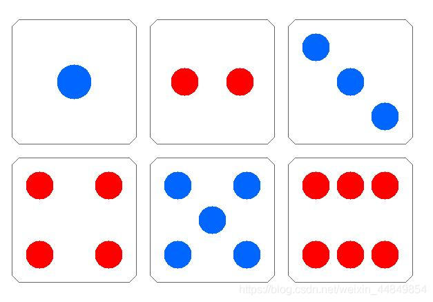
img/dice1-6.jpg需要自己从下图中裁剪,并对应命名


 扫一扫
扫一扫


 5236
5236

 被折叠的 条评论
为什么被折叠?
被折叠的 条评论
为什么被折叠?
 到【灌水乐园】发言


