


 本文介绍两种CSS技巧实现背景图的毛玻璃模糊效果及半透明覆盖层,第一种使用伪元素结合filter属性,第二种利用rgba背景色实现。适用于前端开发者提升网页视觉效果。
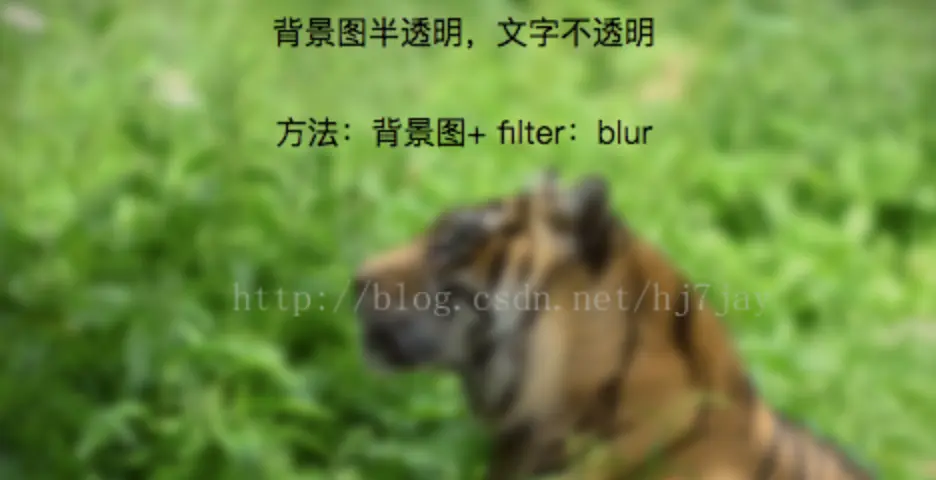
1.毛玻璃效果:背景图 + 伪类 + flite:blur(3px)
image
.demo1{
    width: 500px;
    height: 300px;
    line-height: 50px;
    text-align: center;
}
.demo1:before{
    background: url(http://csssecrets.io/images/tiger.jpg) no-repeat;
    background-size: cover;
    width: 500px;
    height: 300px;
    content: "";
    position: absolute;
    top: 0;
    left: 0;
    z-index: -1;/*-1 可以当背景*/
    -webkit-filter: blur(3px);
    filter: blur(3px);
}

<div class="demo1">背景图半透明,文字不透明<br />方法:背景图+ filter:blur</div>
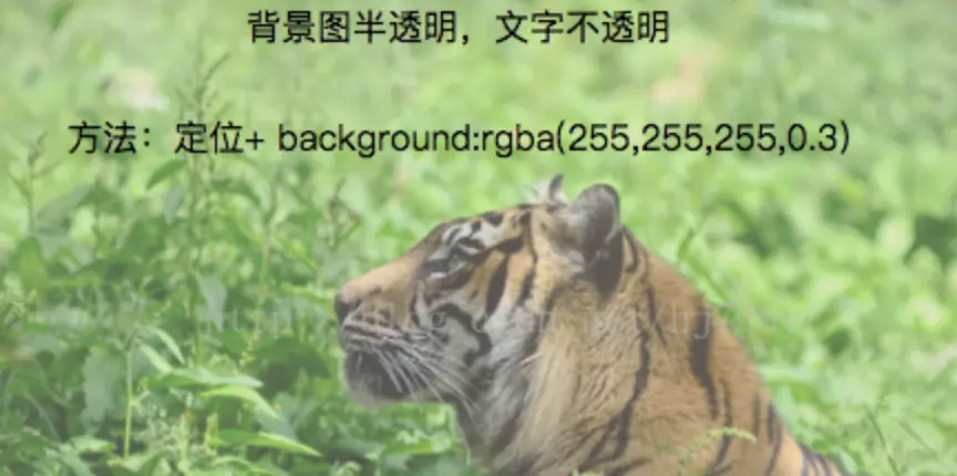
2.半透明效果:背景图 + 定位 + background:rgba(255,255,255,0.3)
image
.demo2-bg{
    background: url(http://csssecrets.io/images/tiger.jpg) no-repeat;
    background-size: cover;
    width: 500px;
    height: 300px;
    position: relative;
}
.demo2{
    position: absolute;
    left: 0;
    right: 0;
    top: 0;
    bottom: 0;
    width: 500px;
    height: 300px;
    line-height: 50px;
    text-align: center;
    background:rgba(255,255,255,0.3);
}


<div class="demo2-bg">
    <div class="demo2">背景图半透明,文字不透明<br />方法:定位+ background:rgba(255,255,255,0.3)</div>
</div>


 扫一扫
扫一扫


 1603
1603

 被折叠的 条评论
为什么被折叠?
被折叠的 条评论
为什么被折叠?
 到【灌水乐园】发言


