


 本文介绍了如何使用CSS3的伪类选择器来改变input[type=checkbox]的默认样式,提供了三种不同样式的实现方法。通过与label元素的联动,利用CSS3特性实现不依赖额外图片的CheckBox样式定制,但需要注意这种方法在某些浏览器的兼容性问题。
我们在使用input中的CheckBox时总会觉得默认的样式很丑 可是它本身能修改的样式又甚少 , 今天给大家介绍几个例子关于修改他的样式
首先我们需要知道的是我们是无法修改它本身的样式但是有两种常用的方法实现同样的功能
- 通过两张或多张图片来覆盖CheckBox点击切换不同的图片来实现 这个方法兼容性比较好但是需要额外引入图片 增大加载量
- 通过lable标签来实现与CheckBox联动 ,我们修改lable的样式来实现 这个方法由于用到很多CSS3的方法所以兼容性差 但是不需要引入额外的图片
今天给大家介绍第二种方法先上代码
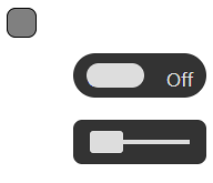
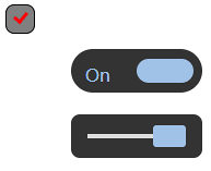
样式1
	<div class="check1">
		<input type="checkbox" value="1" name="" id="type1">
		<label for="type1" class="la1"></label>
	</div>
下面的例子HTML结构都是一样的只是换了一个ID 所以只放一个
		.check1{
			width: 30px;
			position: relative;
		}
		.la1{
			cursor: pointer;
			position: absolute;
			width: 25px;
			height: 25px;
			top: 0;
			left: 0px;
			background-color: gray;
			border: 1px solid black;
			border-radius: 8px;
		}
		/* 这个伪类效果实际上是一个长方形的边框我们裁剪它的上右边框再旋转一个角度所以看上去像一个 √ */
		.la1::after{
			opacity: 0;
			content: "";
			position: absolute;
			width: 9px;
			height: 5px;
			top: 6px;
			left: 7px;
			border: 3px solid red;
			border-right: none;
			border-top: none;
			transform: rotate(-50deg);
		}
		/* 选中check1中的input如果它为选中状态 那我们改变伪类的透明度让√显示出来 */
		.check1 input[type=checkbox]:checked + .la1::after{
			opacity: 1;
		}
样式2
		.check2{
			width: 120px;
			height: 40px;
			background: #333;
			margin: 20px 60px;
			border-radius: 50px;
			position: relative;
		}
		/* 这一个效果我们需要两个伪类一个为On 一个为Off */
		.check2::before{
			content: "On";
			position: absolute;
			top: 13px;
			left: 13px;
			height: 2px;
			font-size: 16px;
			color: #A1C2E7;
		}
		.check2::after{
			content: "Off";
			position: absolute;
			top: 13px;
			left: 84px;
			height: 2px;
			color: #ddd;
			font-size: 16px;
		}
		/* 这里说一下transition这个过渡方法 all表示所有属性 .8代表duration时间 ease代表过渡速度控制 具体的参数大家可以去官网查看 */
		/* 另外z-index让我们覆盖在伪类上面 */
		.la2{
			display: block;
			width: 52px;
			height: 22px;
			border-radius: 50px;
			transition:all .8s ease;
			cursor: pointer;
			position: absolute;
			top: 9px;
			left: 12px;
			z-index: 1;
			background: #ddd;
		}
		/* 当check2被选中时 我们移动lable */
		.check2 input[type=checkbox]:checked + .la2{
			left: 60px;
			background-color: #A1C2E7
		}
		#type2{
			display: none;
		}
样式3
		.check3{
			position: relative;
			width: 120px;
			height: 40px;
			background-color: #333;
			margin: 20px 60px;
			border-radius: 8px;
		}
		/* 这里我们的伪类元素就是一条高为4px的线 */
		.check3::after{
			content: "";
			position: absolute;
			width: 90px;
			height: 4px;
			background-color: #ddd;
			top: 18px;
			left: 15px;
		}
		.la3{
			position: absolute;
			width: 30px;
			height: 20px;
			background-color: #ddd;
			top: 10px;
			left: 15px;
			border-radius: 3px;
			cursor: pointer;
			transition: all .6s ease;
			z-index:9 ;
		}
		#type3{
			display: none;
		}
		.check3 input[type = checkbox]:checked +.la3{
			left: 75px;
			background-color: #A1C2E7
		}
如有错误,请指正


 扫一扫
扫一扫


 1212
1212

 被折叠的 条评论
为什么被折叠?
被折叠的 条评论
为什么被折叠?
 到【灌水乐园】发言


